I have been trying to teach myself Renaissance painting methods for over a year now in my spare time. I have learned so much about paint materials and developing an artistic process. The biggest lesson I’m still working on learning is patience. Everything about this process takes time. Sourcing pigments takes time. Grinding paints takes time. Working in layers and waiting for paint to dry takes time. More time planning and prepping goes into a project than time spent painting.
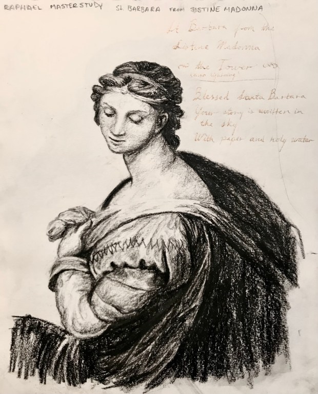
Drawing has as much, if not more importance than the paint. Especially in master copies, spatial relationships, shapes, and perspective are the fundamental glue that holds the composition together. I now understand why there are so many copies from students working in a master’s studio. Sometimes, the only way to truly understand a painting is to study it as discerningly as you do when you need to recreate it.
Evolution of my master studies
I have developed an approximate Renaissance method after consulting the research that I have found. Much of my research focused on the Venetian masters, so I initially tried to recreate their processes and materials used.
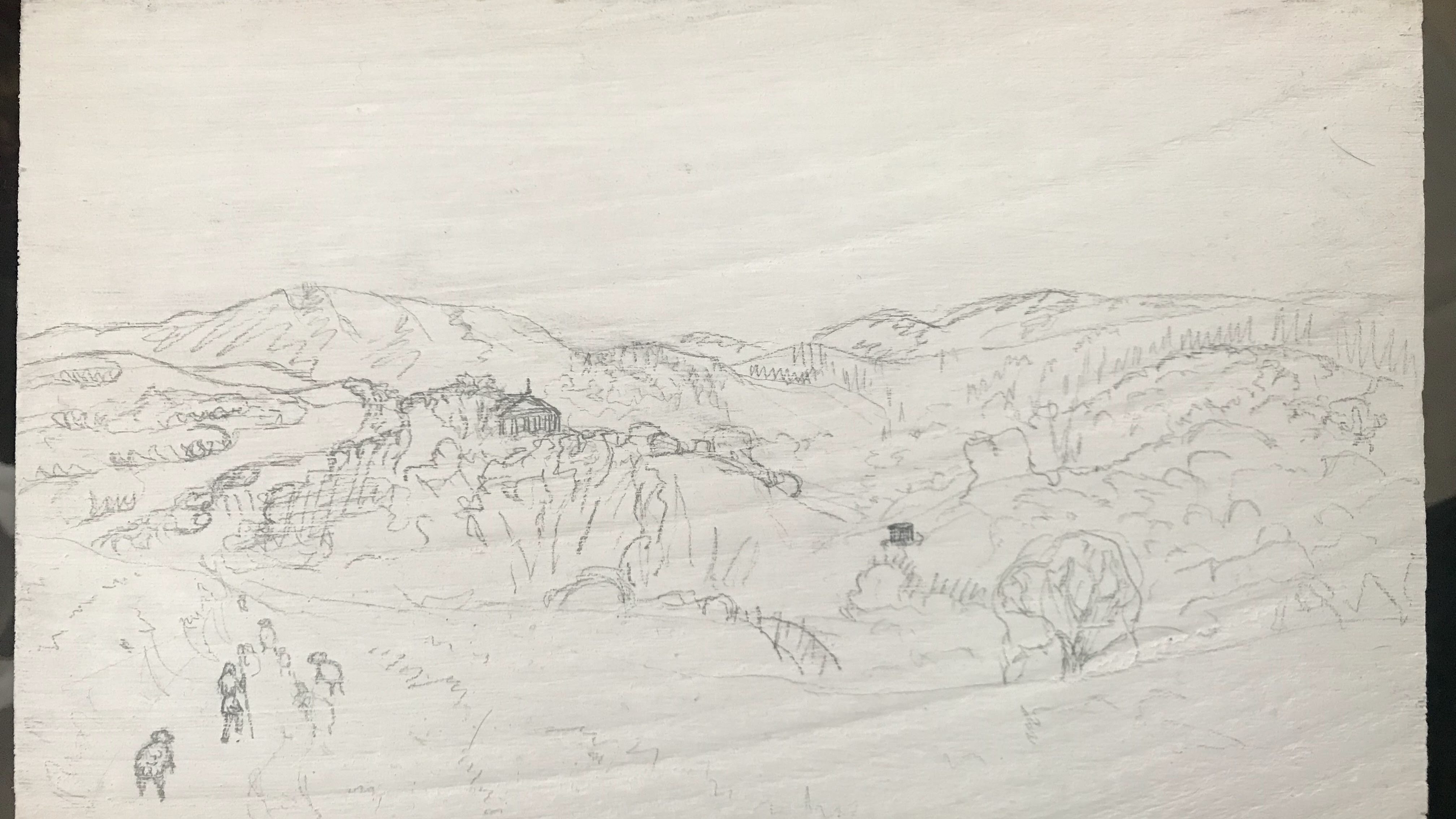
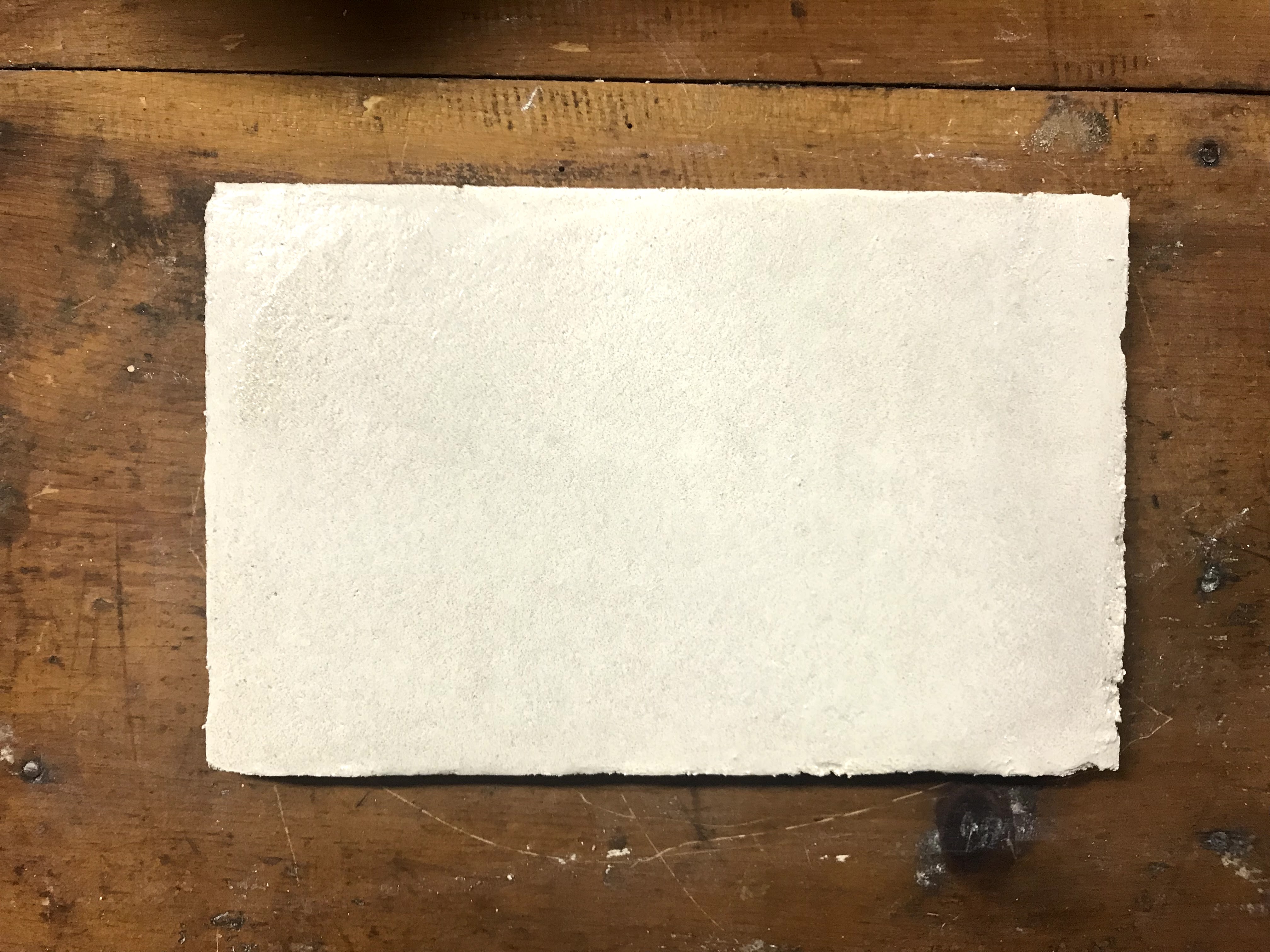
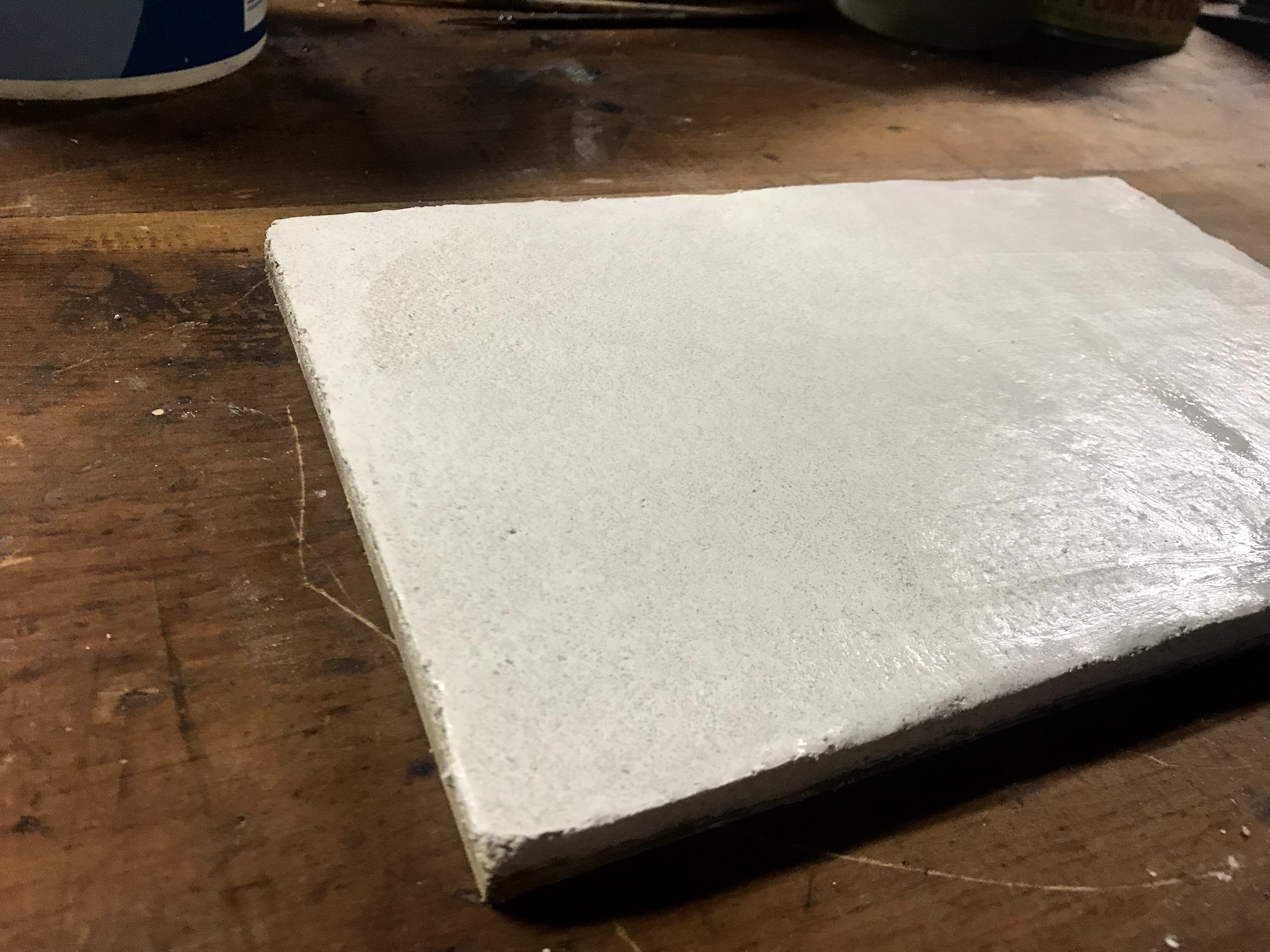
My process begins with preparing a wooden panel with rabbit skin gesso. After applying several layers of gesso and letting it dry, I sand down the surface until it is smooth. Although, I may have been cutting corners on the sanding, admittedly. After the panel is prepared, I make a preliminary underdrawing in pencil.
Pencil underdawing
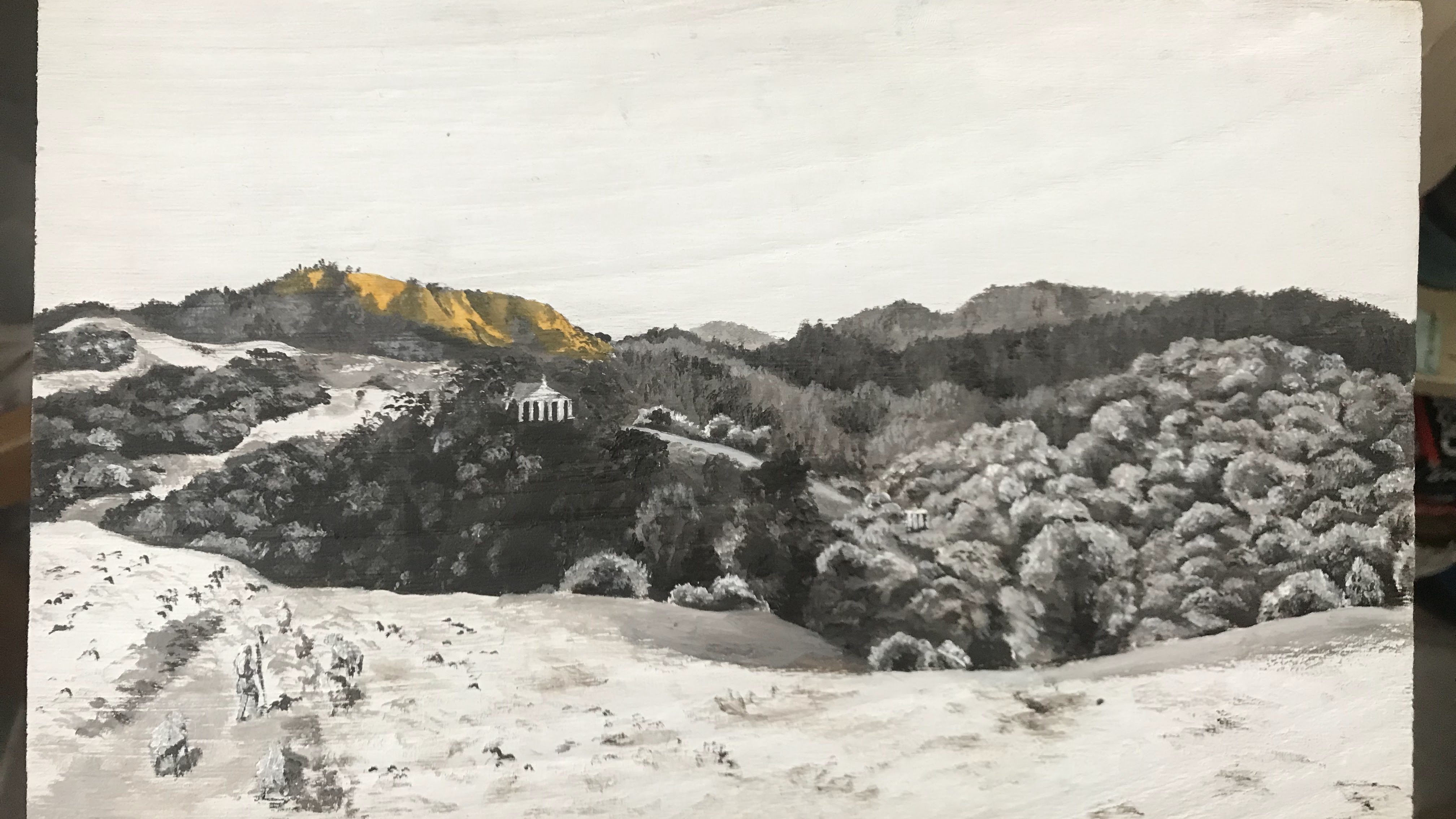
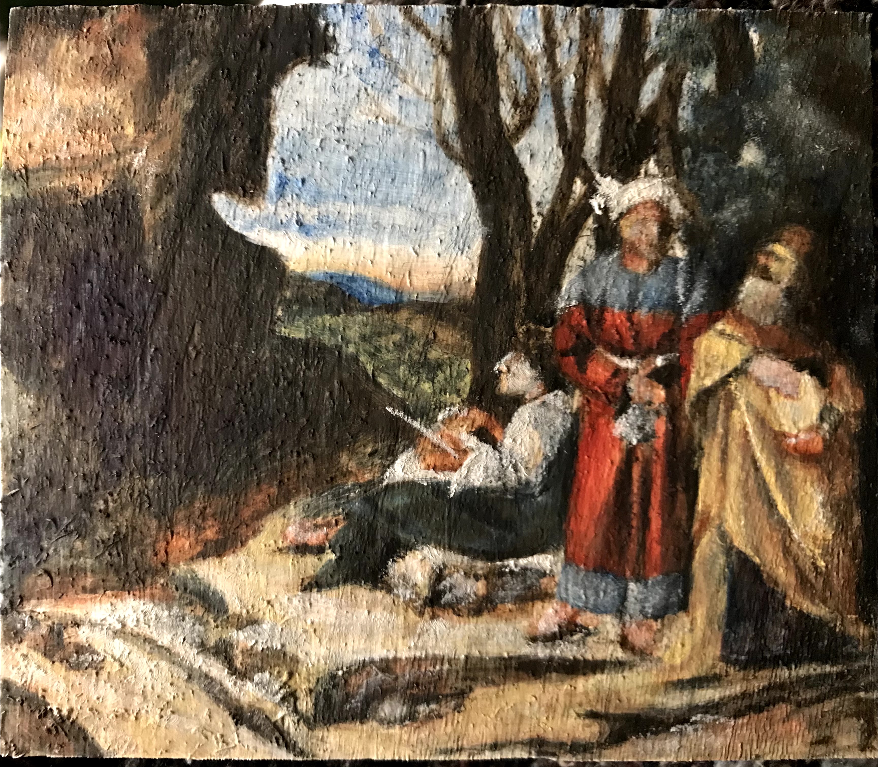
The first paint layer is a grisaille layer which helps to establish tonal values. This layer was commonly done in a black, but I opt to use raw umber.
Grisaille with first additions of yellow ochre glaze
Once the grisaille layer has dried, I begin to layer on glazes of color. For the glazes, I add a balsam medium which is similar to varnish in consistency. The medium gets mixed with paints to produce smooth, glossy paint strokes. The medium’s effect on the paint contributes to the transparency and radiance of the layers.
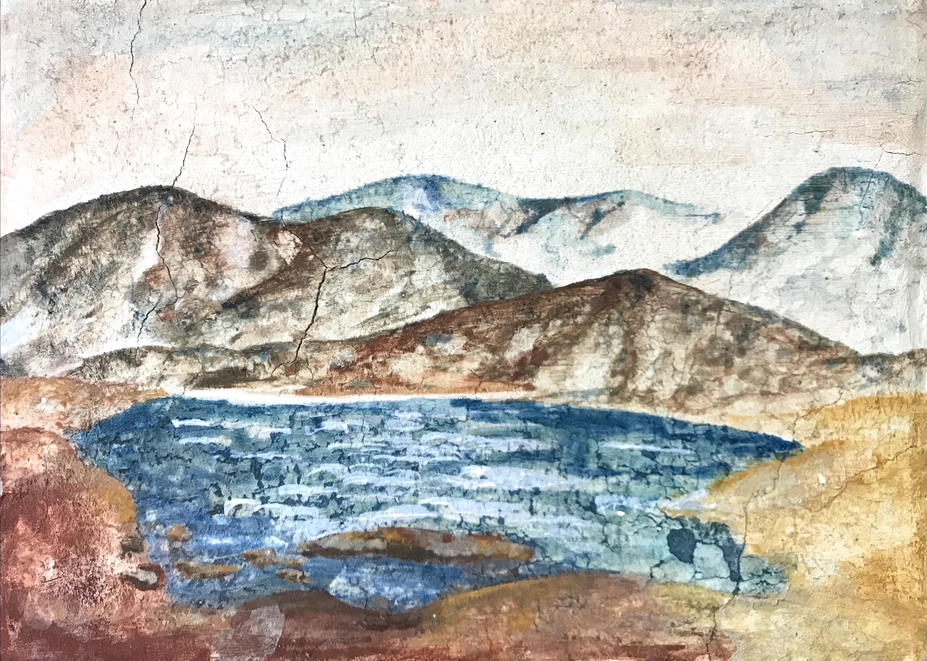
Glazes of yellow ochre and verdigris addedIndian red glaze added, and some ultramarine
Paints that need to be opaque, like light yellows and whites, are saved for the final layer. Once all the layers have dried, I finish paintings with a dammar resin and linseed oil varnish.
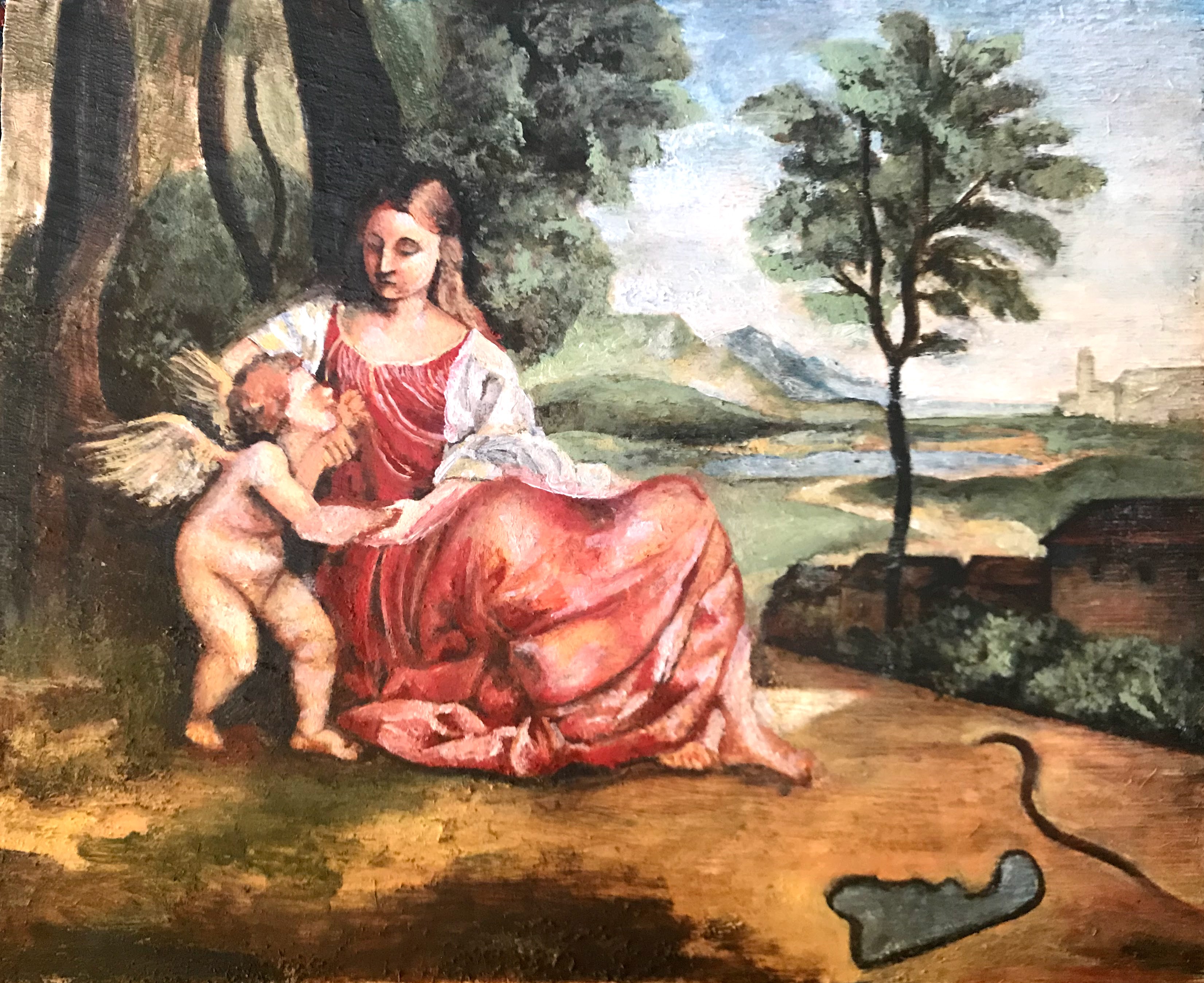
More ultramarine added, opaque highlights added inFinal painting with some edits to the composition and a final verdigris glaze to blend some of the distinct paint strokes
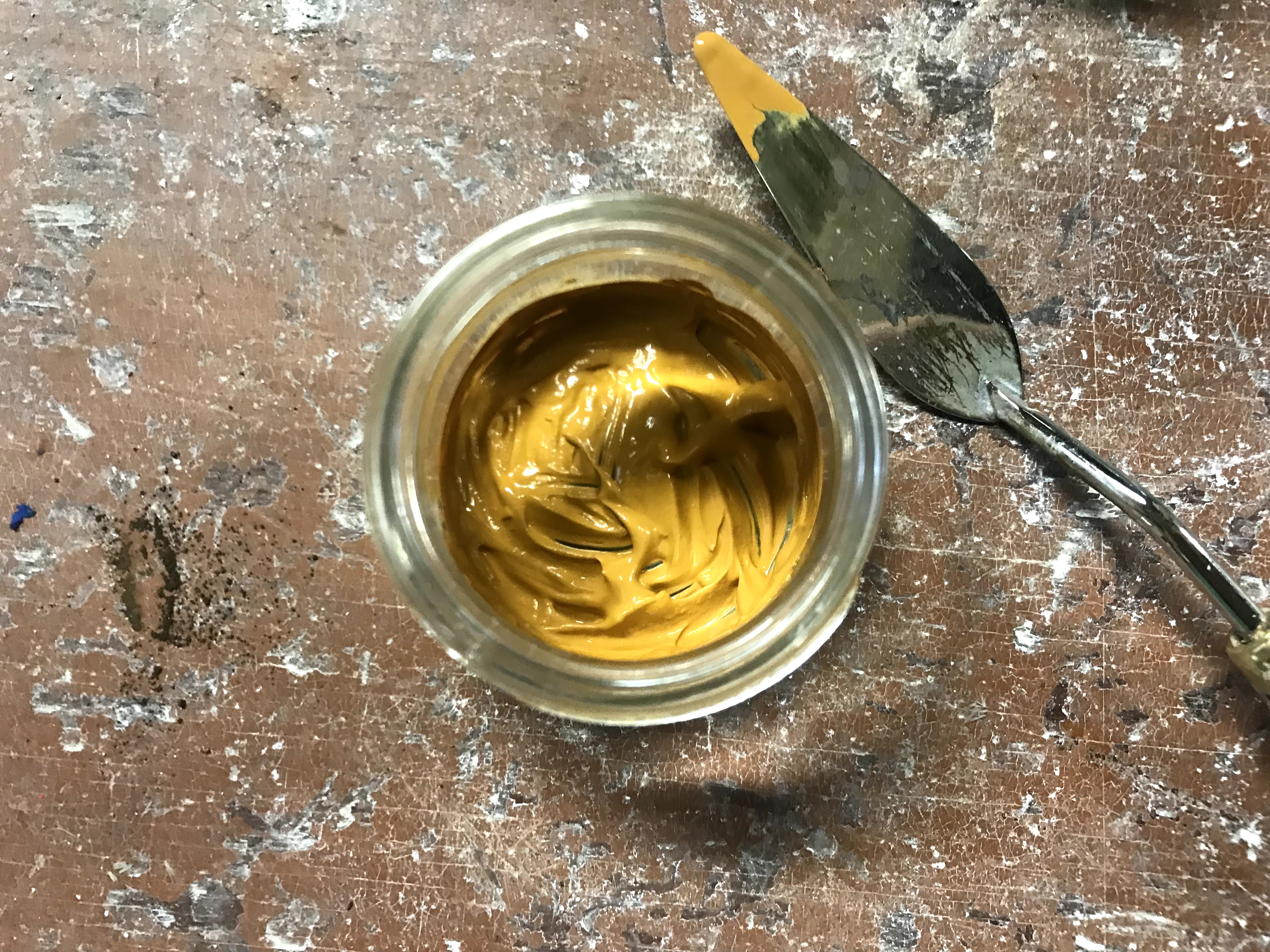
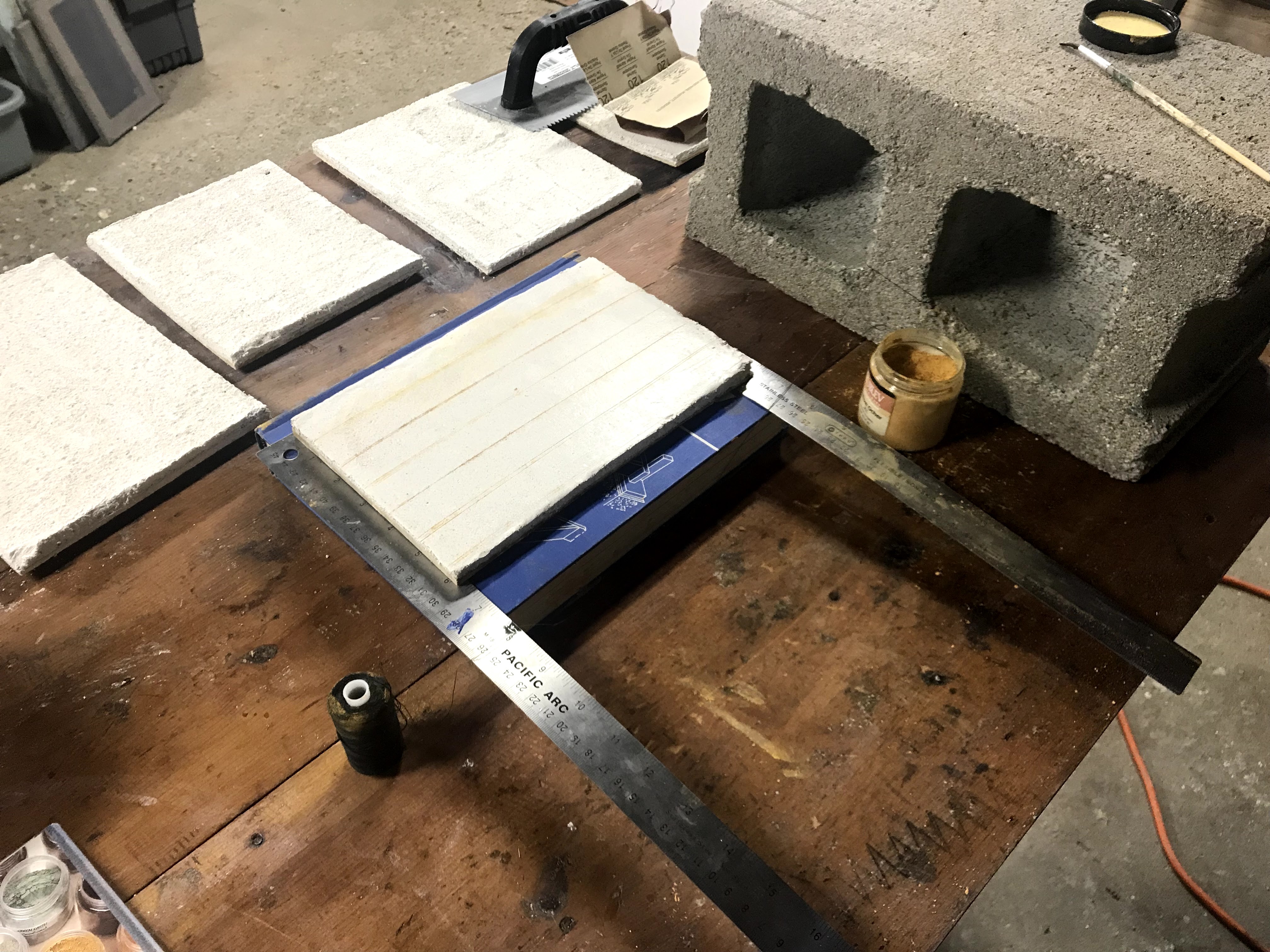
I tried my best to remain historically accurate with my paints and pigments. I use titanium white instead of lead white, but otherwise, I stay true to what materials would have been available at the time. I prepare all of my own paints by sourcing pigments and grinding them in walnut oil. My total pigment lineup includes: titanium white, raw umber, burnt umber, Indian red (hematite), yellow ochre, verdigris, green verditer, blue verditer, ultramarine, vermillion, and rose madder. I do not use all of these in every test that I do, but these pigments are available in my made up workshop.
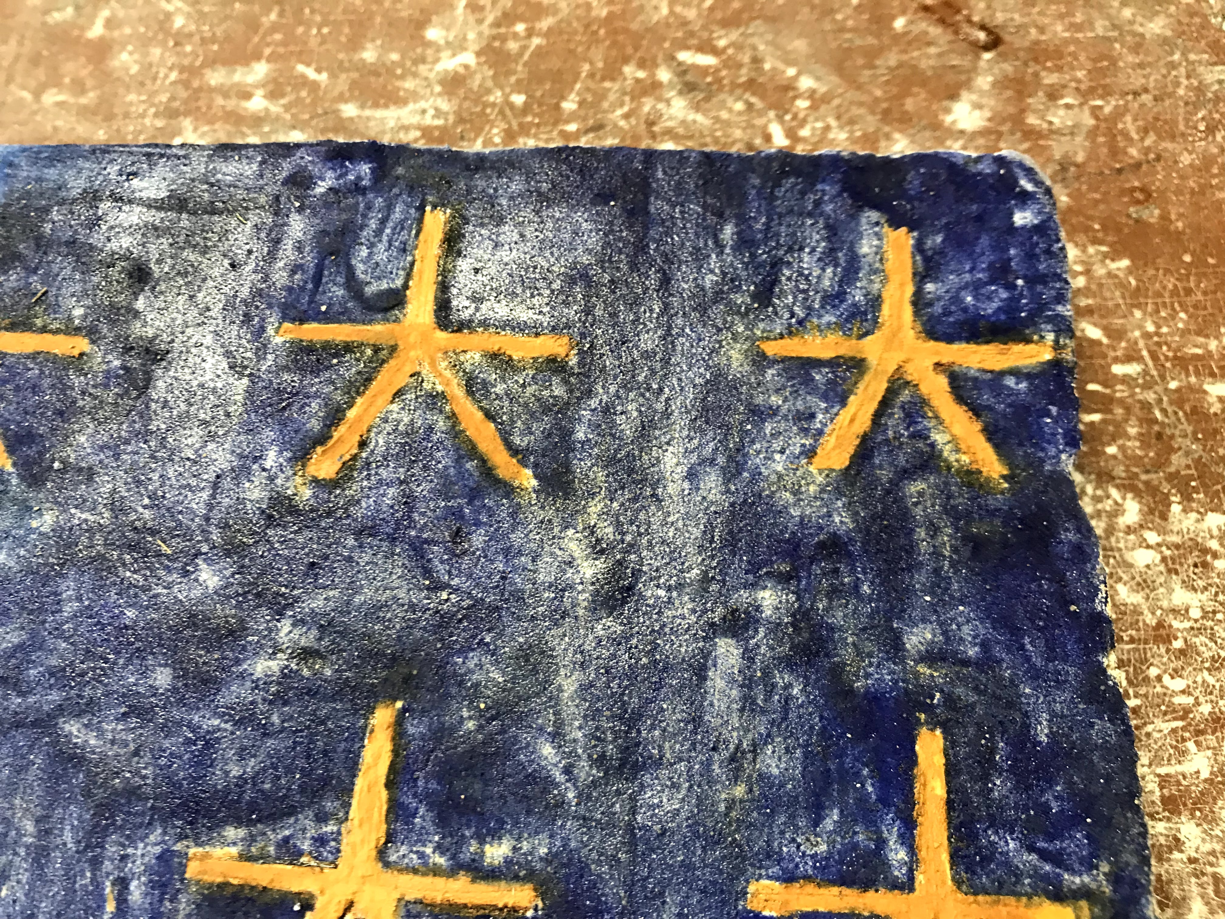
Pigment Lineup
I am constantly learning about how to grind paint more consistently. I am also recognizing how pigments’ absorption levels affect how they grind up and how certain pigments act on the brush. I am also figuring out temperance in layering and trusting the layers to create certain colors instead of mixing paints on the palette. Although my execution of this process has not been flawless, the results are improving.
This will be a quick talk on making cyanotypes. I considered making cyanotypes the long, elaborate way about a year ago. Creating my own chemicals probably would have not worked, and would have raised a few eyebrows with my internet search history into cyanide. I settled for making cyanotypes the easy way with chemicals from an art store.
Most people are probably more familiar with blueprints, but a blueprint is essentially the same thing as a cyanotype. Also, any artists will probably be familiar with the pigment Prussian Blue, which is chemically identical to a finished cyanotype. A cyanotype is made by sensitizing a surface with a chemical wash, and then covering the surface to make a contact print. A contact print is the opposite of a typical camera negative. A negative is exposed in order to eventually print the positive image, however, a contact print directly prints onto the surface. Once the surface has finished exposing, it must be washed with water to stop any further exposure, and the print will continue developing as the surface dries.
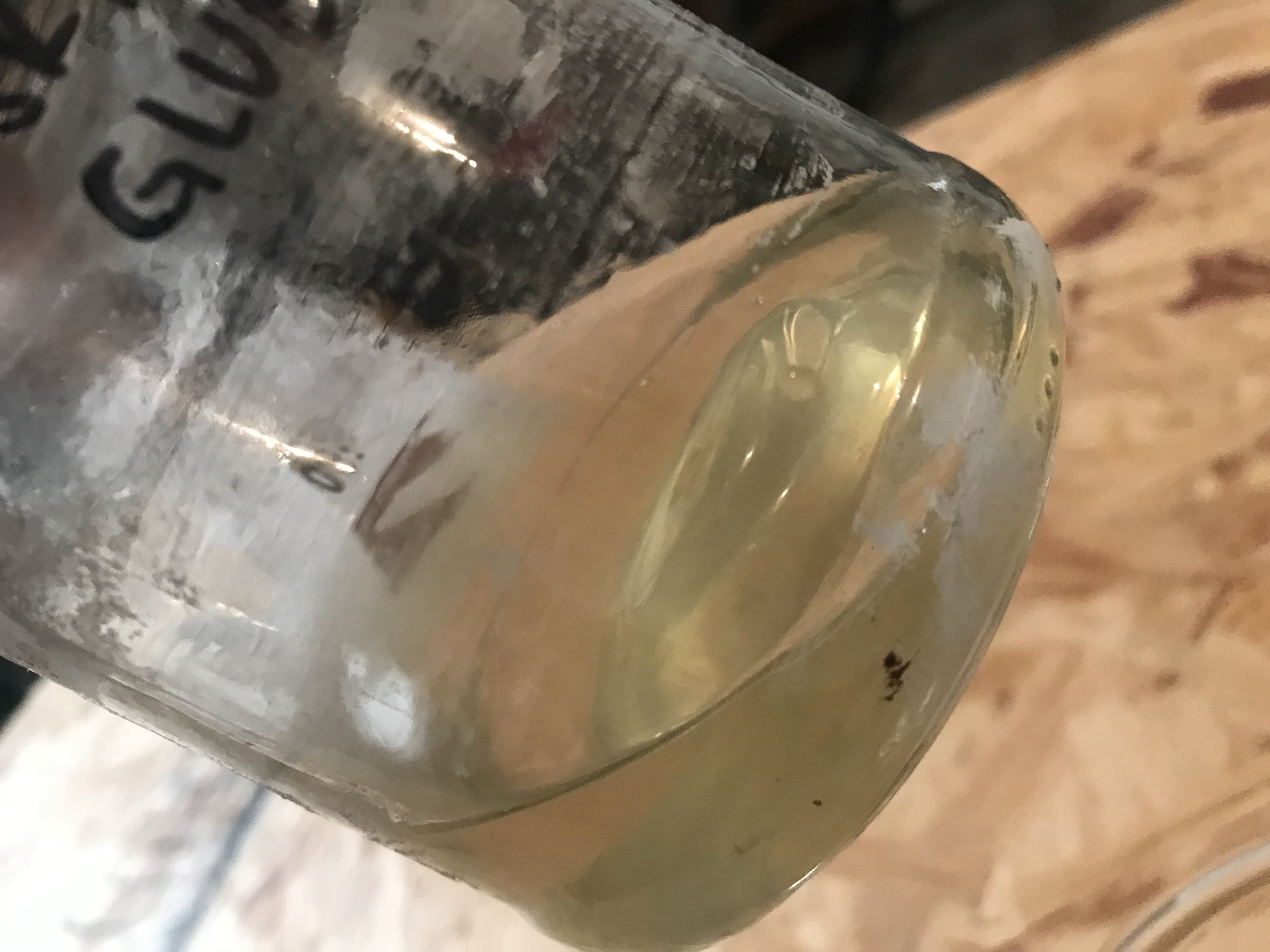
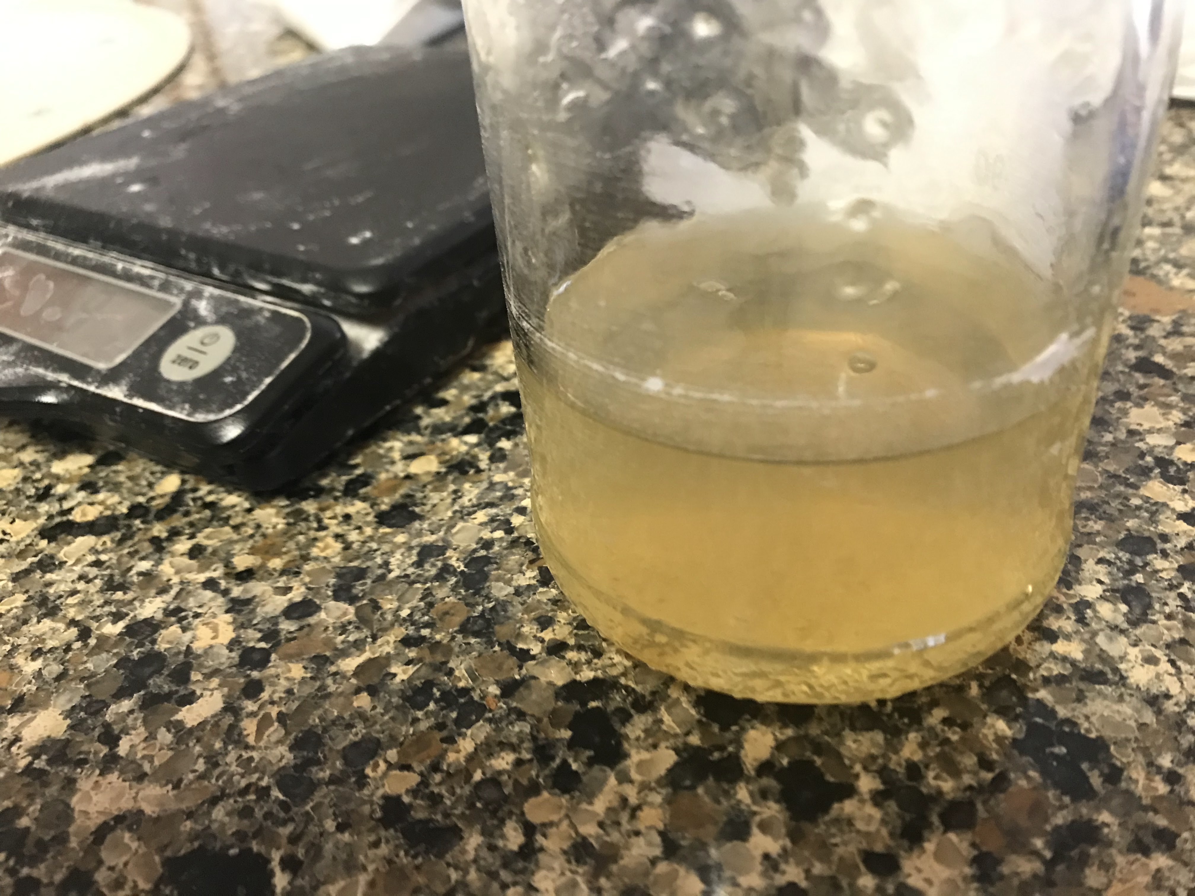
The chemicals come as two dry powders and must be dissolved in water before combining. Both chemicals are made into solutions separately as Part A and Part B, which I mixed by weight and stored in empty hydrogen peroxide bottles. The opaque plastic will store the chemicals longer. The chemicals are iron(III)ammonium citrate and potassium ferricyanide. Combining these chemicals creates a photosensitive solution, which when exposed to sunlight, reacts and causes the iron(III)ammonium citrate to oxidize to ferric ferricyanide. Ferric ferricyanide is insoluble in water, so once the surface has been exposed for long enough, the surface is rinsed with water so any unexposed chemicals or waste chemicals are washed away, leaving the dark blue ferric ferricyanide.
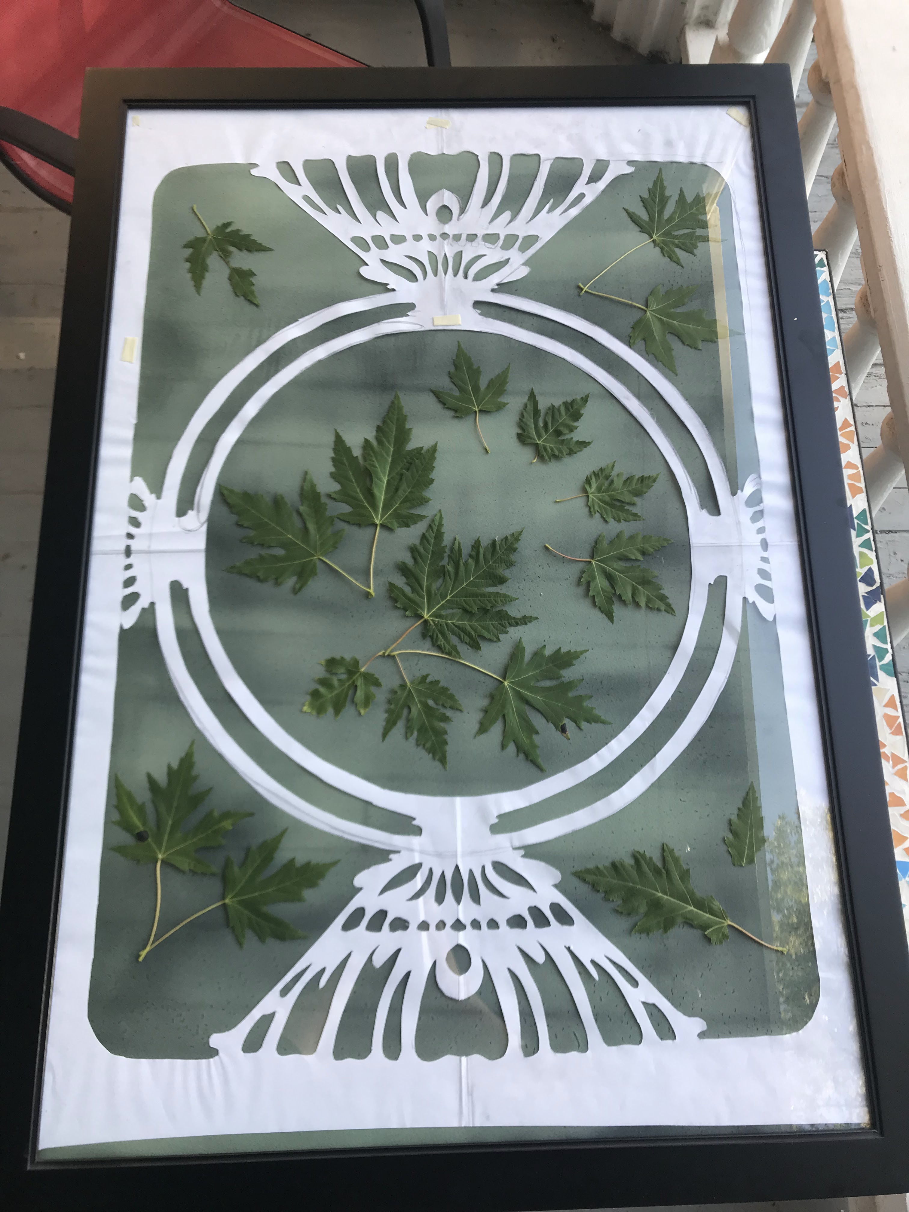
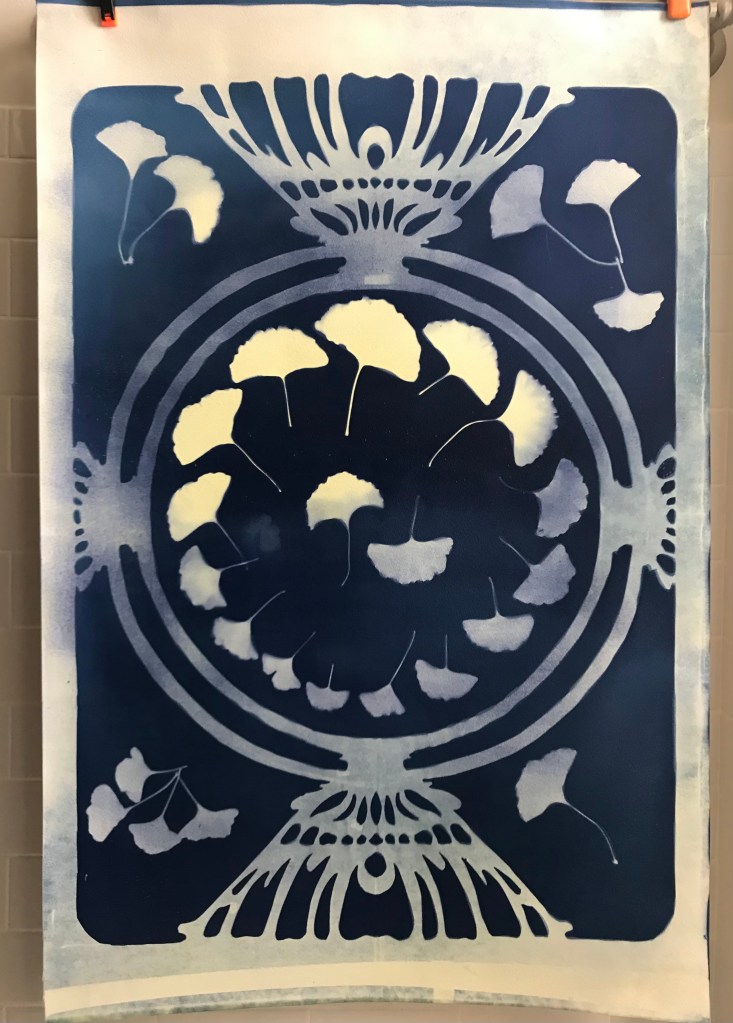
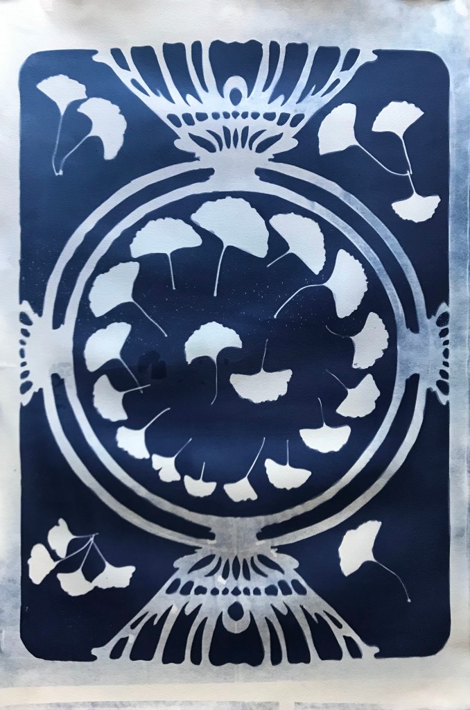
My initial concept for the image that I created was early botanical prints. Cyanotypes were used in botanical study as a way to contact print specimens for accurate reproduction as a replacement for drawing. I also wanted big prints, so I filled up more of the space with a Mucha inspired frame that was traced and cut out of vellum paper.
The final cut frame
I wanted 24”x36” prints, foolishly, so I tracked down a poster frame to use in my exposure. Finding big paper proved to be a big challenge, as most watercolor paper tops out around 22”x30”. I would recommend just making smaller prints. I, however, found a very nice heavy cotton print paper, which I had to trim in order to fit in the frame.
I made a few test exposures before I worked on the big paper. After several failed tests, I felt confident in my exposure times. I gathered leaves from outside and sensitized my big paper in order to prepare everything for the next morning.
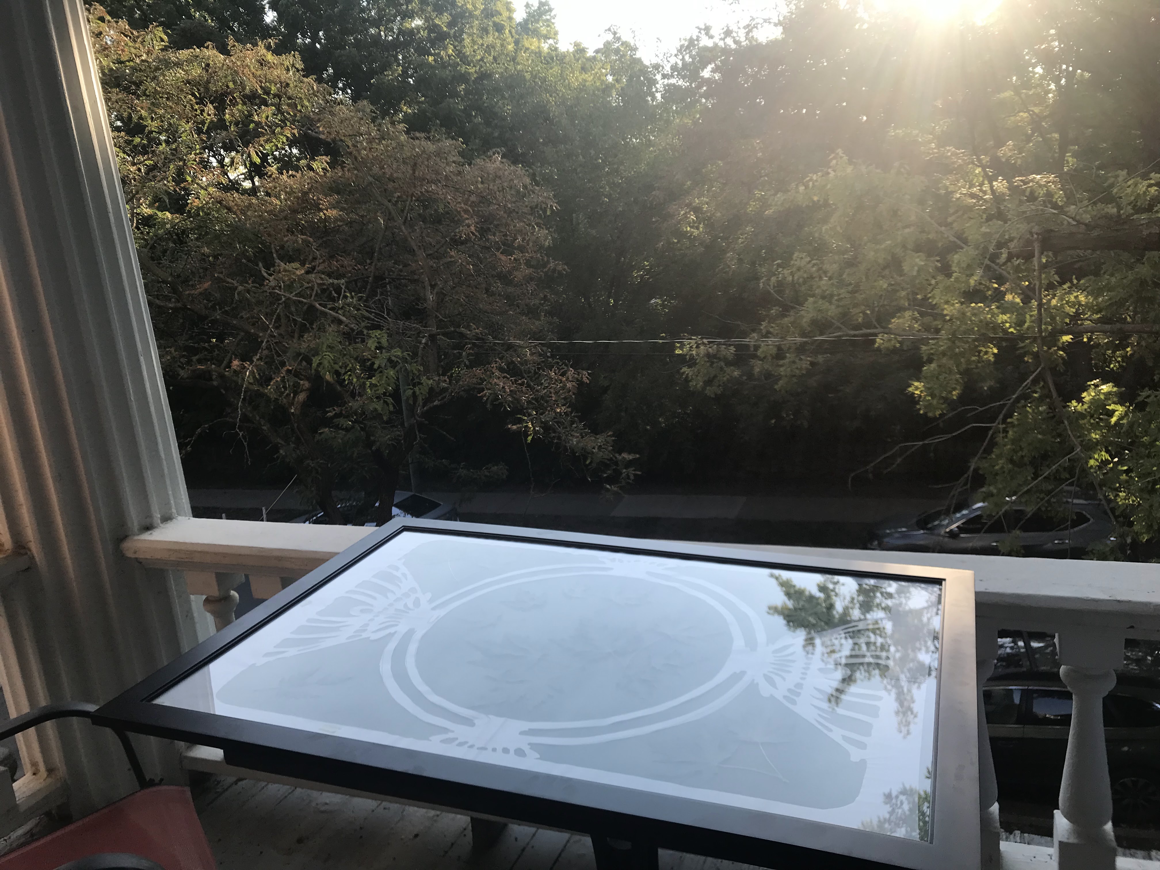
I prepared my print by placing the decorative paper frame on the paper and arranging the leaves around it. The paper and everything on it was then placed between panes of glass and left in the sun. I tried leaving everything in the poster frame, but after a rough print, I realized that the center was not pressed against the glass tightly enough. Luckily, I prepared three papers to expose as contingency for exactly this scenario.
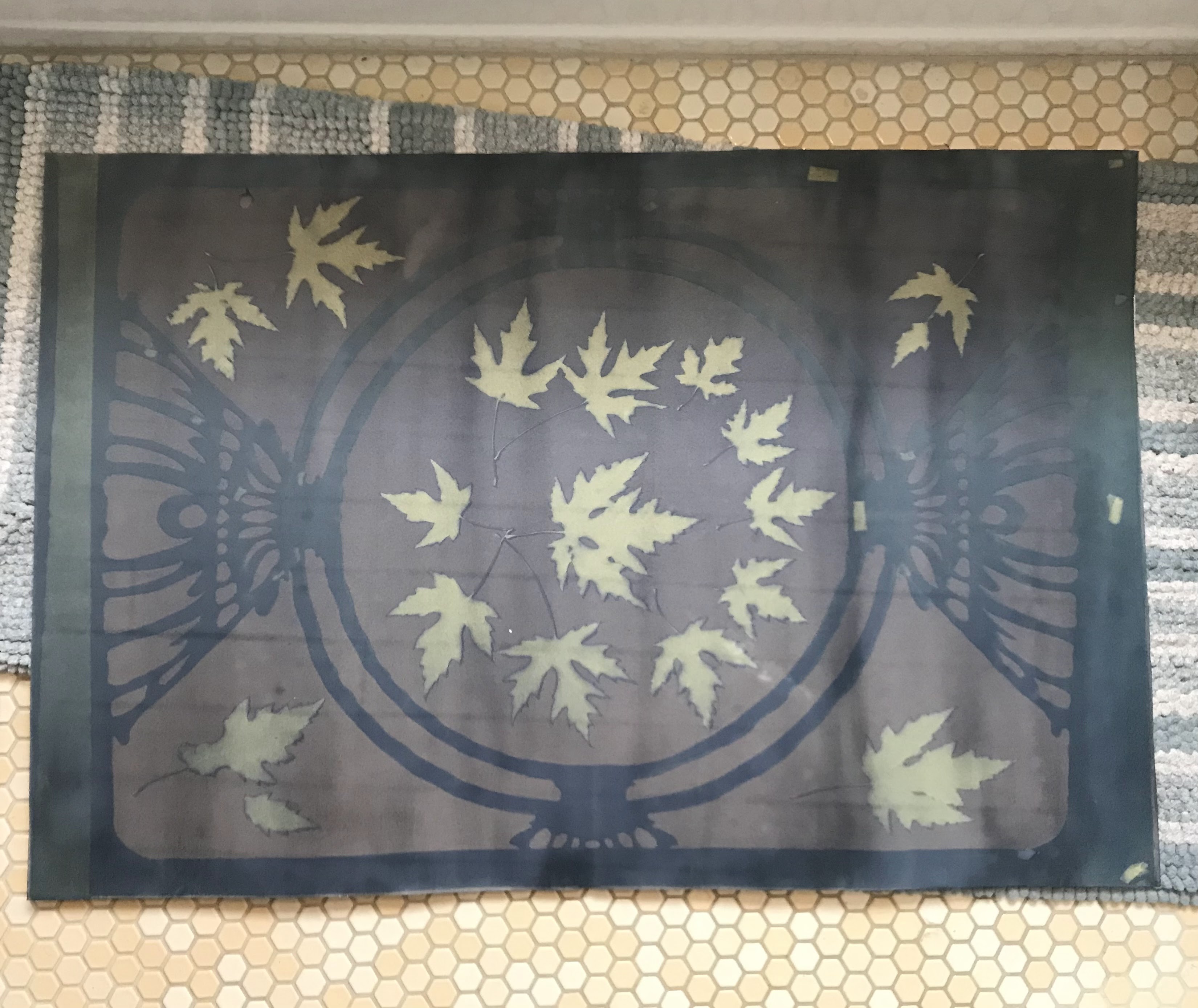
Everything set in the frame to expose. This was my failed attempt.
The paper was not exposed for long enough, and the poster frame did not press everything on tightly, so many of the edges are not clean.
Exposing in the morning sun.The double glass pane method.
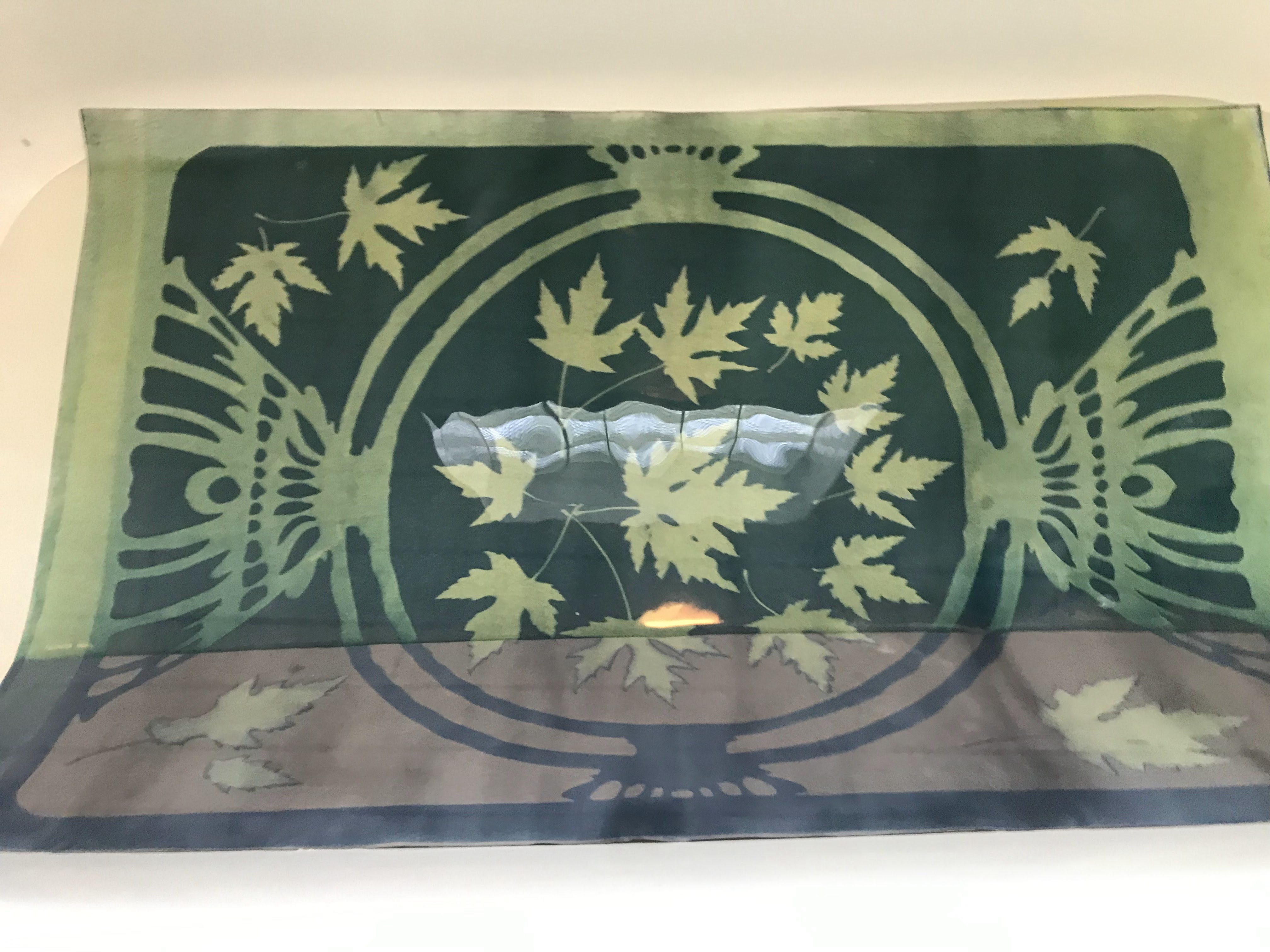
I continued with a double glass pane exposure method. To tell when the exposure was done, I looked at the color change in the print. The chemicals start as a green and slowly turn blue, then brown. This is the reaction taking place, as molecules convert from the reactants to the products. Once I deemed the exposure to be complete, I took the print inside to my bathtub filled with water. I gently ran the big paper through the water to wash off undesirable chemicals, this is when you get a first glance at the print.
One of the prints directly after exposure. The uncovered background has turned brown, and the where the semi-transparent vellum frame was placed has turned dark blue from partial exposure. The leaf silhouettes are still green from no no light getting through.The print gets washed in water after exposure. Notice the difference in color as it comes into contact with water. The color washes away from the underexposed frame and leaves. The brown background turns dark blue as it became insoluble in water after exposure. After washing, the paper is no longer photosensitive.
I then hung the prints off a towel rack in the bathroom to dry. The blues continued to get darker and develop as the paper dries. My second print, the ginkgo leaves, was partially exposed before I wanted it to be exposed. It is not super evident in these photos taken immediately afterwards, but this print has since darkened considerably in the frame areas.
A print immediately after washingA print after drying and its stopped developing
I embarked on my next task in historic painting methods by tackling the very ground that my art would go on. “Ground” in art terms usually means the surface that gets worked on, most commonly canvas or wood panel. I decided that if I was already going down the rabbit hole of historic painting, I might as well lean into it and start from the ground up. Paint rarely goes directly onto a canvas or paper without the surface first being primed with a ground to help protect it. Surfaces like canvas, wood, and paper are all porous and will absorb the paint, and oil paints and enamel paints can corrode these surfaces, unless a proper barrier is in place. Any sort of water-proofing or skin-forming layer would do, and now acrylic gesso is fairly standard for panels and canvases. However, rabbit skin gesso used to be the old stand-by for many many years.
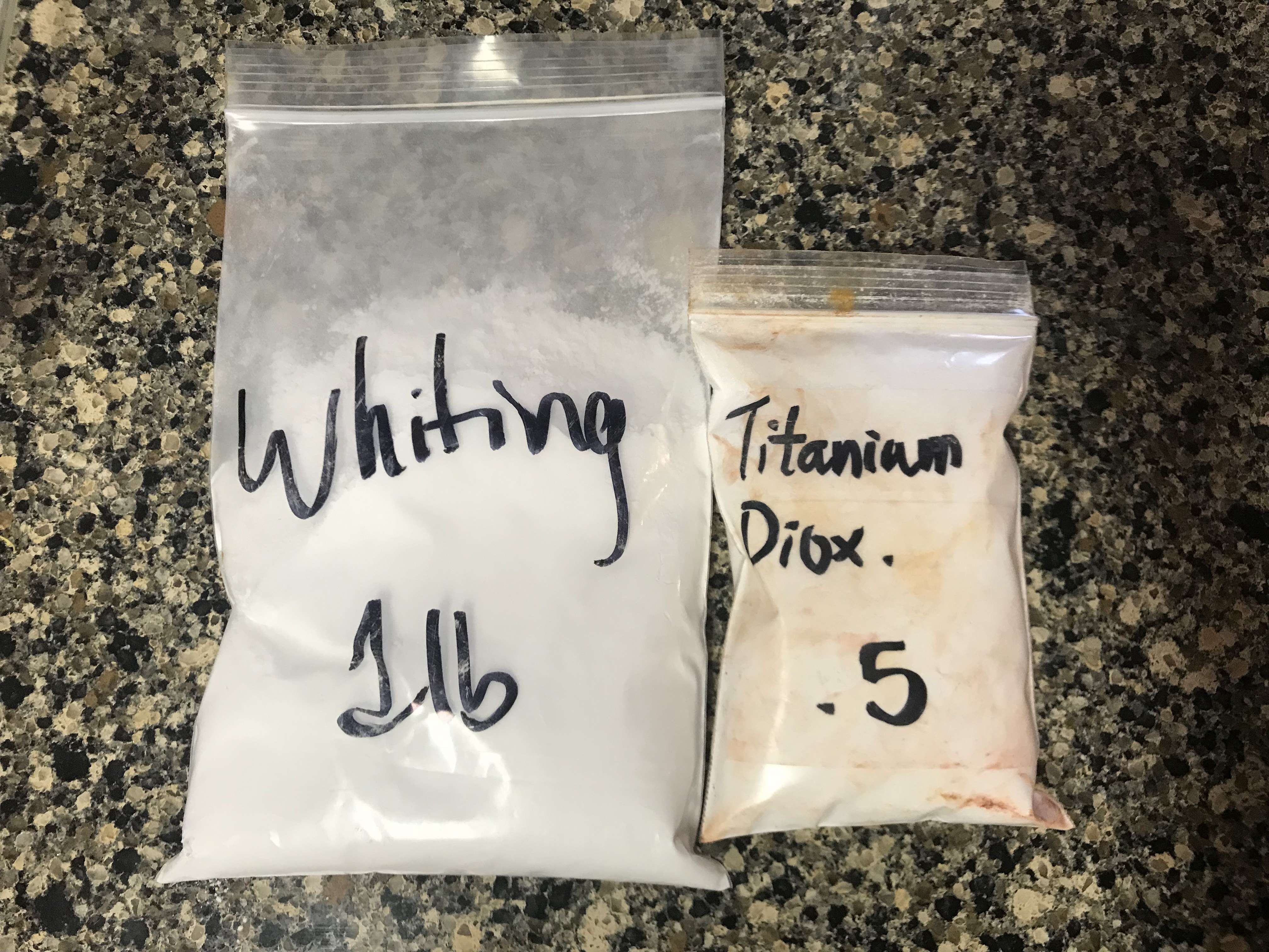
Most old recipes for rabbit skin gesso consist of rabbit skin glue and lead white pigment or whiting. Rabbit skin glue, or any animal hide glue, is a collagen-based glue made from soaking skins in water to extract the strong proteins which form strong, water-proof bonding once dried. Believe me, I wanted to find real, genuine rabbit skin and soak it, and really do the whole process right. However, in today’s society? I’m not really sure where one would go to obtain some rabbit skins legitimately. So, I settled for powdered rabbit skin, which is commercially available and functions on the just-add-water principle. Simple and easy.
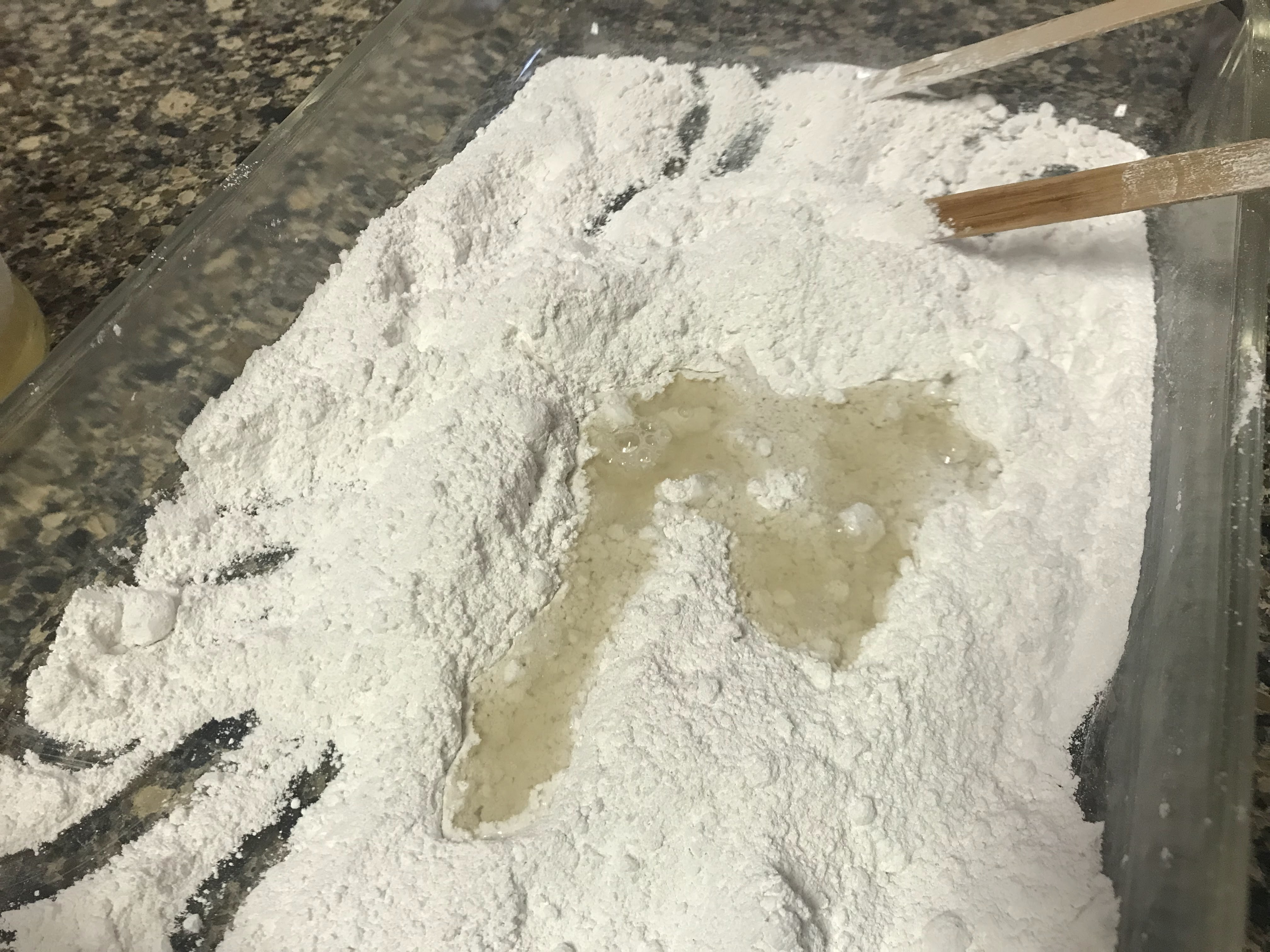
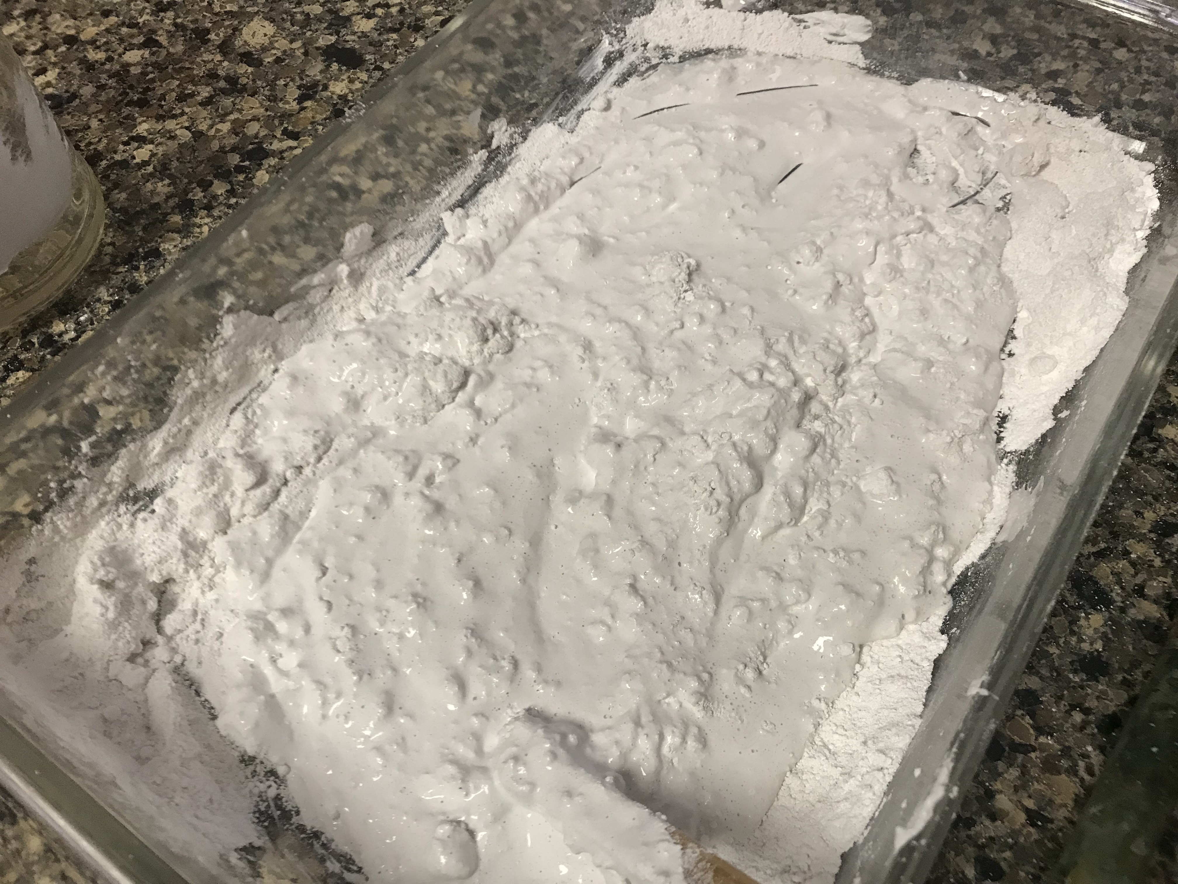
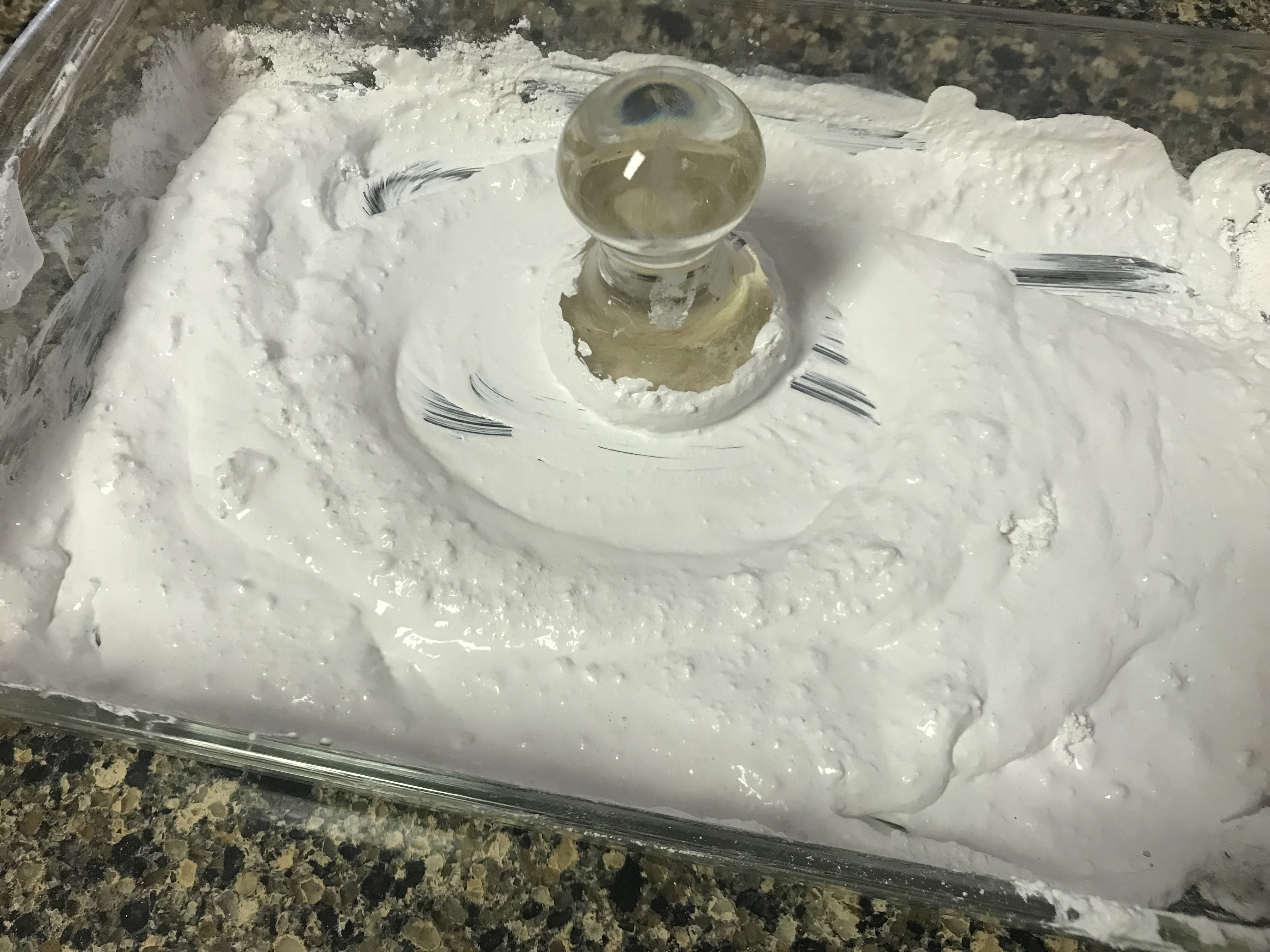
I dissolved the powdered rabbit skin in boiling water. Temperature definitely played a big role in this experiment, and I tried my best to stay on top of it. After the powder dissolves, the glue stays liquid while it is hot, and the glue solidifies at room temperature. It can be reheated and reliquified.
I should have only used whiting as the pigment because using nicer pigments feels like a waste when the gesso will be completely covered up by the painting. The gesso recipe that I followed used titanium white (in replacement of lead white) and whiting in equal parts. Titanium white has better brilliance than whiting, so I get why it would be included. Honestly though, the gesso will get covered anyways, so I see little use in including a good white pigment in the gesso. Going forward, I plan on just using whiting.
The recipe I followed also said to add all ingredients into a dish and then use a muller to incorporate everything, similar to mulling down paint. I tried this at first, and it was incredibly inconvenient and messy. The process took a while and still had some unmixed chunks of dry pigments. Later in my project, I needed to make a second batch of gesso, and I did what I think most reasonable people would do, which is throw all the components in a jar and shake it like it’s Bisquik batter on Saturday morning. The jar method proved to be the best strategy, it was clean, quick, and efficient. The rabbit skin glue does need hot water to be mixed, so there is an element of danger in holding and shaking hot water to beware of.
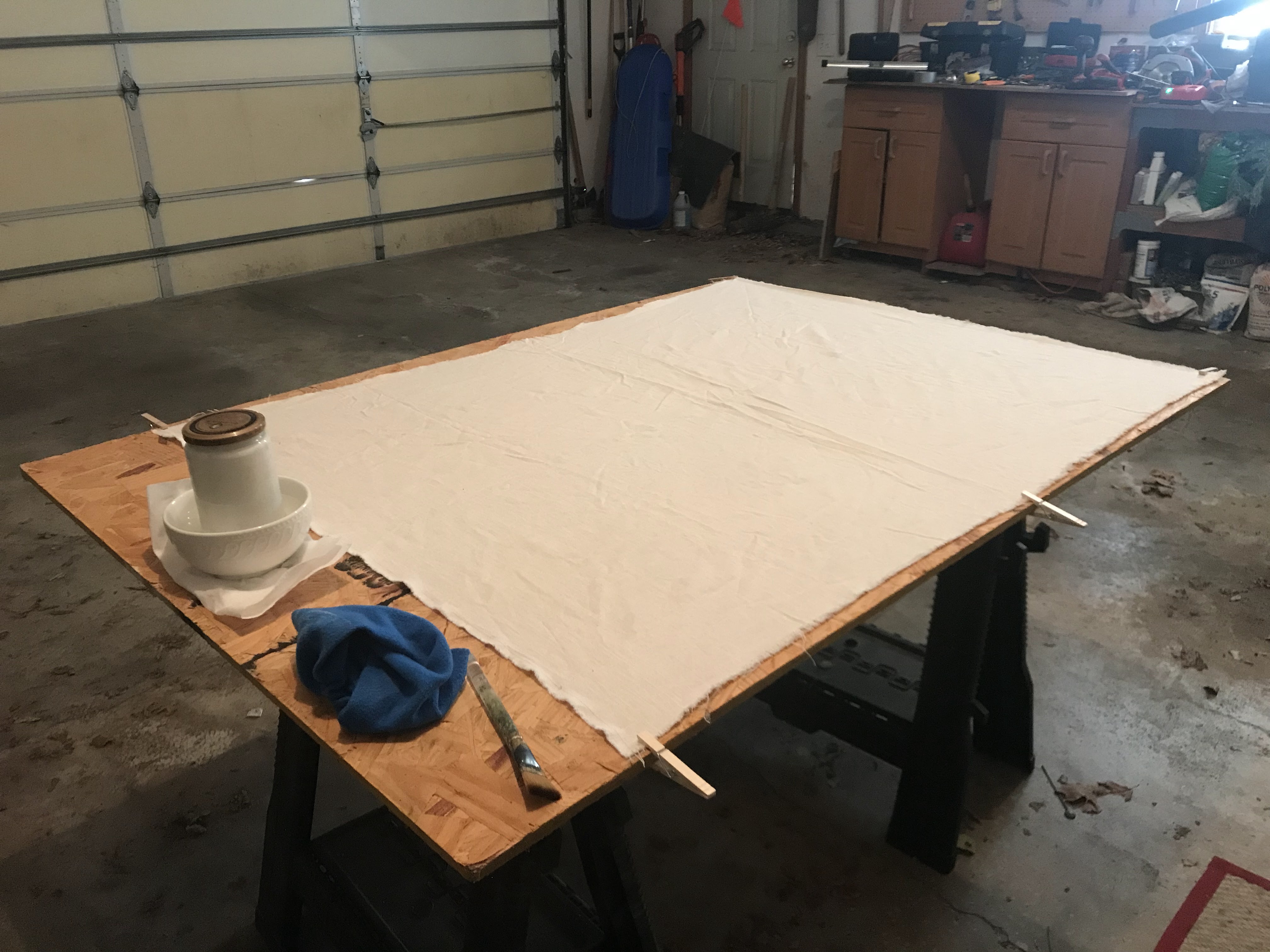
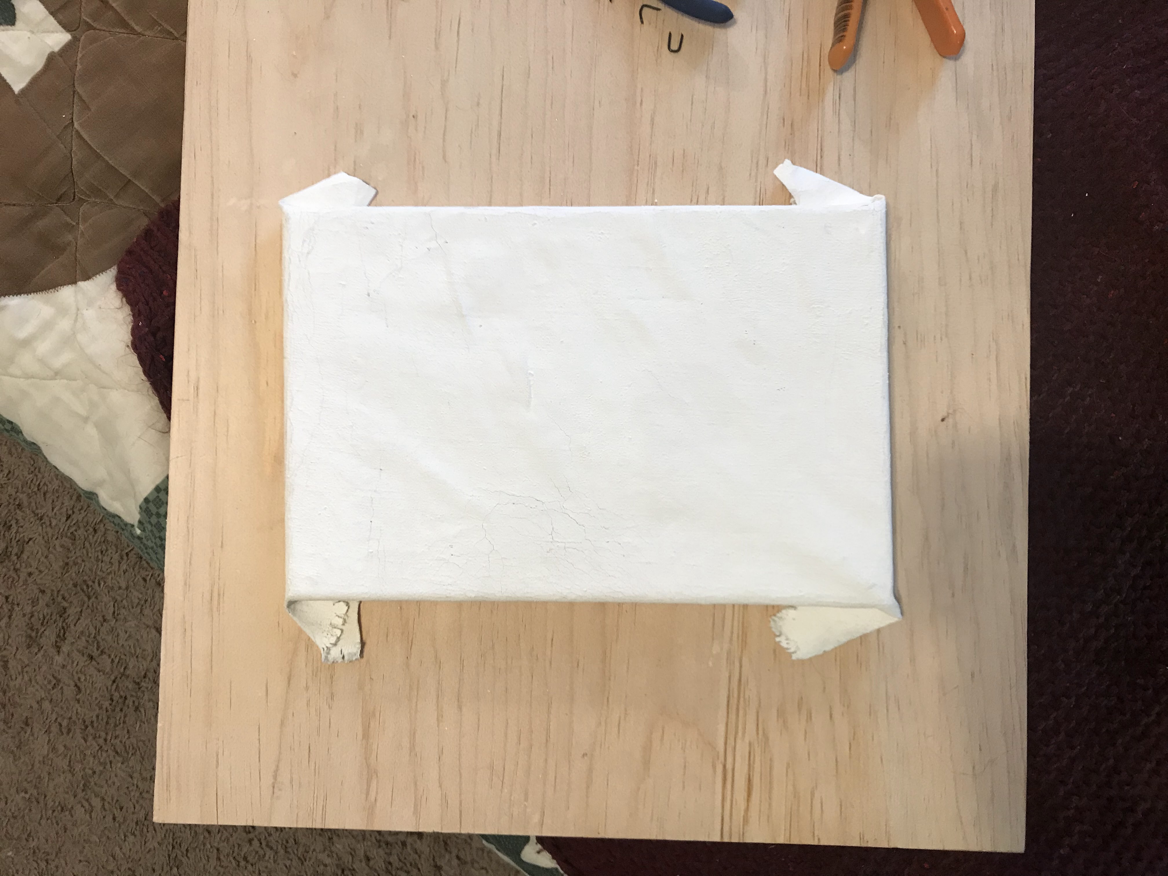
In my pursuit of frugality, I found some canvas from a fabric consignment shop. The canvas was probably too lightweight and not completely suitable for my purposes, but I went on ahead anyways.
I kept the gesso in a bath of hot water in an attempt to keep it loose and liquid, but as the water temperature changed between the water cooling and me adding in hot water, the consistency of the gesso fluctuated and was unfortunately inconsistent across the canvas. The fibers of the canvas were also relatively loose and would stretch at inconsistent rates and then get locked in varying stretched states as the gesso dried.
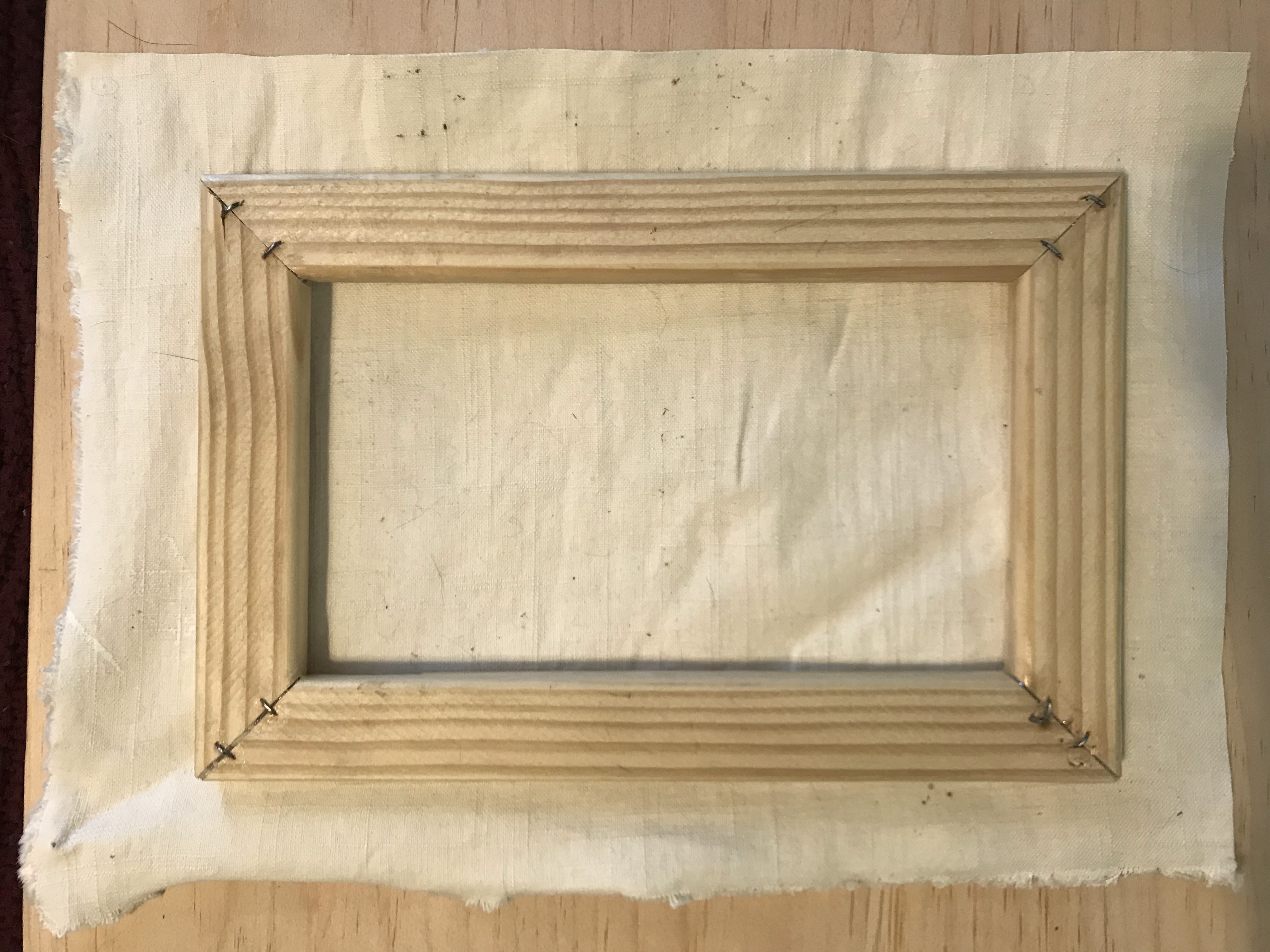
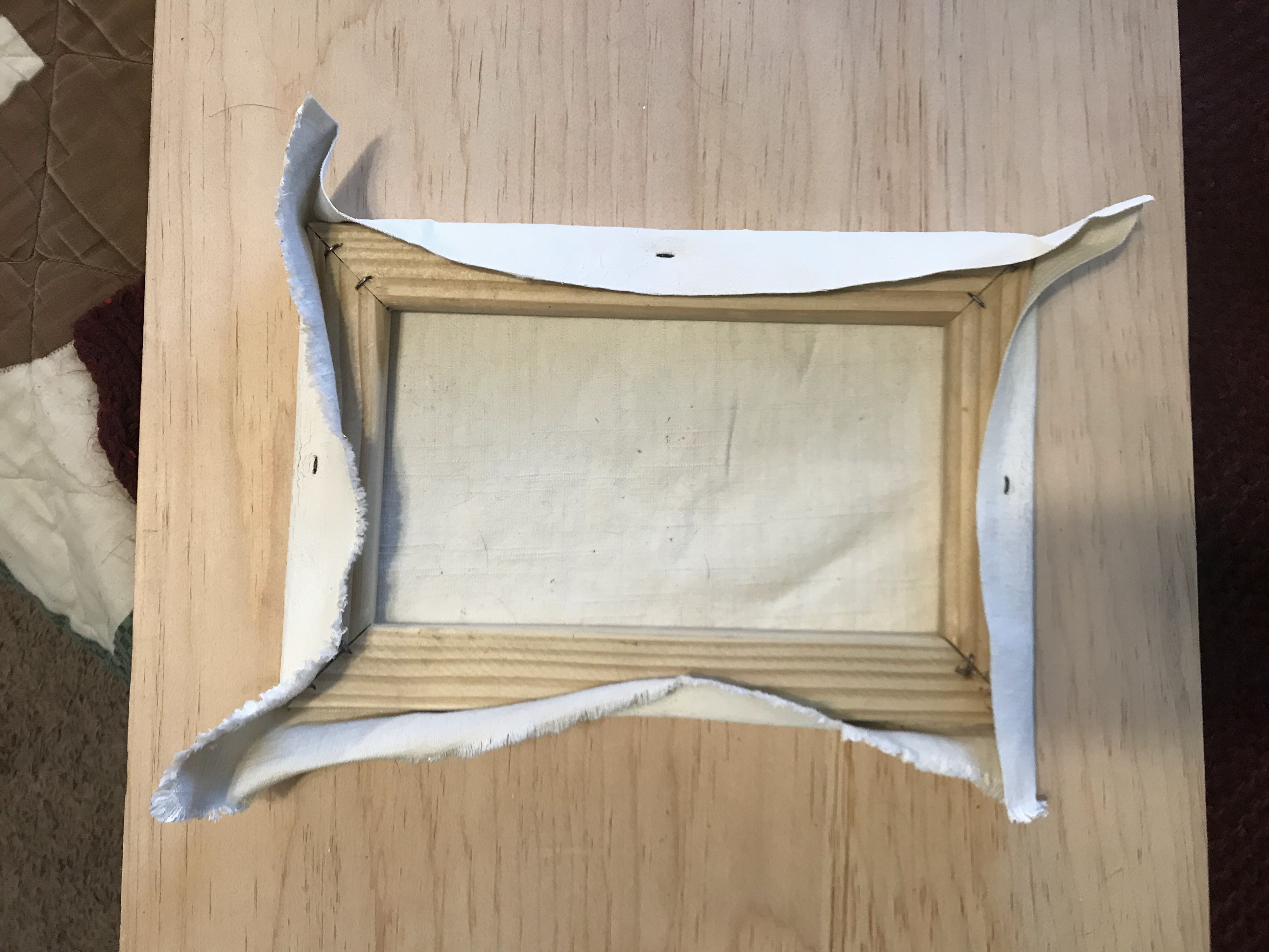
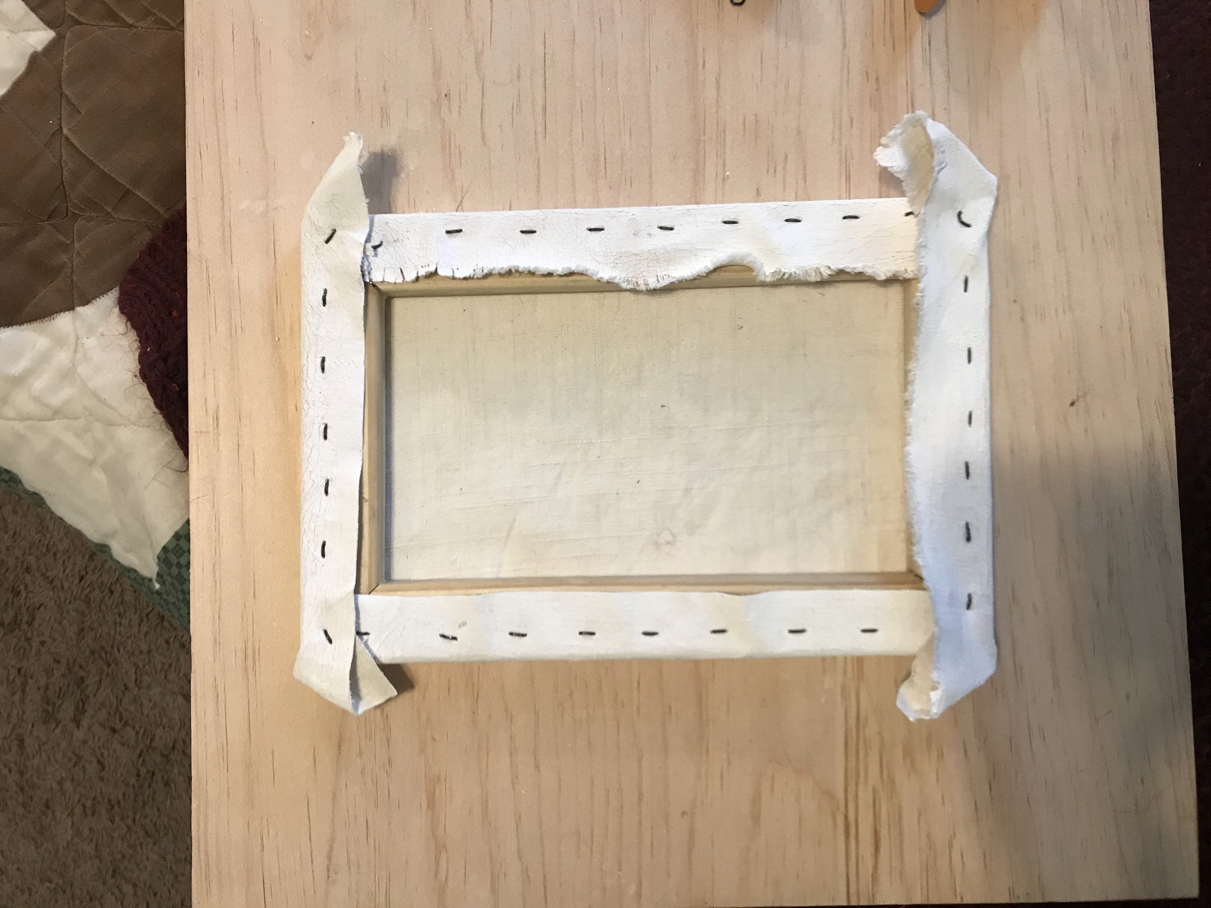
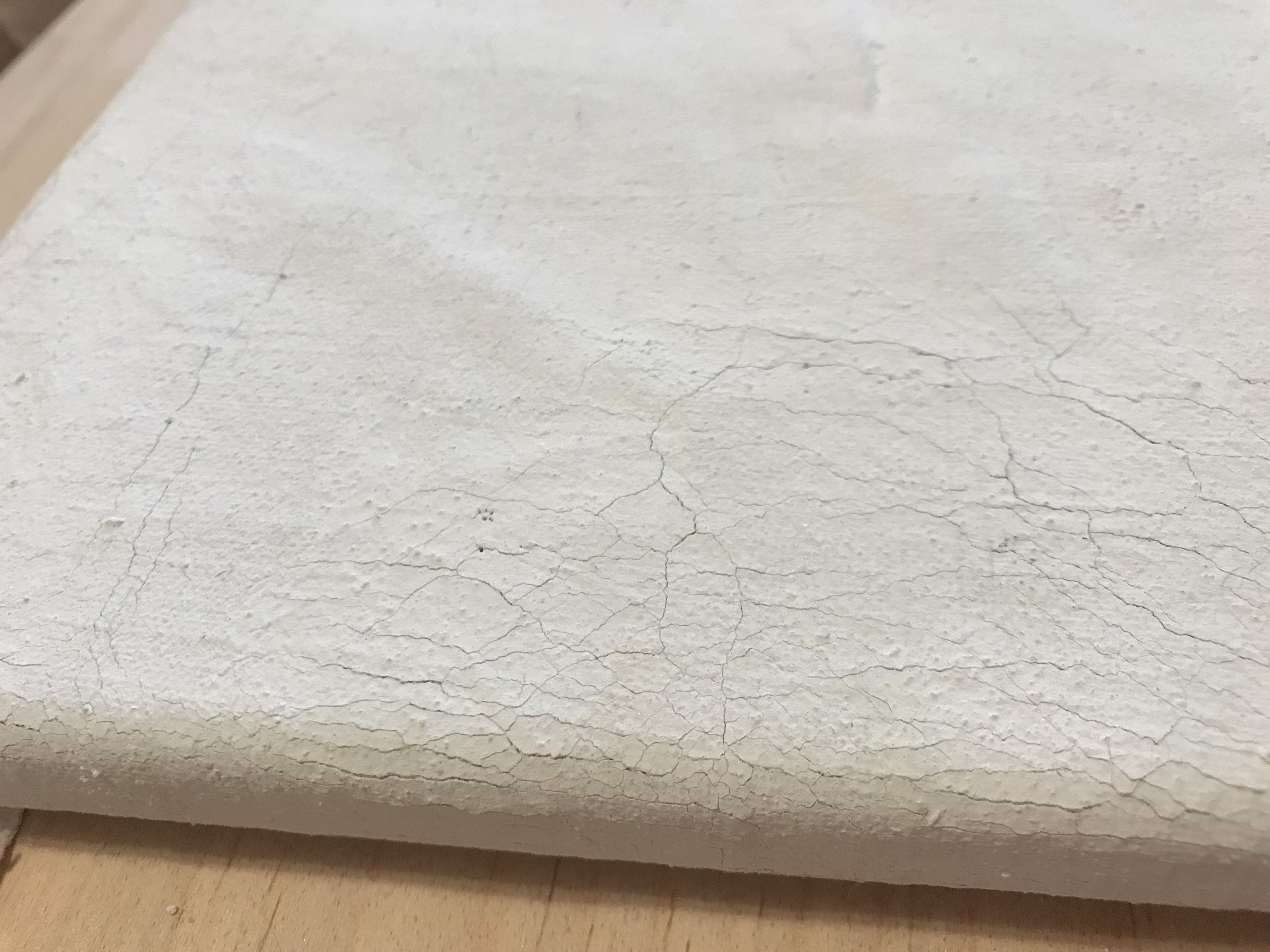
Once the gesso was fully applied and dry, I tried to stretch a canvas with what I made. It was immediately obvious that the gesso had been applied too thickly in some areas and would crack. As always, I just went ahead and tried to make it work anyways. I made the canvas frame from some pine furring strips. I used awful staples and more rabbit skin glue to construct the frame. Then, I cut out a section of canvas and stretched it like any other canvas. It cracked a lot.
I think the canvas can be salvaged and painted on, but my diagnosis of the situation is that the canvas was too thin and the rabbit skin gesso was not warm enough consistently. I will have to source better canvas and work in smaller gesso batches. Experimentation is all about living and learning, right?
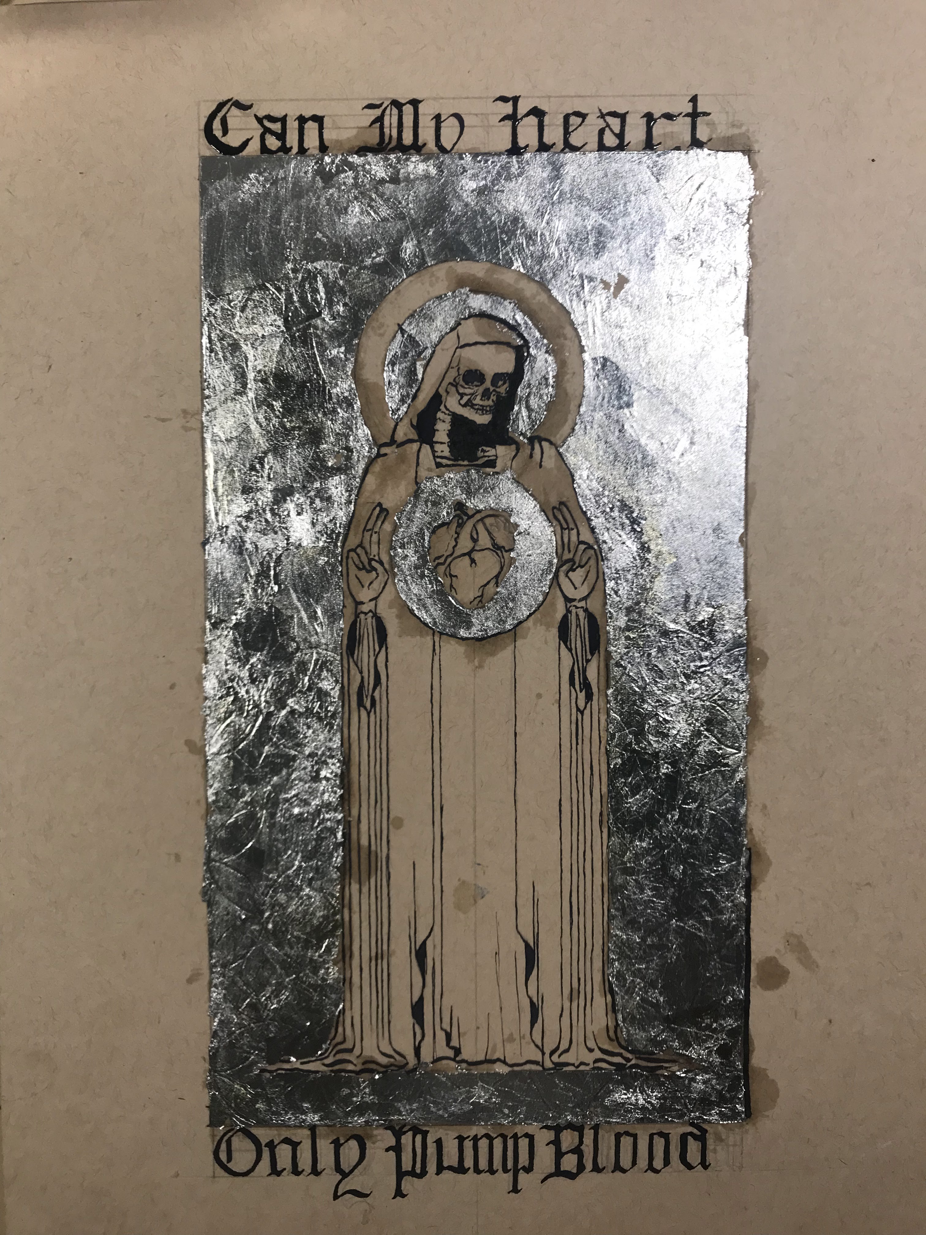
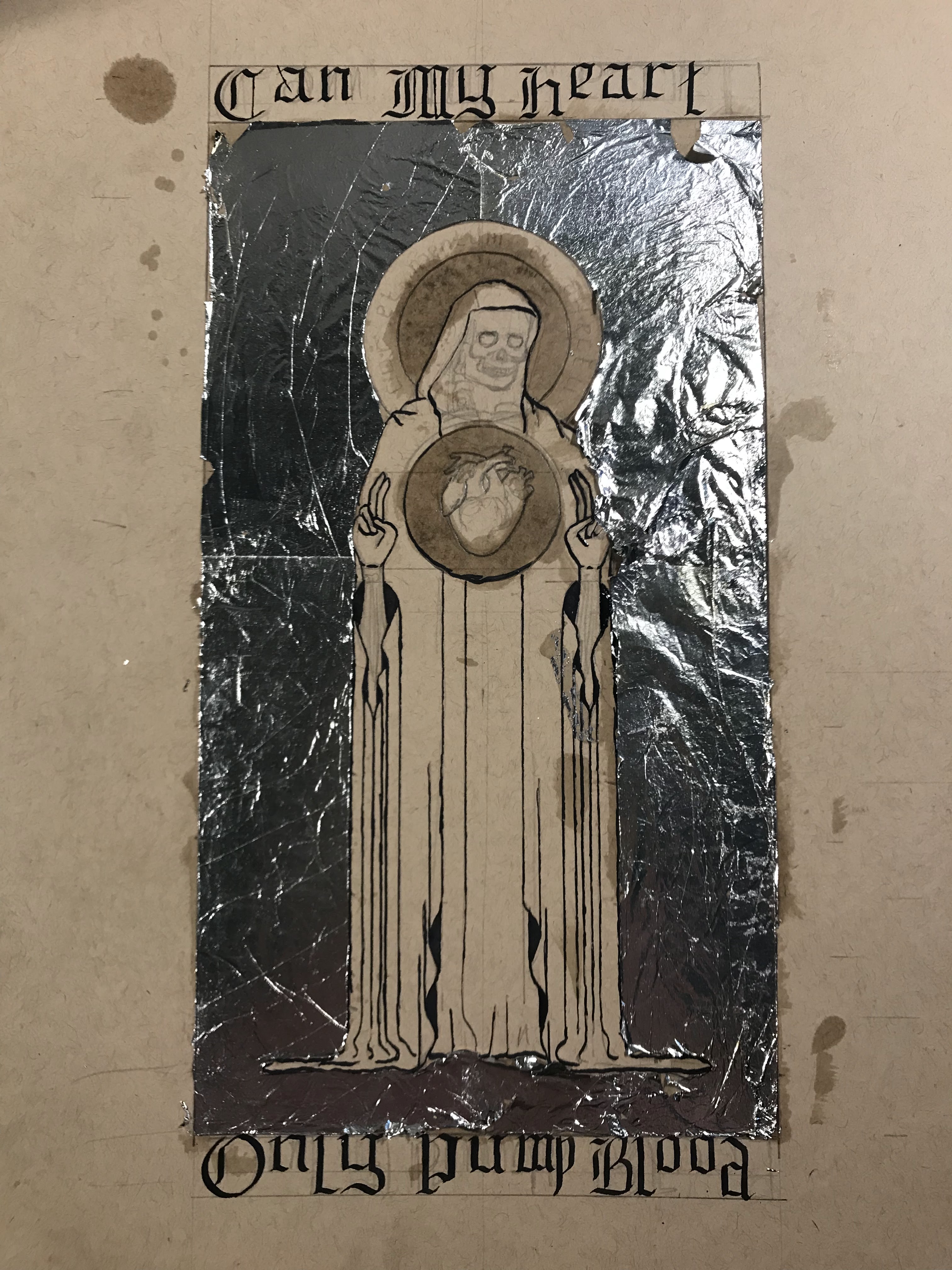
Illuminated manuscripts have been a major inspiration for me over the last couple of years. I am a huge fan of the complete integration of text and design. Most of my information on techniques or materials comes from The Craftsman’s Handbook by Cennini, On Divers Arts by Theophilus, and The Materials and Techniques of Medieval Painting by Daniel V. Thompson. My design comes from a sketch that I made a couple years back, when I was better at coming up with slightly vague and ominous wording to accompany my work. The skeleton mostly represents my aversion to drawing people.
There are many components that went into the creation of one sheet. The first material that I wanted to make sure to have was the ink. Iron-gall ink was the standard for scriptoriums because of its permanency and pure black tone. As the name would suggest, the ink consists of iron and gall, in the forms of iron(II) sulfate and oak gall concentrate, respectively. I made my iron(II) sulfate, sometimes called ferrous sulfate, from dissolving steel wool in sulfuric acid. Steel wool is not pure iron and contains other components like carbon which do change the composition of the final product. The final result is still mostly iron(II) sulfate. As the steel wool reacts with the sulfuric acid, it oxidizes to the iron(II) state, and the reaction is exothermic and violent if the steel wool is not added slowly. Pale green crystals of iron(II) sulfate begin to form after the reaction stops bubbling. I waited overnight to give the crystals time to form. The next morning, I set up a gravity filtration to separate the crystals from the liquid, which most of the impurities from the steel should have stayed in the liquid.
Reacting the steel wool with the sulfuric acidThe iron(II) sulfate precipitate after it settled overnightIron(II) sulfate filtered and ready to use in ink
For the gall component, this only requires creating a gall concentrate. Wasps create gall on the trees that they occupy, and oak gall has been harvested and used for centuries. For my purposes of making ink, oak gall is important because it contains tannic and gallic acids. Tannins in other materials have a bitter taste, like in wine, but they also turn dark when exposed to oxygen and stain very well, like wine or walnut shells. To make the concentrate, the gall must be left in vinegar for at least nine days. The gall concentrate on its own could make a decent ink, but it looks more like a dark brown than a black. Combining the iron(II) sulfate with the gall concentrate, along with a little water to help dissolve the iron(II) sulfate, creates a dark ink. When the ink is first applied, it looks watery and faint, but as it gets exposed to the air and the water evaporates off, it darkens significantly and can retain a good shine if applied thickly enough.
Oak gall soaking in vinegar for the concentrate
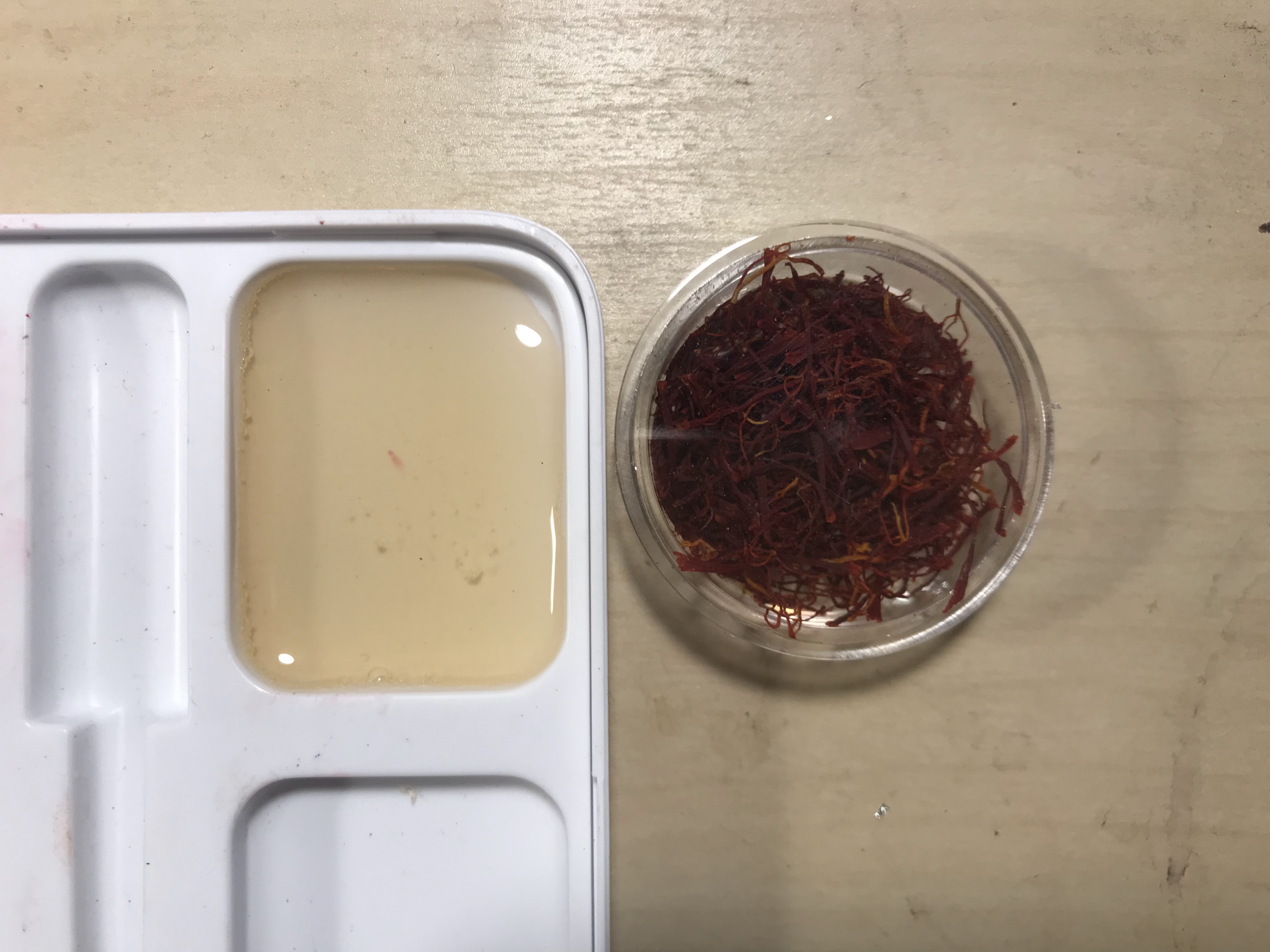
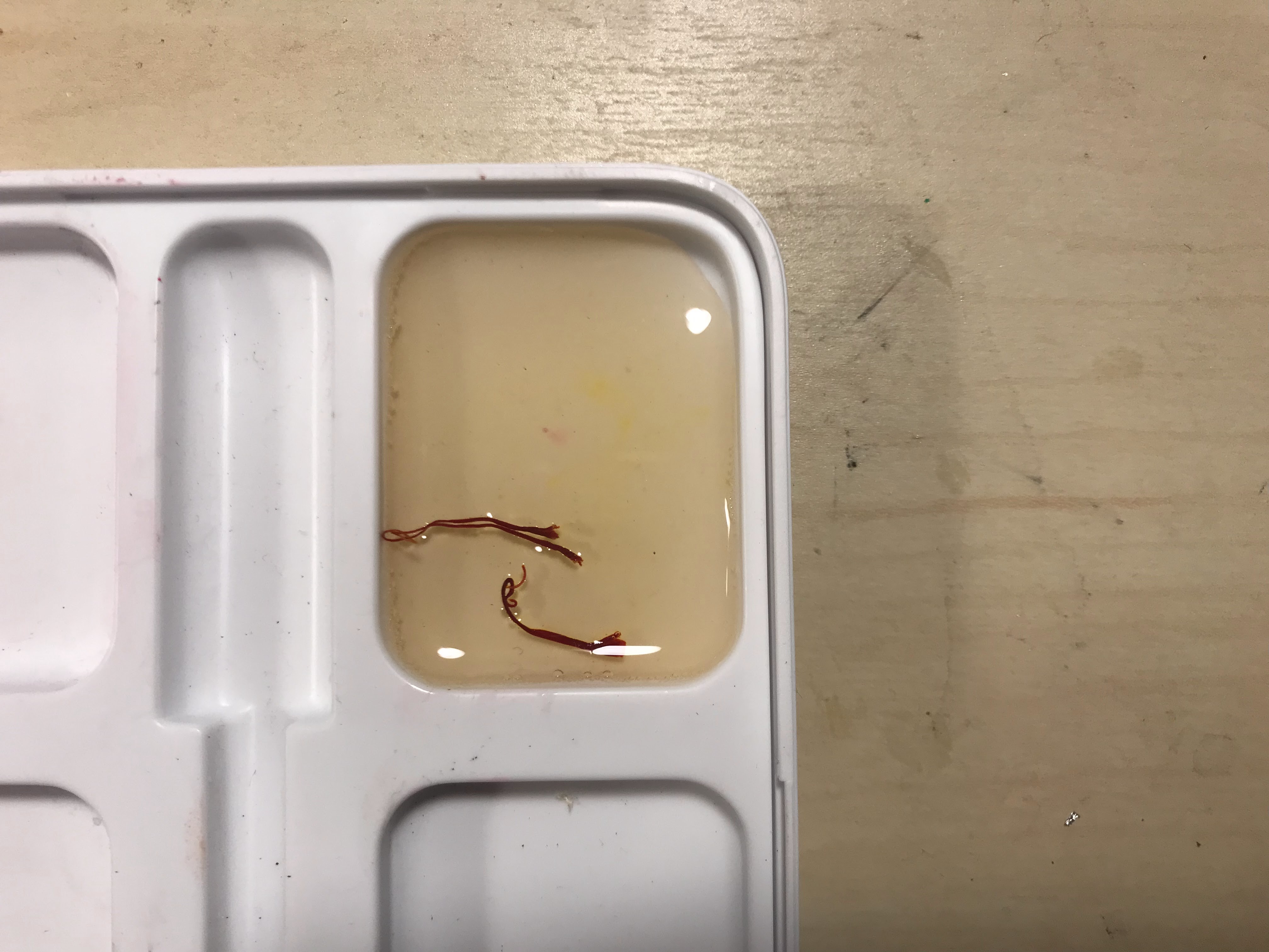
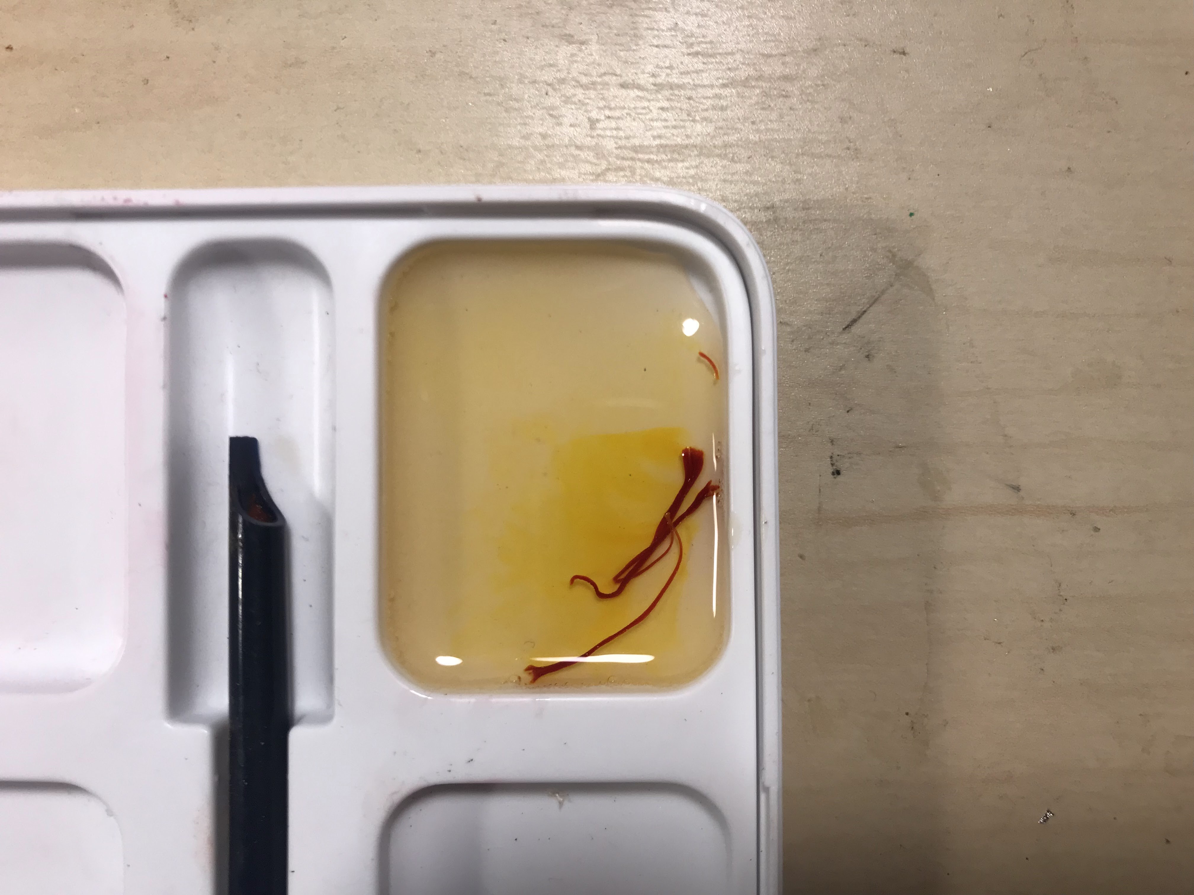
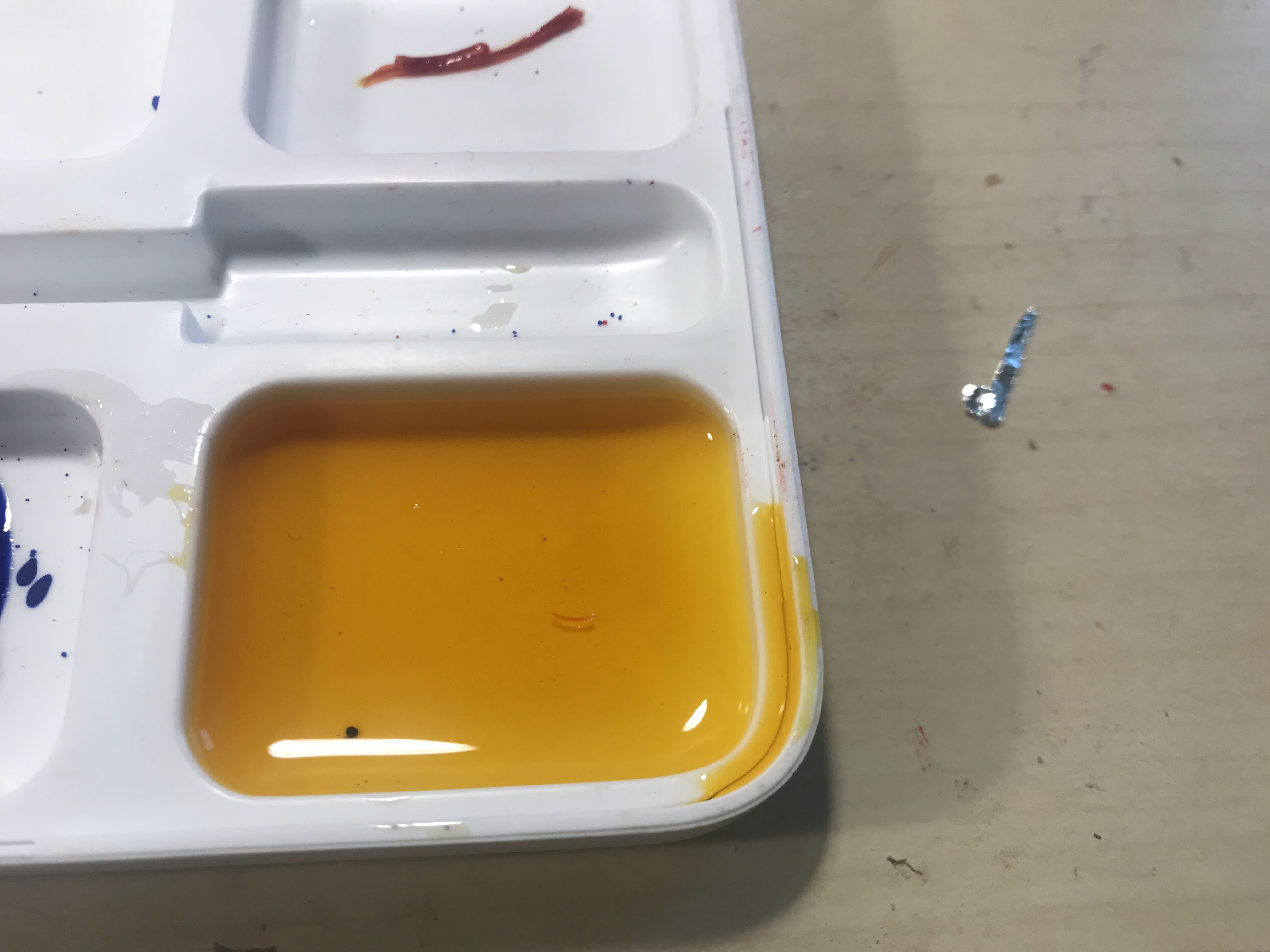
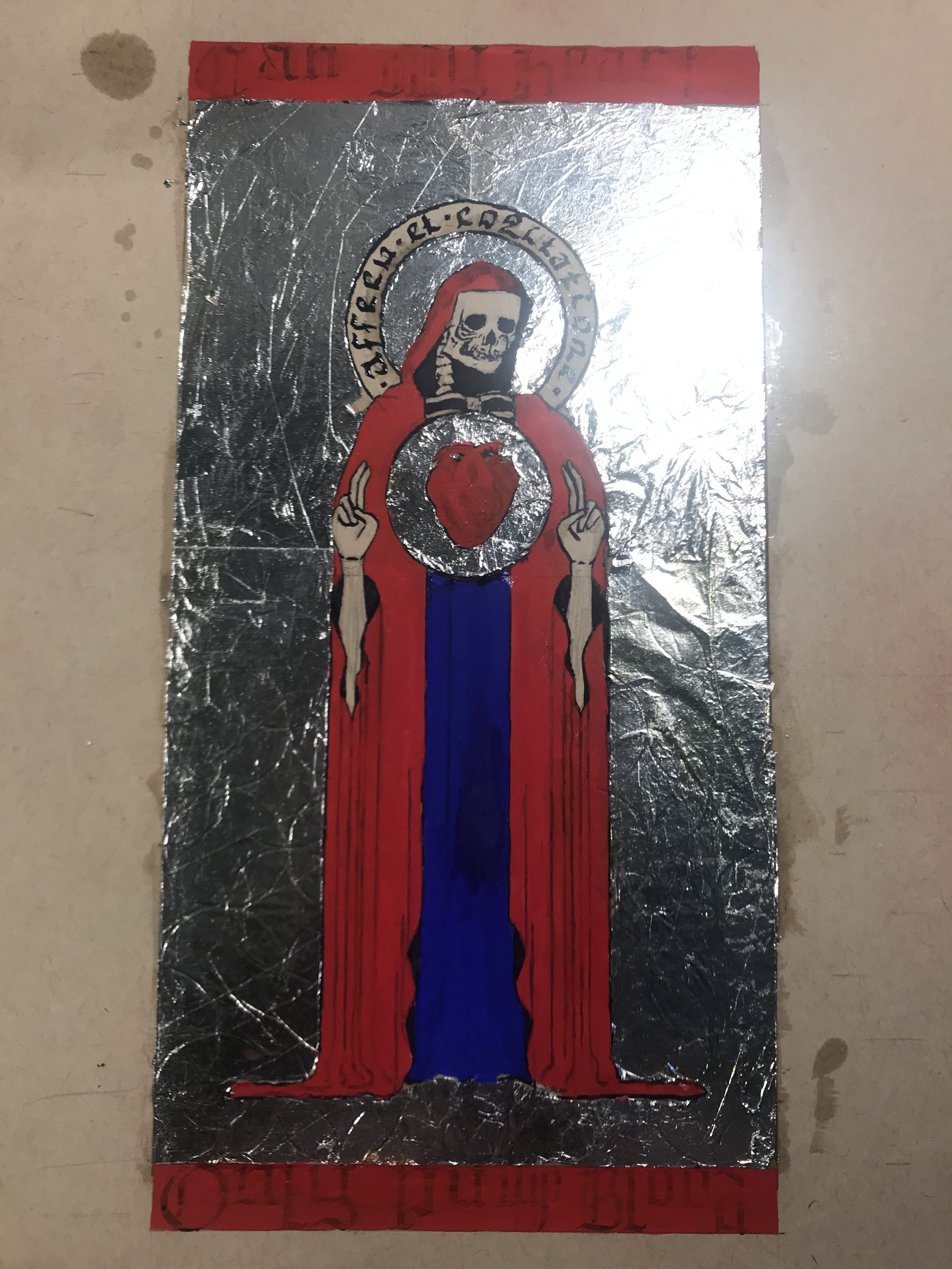
With the ink settled, I started to look into gilding. As I am new to this, and I am not making a profit off of my experiments, I decided to rule out using real gold leaf. Instead, I found a technique in On Divers Arts called “doratura”, though I have also seen it elsewhere called “auripetrum”, which uses tin leaf instead of gold leaf. After applying the tin leaf, or aluminum leaf in my case, it gets a coating of saffron-infused glair to make it look golden. Glair is also the medium that I used for the paint, and it is made from beaten egg whites left to settle. Beating the egg whites breaks the protein structures so that it becomes smooth once it rests and turns back into liquid.
Saffron infusing into glair over time, the final image was after it sat overnight
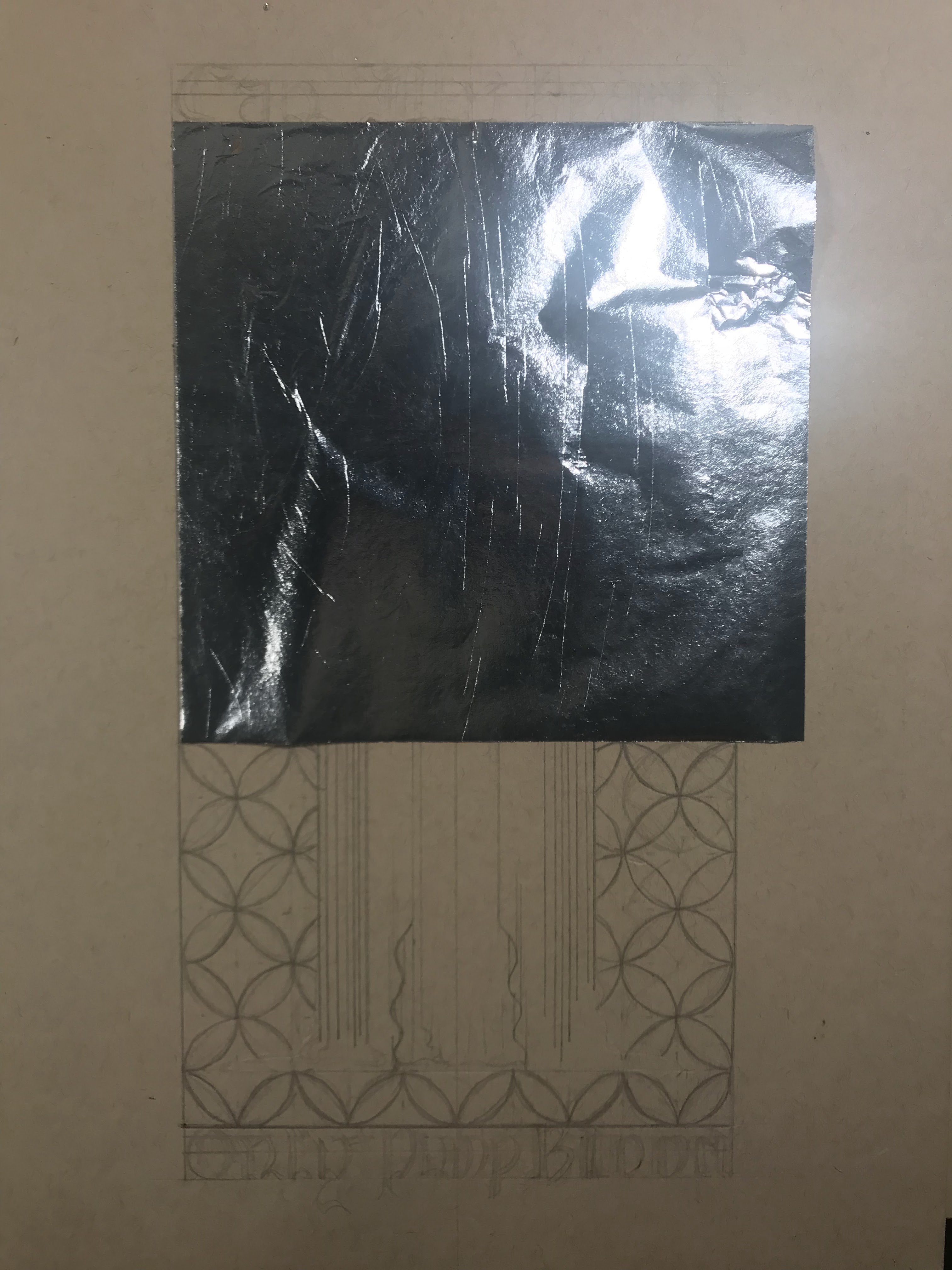
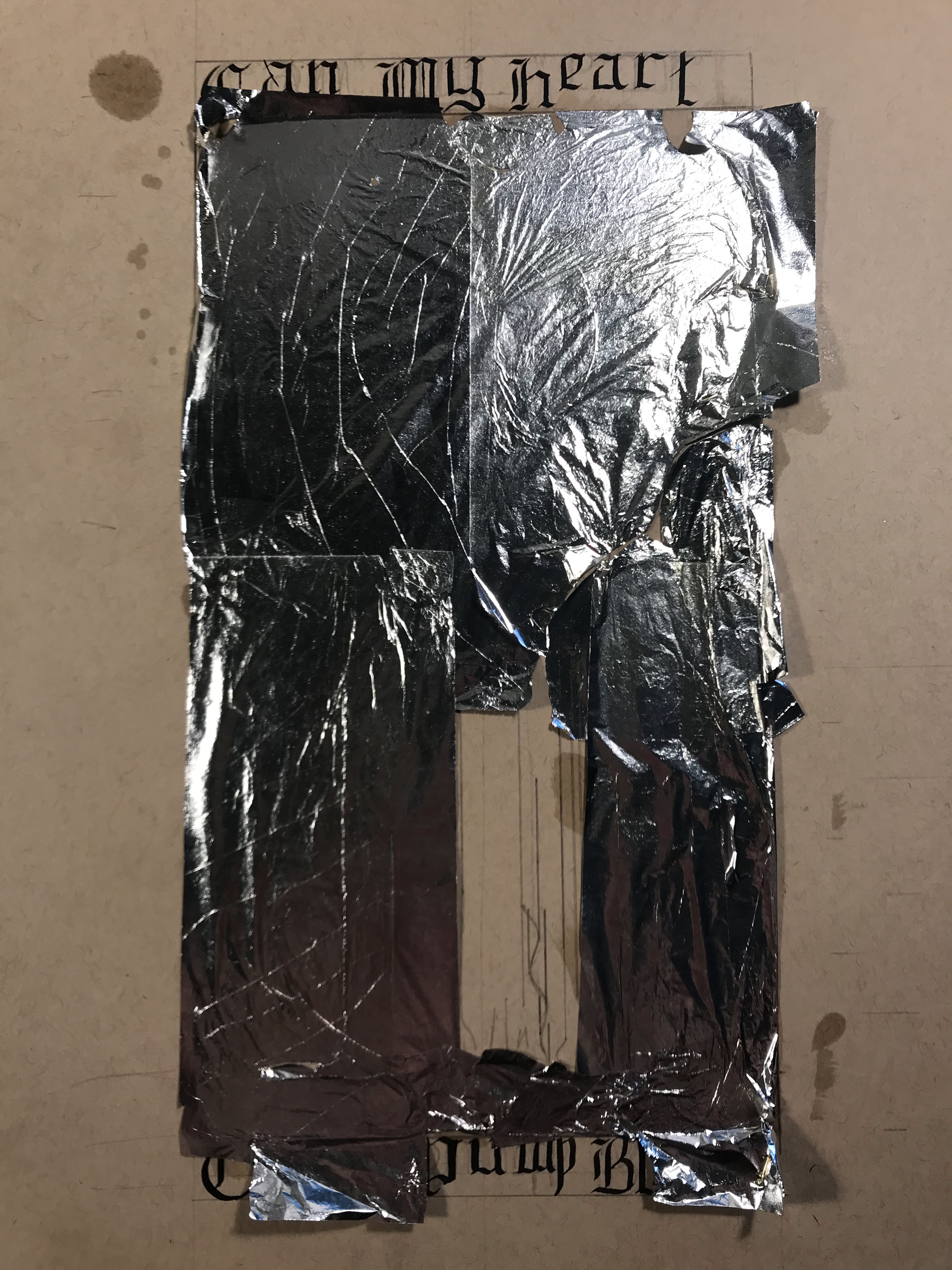
I attempted this project twice. I learned a lot from the first attempt, so I tried it again with a little more success. The biggest thing that I learned after my first attempt is that patience is a virtue, and letting the materials have time to fully dry and set up makes life much easier. During the first attempt, I tried laying down the aluminum leaf and cleaning it up all at once. Leaf is infamously difficult to work with, and without waiting for the adhesive to dry, it was flying everywhere, tearing, and sticking to everything. It may be the worst gilding that I have ever seen, but I tried my best.
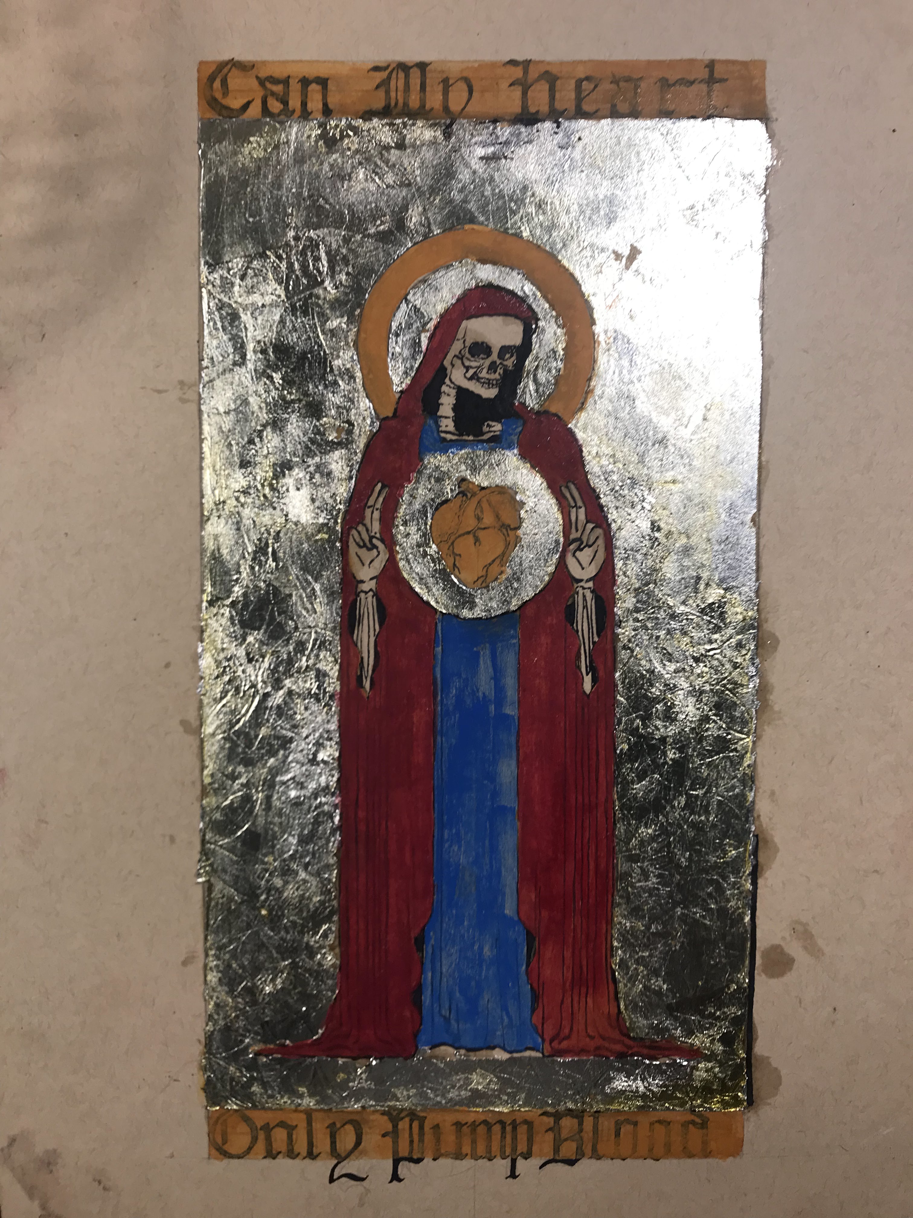
The other problem with the first attempt was that I did not have the correct pigments. Ideally, this would be in ultramarine blue and vermillion, in order to be accurate to medieval manuscript painting. At the time of the first attempt, I only had blue verditer and madder lake, which are not close substitutes. I thought that the blue verditer would appear more like ultramarine than it does, but its tone is much lighter. Blue verditer also has a coarse consistency which made it more difficult to mix into the glair, and the paint itself came out grainy with spotty coverage. However, I think that trying to grind the blue verditer further would only make it paler and look even less like ultramarine. As far as the madder lake goes, I thought I could make it resemble vermillion by first applying an underlayer of yellow ocher to warm up the naturally cold-leaning madder. The layering definitely helped, but it really cannot compete with the brilliance of vermillion.
The process for my first attempt
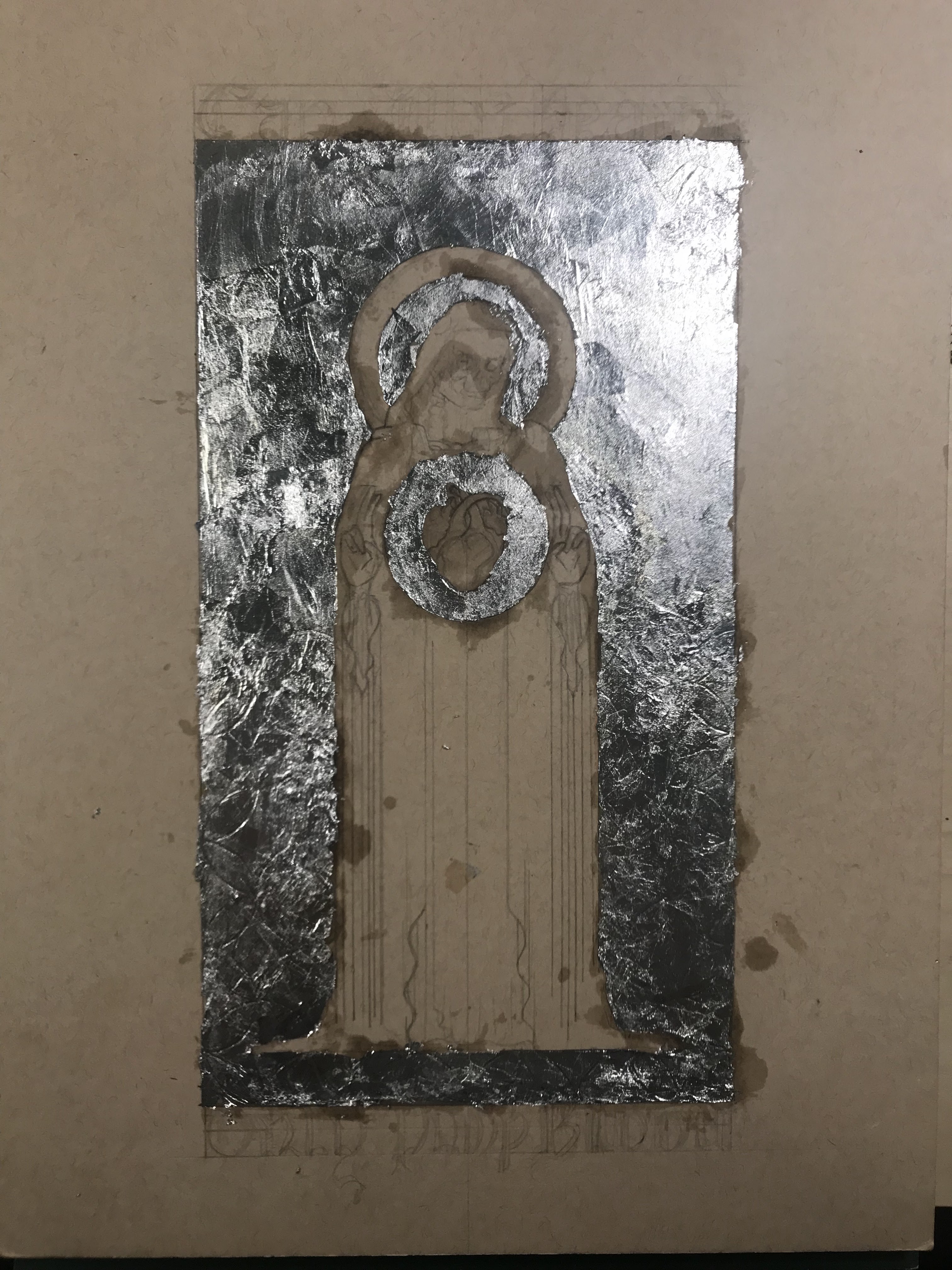
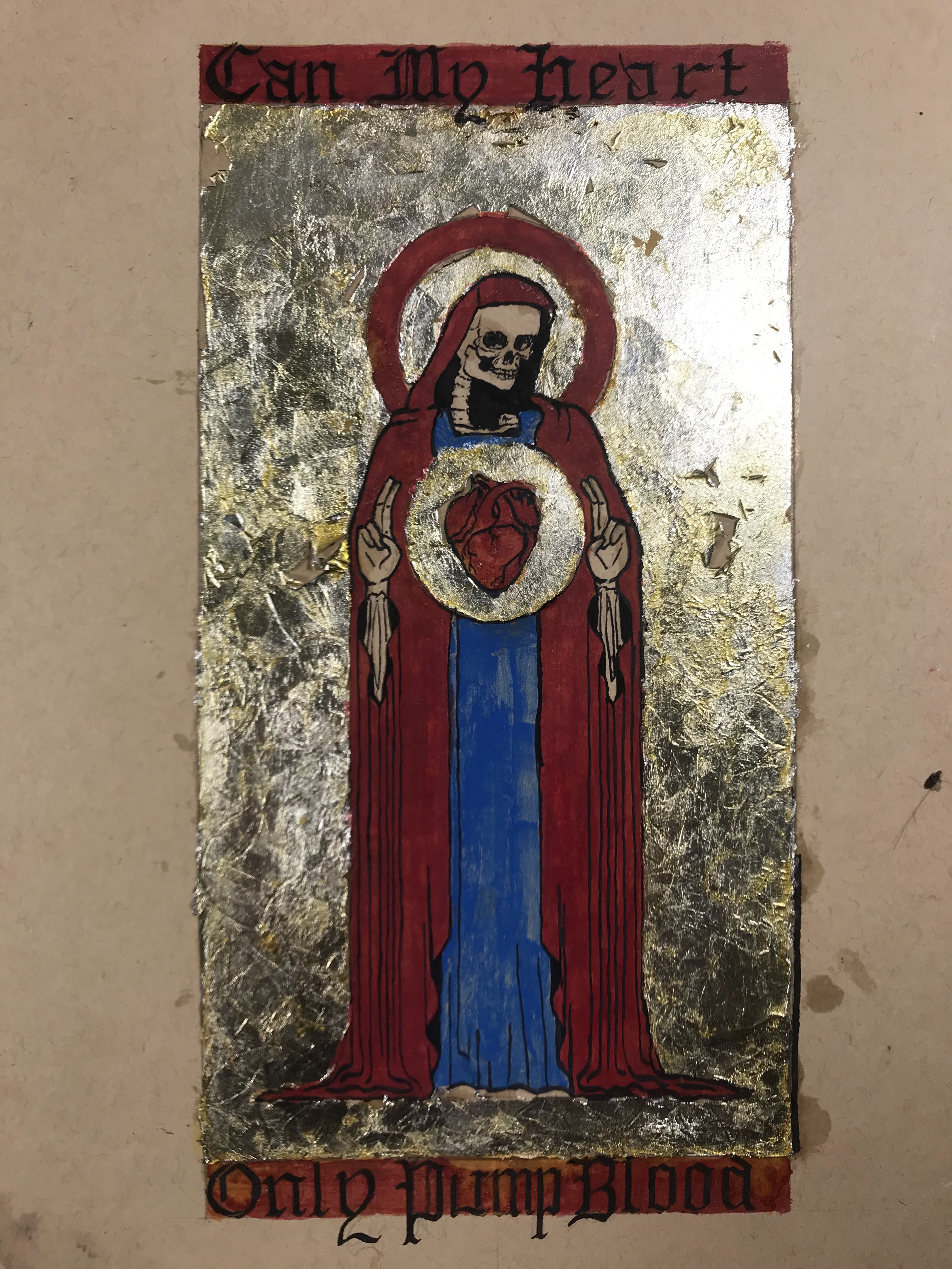
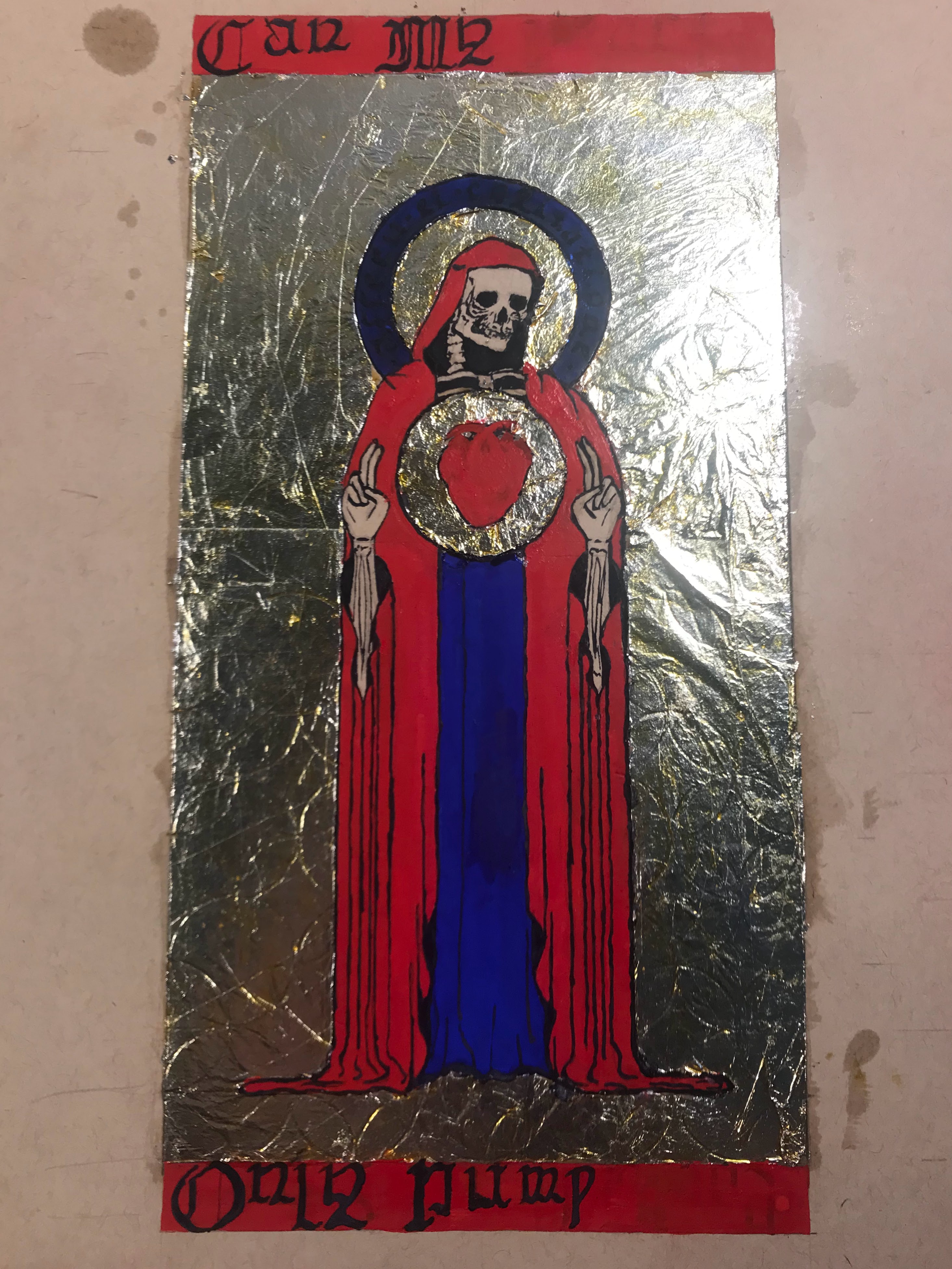
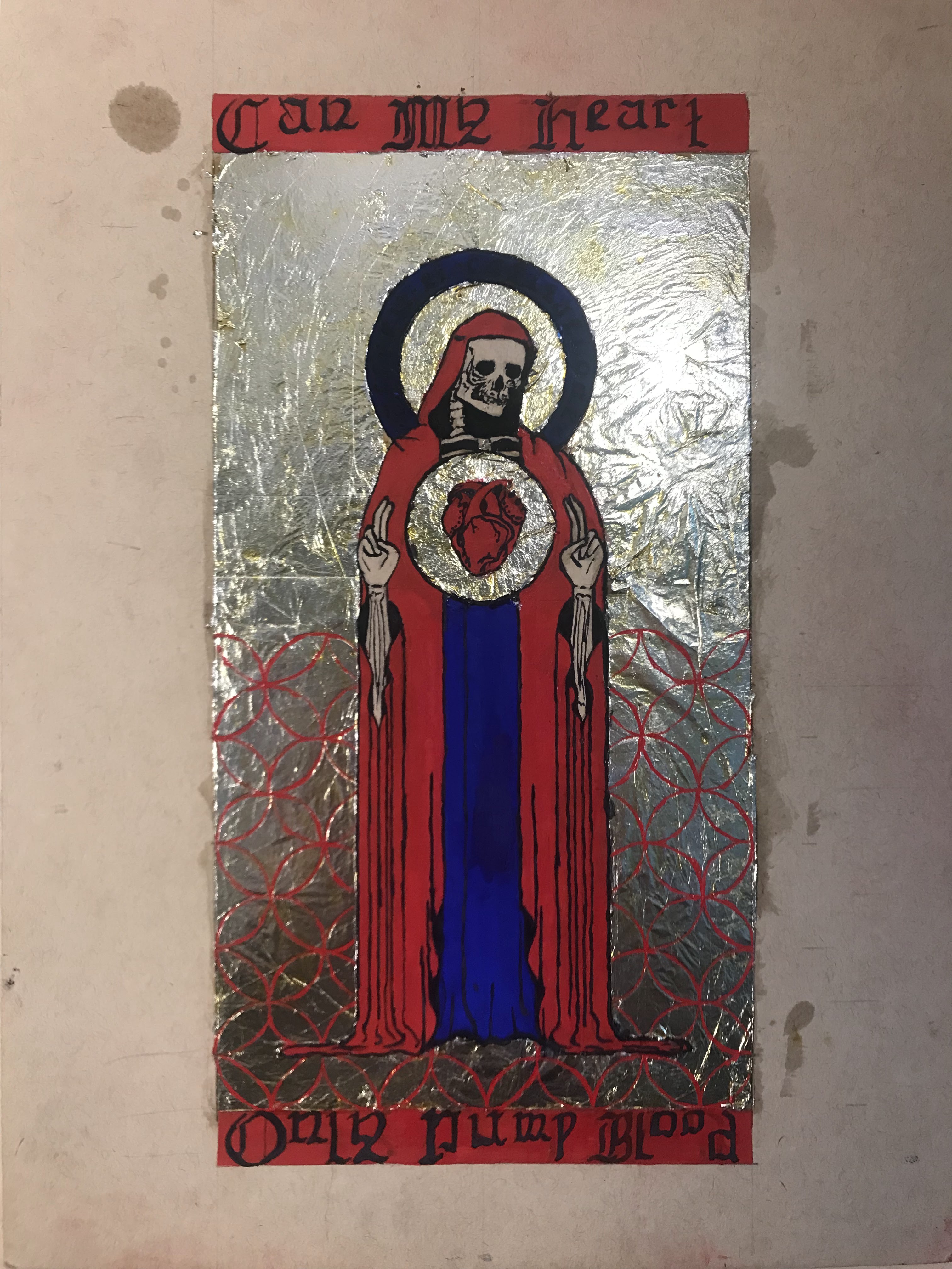
For the second attempt, I vowed to be more patient with the gilding, and I made sure to track down some proper ultramarine and vermillion pigments. My gilding could definitely be improved, but I think it looks better than the first try. I would like to track down a good stone burnisher to help smooth the leaf into a mirror-like finish, but maybe next time. My hand was notably shakier as I inked the second attempt, and the ink did not go onto the paint as easily as onto the smooth paper. I also added some honey into the glair for the second attempt because I noticed in the first attempt that the paint became scaly once it dried, and some of the glair over the gilding became brittle. The honey should help give the glair a little more body and help it dry more slowly and evenly. I think that the gilding looks more golden in real life than it does in any of the pictures.
To outline the entire process: I first laid out the design in pencil, and I pressed down enough to make a small imprint on all of the lines. I also took an exacto knife to lightly go over the lines where I would trim the gilding. Then, I applied adhesive and laid the aluminum leaf. After waiting overnight for the adhesive to set, I trimmed the excess gilding and patched up any holes or tears to the best of my ability. I whipped up some egg whites for glair and got some saffron infused to apply onto the aluminum leaf. After that, I inked the letters and figure, then mixed up the pigments in more glair, and painted the rest of the design. Once the paint dried, I inked all of the lines and letters again.
The process for my second attempt. The drawing stage is not pictured, but was identical to the first attempt.
All in all, I learned a lot, and I plan to make more manuscript-inspired pages. I know that I need to work on my gilding, and my calligraphy is a little out of practice. There are many aspects in medieval painting that maximizes the use of color and abstraction in conjunction with text and symbolism. These elements created a language for religious art and book design. Medieval painting might look a little silly to us now, but it shaped modern design as we know it today.
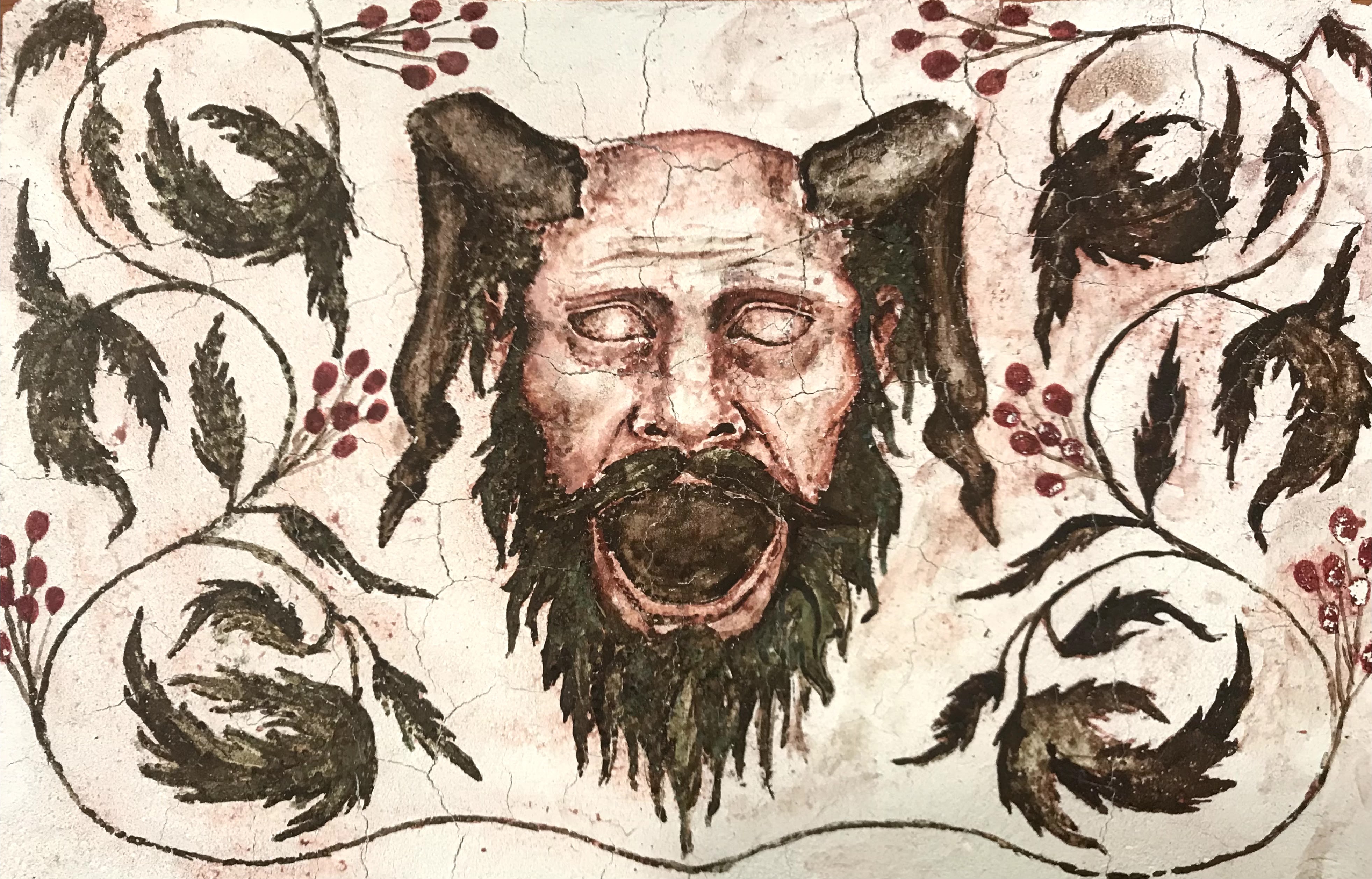
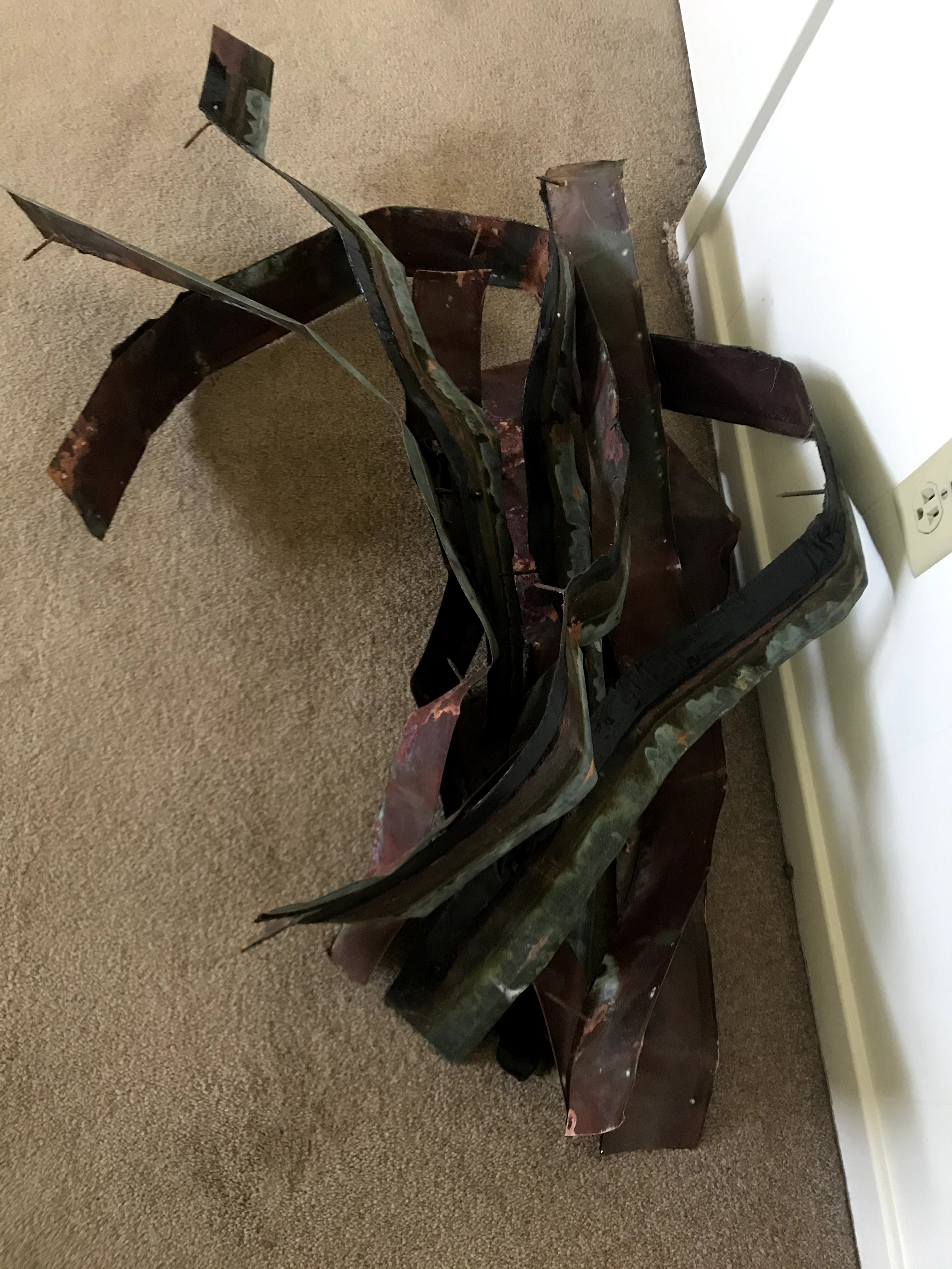
Grotesques originate from Roman Antiquity, where they were painted onto walls. The rooms in which they were painted in were referred to as grotte, or caves, and thus grotesque means “in the cave style”. Late Romans used this style to decorate their spaces with fantastical, impossible elements and figures. There are human figures with animal-like or plant-like features. In addition, the style combines elements that do not occur together in nature, such as plants in architecture. In a sense, grotesques were a form of surrealism. Grotesque remained popular in Early Christian wall paintings, but mainly manifested as vegetal motifs rather than featuring fantastic figures. Grotesque fell in and out of fashion throughout the Middle Ages, but securely got revived in the Renaissance and Mannerist periods. Grotesques became a permanent motif among paintings, sculptures, architecture, and furniture as an element to bring drama and decadence. The grotesque also become an important trope in literature, as portraying a monster as more comedic or empathetic.
In architecture, when figures are attached to gutters and draining systems of roofs, they are known as gargoyles. Figures are considered grotesques if they are purely decorative. Despite not draining water, many architectural grotesques feature an open mouth, much like their gargoyle relatives, whose open mouths serve as drain spouts. I decided to evoke grotesques from the decorations of Late Gothic and Renaissance architecture, but I kept true to its wall painting roots by making a fresco painting.
My design features a horned human face with a wide open mouth, as well as a scrolling plant motif. The plant is baneberry, which grows fairly abundantly in Northern Minnesota. Its berries are more vibrantly red in person than I could paint. It is also toxic, so I thought that it fit the grotesque thematically. I also tried to incorporate the baneberry leaves into the beard on the figure, but that proved to be much more difficult to implement in a fresco.
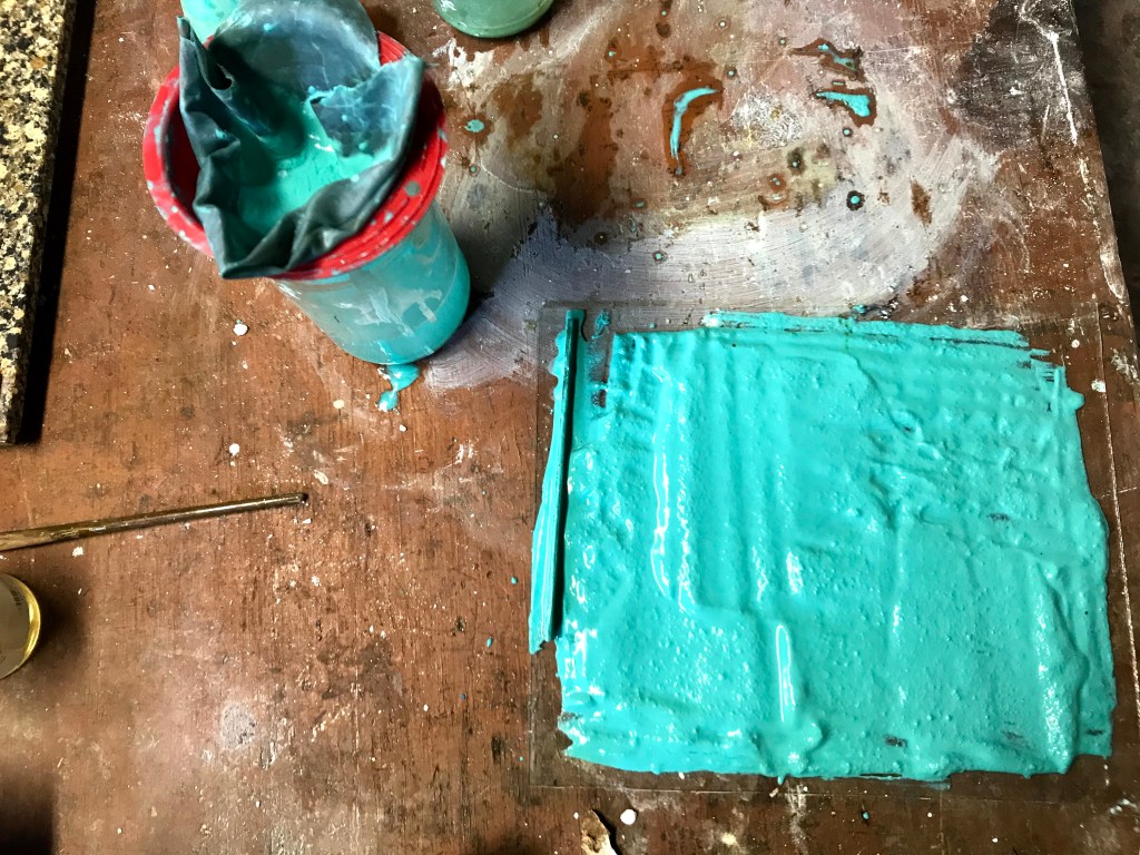
The plaster with the design applied in two ways.
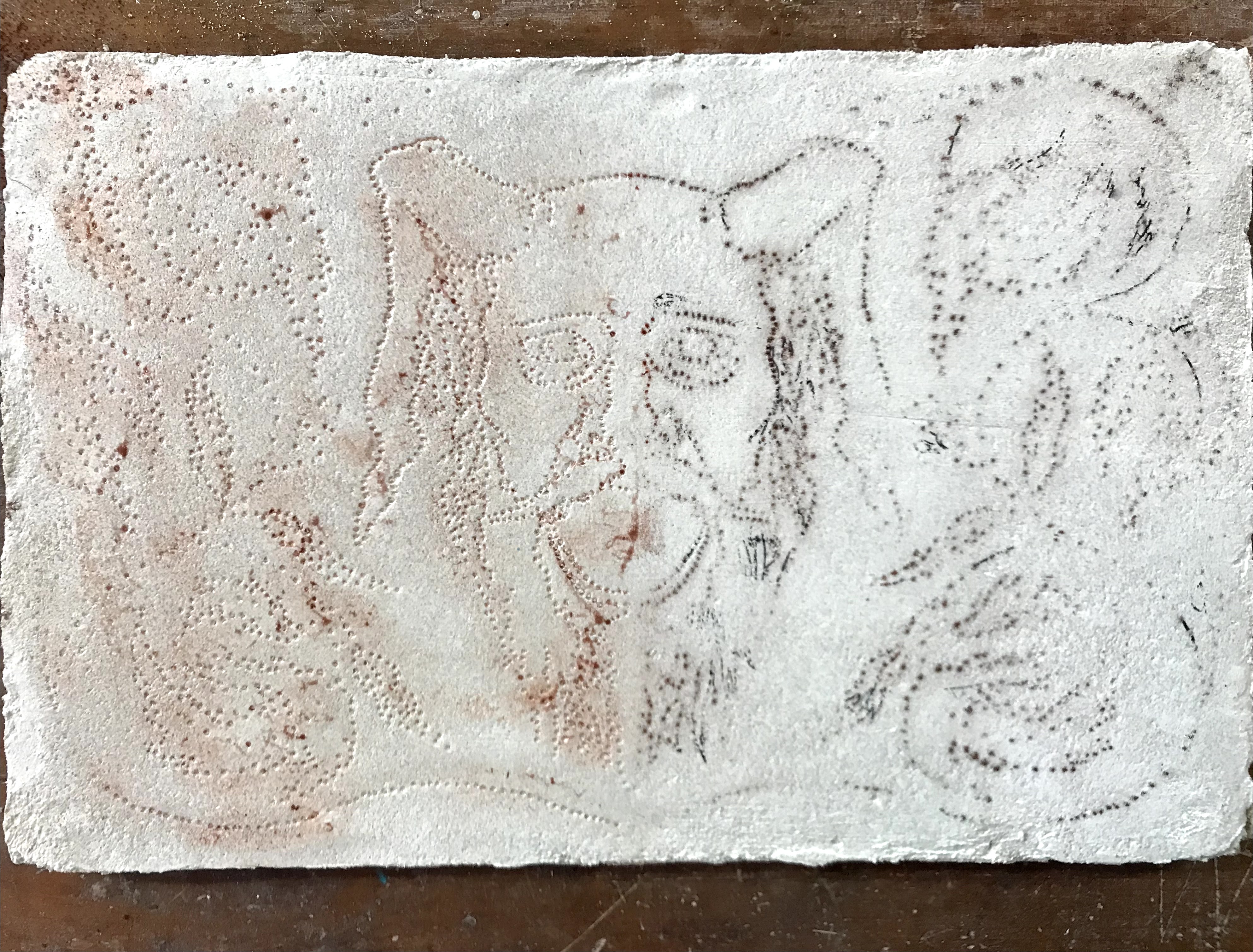
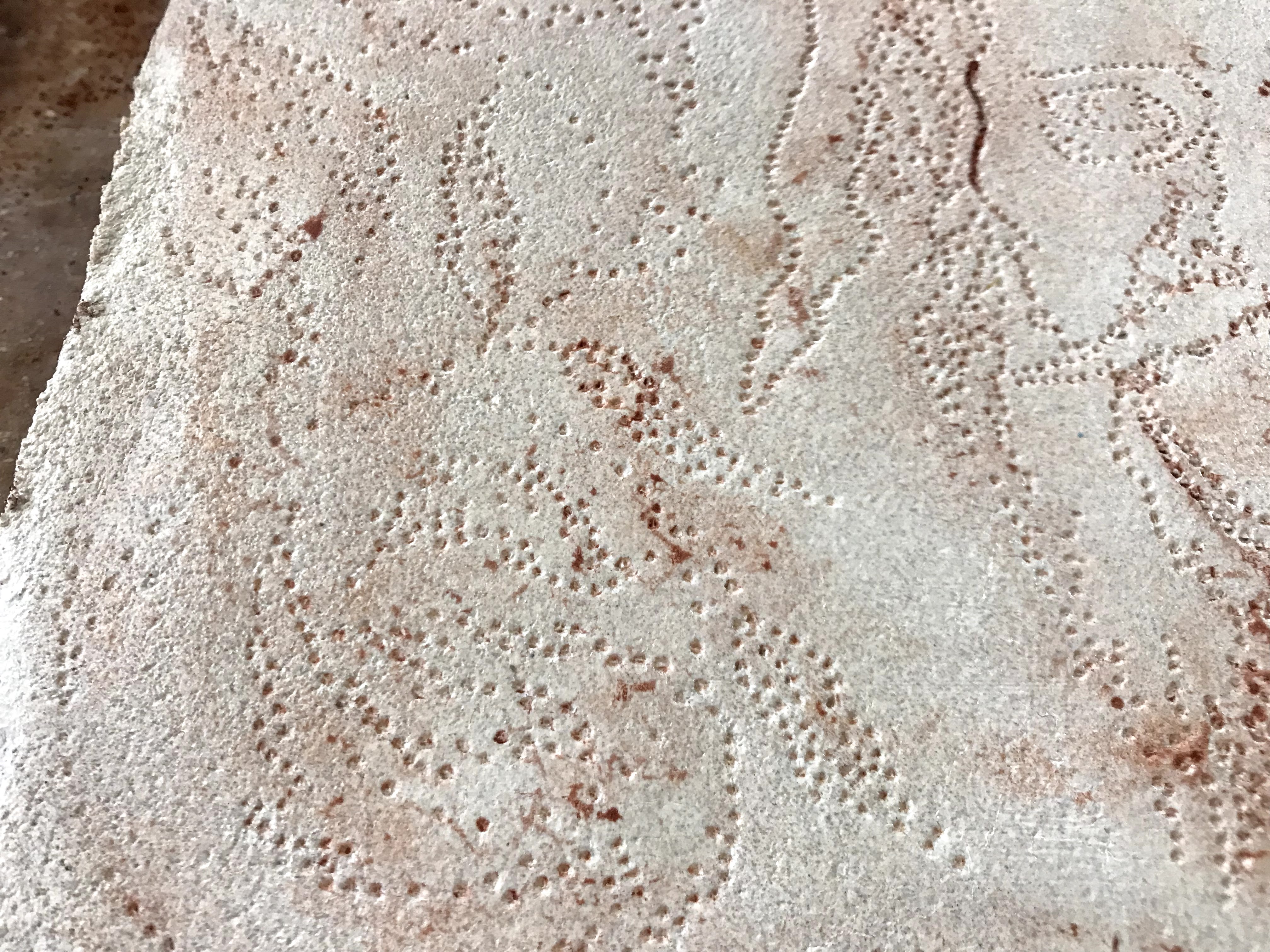
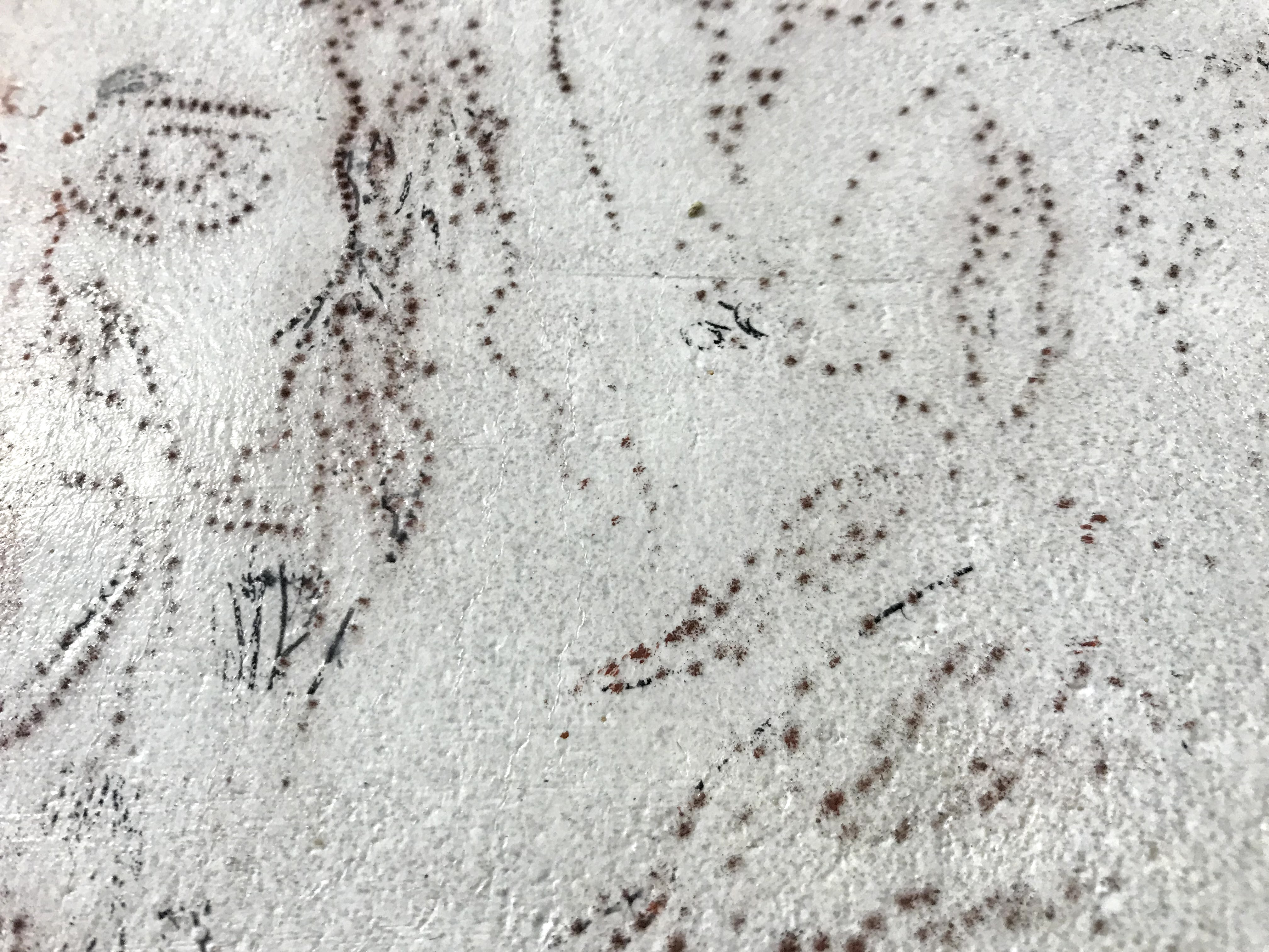
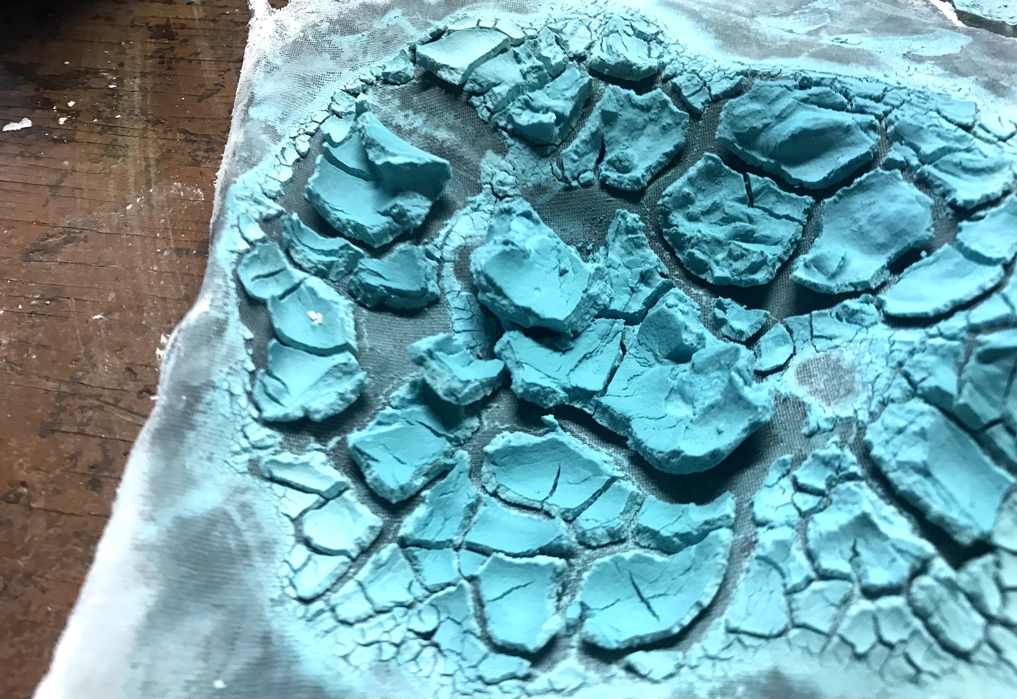
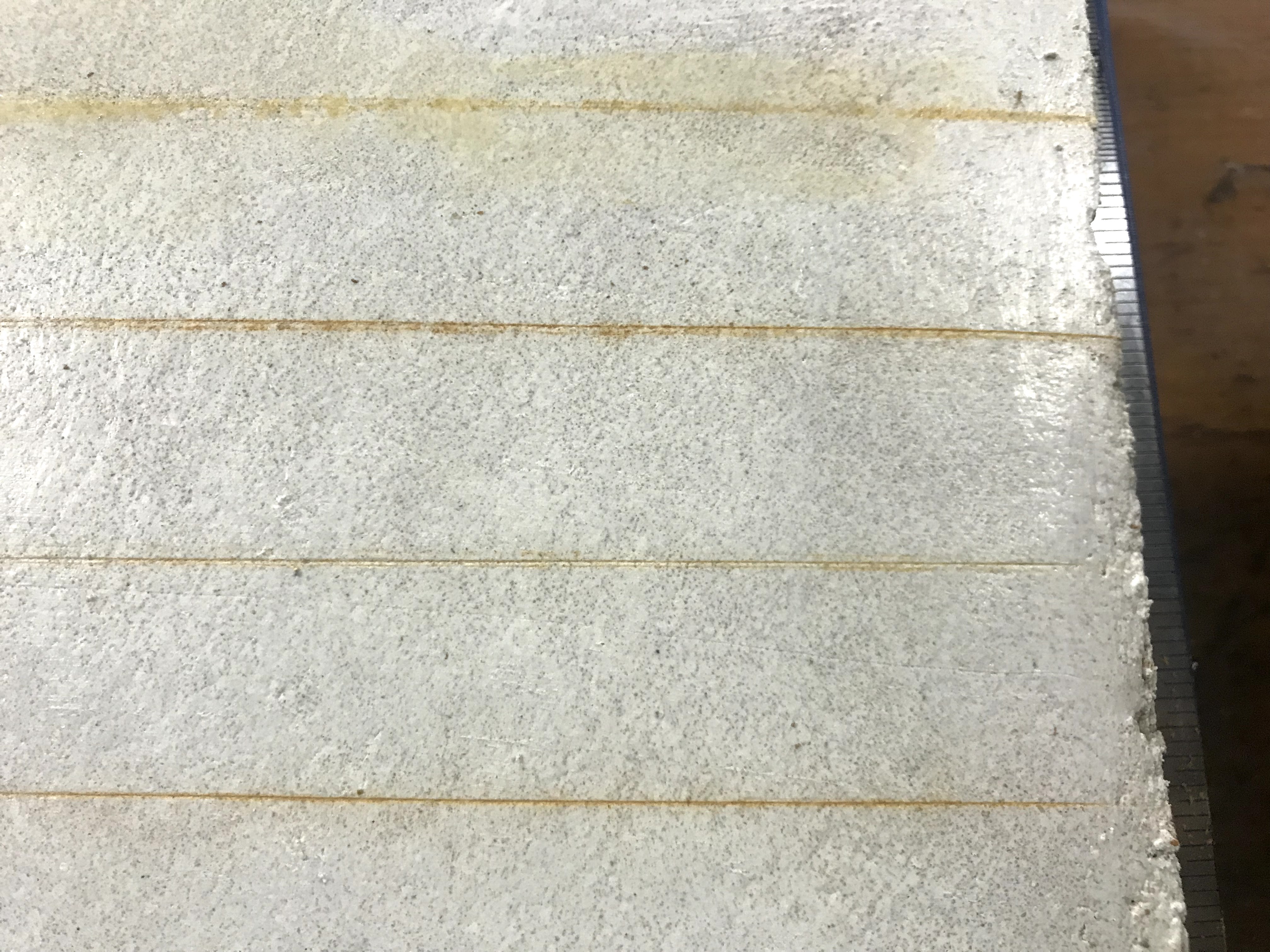
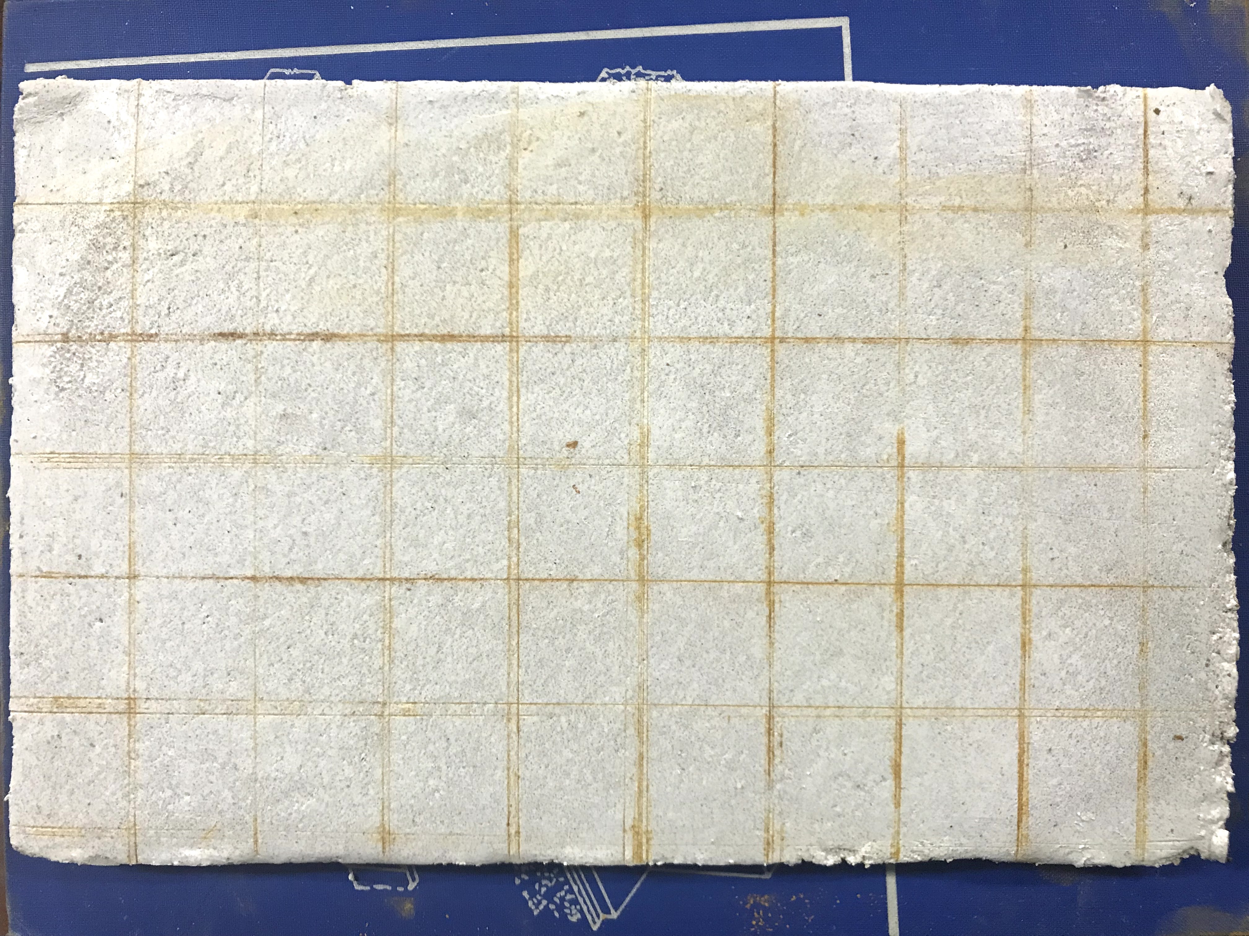
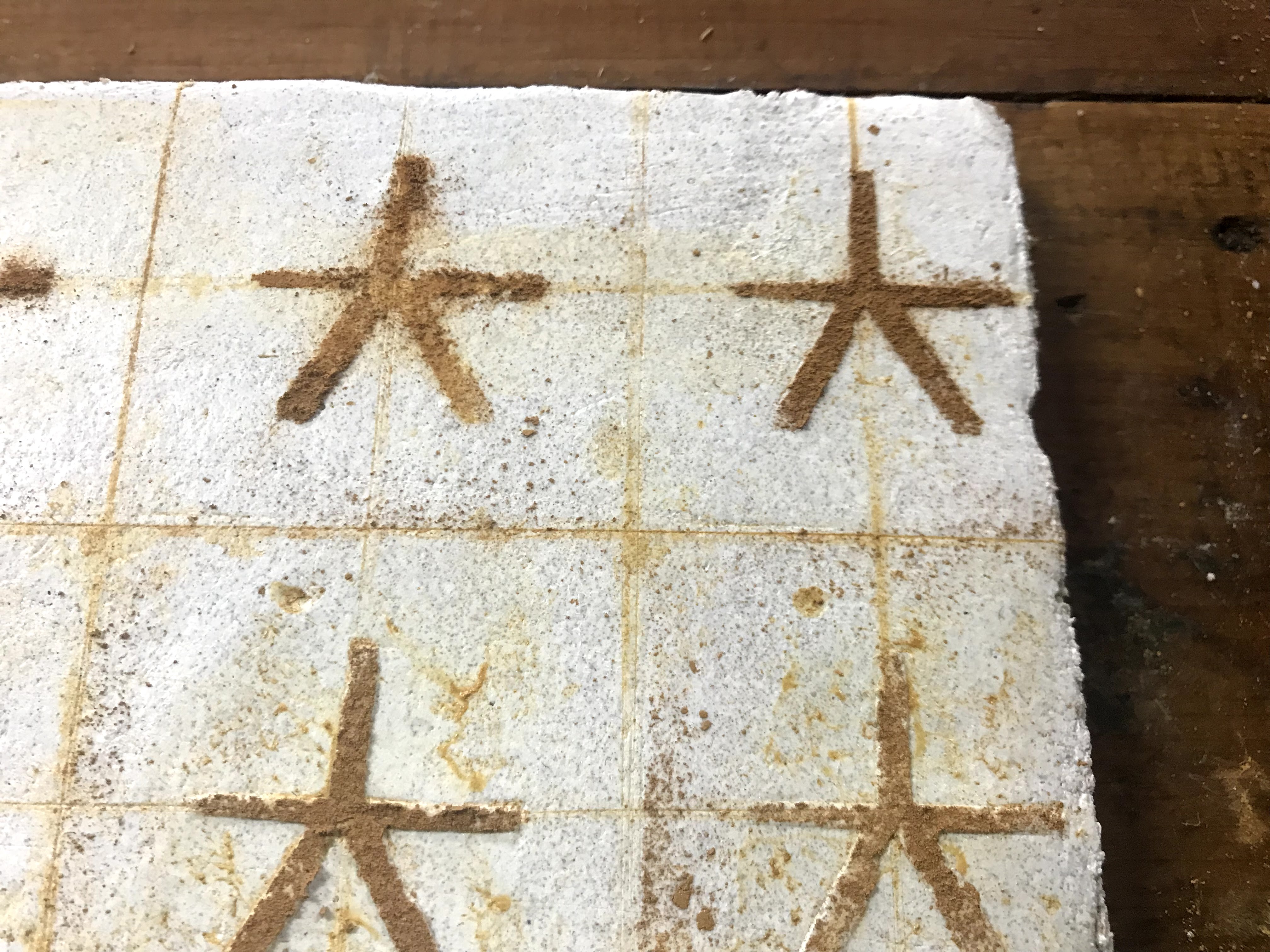
My methodology followed my earlier attempts for the most part. I laid down the first plaster layer and let that completely set up. Once the first layer was dry and I was ready for the next layer, I dampened the first layer and laid the second. As the second layer dried, I prepared the design to transfer onto the plaster. I tried two methods of transferring the design. I drew out the design, but I only punched through one half of the drawing. The punched paper can be pressed into the plaster to leave small dots in the plaster’s surface. The paper can be flipped over, and the holes left by the punches allow pigment to be pushed through and leave dots on the plaster’s surface that are easily traced to accurately recreate the image.
The side of the plaster with the paper pressed dots for tracing.The side of the plaster with the pigment dotted tracing.
I waited for the plaster to dry until I was able to lightly press my finger in and leave a print but not dent the plaster surface. Then I transferred the design on. I used Indian red, yellow ocher, raw umber, and verdigris for the true fresco pigments. I also used madder red watercolors once the plaster had dried to give the berries a bit more color. Fresco painting is fairly straight-forward, and the rules are pretty much the same as watercolor painting. It works best to start light and layer up colors for more intense, varied tones. The process of lifting out colors is also similar, if a little less forgiving than watercolors.
The one aspect that proved to be the most difficult, and quite stressful, was the limited timeframe of the plaster drying. I felt rushed to get the entire painting done before the plaster dried too much. I admit that my painting work ethic leaves something to be desired, and I normally I pause during painting if I feel like something is not working. However, painting frescoes feels like a high stakes, now or never type of activity, and I have not painted something for so long and with such intensity for a while.
The final painting directly after it was finished.
I am happy with the final result. The pigmented dots tracing the design muddied the verdigris quite dramatically, but I’ll say that it is a commentary on the duality of life and death. Otherwise, I am really impressed with the delicate, translucent quality of the pigments in the plaster. I think the face showcases the potential of fresco painting the best. The plaster sets up and gives the pigments a beautiful stone-like quality. Like watercolors, the light layers of paint are brought to their full potential. The cracking is still a problem, but I think leaving the fresco outside left the plaster vulnerable to the swinging summer temperatures. Moving inside should help mitigate the issue.
The fresco after it had dried for a week. The verdigris turned brown, and the secco painting of the berries began to flake off.
Unfortunately, the verdigris that I used turned brown very quickly. After just a week, the beautiful green had disappeared and left behind a muddy brown. I guess I shouldn’t be surprised, but the other paints I made with verdigris have not had this problem yet. Instead, I might try to use green verditer, which is still a copper compound like verdigris, but from what I have read, it does not seem to have the blackening quality of verdigris.
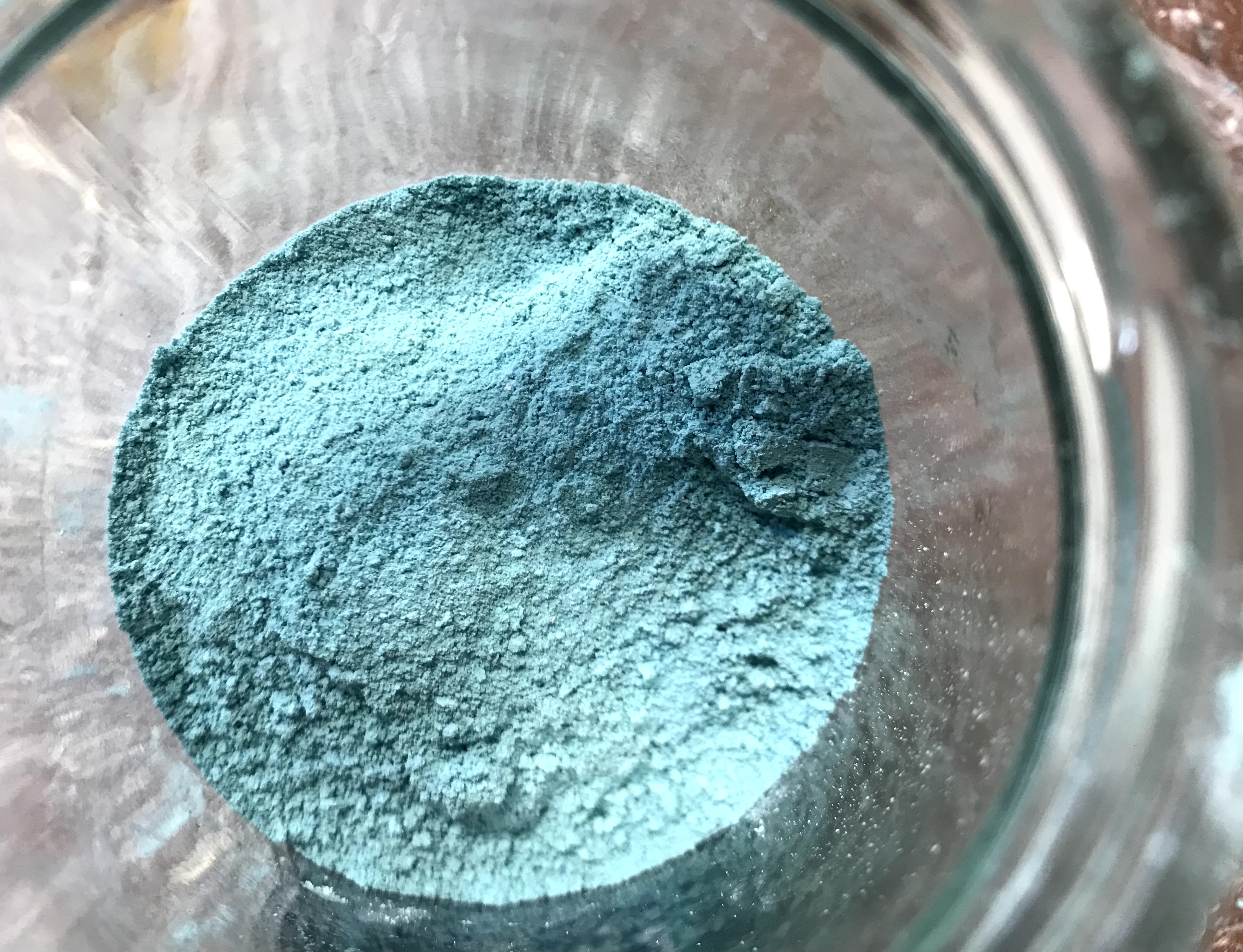
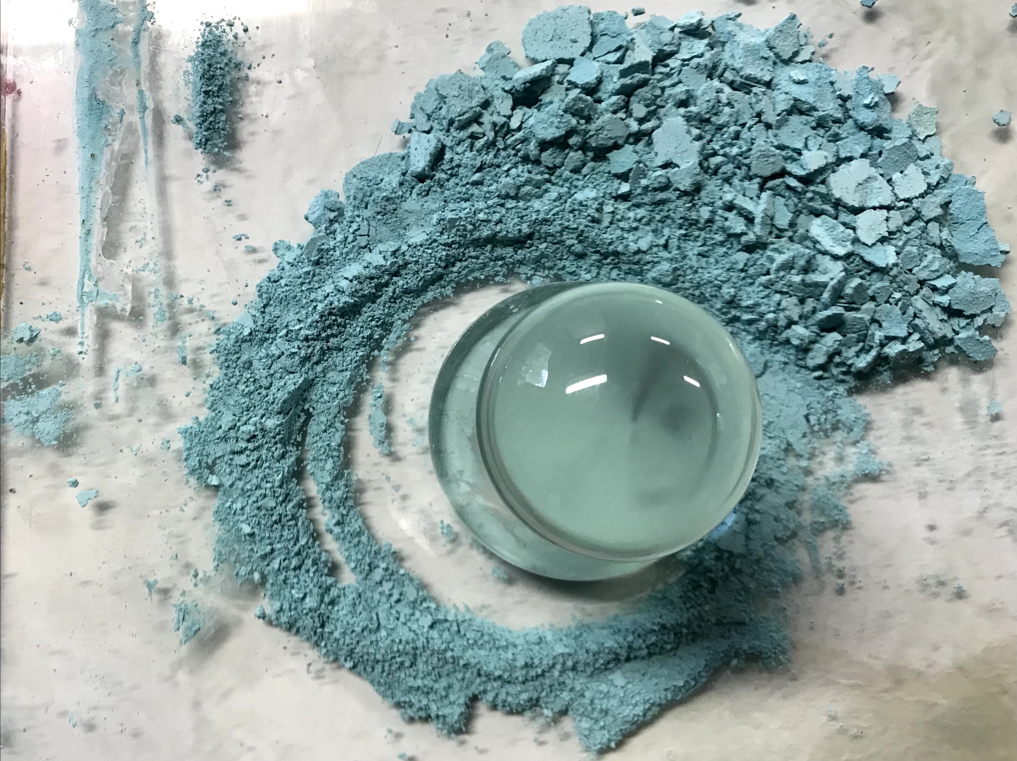
One of the other great green pigments from history is malachite. It makes a soft, cool green. Malachite as a pigment is made up from a basic copper carbonate. Malachite can still be bought, if you know where to look. However, I wanted to try making the artificial version of malachite, which goes under the name green verditer, green bice, or mountain green. Verditer as a term comes from verte di terre, or green of the earth, which is not to be confused with another pigment called terre verte. The names may mean the same thing, but the pigments themselves are very different.
My final result in making green verditer pigment
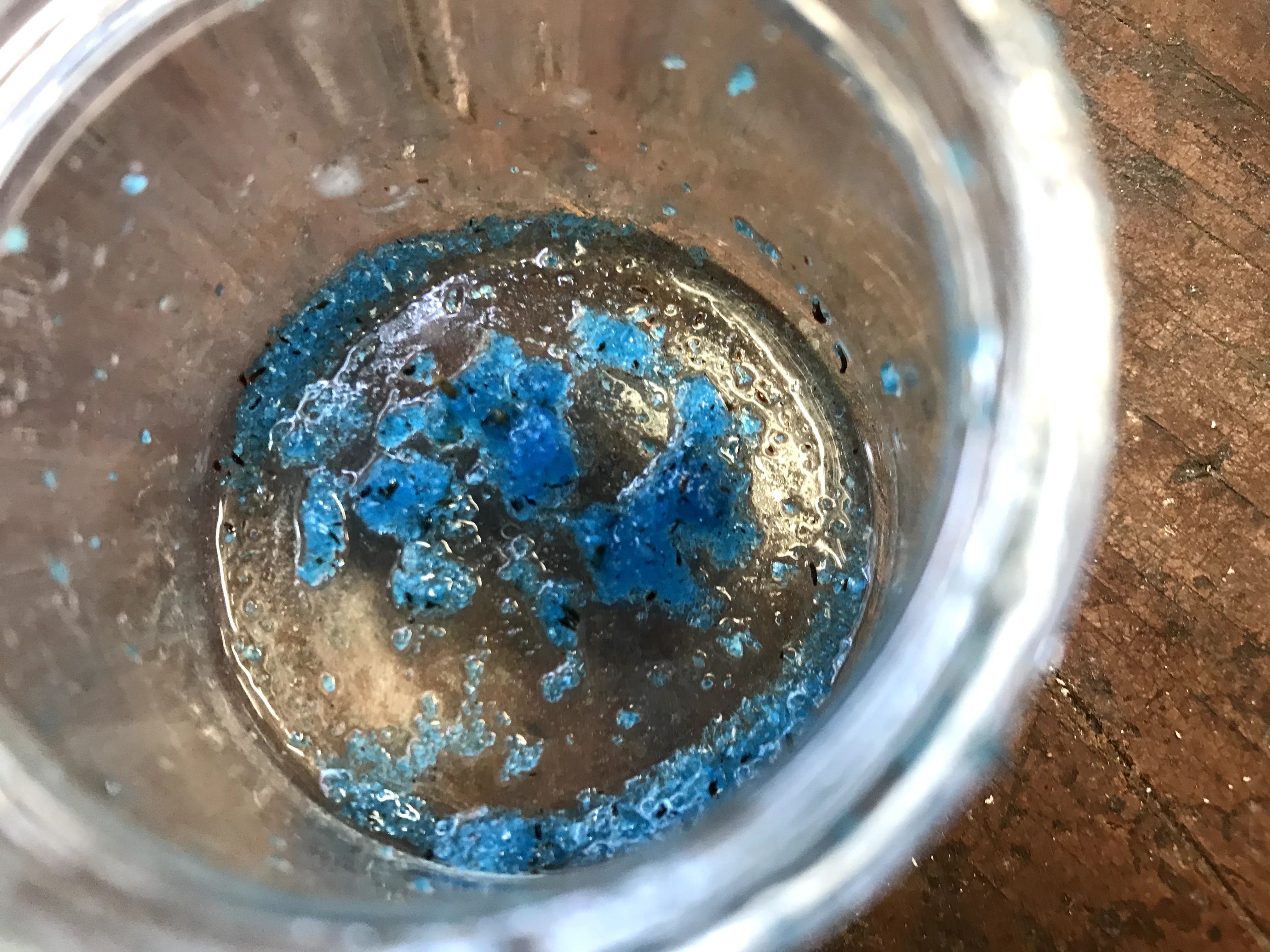
Creating green verditer took a couple of attempts to get right. I also wanted to make it sooner than I did in the end, but I was also trying to make my own copper sulfate. I later figured out that I had been making copper sulfate correctly, but I was not patient enough to let it fully evaporate. Making copper sulfate involves adding copper to oxidized sulfuric acid. I thought that copper sulfate would precipitate in the liquid, but the liquid evaporates and leaves copper sulfate crystals. I did end up with a small batch of copper sulfate crystals, but I ended up buying some copper sulfate pentahydrate from a hardware store.
The small amount of copper sulfate that I was patient enough to get.
I ended up buying my copper sulfate from a local hardware store since I could not make enough in time. The process is pretty simple. Dissolve copper sulfate in water, which may take some time unless it gets heated, and dissolve sodium carbonate in water. Add these two solutions together and stir gently.
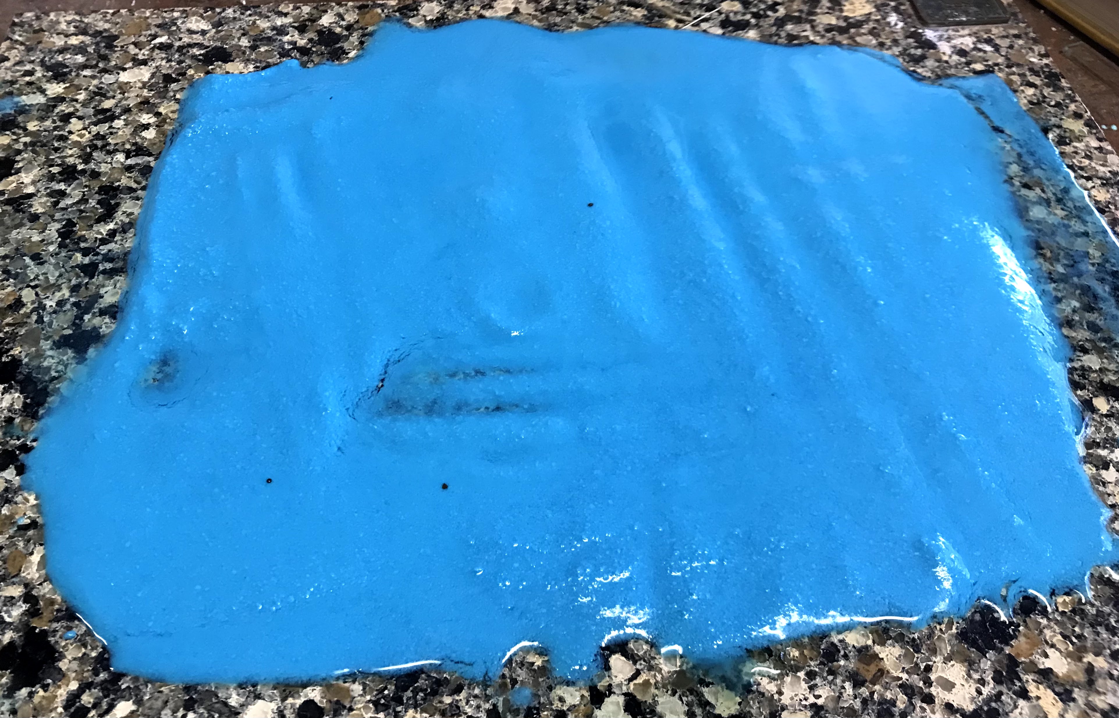
In my first attempt, I used equal amounts of copper sulfate and sodium carbonate. The initial product appeared to be successful. The color was more blue than I thought it should be, but I filtered it and spread it out to dry. Once it dried, the beautiful blue color turned a greyish green with a couple of patches of baby blue. I tried scraping the pigment into two powders based on their colors and made test oil paints out of them. Both pigments made similar colors that actually reminded me of terre verte, because the resulting paint is a warm, brownish green. What I made was not a bad pigment, I saved it and will use it later, but it was not green verditer.
After the first attempt, I checked some websites and YouTube videos to get a more exact recipe. I adjusted the ratios to have more copper sulfate solution than sodium carbonate solution and added the two solutions together in a flask. This time, when I started swirling the flask, it bubbled up and over the top. Once it calmed down, I gently stirred until the solution turned a sea green and stopped bubbling. After that, I dumped the contents of the flask into a filter to separate the solid copper carbonate from the water and set the copper carbonate out to dry completely.
The second attempt was much more successful than the first. Once the copper carbonate had fully dried, I ground it up into a fairly fine powder. Sources that I have read mention that malachite can go pale if it is ground too finely. With hand grinding the pigment, I am not too worried about making it into too fine of a powder to lose color.
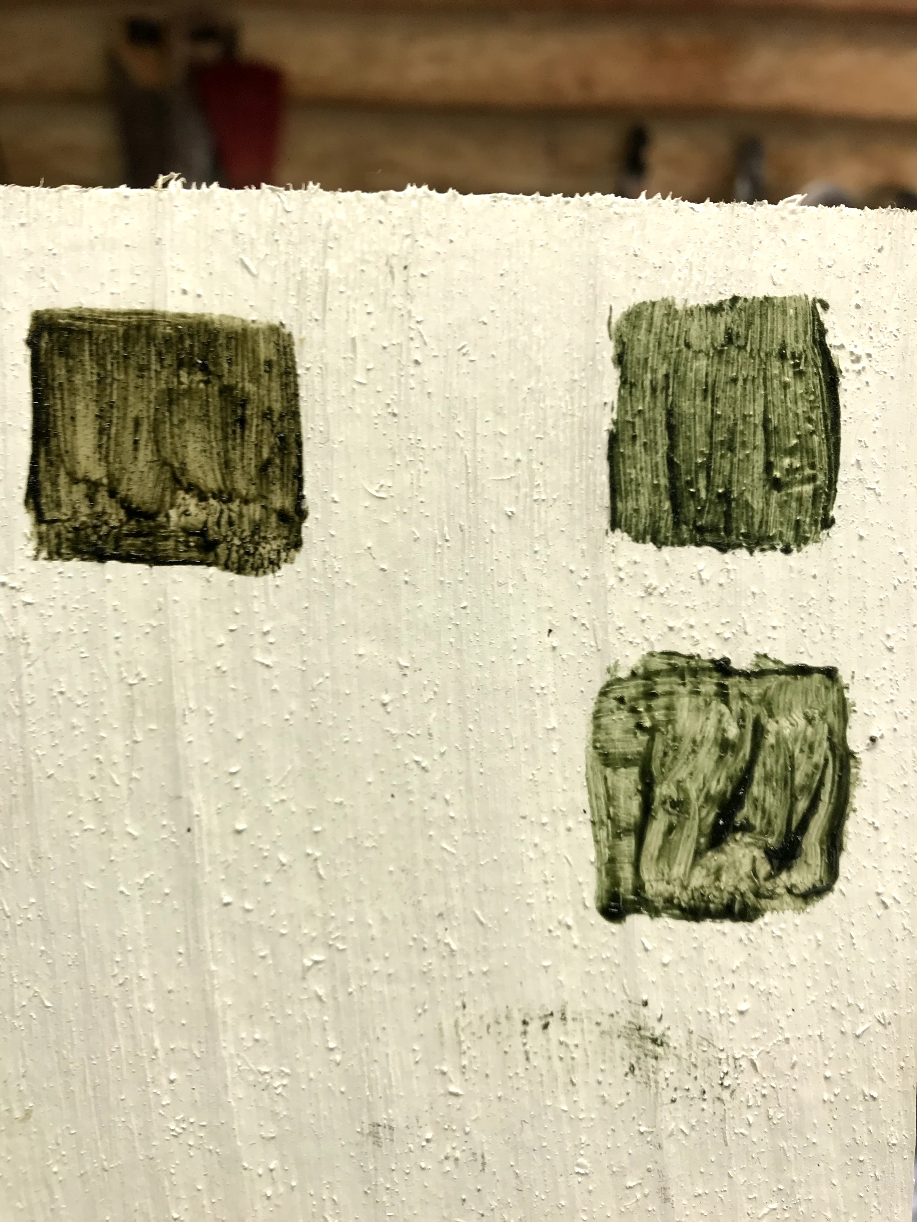
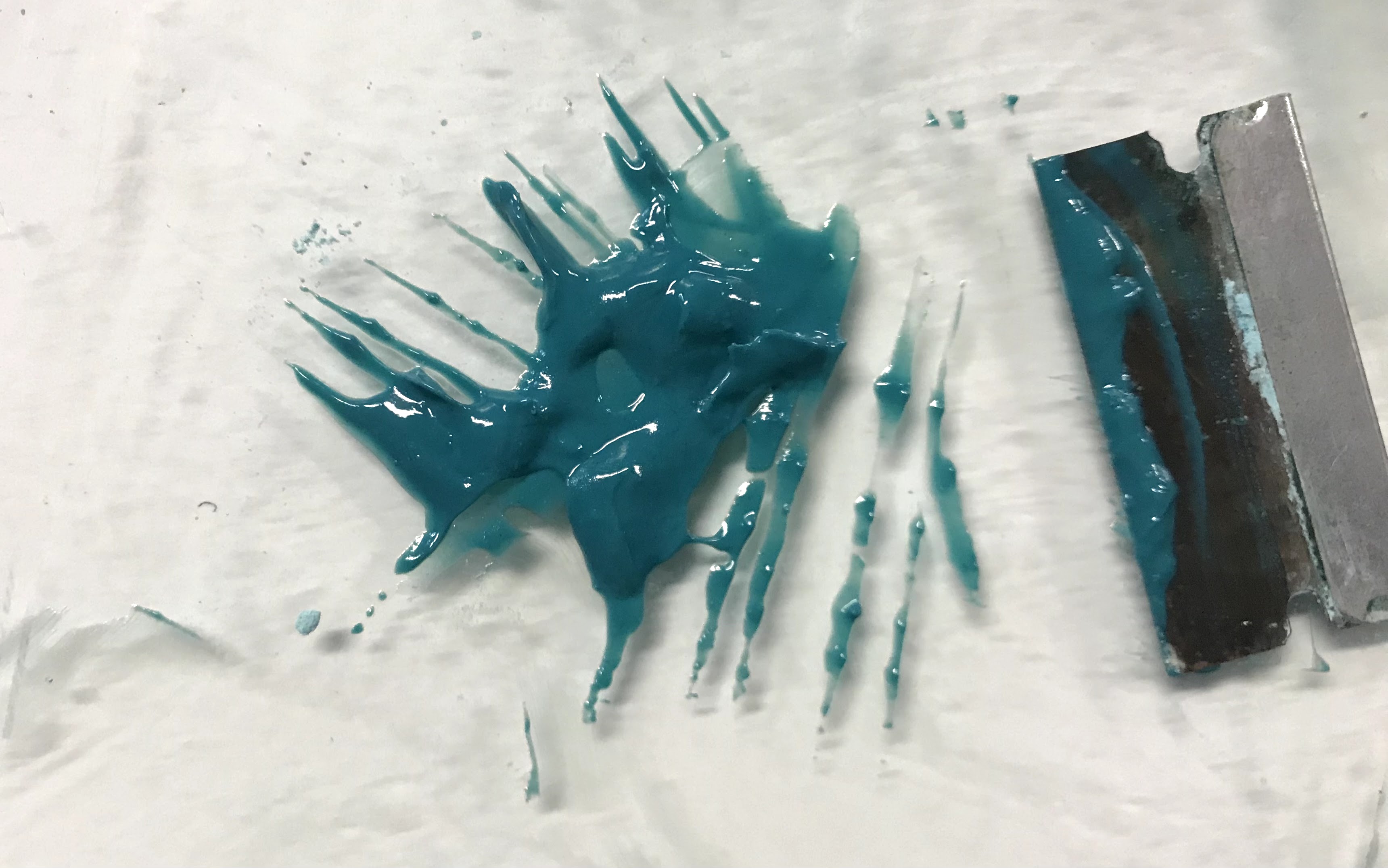
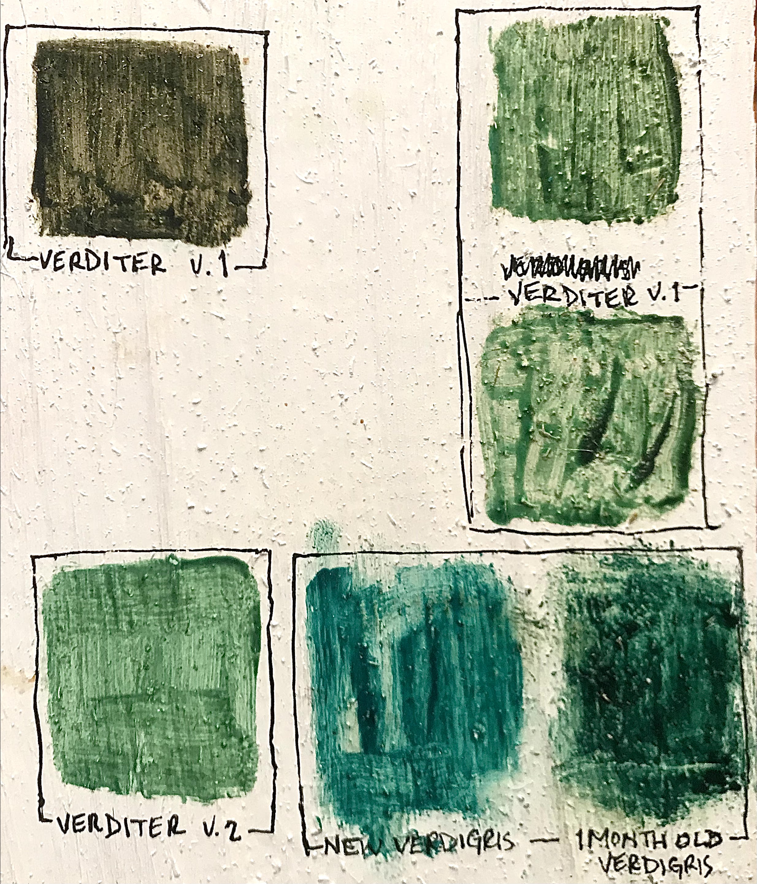
As I went, I quickly made up some oil paints of the pigments I was working with to compare them and test their color in application. I am still a little shocked by how different the colors of the powder pigments are from the paints they create. I tried to make a neatly organized and labeled test board, but I will explain it in more depth.
Verditer v. 1 was the result from my first attempt using equal parts copper sulfate and sodium carbonate. There were two distinctly colored sections of the powder as it dried. When these two powders were made into paint, the darker, greyer powder made the top leftmost square. The baby blue powder from the first attempt made the two squares in the top right corner.
Verditer v. 2 is the paint made from my second attempt, which was more successful. This was what I expected out of a green verditer pigment. Although, the top right squares from Verditer v. 1 look similar to the v. 2 square, they are a little more muddy of a green. The Verditer v. 2 color is more purely green, without the hits of brown or yellow that come through in the Verditer v. 1 squares.
I also thought that it would be interesting to compare green verditer to verdigris to see the difference between the two copper-based greens. At first blush, the paints were not too different when freshly painted next to each other. The green verditer went on as a light green that leaned heavily towards blue, but as it dried, it became a little warmer and more vibrant. Verdigris is a shockingly cold green, and most painting treatises from the middle ages suggest adding ochre or lead-tin yellow to verdigris in order to make it into a more proper green. However, I also knew that verdigris will change dramatically over time when exposed to air. I had some older verdigris paint that I made over a month ago, and it becomes a much warmer, deeper green over time.
I begin my next adventure in trying to create frescoes. I have frescoes built up in my mind as the epitome of “high art”, probably because they are most closely associated with the Renaissance, which is marketed as the height of culture that we’re all still supposed to be striving for. My aim in learning fresco is not to achieve the great heights of genius, not trying to borrow some of the rarified air of Leonardo or Bellini. The scope of frescoes or wall paintings throughout history stretch far beyond the warm shores of Italy. With that said though, Italy is my starting point because there are so many resources devoted to the materials and processes of Italian fresco.
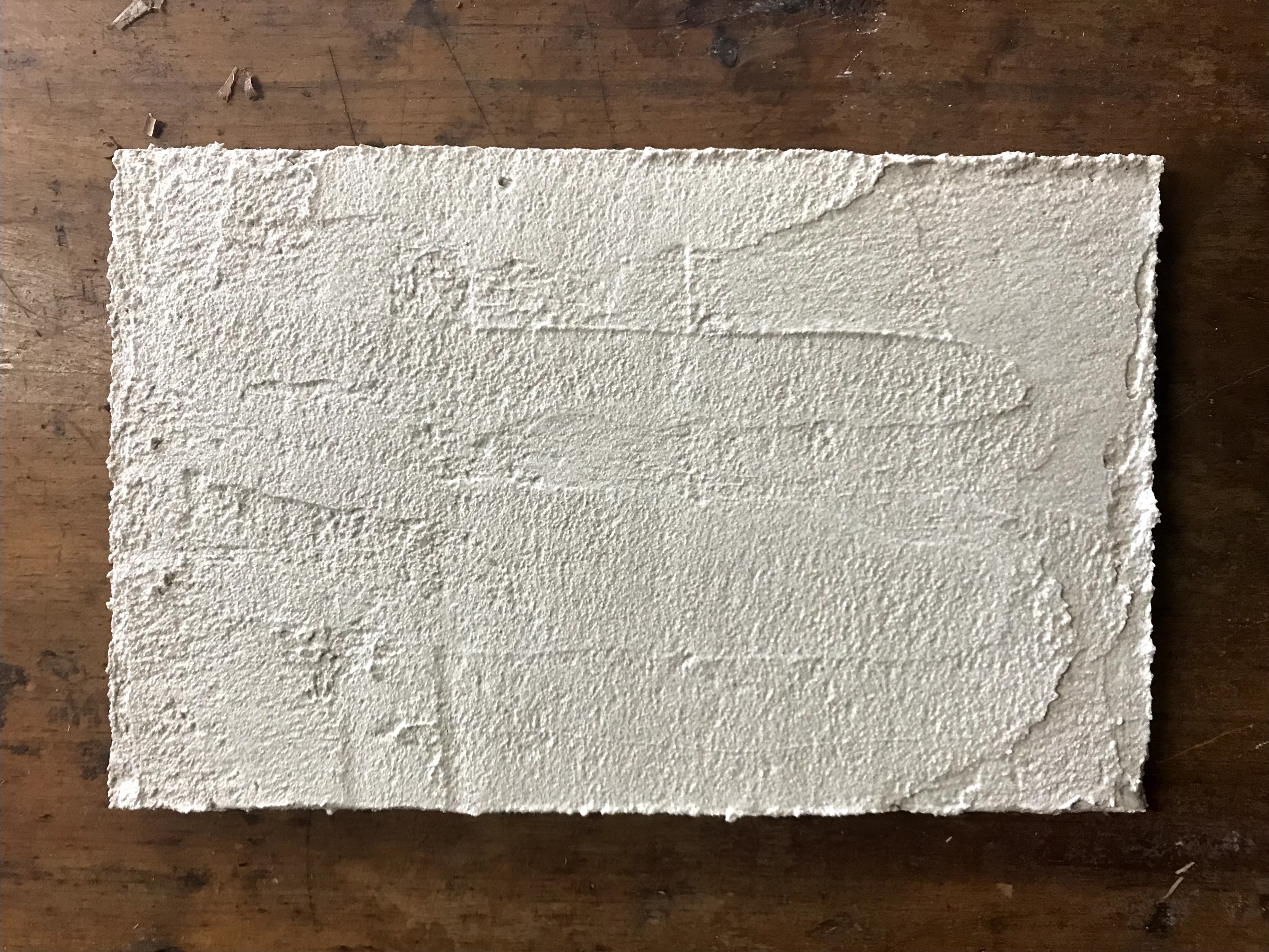
This project is only barely started, as with most other projects here there is a decent amount of waiting that must happen. Time is a material just as much as lime and sand are in this process. The real shock of this project was trying to find plain hydrated lime, because most hardware store just stock cement mix or mortar mix that is in the “just add water” variety. Granted, these mixes might be just lime and sand, but they never say what they’re made of, and I wasn’t about to risk it. The two ingredients in fresco plaster are just lime and sand. The hydrated part of the lime I needed meant that the lime was already slaked and ready for use. If I had gotten straight lime, it would need to be soaked for months before it could be used. Slaked lime, hydrated lime, Type S Lime, and quicklime all refer to the same thing, as far as I can tell. I also needed fine, washed sand, which was also harder to find than I thought, especially when I was looking in summer, when conceivably the most amount of DIY projects would be done needing sand. But I digress. The sand I found was washed but not fine, and I got around this by making a sieve screen out of window mesh. I channeled my archaeology days as I shook out the finer particles into a bucket to combine with the lime. In some recipes, it is suggested to add whiting or marble dust into the final coat of plaster that the pigment gets laid into.
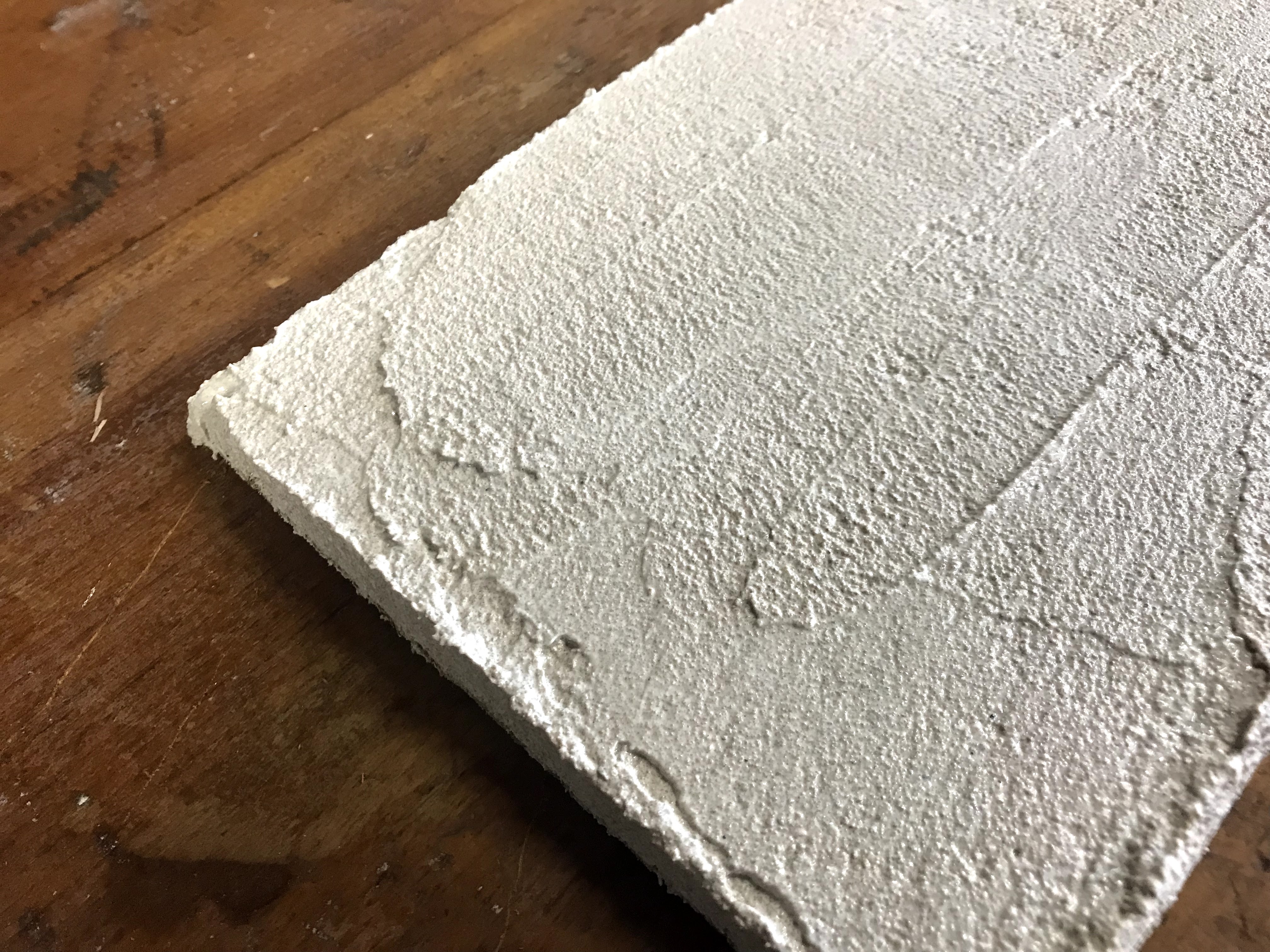
Traditionally for frescoes on walls, or plastered walls in general, three coats of plaster are standard. The first two have higher sand to lime ratio and help build up the base for the top layer to bind to. The final top layer has a higher lime to sand ratio (sometimes also with whiting) and is typically very thin. For my initial experiments, I am only doing two coats, a rough coat and final coat, on cedar panels.
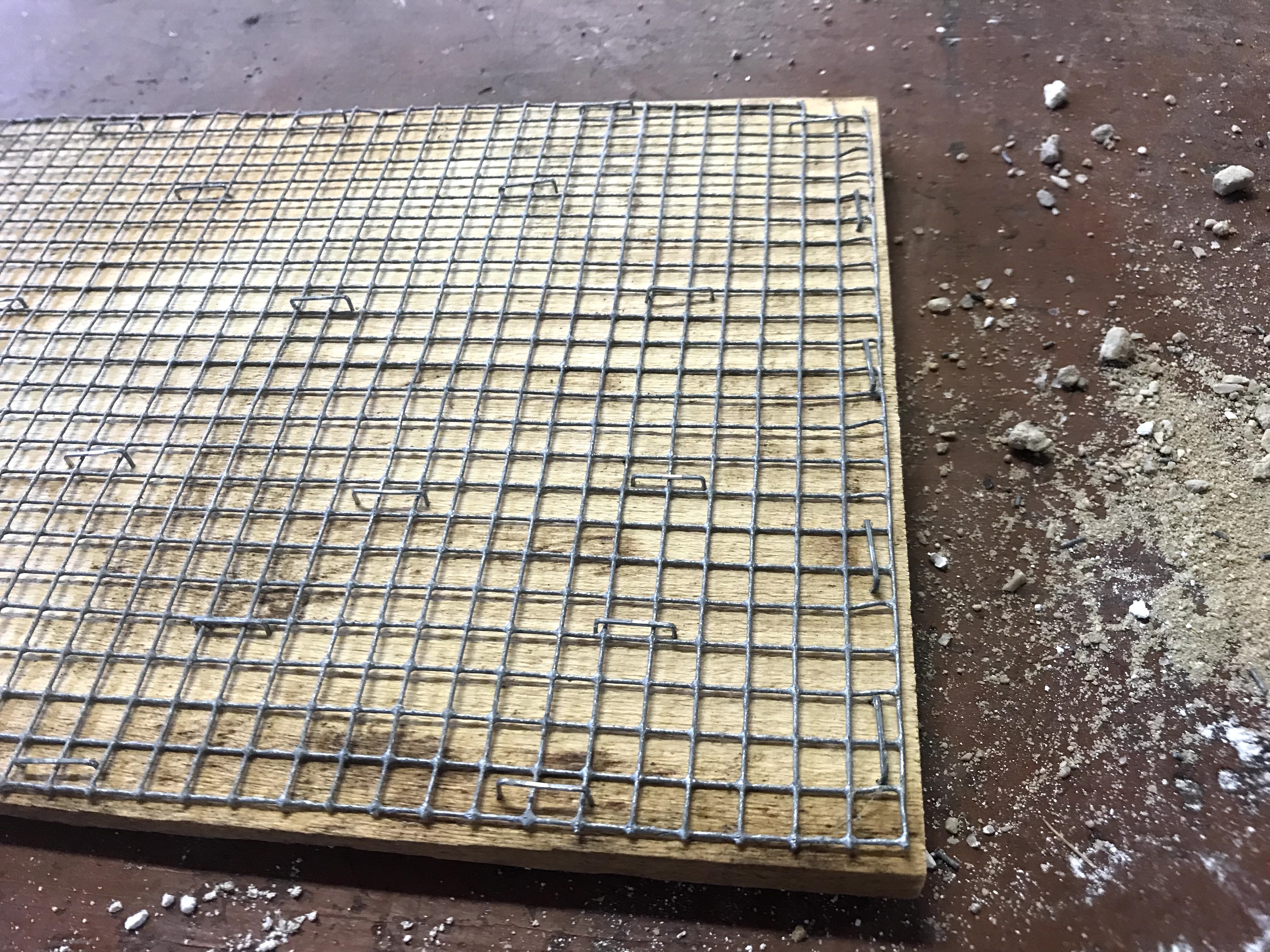
Stapled mesh on cedar panels. Ideally, the panel would be thicker to be less likely to warp from the amount of water required to make frescoes work well, but I’m just working with what I’ve got
I stapled mesh onto the panels to give the rough coat plaster something to grab onto and make a stronger bond. Once the rough coat sets, the plaster gets generously watered in preparation for the top coat. The plaster needs to set over time, but wetting it down before the next coat helps the two coats bond, in addition to helping not dry out the top coat before it’s done being painted.
For my first set of frescoes, I was not patient or knowledgeable enough to have perfect results, but hey, I’m here to learn. I let the first coat set up for too long, and the second coat not set up enough. In addition, both coats dried too quickly on a couple other panels I prepared, which led to some serious cracking in the plaster.
To paint them, watercolors or distempers could be used, so I tried the distempers at first. A distemper paint consists of just pigment in water and made up into a paste for this use.
This is a yellow ochre distemper I made for fresco painting. It can be used in this viscosity, or it can be watered down according to what the plaster responds to best.
I tried laying out a design for the first fresco, but it was still a little to wet. I also tried using smalt for the background, which is a pigment made from blue glass. Smalt has to be ground coarsely, otherwise it would have no color to it, and I think because of its coarseness, it did not sink into the plaster.
Because my smalt distemper was a failure for the most part, I ended up painting over it with watercolors for a little fresco secco. I did one half in blue bice (artificial azurite) and the other half in smalt again. These were more successful, and the smalt had its characteristic glassy shine when used as a watercolor.
My first fresco is far from perfect, but I learned a lot from going through the process. All of my understanding before came from reading about frescoes, so having first hand experience puts everything I’ve read in context. The process makes much more sense now, and I am ready to keep trying and failing a bit until I am a fresco master.
Stay tuned for more fresco attempts. I’ll leave off with the other fresco secco panels I did from the first batch.
Did Bob Ross ever make fresco landscapes?This is not supposed to be the Man in the Yellow Hat, but I suppose it could be. It’s also difficult to see the vermillion red eyes of the loons in the picture, but they’re there. This one had serious cracking problems, but it just makes it look like this was unearthed from the ruins of Northern Minnesota
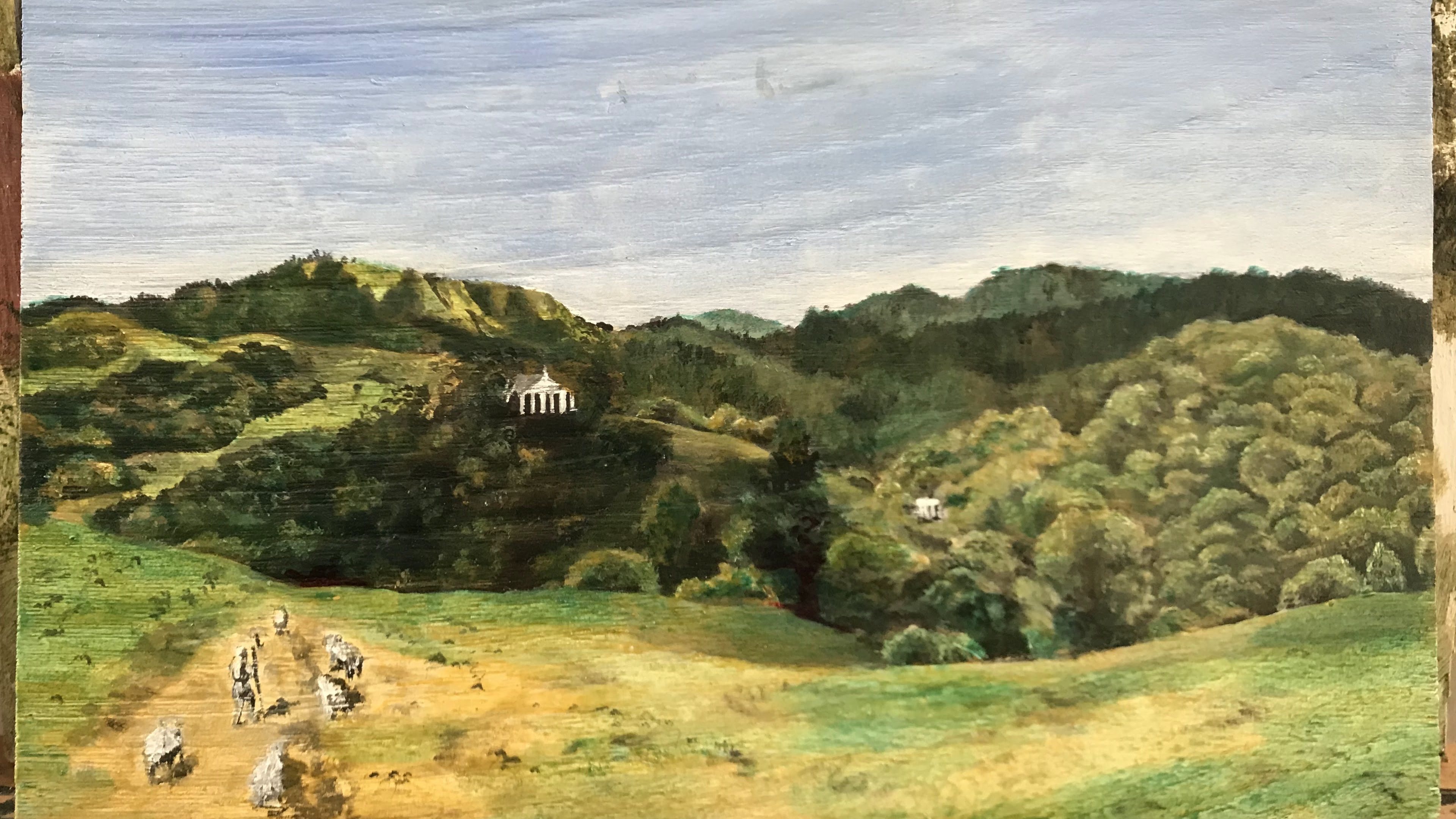
Back in January of 2021, I began an apprenticeship on the North Coast of California. I wasn’t quite in wine country proper, but I was close enough that the landscape looked Mediterranean to my midwestern eyes. The blue morning haze quietly crept through the trees, and the grass shone silvery as the first beams of light rose above the hills. The trees themselves looked familiar, like they were taken straight from a Giotto masterpiece. The far off farm building dotted the landscape in much the same way as little chapels in church panels. At the time I arrived there, the landscape was still shockingly verdant, and the sun stayed low, which created a mystical ambiance that I became enamored with.
Part 1: The Grass is Never Green Enough
The catalyst for my eventual rabbit hole was simply wanting to make plein air paintings of my surroundings to capture the Italianate nature of the landscape. I wanted to learn oil painting, as I had never tried it before, and I figured that oil painted picked up popularity in the height of the Italian Renaissance, so looking up Renaissance painter’s processes seemed like as good an introduction into oil paint as any university class on the same subject. I thought that the most direct method would be to get oil paints and just get out there and paint. However, true to form, I did a little research before I did anything.
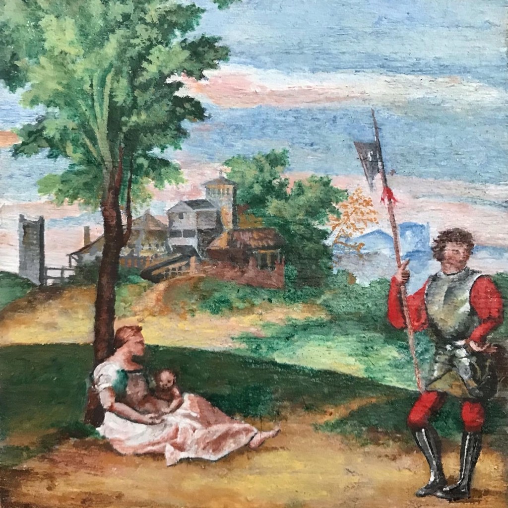
I thought that it would be the most interesting and practical to find the same pigments that the Renaissance masters would have used, in order to more faithfully follow along in their painting processes. I also figured that matching pigments would make my own painting better resemble Renaissance paintings with not much added effort.
The palette that I researched and aimed to find was: White (not lead) Venetian Red Naples Yellow Azurite (Mountain Blue) Verdigris Raw Umber Carmine Red
I tried two different stores a couple of weeks apart, because I find most of them fairly easily, and even pick up terre verte. I did accidentally pick up cadmium red, instead of carmine red, which was a surprisingly expensive mistake, and not quite alike in color, but cadmium red made a decent substitute for vermillion. However, two proved to be particularly hard to find. I looked and looked at every last tube of paint trying to find azurite (also under the moniker of Mountain Blue) and verdigris. These pigments were going to be the backbone of my paintings, because it’s difficult to paint a landscape without blue and green.
My first attempt was abandoned after I became frustrated that the pigments were not right, especially the greens.
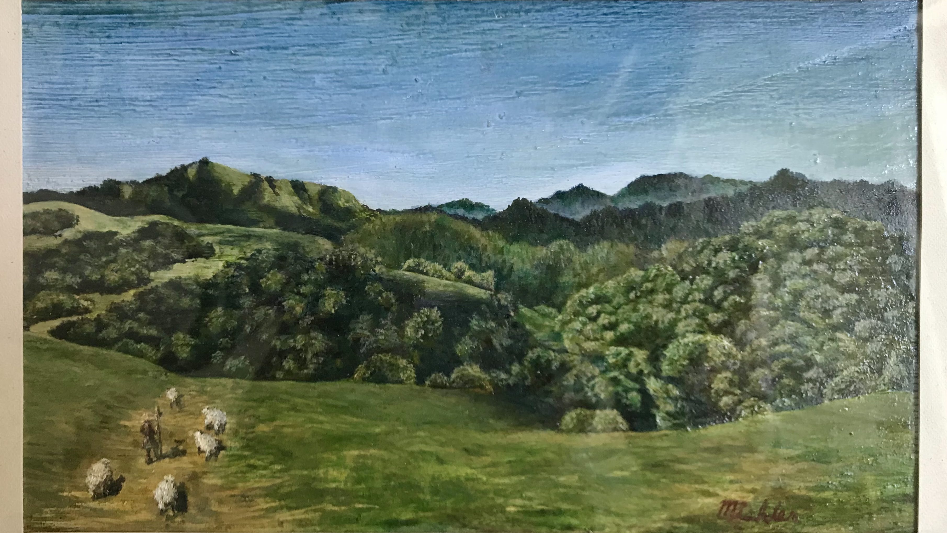
Nevertheless, I tried to soldier on and make some master study paintings with the paints that I had. They looked okay technically, the shapes were right, and there was a slight translucency to the painting from the process of laying in glazes. But there was one glaring flaw to all the paintings I tried, and that was the greens looking wrong.
My second attempt got worked a little further, but eventually given up because I couldn’t get the greens to look right.
An additional hurdle I realized during painting my second master study, which also contributed to my abandonment of the painting, was that the colors that I was trying to copy were the aged pigments and varnish after years of degradation. At the start of the painting, I tried to match the warm hues of the yellows and browns, but I considered the warming effect of aged varnish and dying verdigris. I came to the conclusion that this painting was probably originally vibrant in the reds, blues, and greens, but over time, the blues and greens had turned brown from the copper-based pigments oxidizing, and the whole painting took on a yellowy cast from the old varnish. At that point, I was unsure which version I should copy, either the painting’s current state or what would have originally looked like. Either way, I knew I could not truly achieve an excellent copy of either because my greens were not right.
I knew that I had to find verdigris or its modern equivalent, so I resigned myself to doing more research.
Part 2: Breaking Bad
I came to the heartbreaking conclusion that it was impossible to find azurite or verdigris in any modern tube of paint. Both pigments are fairly fugitive, meaning the color does not last when exposed to other materials and the environment. The pigments, being copper based, also had the nasty habit of oxidizing and turning black or brown in oil paintings. I had picked up a phthalo blue tube, so for a time, I had a blue to use in my paintings. A green would be more difficult. I already had a complicated relationship with green paints, leftover from my acrylic painting days, and I had not bought a tube of green paint maybe ever in my life. I stuck to mixing blue and yellow, which I tried to do for oil painting as well. Pthalo blue and Naples yellow do not make a pretty green. In fact, they hardly make more than a saturated grey. The terre verte that I got was not much more useful than for base washes of color. So, it was back to the drawing board.
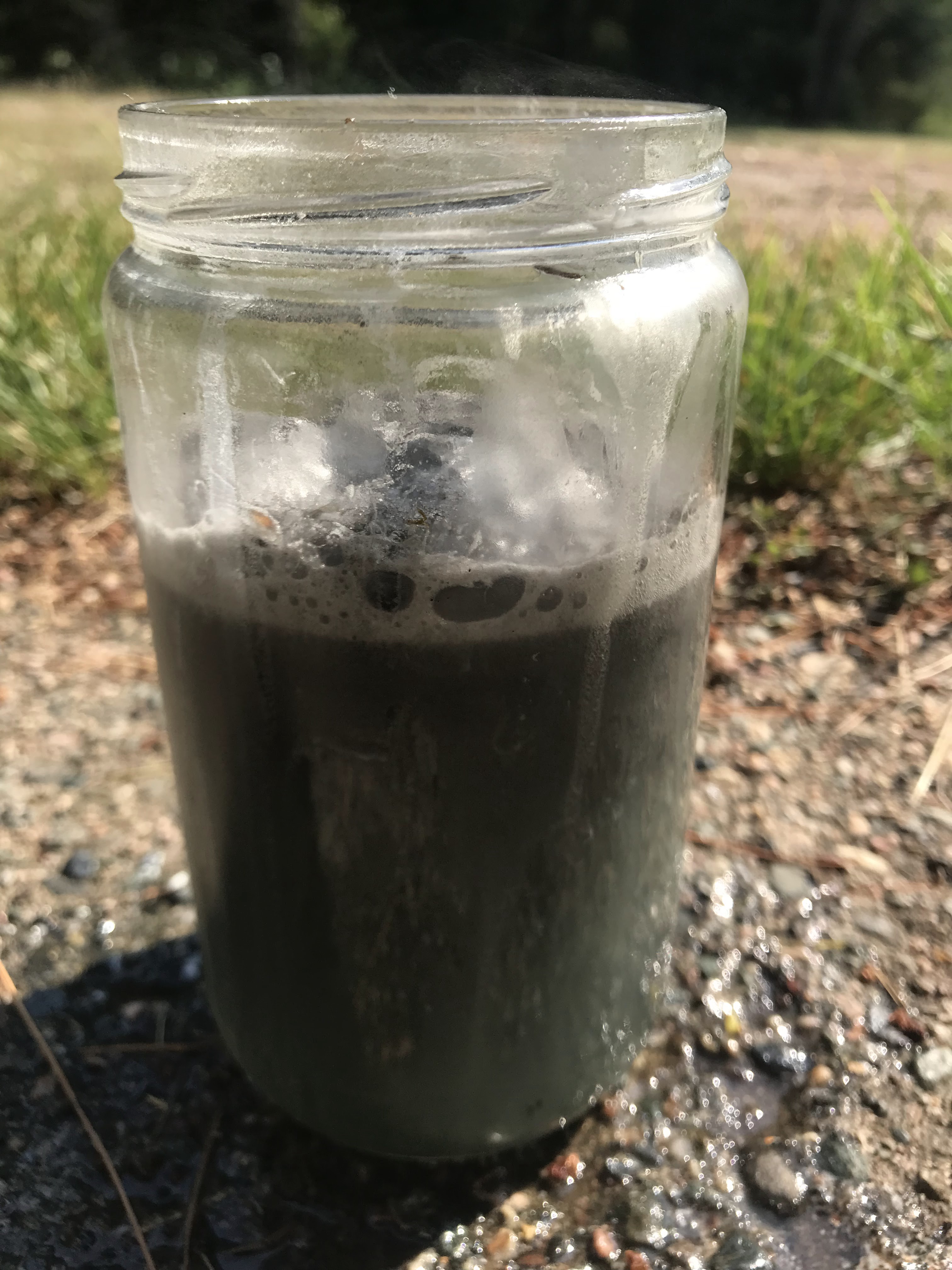
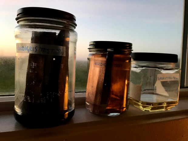
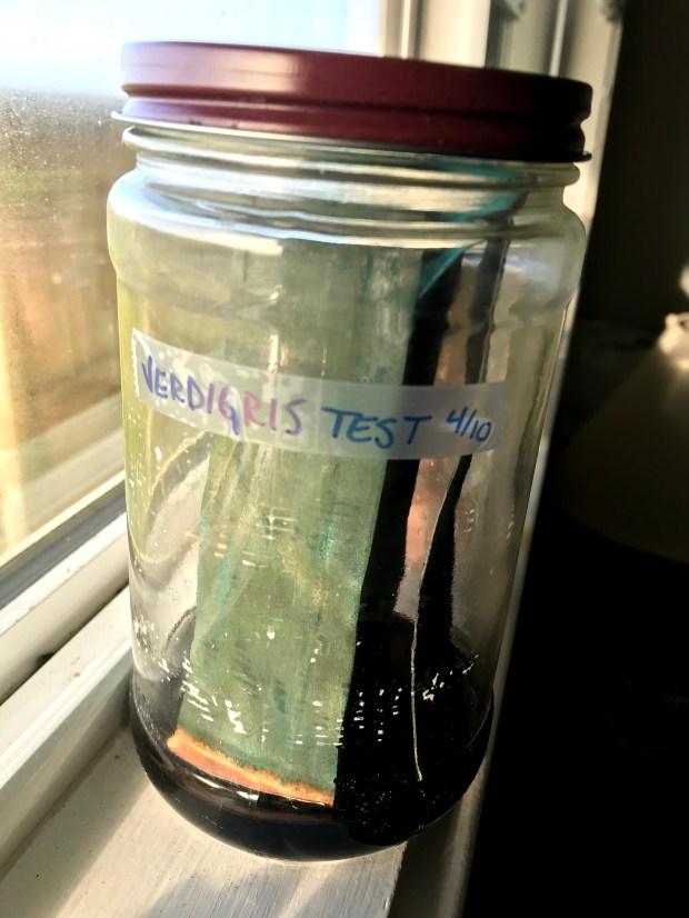
After more research, looking into verdigris specifically, I discovered that it is fairly simple to make at home. Verdigris is a basic copper acetate, and to make it, copper must be exposed to the vapors of acetic acid, better known as vinegar. Historically, verdigris was made by winemakers, somewhat as a byproduct. The dregs of wine mash that had gone off were thrown in a barrel, and sheets of copper were sealed inside as well. The barrel was sometimes buried, but left for a few weeks, then the barrel was open, the copper scraped off then returned to the barrel, and the process restarted. The patina that forms on the copper when exposed to vinegar fumes is the verdigris pigment used for paints. All I needed to do was find some copper.
As fortune occasionally smiles upon me, I didn’t have to wait long for copper. Meanwhile at work, I was redoing some wood shingle roofs. Sometimes, roofers would add a strip of copper flashing underneath the ridge boards to act as a deterrent for organic growths, like moss or lichen. On one particular roof, we were going to get rid of the copper flashing because it was adhered by tar strips, and we weren’t about to stick them onto the new ridge boards. I took the flashing home with me, knowing that I could finally make some verdigris and get to painting my landscapes.
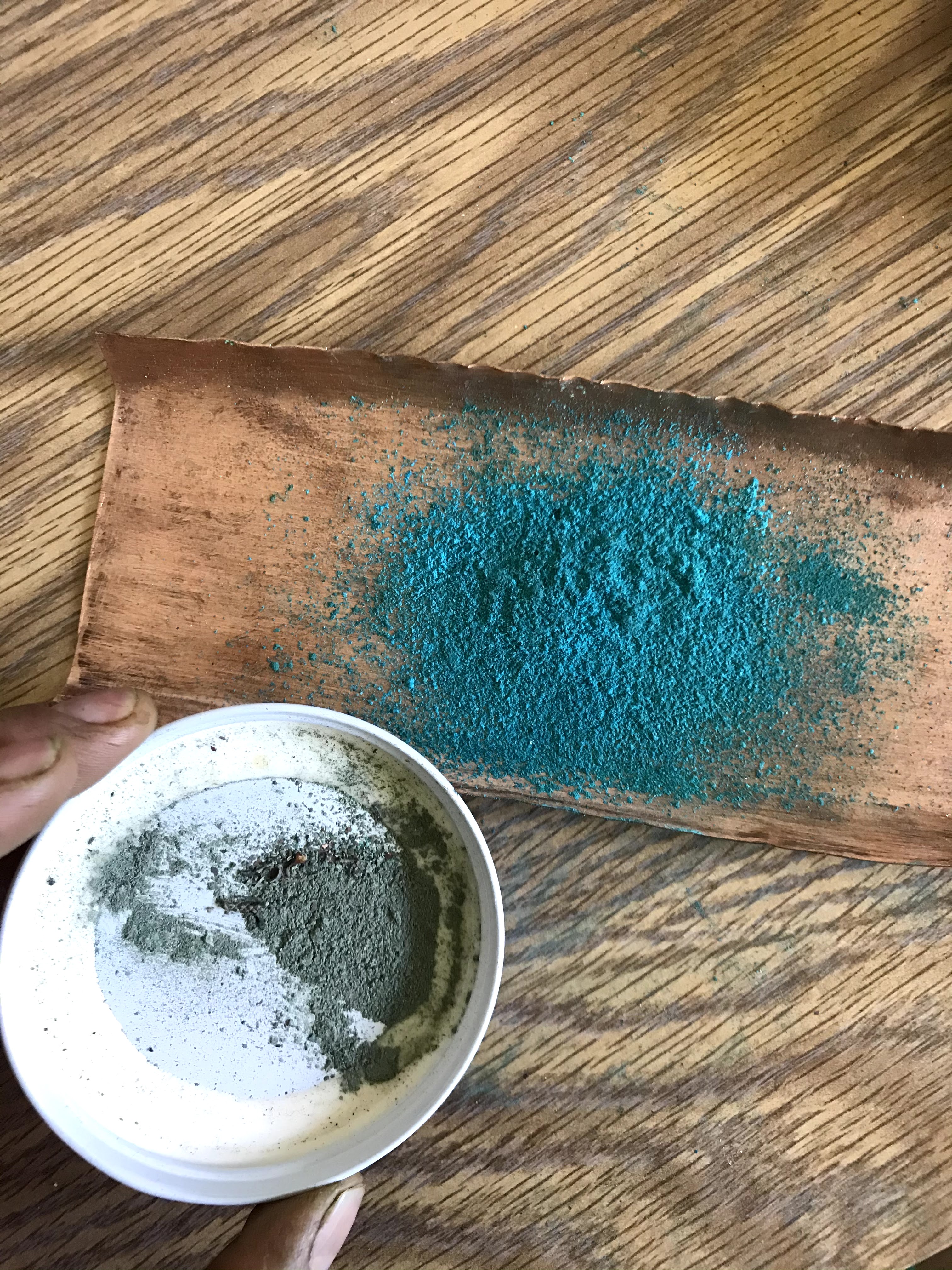
The pile of scrap copper flashing that I brought home
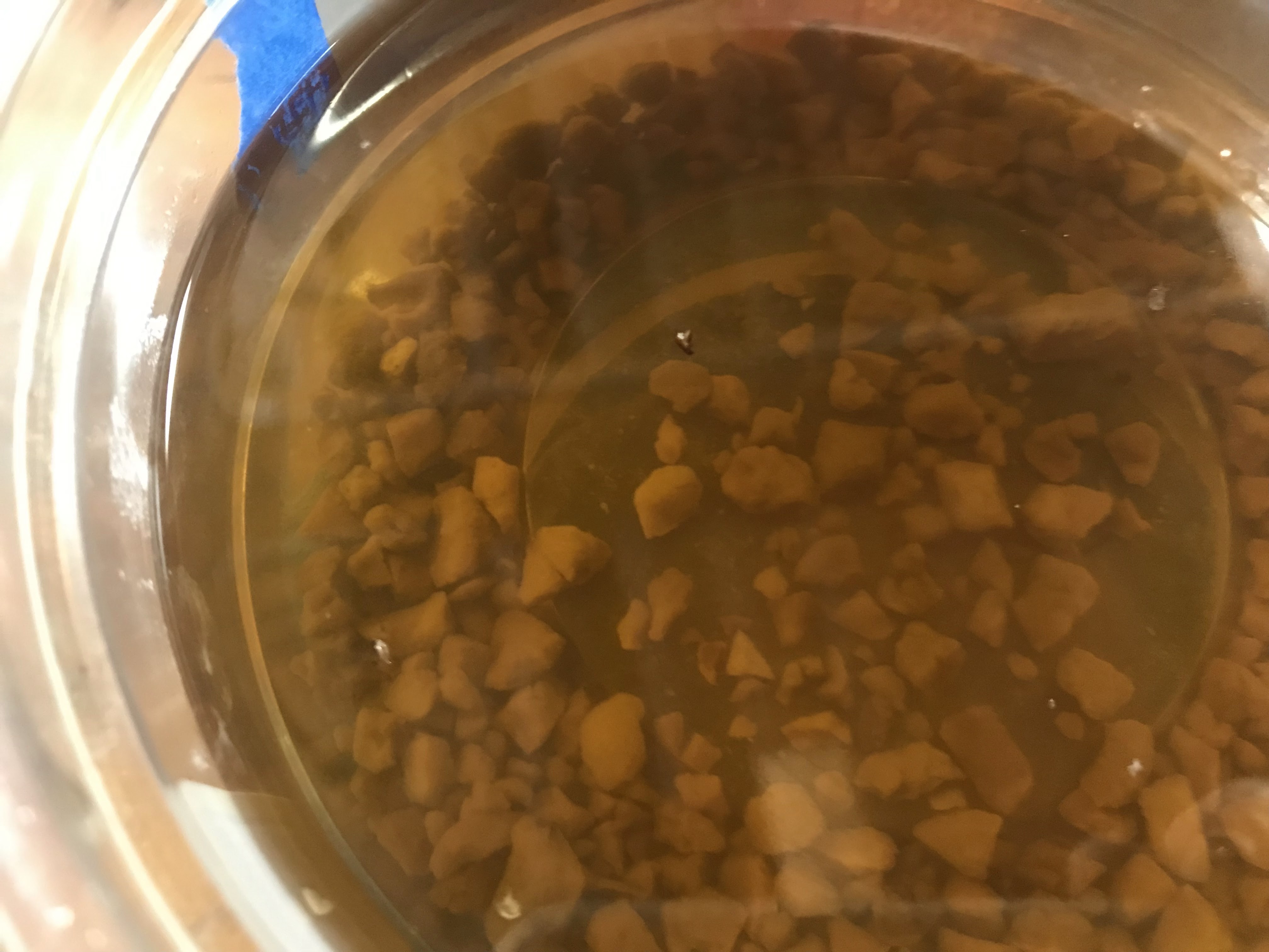
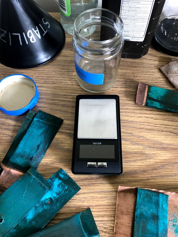
I tried just scraping off the existing patina on the flashing, but that turned brown when added to oil. I then set on resurfacing the sheets, which had become tarnished after exposure to the sun and ocean air for years. After that, the only thing left to do was place some copper sheets in a jar with vinegar.
I thought that this next step would take months of waiting to let the patina grow to a substantial amount. However, to my surprise, there was enough verdigris after a week. I spent the rest of my time in California maintaining my verdigris factory. I still ended up with very little verdigris because of the small scale I was working in.
The original patina in the white cap below versus the patina I manufactured by exposing the copper to vinegar fumes above
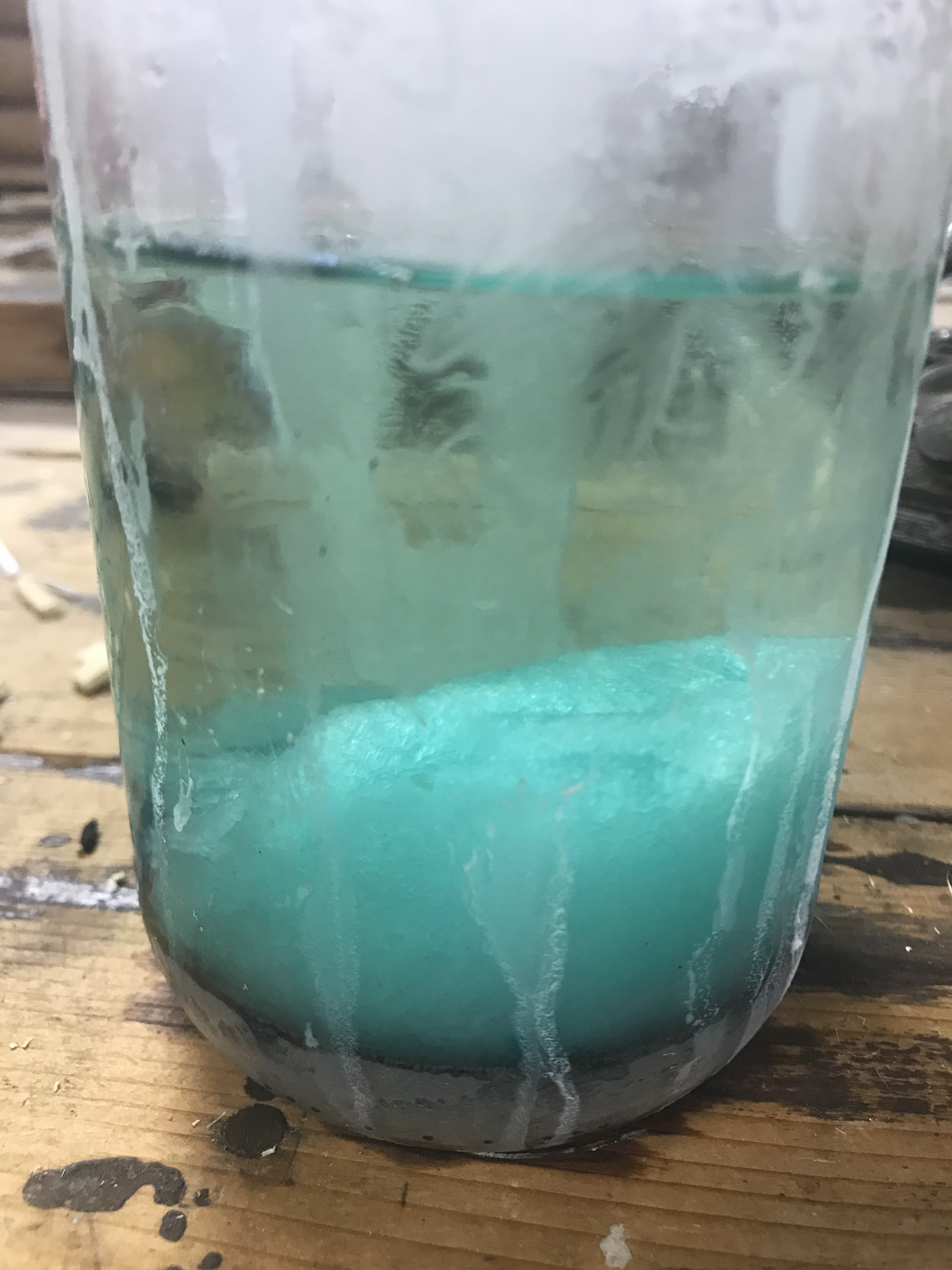
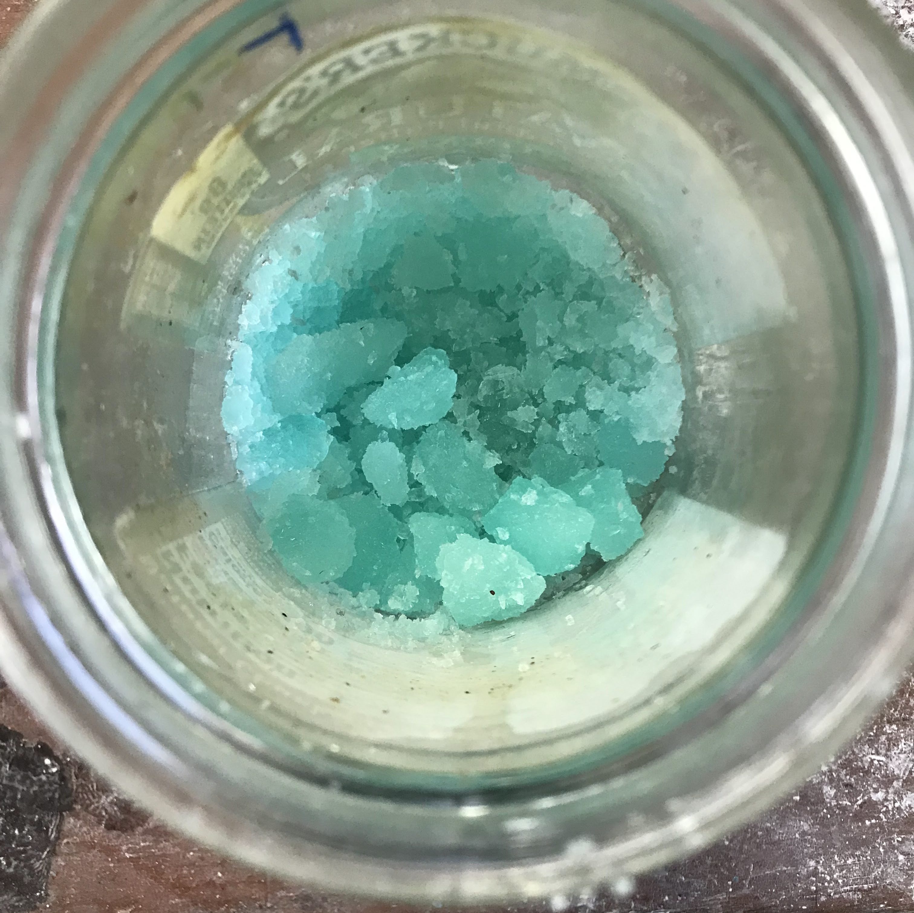
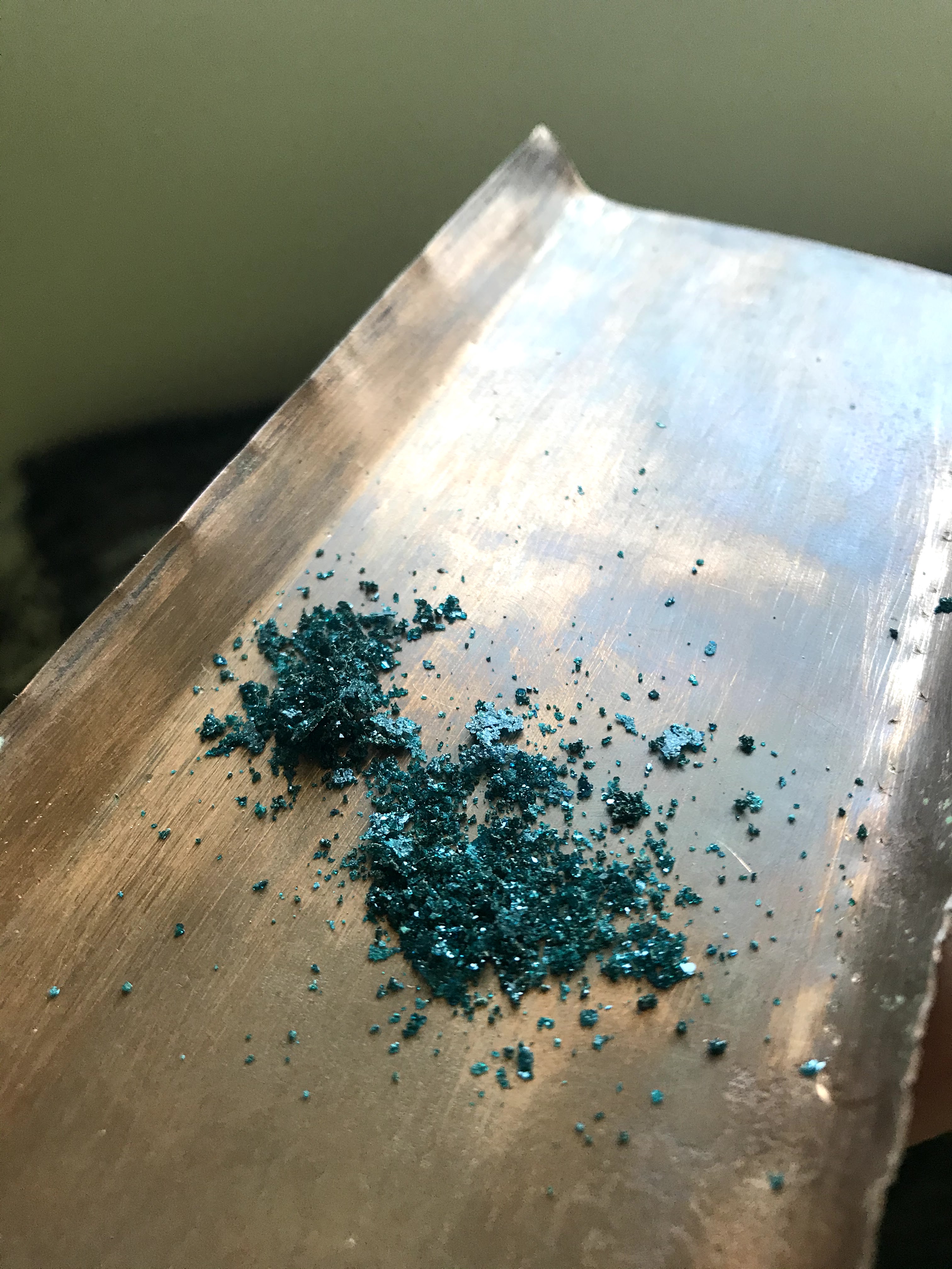
I also added the step of neutralizing the verdigris. To do so, the verdigris that is freshly scraped off of the copper sheet gets redissolved in vinegar. As the vinegar and water evaporate, the verdigris recrystallizes and becomes more stable in paints.
Neutral verdigris after crystalizing as vinegar evaporated
By the time I had enough neutral verdigris to make paints with, it was the end of March. My quest had taken me three months to achieve my goal. This experience also exposed me to the wonderful world of pigments, which I had looked into fleetingly before, but I became deeply engrossed in understanding pigment properties and chemical composition in relation to use in different paint mediums. Thus began my work into pigment making, as well as my desire to understand historic paints and pigments.
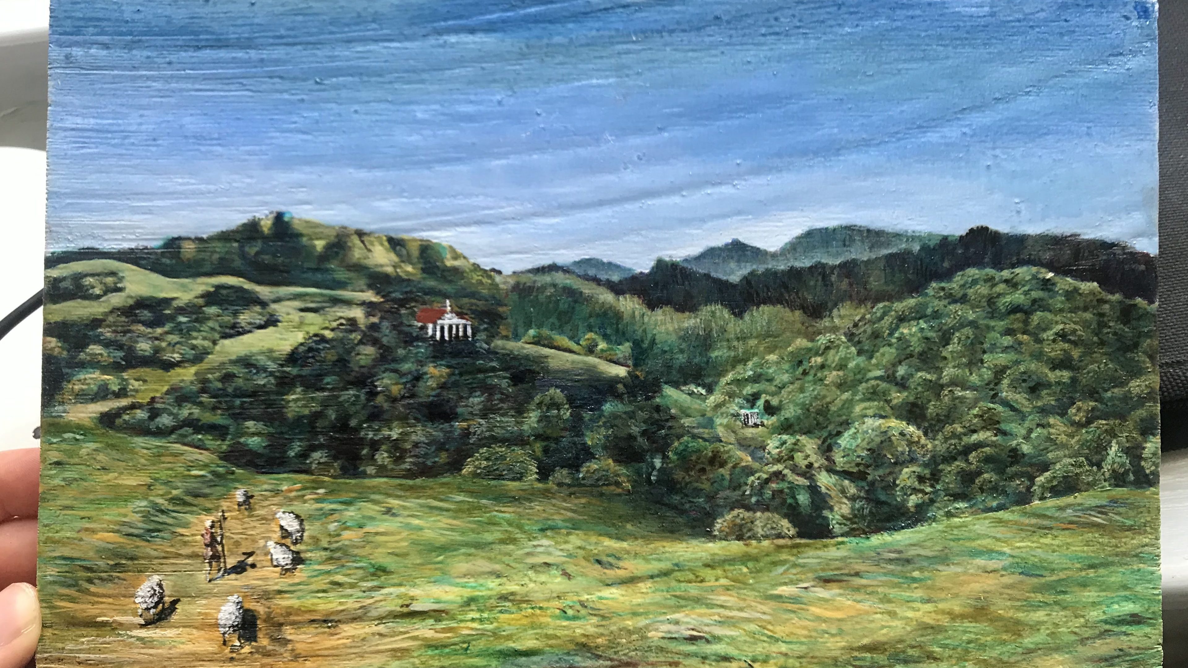
A master study attempt which used the verdigris that I made