This will be a quick talk on making cyanotypes. I considered making cyanotypes the long, elaborate way about a year ago. Creating my own chemicals probably would have not worked, and would have raised a few eyebrows with my internet search history into cyanide. I settled for making cyanotypes the easy way with chemicals from an art store.
Most people are probably more familiar with blueprints, but a blueprint is essentially the same thing as a cyanotype. Also, any artists will probably be familiar with the pigment Prussian Blue, which is chemically identical to a finished cyanotype. A cyanotype is made by sensitizing a surface with a chemical wash, and then covering the surface to make a contact print. A contact print is the opposite of a typical camera negative. A negative is exposed in order to eventually print the positive image, however, a contact print directly prints onto the surface. Once the surface has finished exposing, it must be washed with water to stop any further exposure, and the print will continue developing as the surface dries.
The chemicals come as two dry powders and must be dissolved in water before combining. Both chemicals are made into solutions separately as Part A and Part B, which I mixed by weight and stored in empty hydrogen peroxide bottles. The opaque plastic will store the chemicals longer. The chemicals are iron(III)ammonium citrate and potassium ferricyanide. Combining these chemicals creates a photosensitive solution, which when exposed to sunlight, reacts and causes the iron(III)ammonium citrate to oxidize to ferric ferricyanide. Ferric ferricyanide is insoluble in water, so once the surface has been exposed for long enough, the surface is rinsed with water so any unexposed chemicals or waste chemicals are washed away, leaving the dark blue ferric ferricyanide.
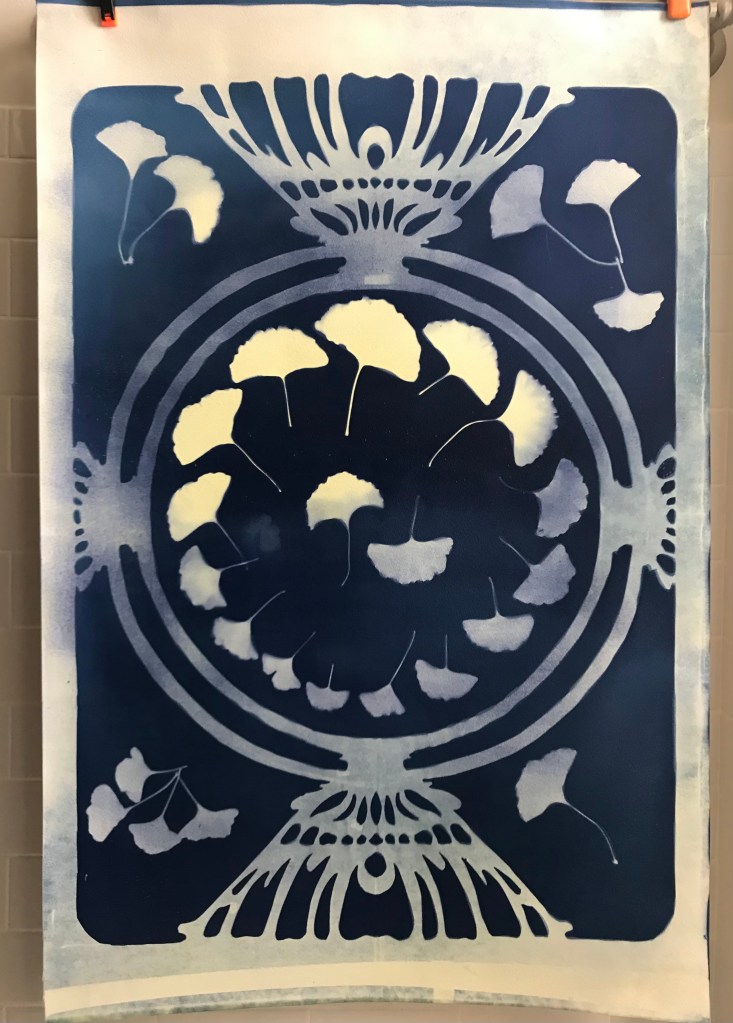
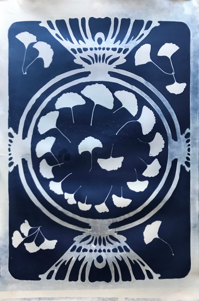
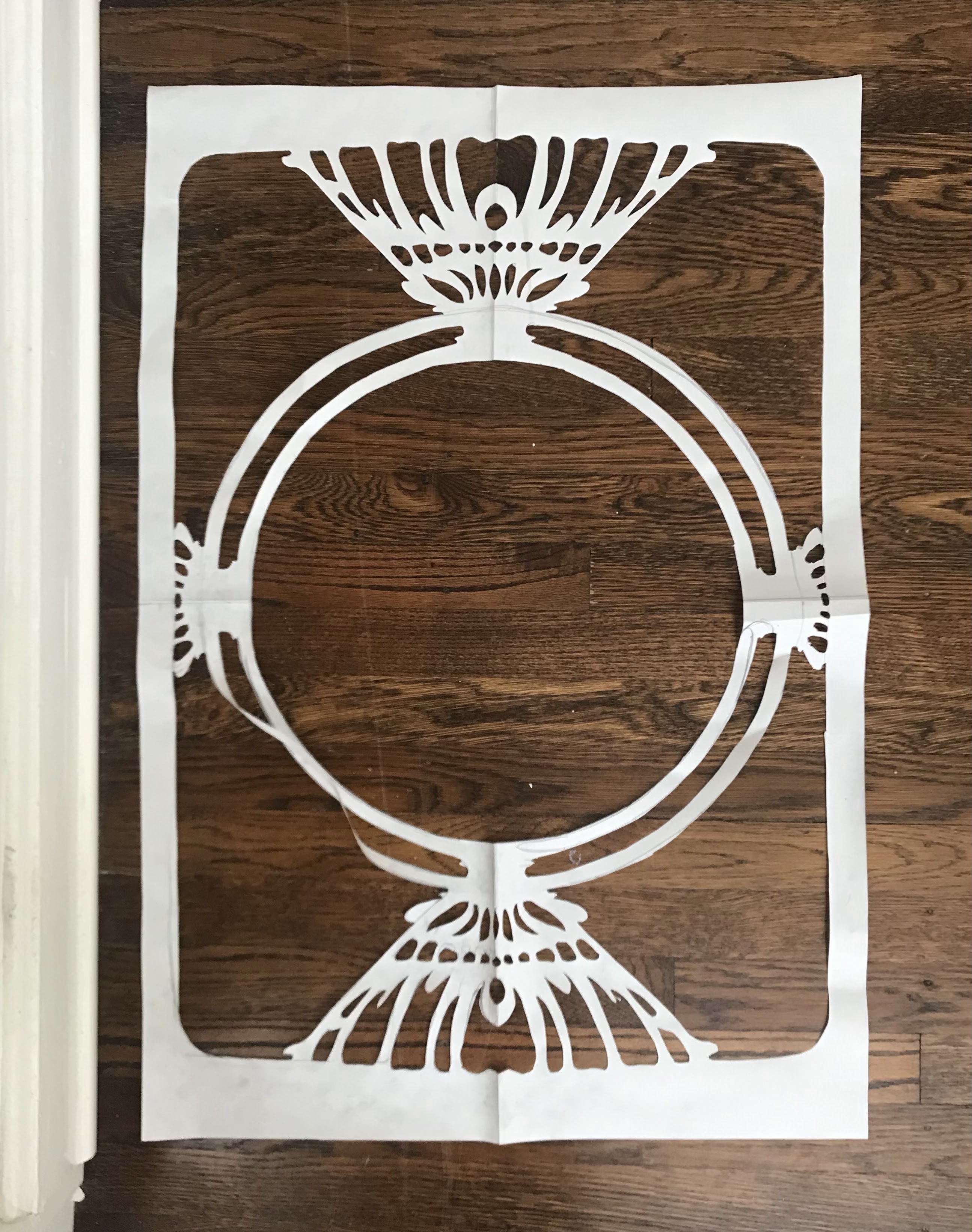
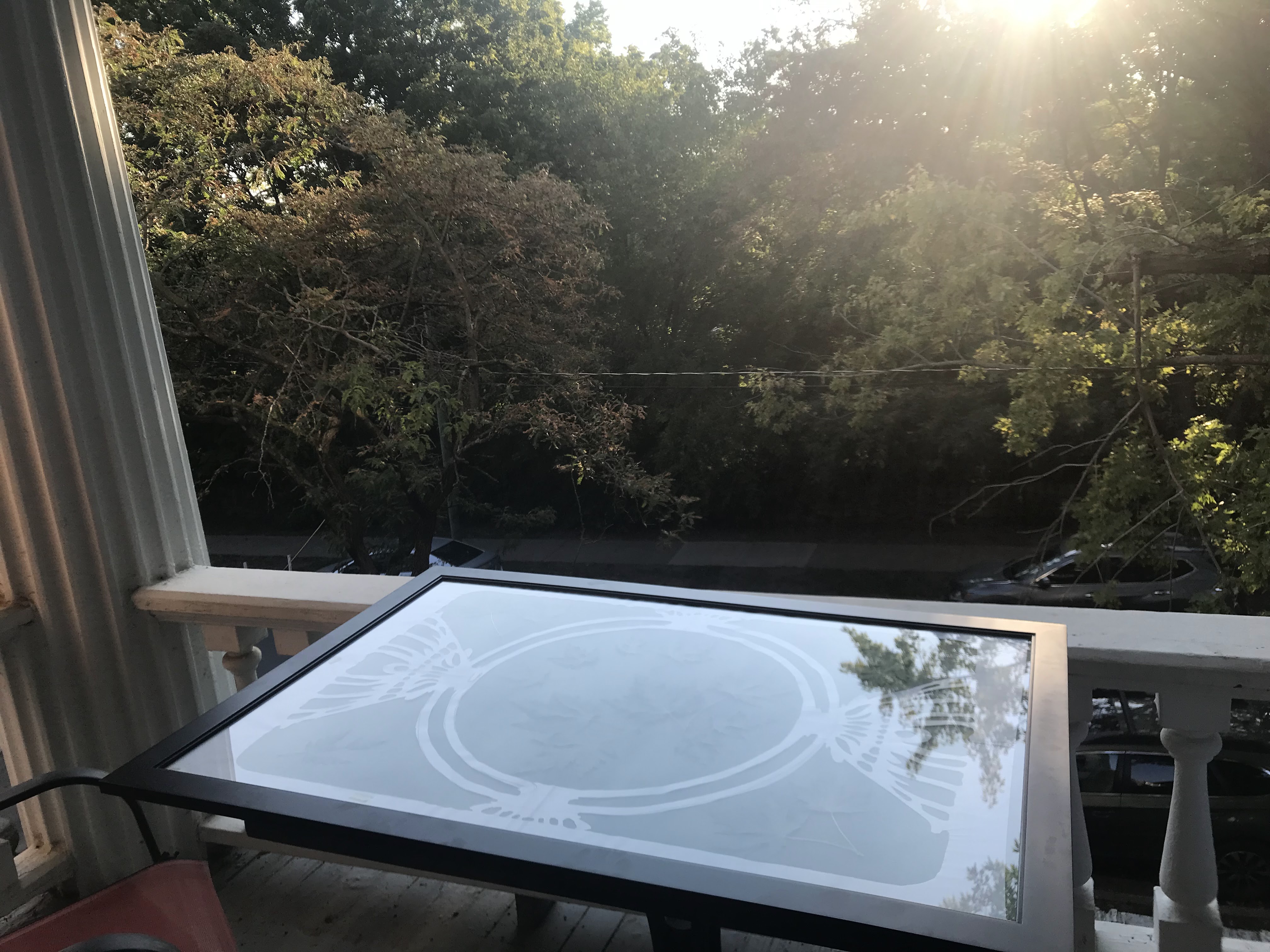
My initial concept for the image that I created was early botanical prints. Cyanotypes were used in botanical study as a way to contact print specimens for accurate reproduction as a replacement for drawing. I also wanted big prints, so I filled up more of the space with a Mucha inspired frame that was traced and cut out of vellum paper.
I wanted 24”x36” prints, foolishly, so I tracked down a poster frame to use in my exposure. Finding big paper proved to be a big challenge, as most watercolor paper tops out around 22”x30”. I would recommend just making smaller prints. I, however, found a very nice heavy cotton print paper, which I had to trim in order to fit in the frame.
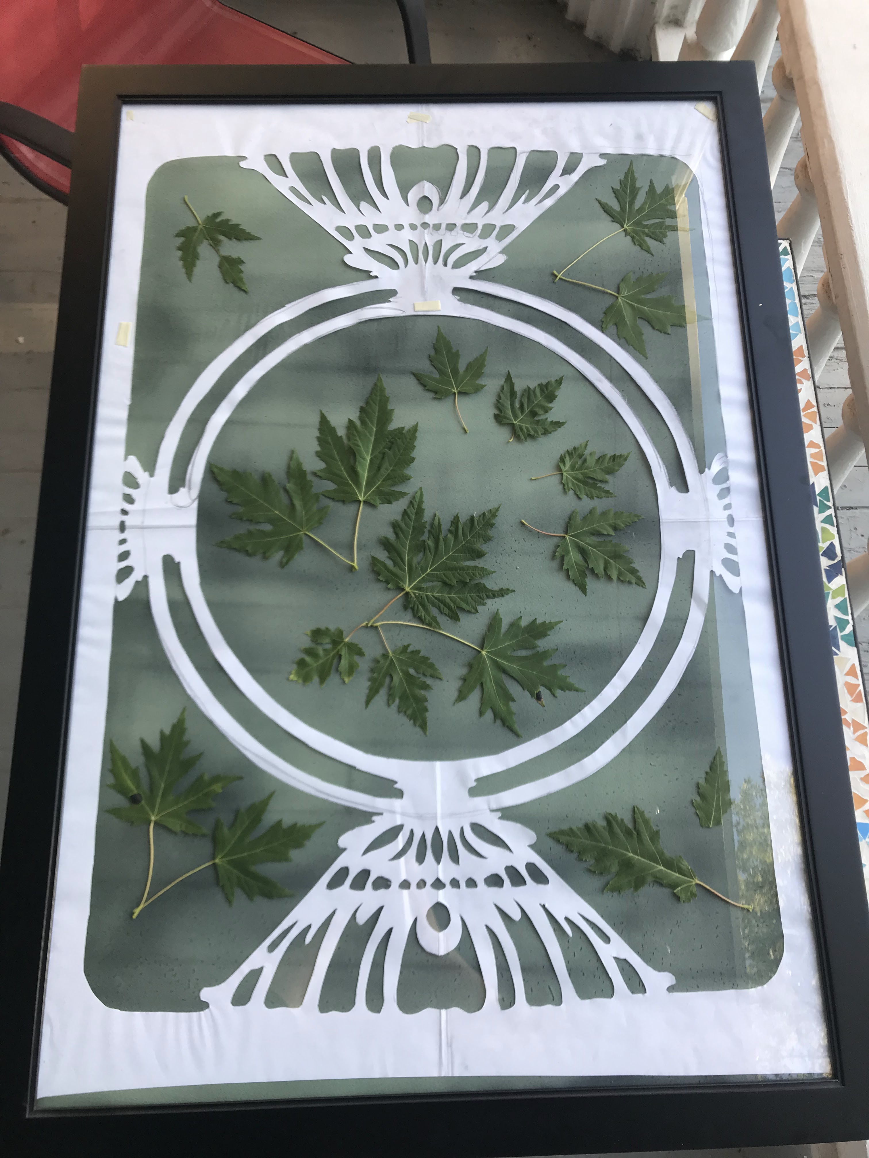
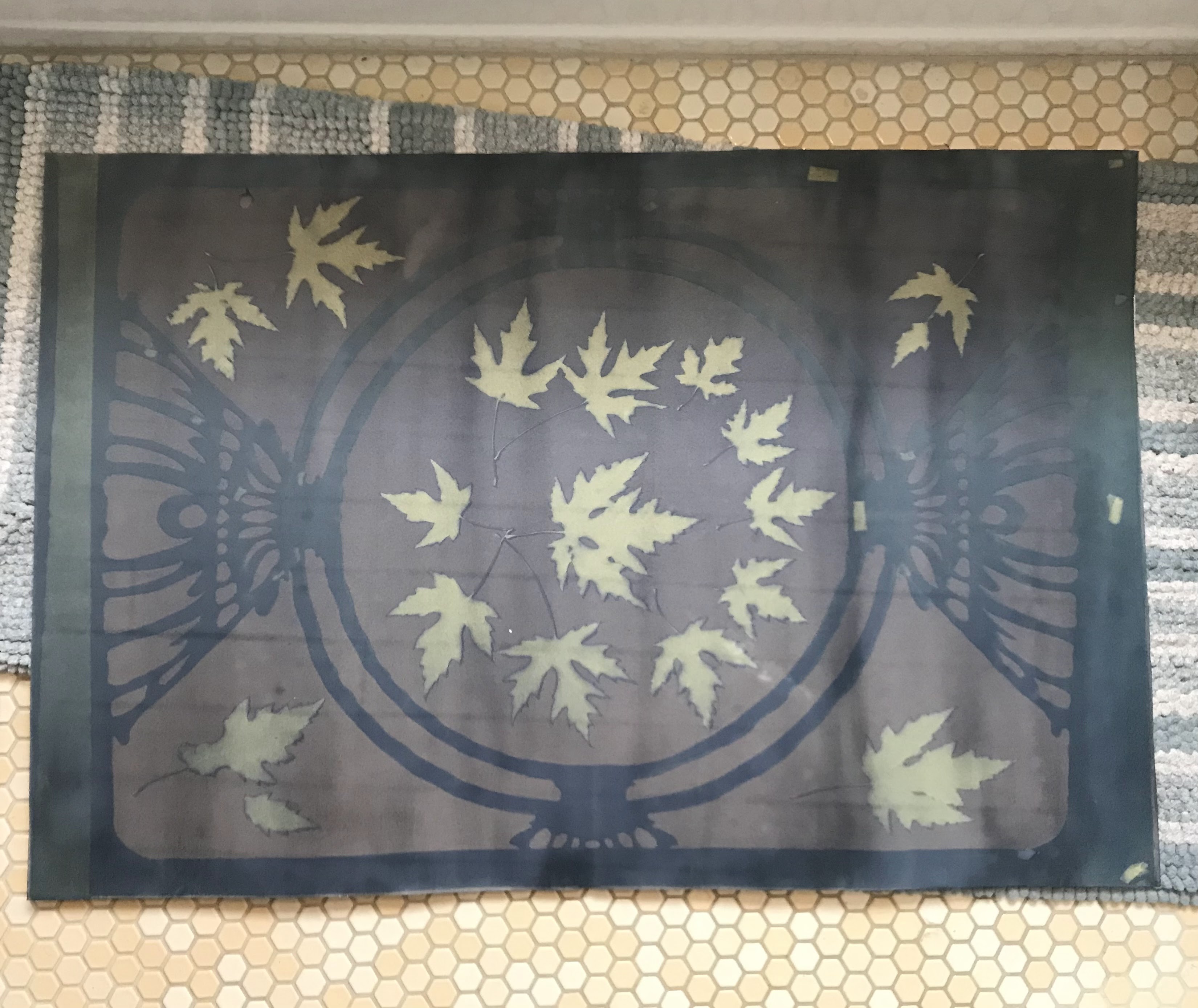
I made a few test exposures before I worked on the big paper. After several failed tests, I felt confident in my exposure times. I gathered leaves from outside and sensitized my big paper in order to prepare everything for the next morning.
I prepared my print by placing the decorative paper frame on the paper and arranging the leaves around it. The paper and everything on it was then placed between panes of glass and left in the sun. I tried leaving everything in the poster frame, but after a rough print, I realized that the center was not pressed against the glass tightly enough. Luckily, I prepared three papers to expose as contingency for exactly this scenario.


I continued with a double glass pane exposure method. To tell when the exposure was done, I looked at the color change in the print. The chemicals start as a green and slowly turn blue, then brown. This is the reaction taking place, as molecules convert from the reactants to the products. Once I deemed the exposure to be complete, I took the print inside to my bathtub filled with water. I gently ran the big paper through the water to wash off undesirable chemicals, this is when you get a first glance at the print.
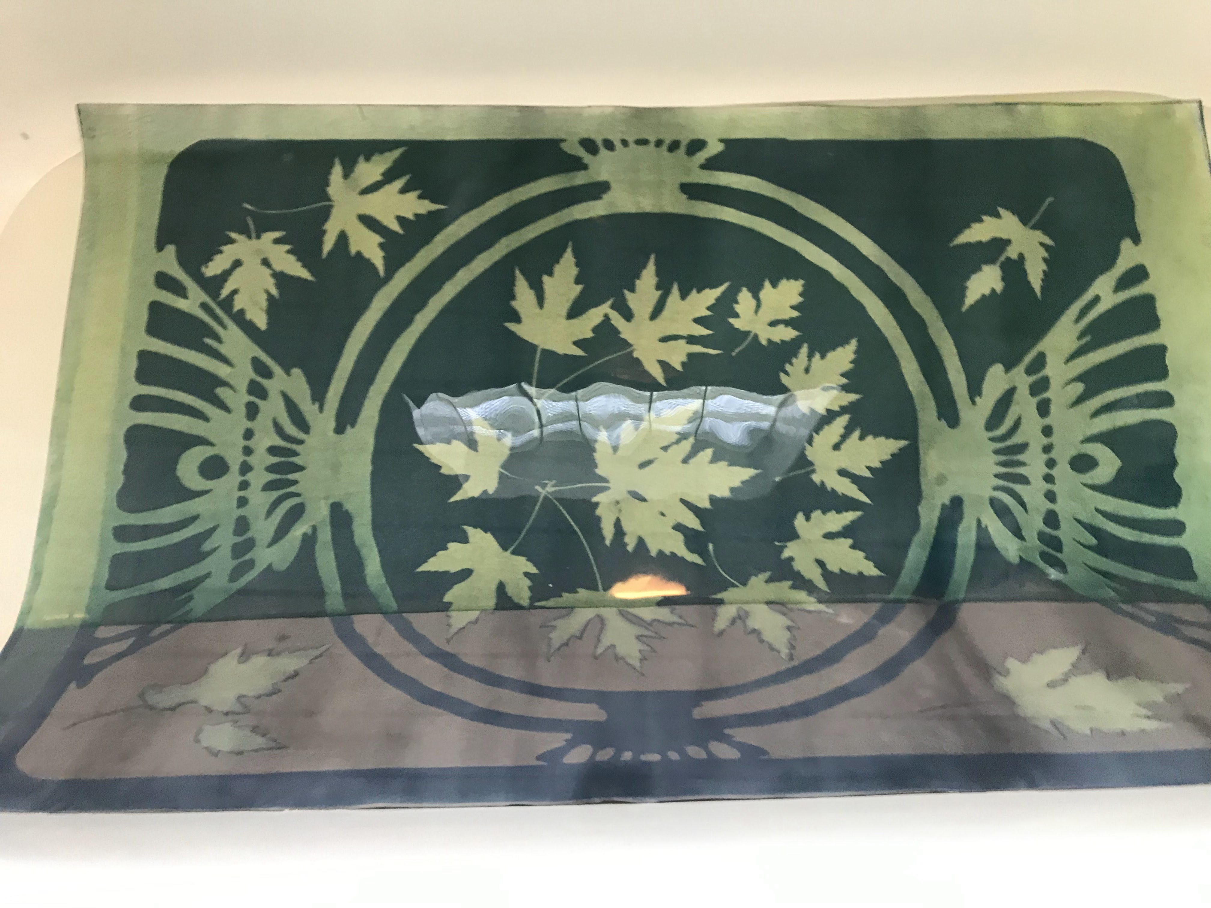
I then hung the prints off a towel rack in the bathroom to dry. The blues continued to get darker and develop as the paper dries. My second print, the ginkgo leaves, was partially exposed before I wanted it to be exposed. It is not super evident in these photos taken immediately afterwards, but this print has since darkened considerably in the frame areas.