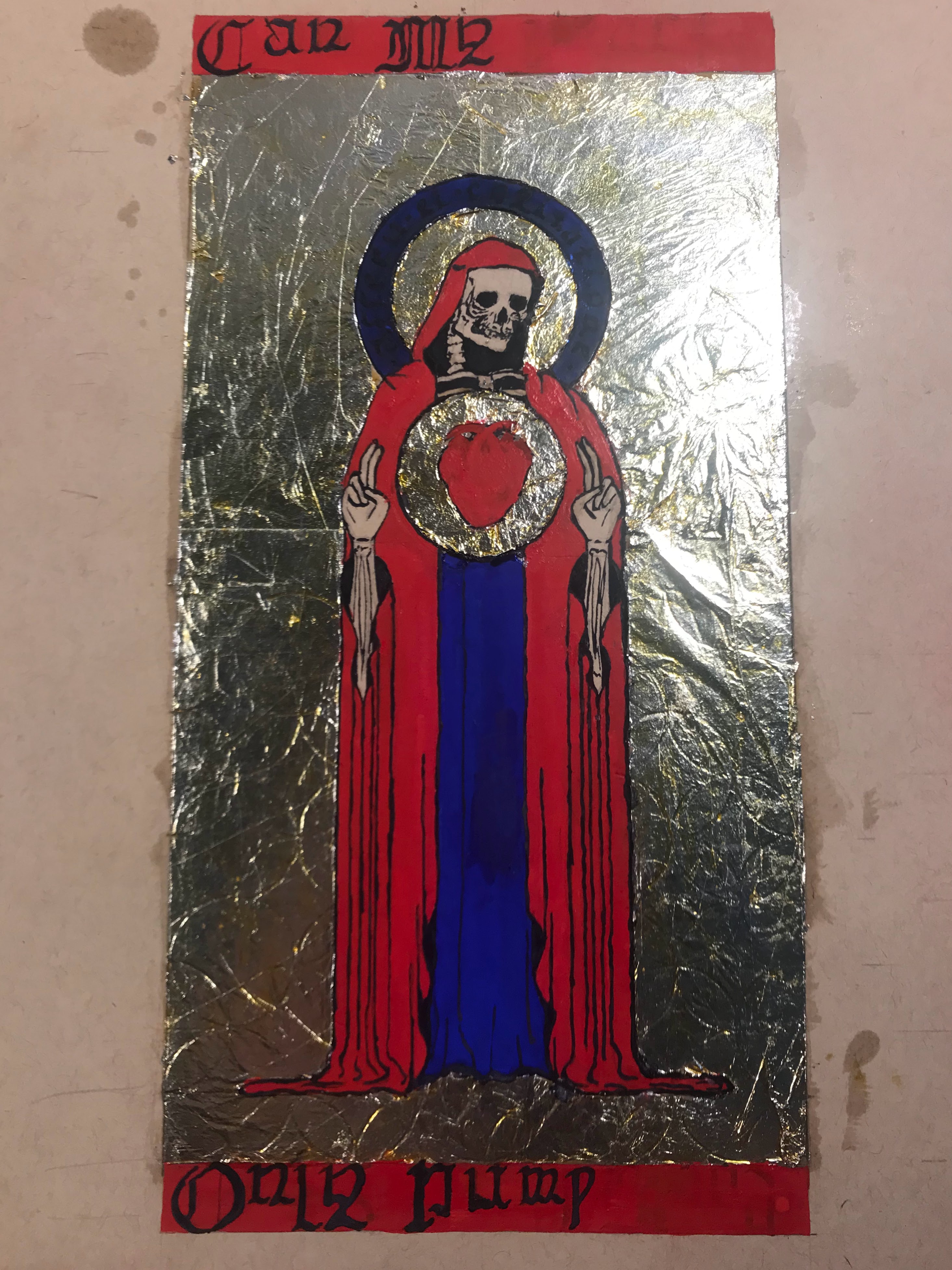
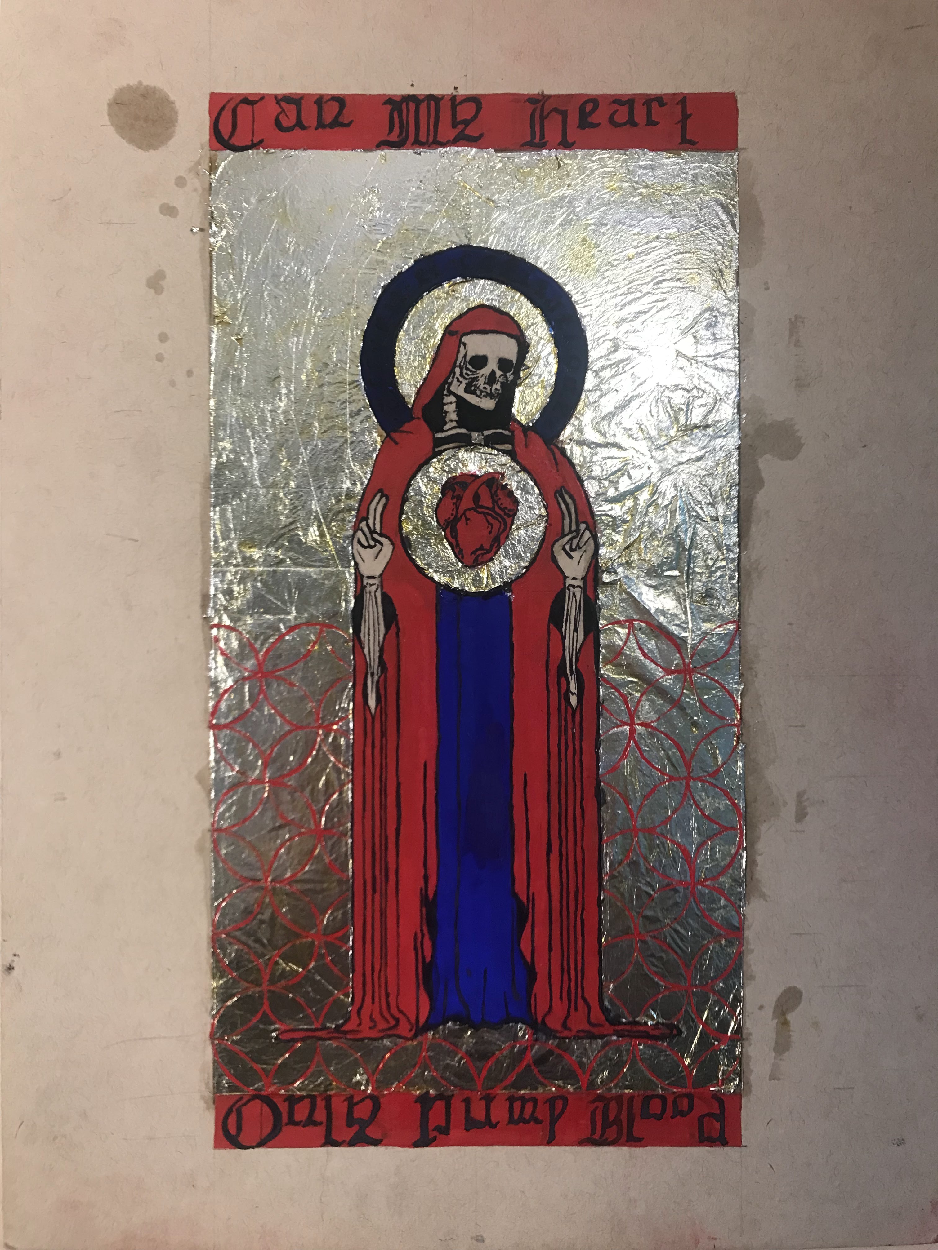
Illuminated manuscripts have been a major inspiration for me over the last couple of years. I am a huge fan of the complete integration of text and design. Most of my information on techniques or materials comes from The Craftsman’s Handbook by Cennini, On Divers Arts by Theophilus, and The Materials and Techniques of Medieval Painting by Daniel V. Thompson. My design comes from a sketch that I made a couple years back, when I was better at coming up with slightly vague and ominous wording to accompany my work. The skeleton mostly represents my aversion to drawing people.
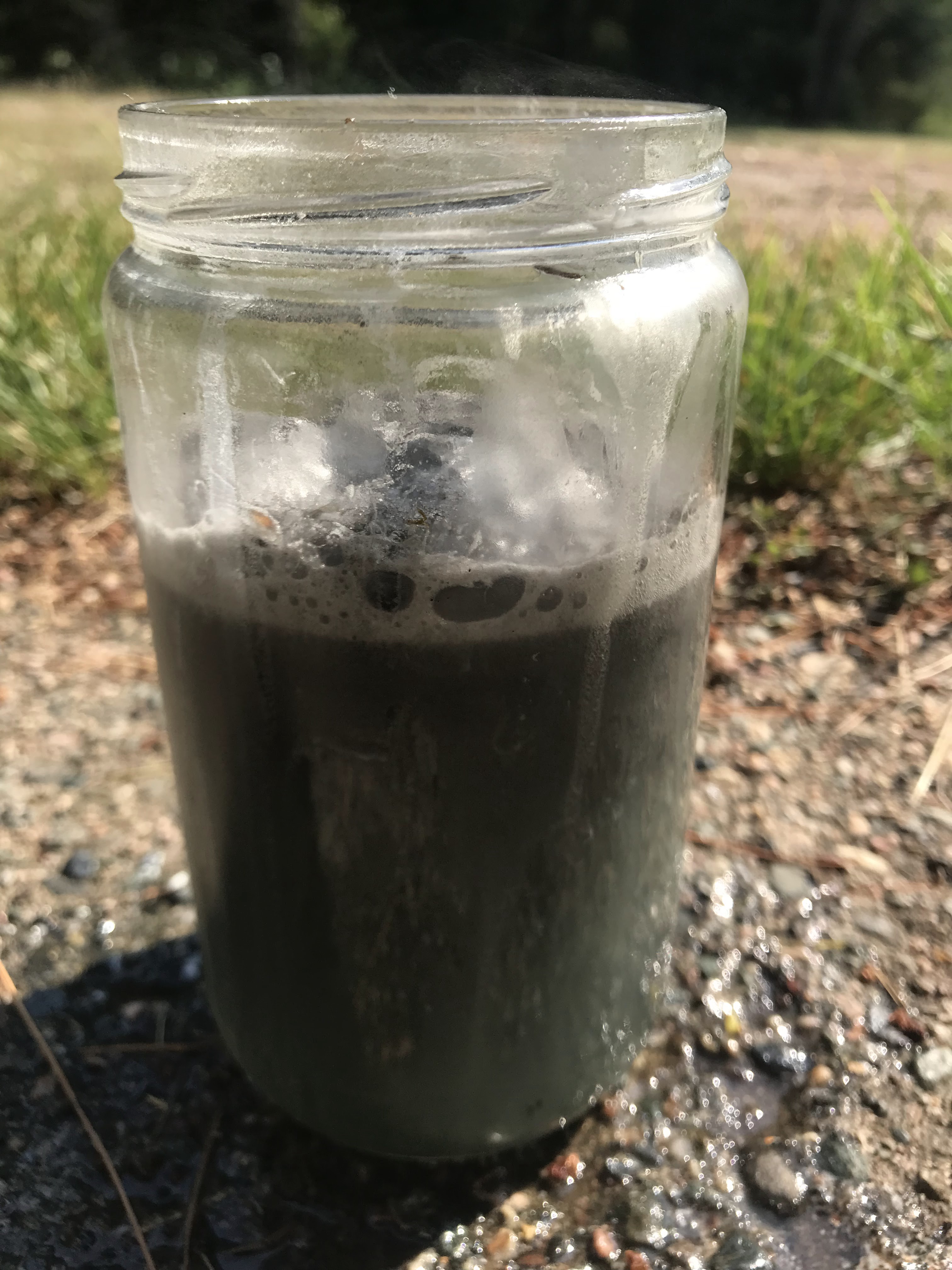
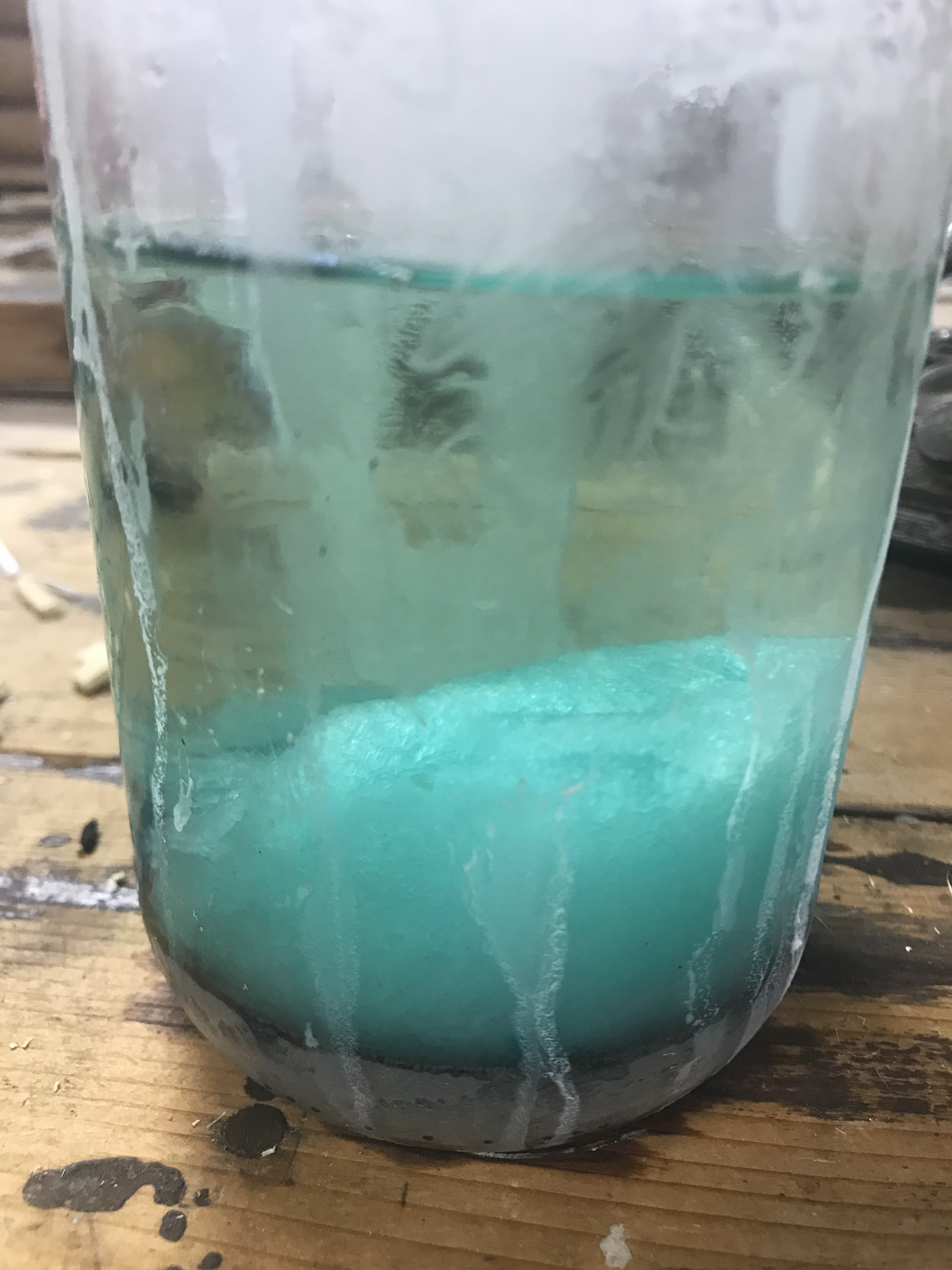
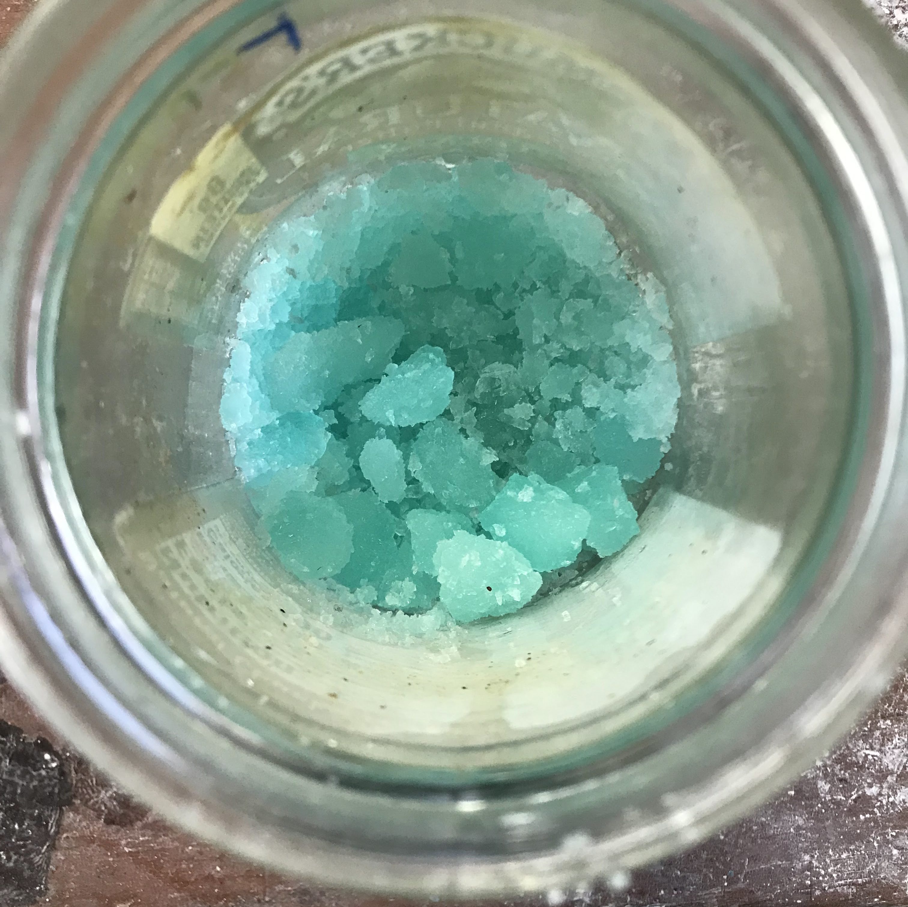
There are many components that went into the creation of one sheet. The first material that I wanted to make sure to have was the ink. Iron-gall ink was the standard for scriptoriums because of its permanency and pure black tone. As the name would suggest, the ink consists of iron and gall, in the forms of iron(II) sulfate and oak gall concentrate, respectively. I made my iron(II) sulfate, sometimes called ferrous sulfate, from dissolving steel wool in sulfuric acid. Steel wool is not pure iron and contains other components like carbon which do change the composition of the final product. The final result is still mostly iron(II) sulfate. As the steel wool reacts with the sulfuric acid, it oxidizes to the iron(II) state, and the reaction is exothermic and violent if the steel wool is not added slowly. Pale green crystals of iron(II) sulfate begin to form after the reaction stops bubbling. I waited overnight to give the crystals time to form. The next morning, I set up a gravity filtration to separate the crystals from the liquid, which most of the impurities from the steel should have stayed in the liquid.
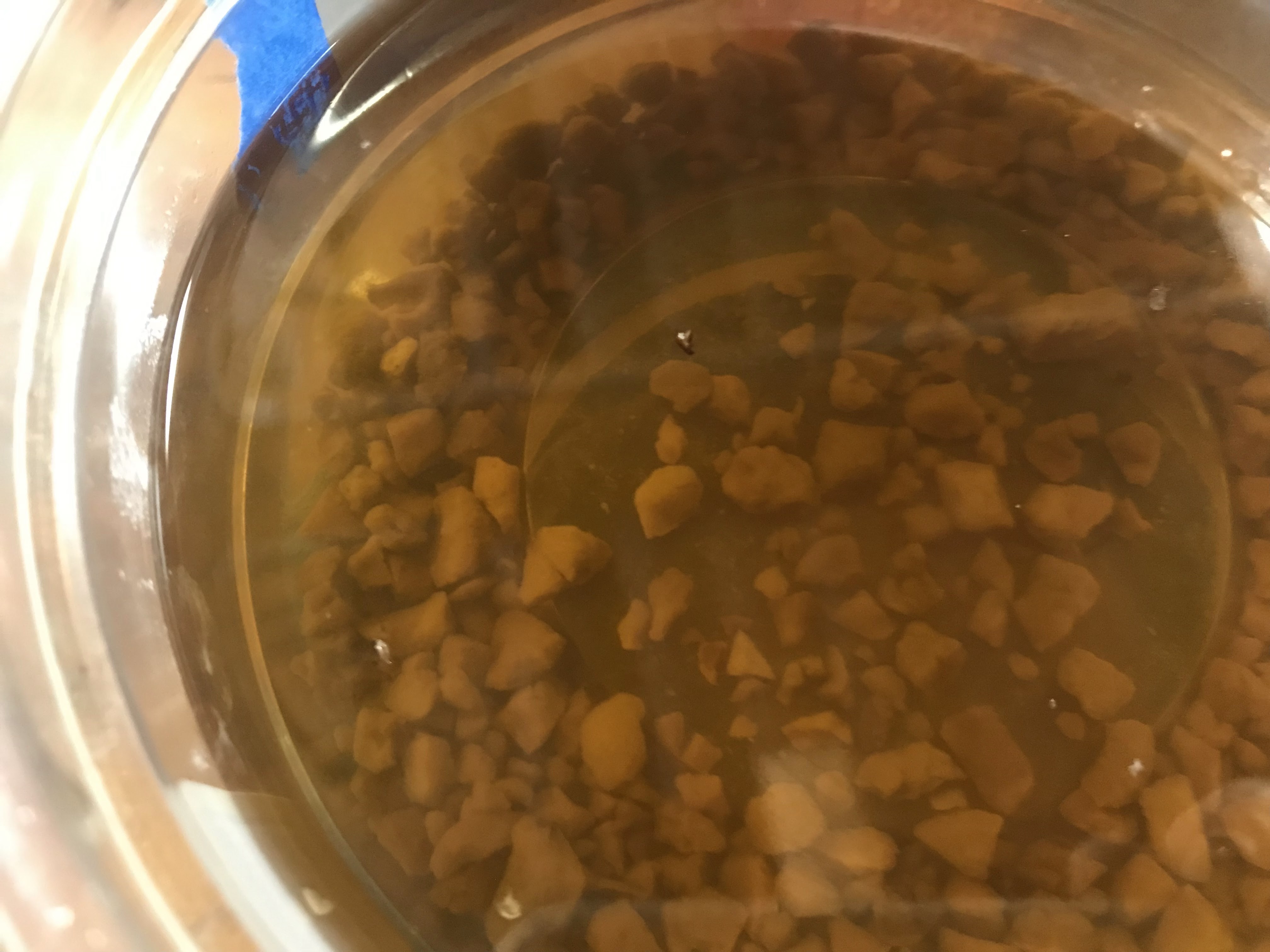
For the gall component, this only requires creating a gall concentrate. Wasps create gall on the trees that they occupy, and oak gall has been harvested and used for centuries. For my purposes of making ink, oak gall is important because it contains tannic and gallic acids. Tannins in other materials have a bitter taste, like in wine, but they also turn dark when exposed to oxygen and stain very well, like wine or walnut shells. To make the concentrate, the gall must be left in vinegar for at least nine days. The gall concentrate on its own could make a decent ink, but it looks more like a dark brown than a black. Combining the iron(II) sulfate with the gall concentrate, along with a little water to help dissolve the iron(II) sulfate, creates a dark ink. When the ink is first applied, it looks watery and faint, but as it gets exposed to the air and the water evaporates off, it darkens significantly and can retain a good shine if applied thickly enough.
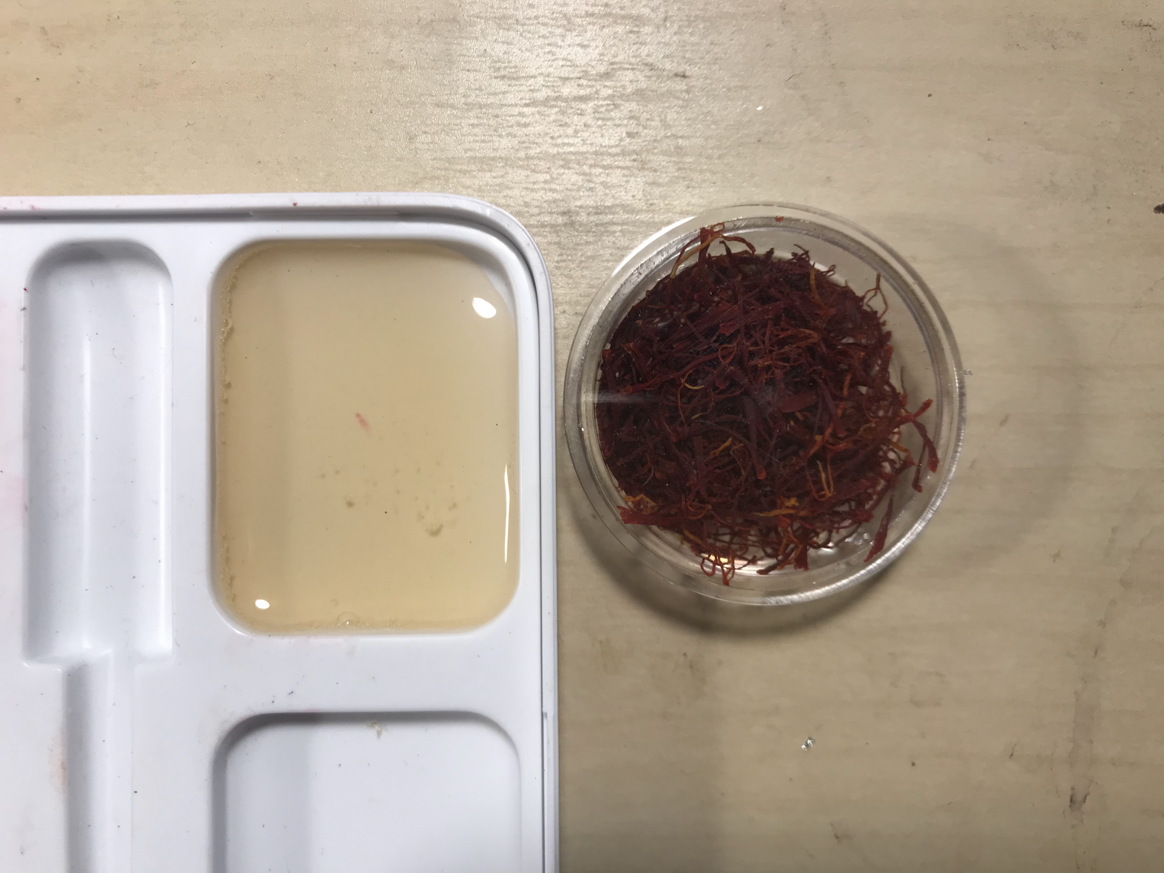
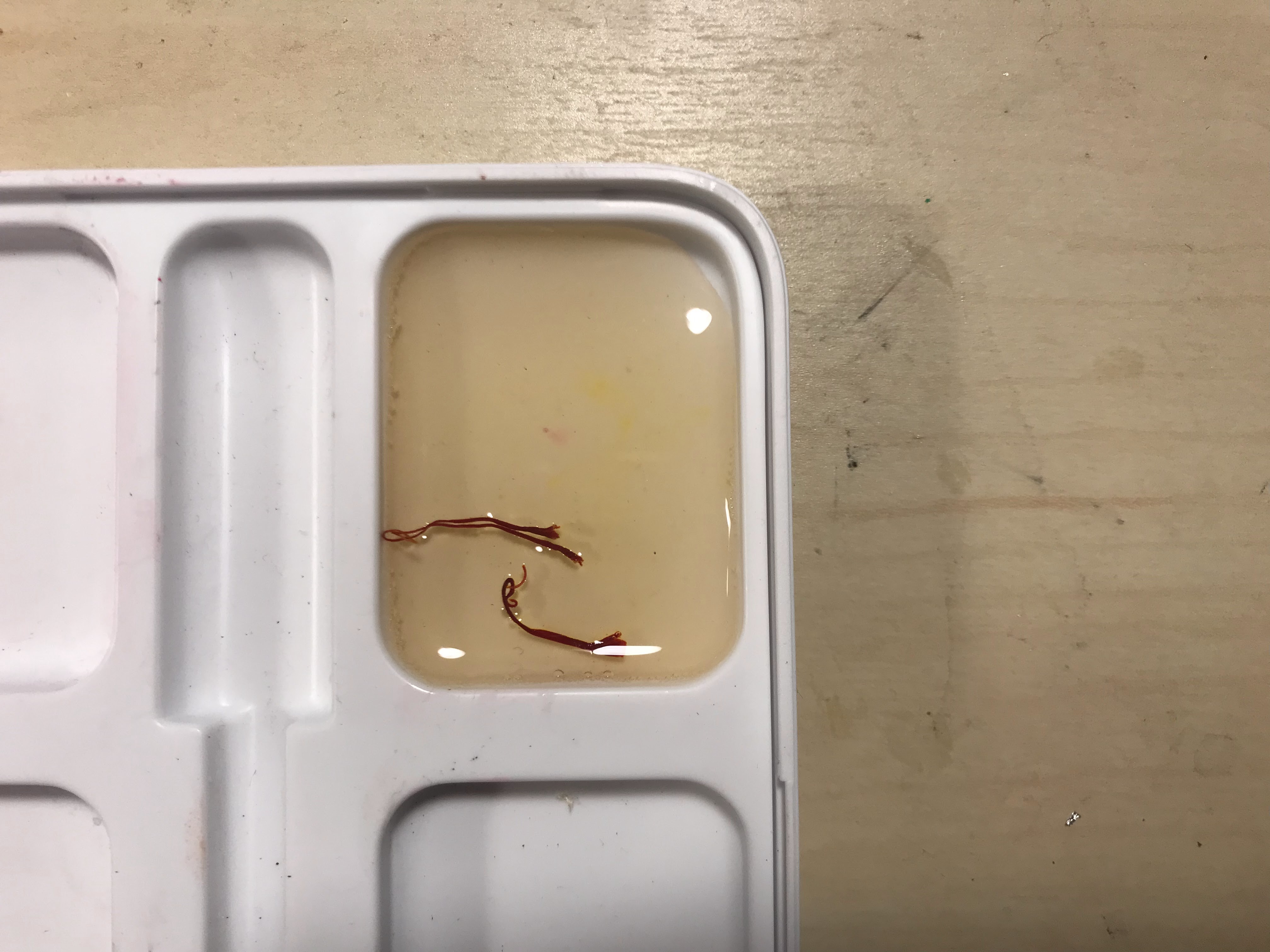
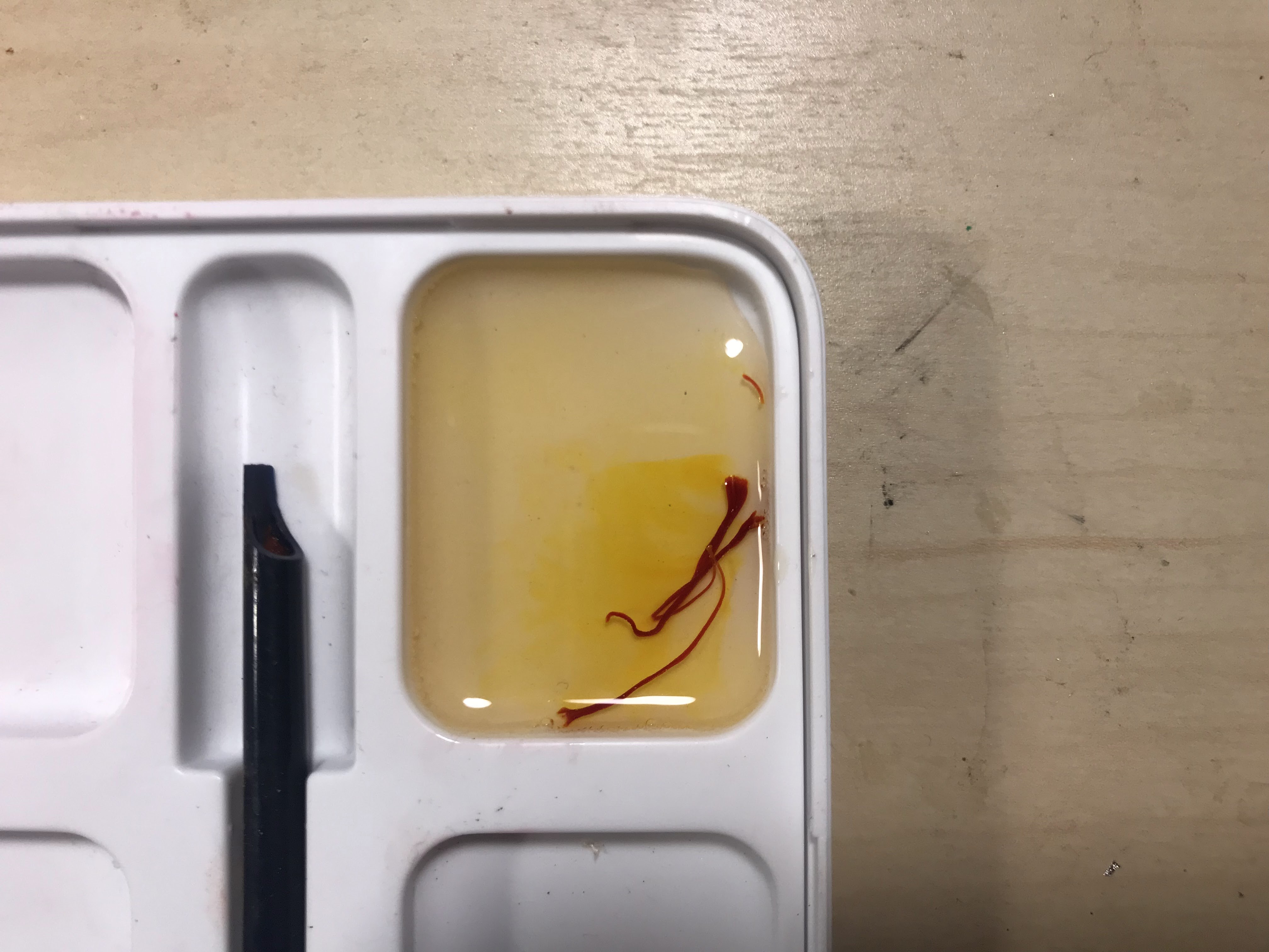
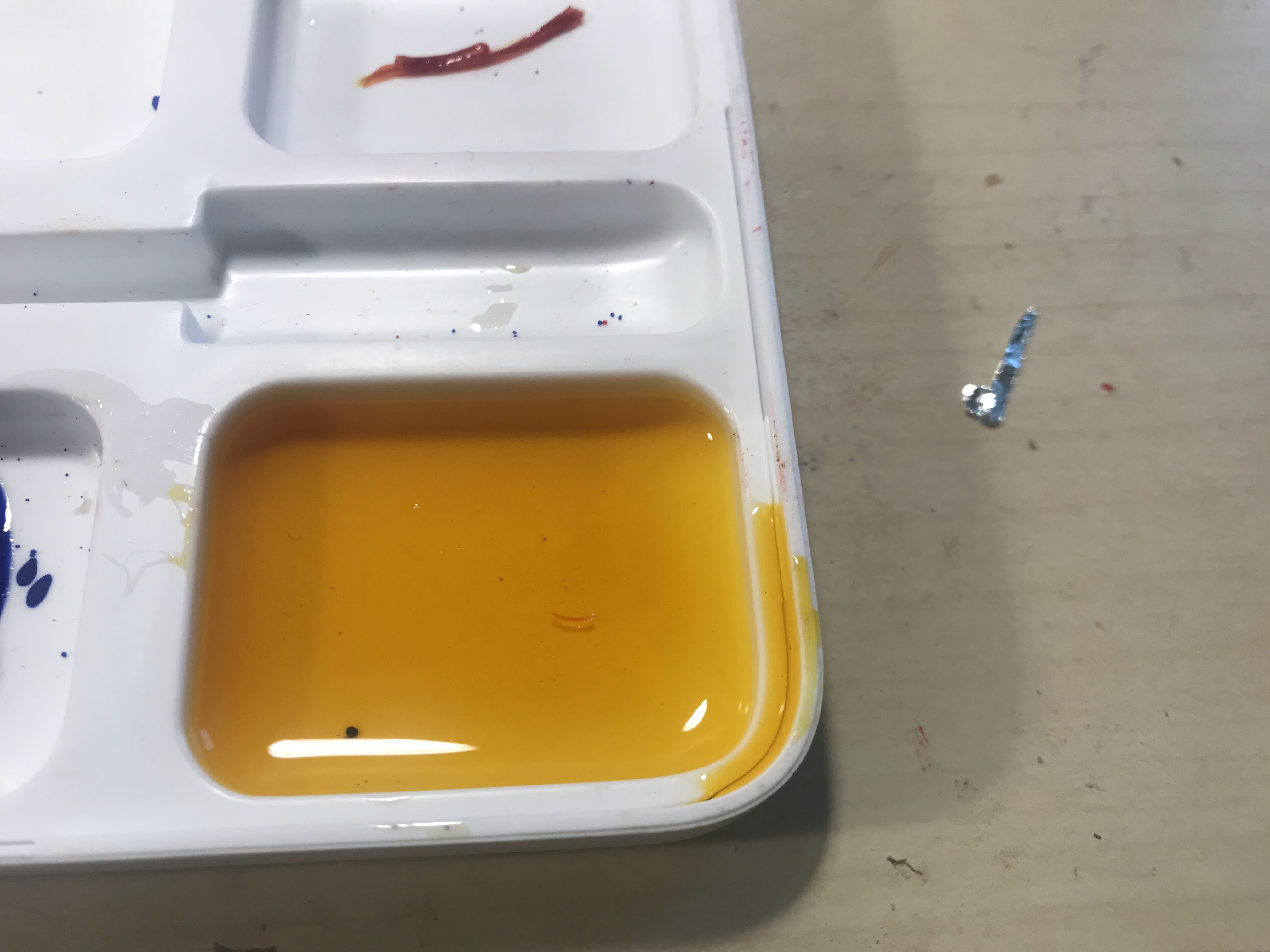
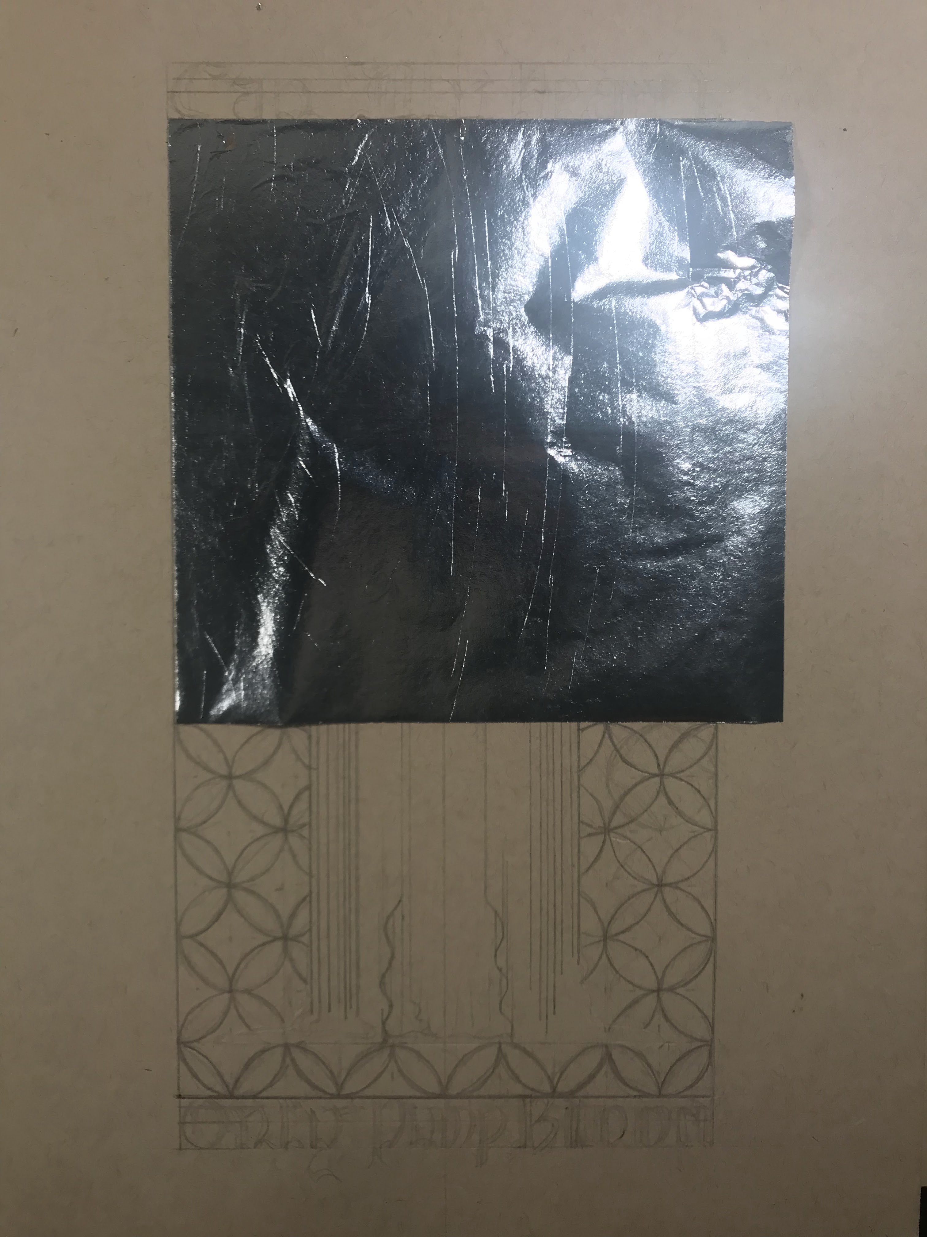
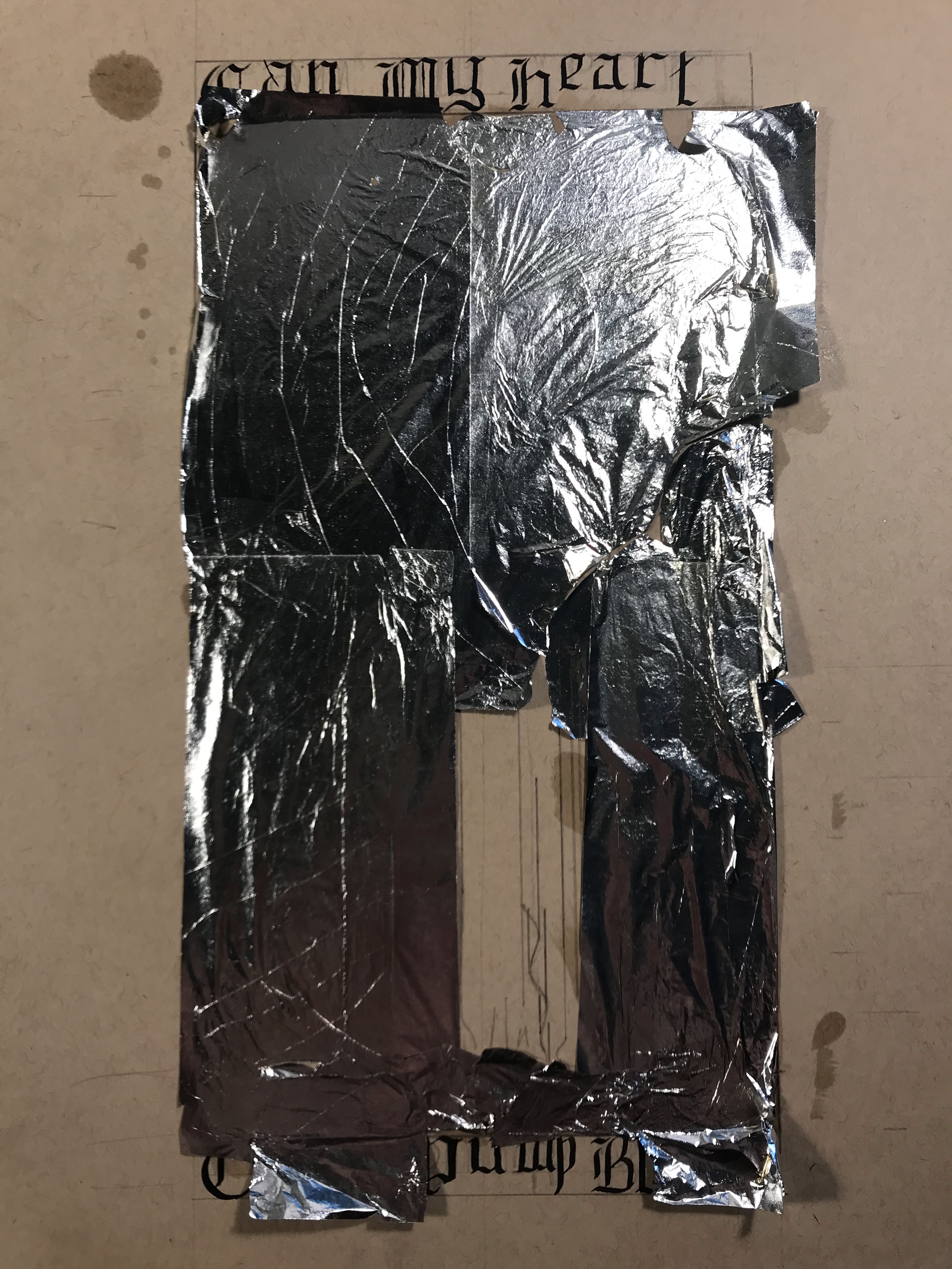
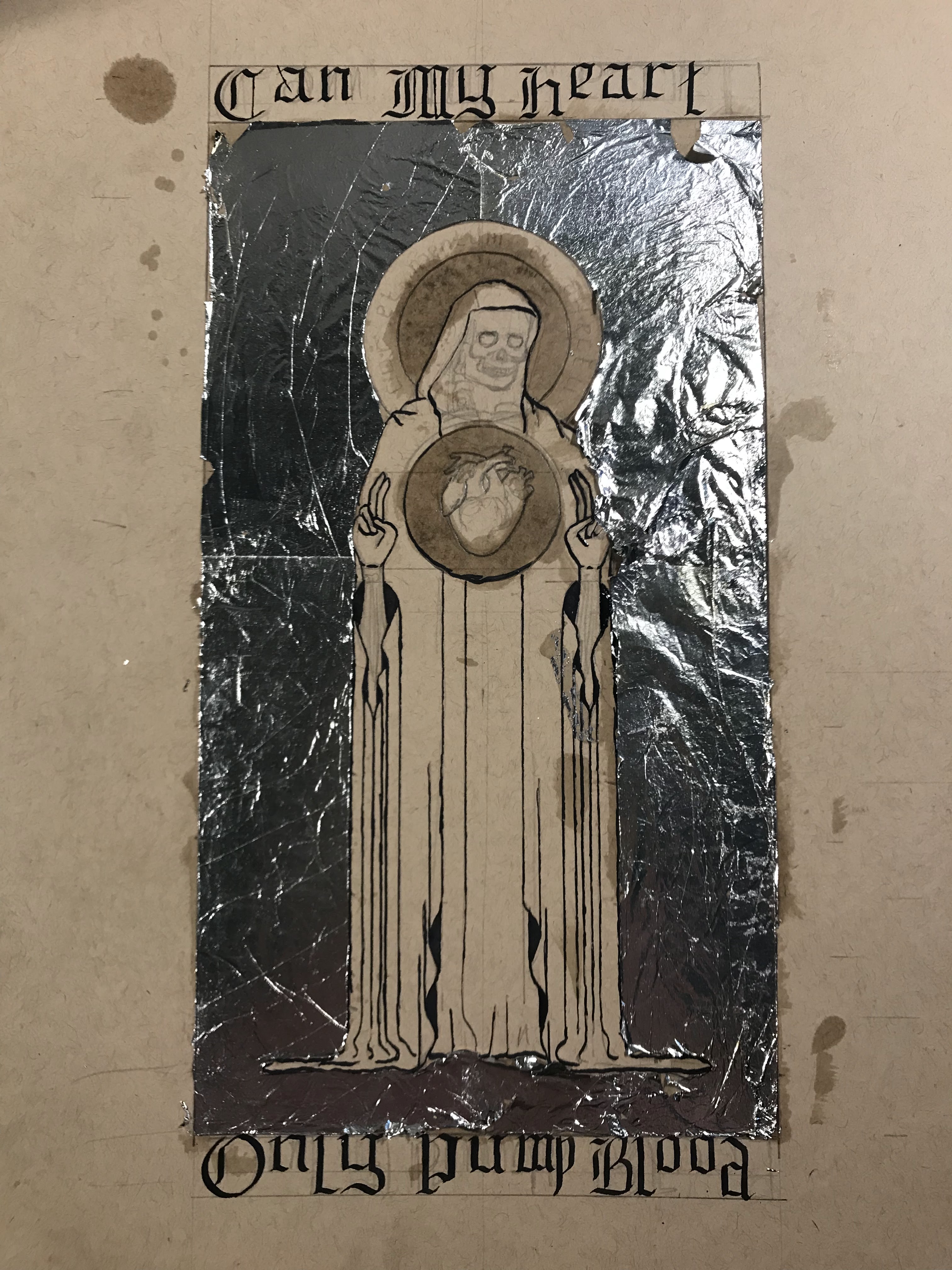
With the ink settled, I started to look into gilding. As I am new to this, and I am not making a profit off of my experiments, I decided to rule out using real gold leaf. Instead, I found a technique in On Divers Arts called “doratura”, though I have also seen it elsewhere called “auripetrum”, which uses tin leaf instead of gold leaf. After applying the tin leaf, or aluminum leaf in my case, it gets a coating of saffron-infused glair to make it look golden. Glair is also the medium that I used for the paint, and it is made from beaten egg whites left to settle. Beating the egg whites breaks the protein structures so that it becomes smooth once it rests and turns back into liquid.
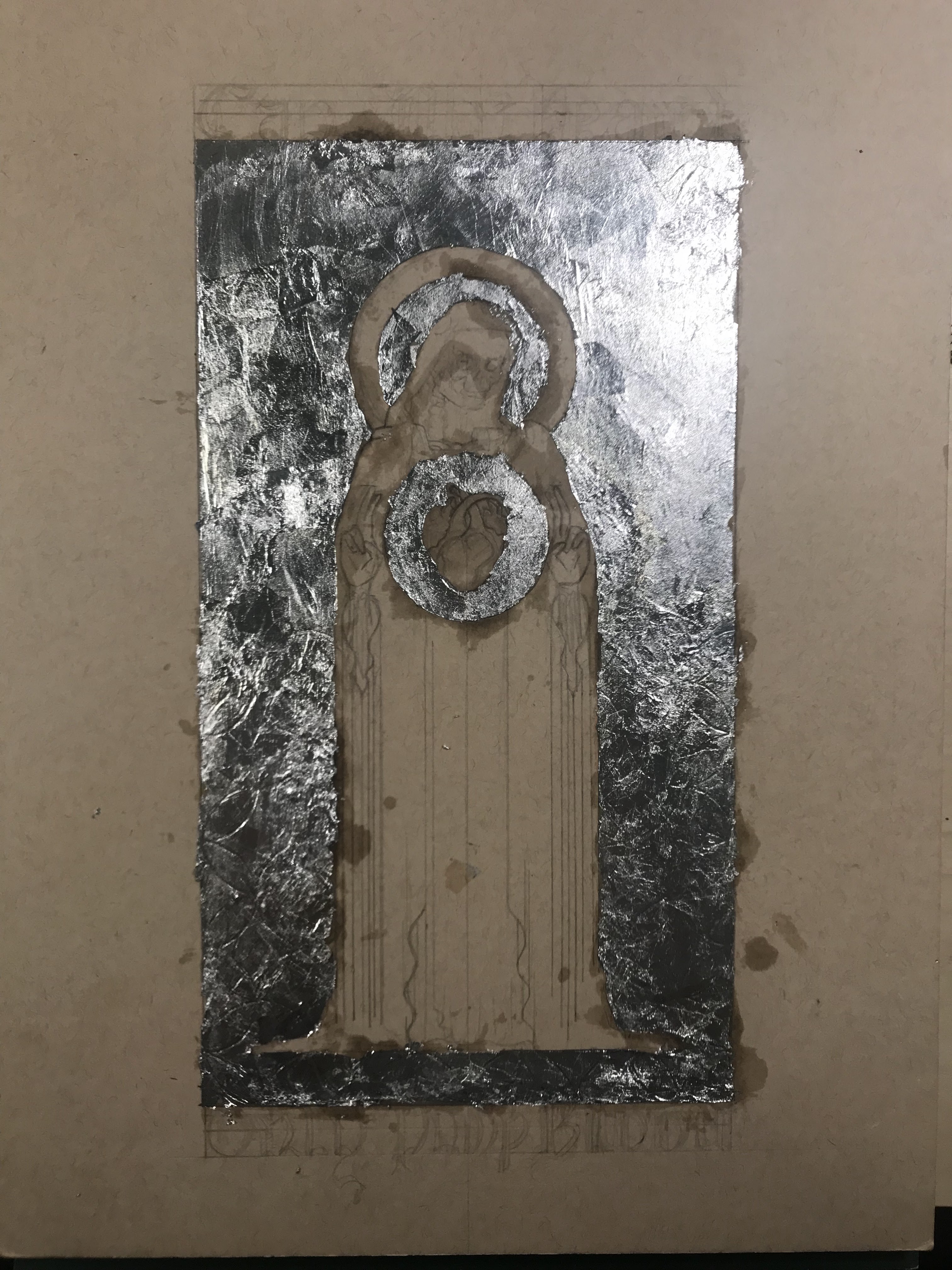
I attempted this project twice. I learned a lot from the first attempt, so I tried it again with a little more success. The biggest thing that I learned after my first attempt is that patience is a virtue, and letting the materials have time to fully dry and set up makes life much easier. During the first attempt, I tried laying down the aluminum leaf and cleaning it up all at once. Leaf is infamously difficult to work with, and without waiting for the adhesive to dry, it was flying everywhere, tearing, and sticking to everything. It may be the worst gilding that I have ever seen, but I tried my best.
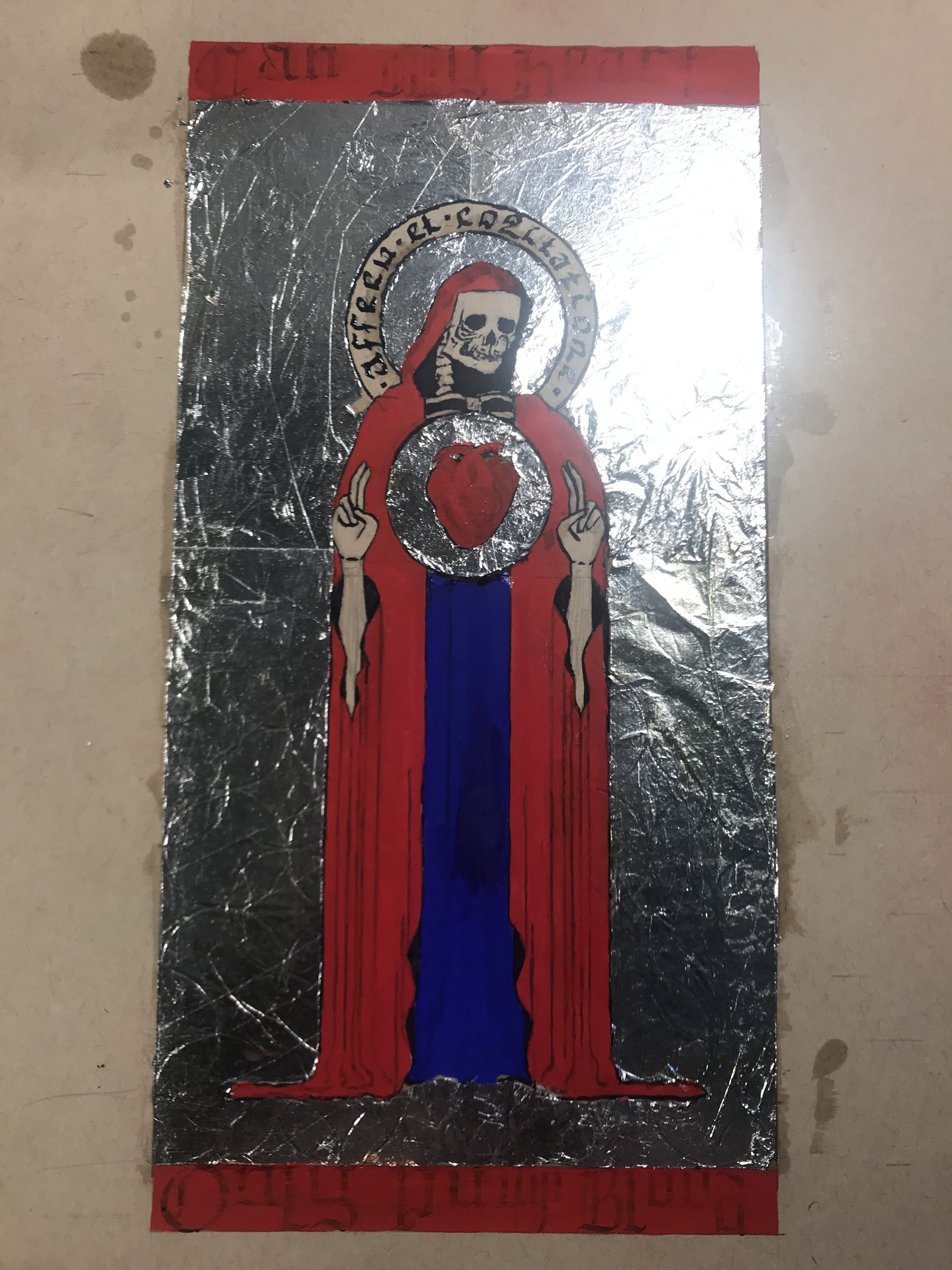
The other problem with the first attempt was that I did not have the correct pigments. Ideally, this would be in ultramarine blue and vermillion, in order to be accurate to medieval manuscript painting. At the time of the first attempt, I only had blue verditer and madder lake, which are not close substitutes. I thought that the blue verditer would appear more like ultramarine than it does, but its tone is much lighter. Blue verditer also has a coarse consistency which made it more difficult to mix into the glair, and the paint itself came out grainy with spotty coverage. However, I think that trying to grind the blue verditer further would only make it paler and look even less like ultramarine. As far as the madder lake goes, I thought I could make it resemble vermillion by first applying an underlayer of yellow ocher to warm up the naturally cold-leaning madder. The layering definitely helped, but it really cannot compete with the brilliance of vermillion.

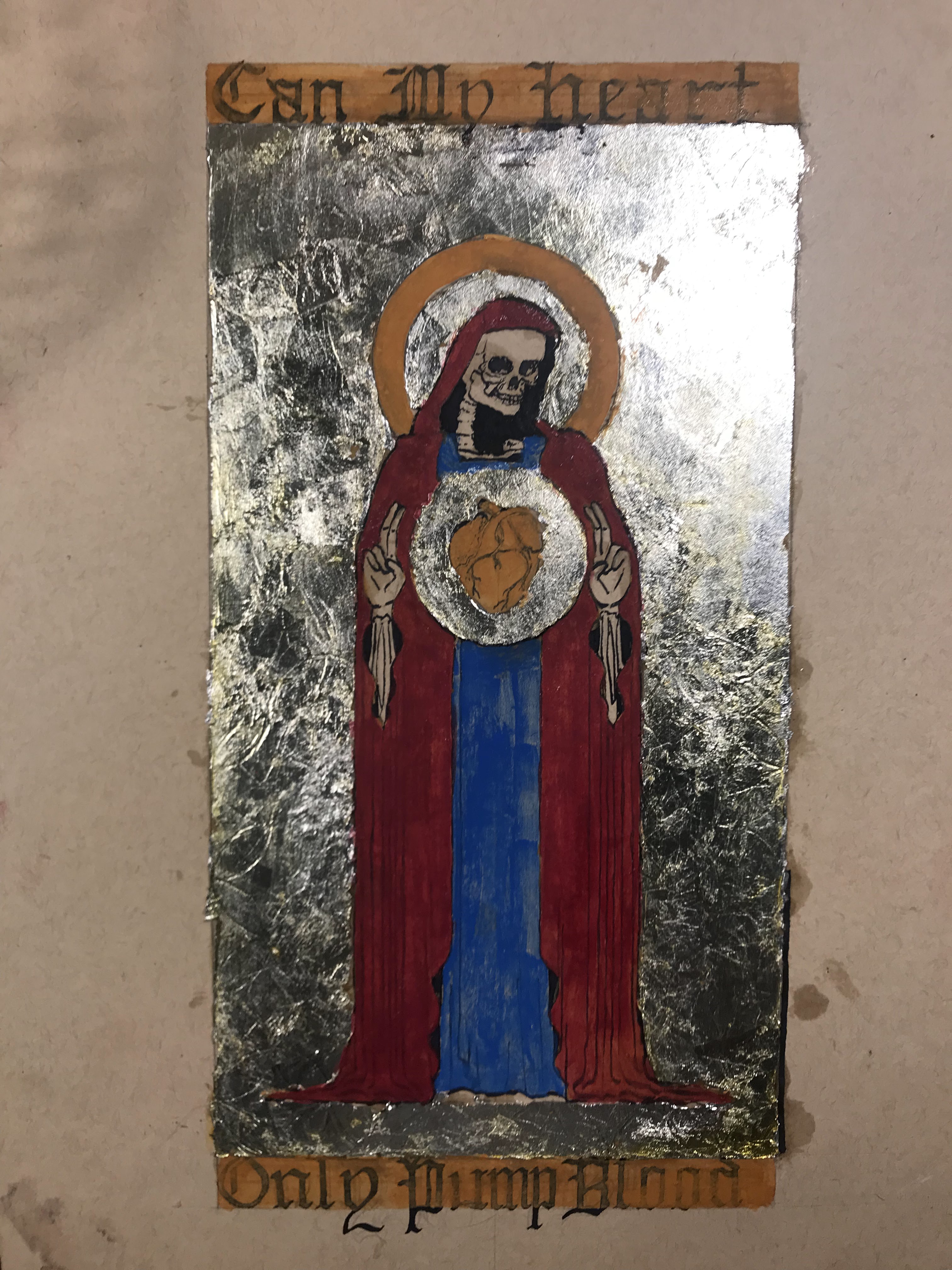
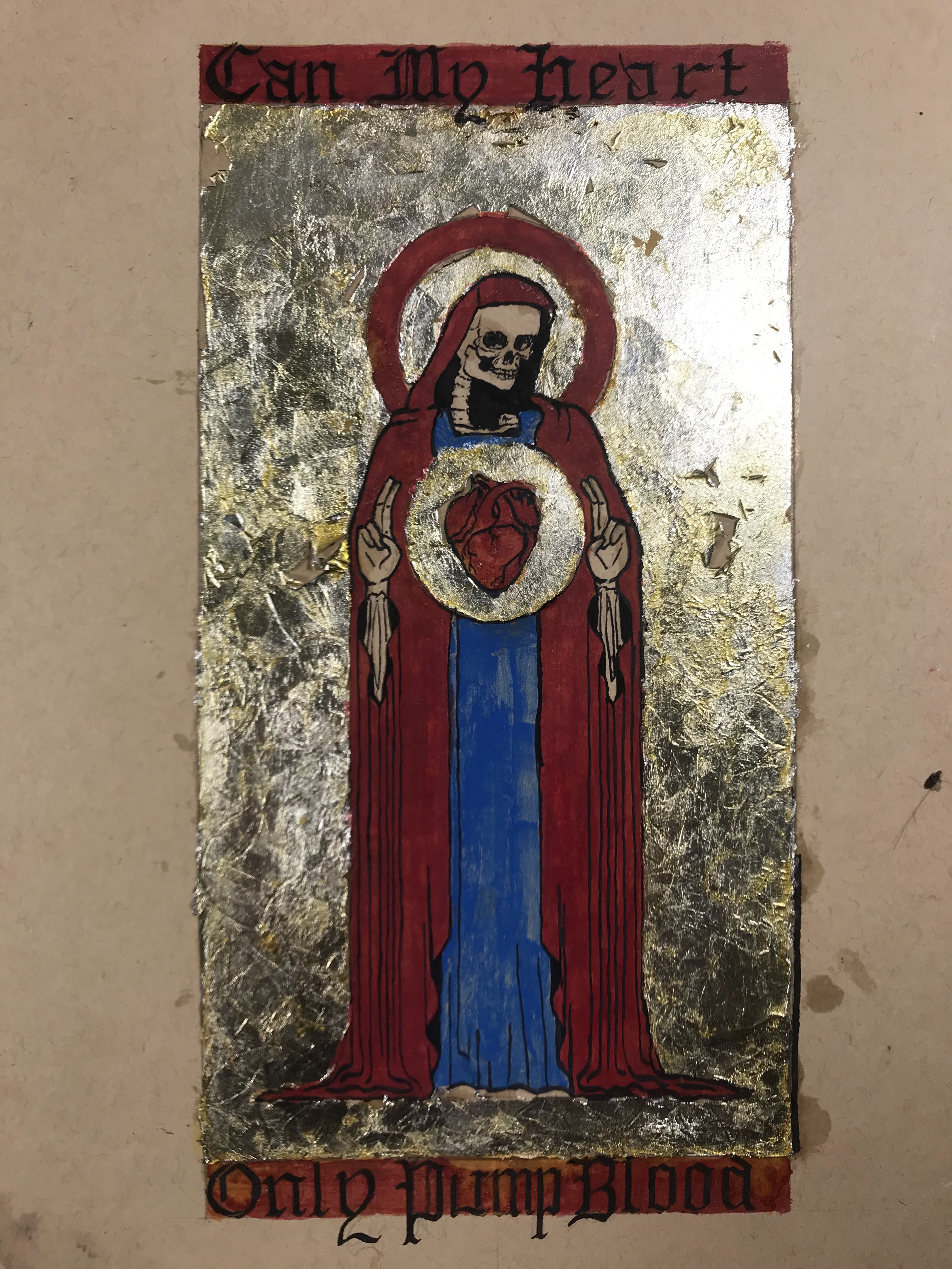
For the second attempt, I vowed to be more patient with the gilding, and I made sure to track down some proper ultramarine and vermillion pigments. My gilding could definitely be improved, but I think it looks better than the first try. I would like to track down a good stone burnisher to help smooth the leaf into a mirror-like finish, but maybe next time. My hand was notably shakier as I inked the second attempt, and the ink did not go onto the paint as easily as onto the smooth paper. I also added some honey into the glair for the second attempt because I noticed in the first attempt that the paint became scaly once it dried, and some of the glair over the gilding became brittle. The honey should help give the glair a little more body and help it dry more slowly and evenly. I think that the gilding looks more golden in real life than it does in any of the pictures.
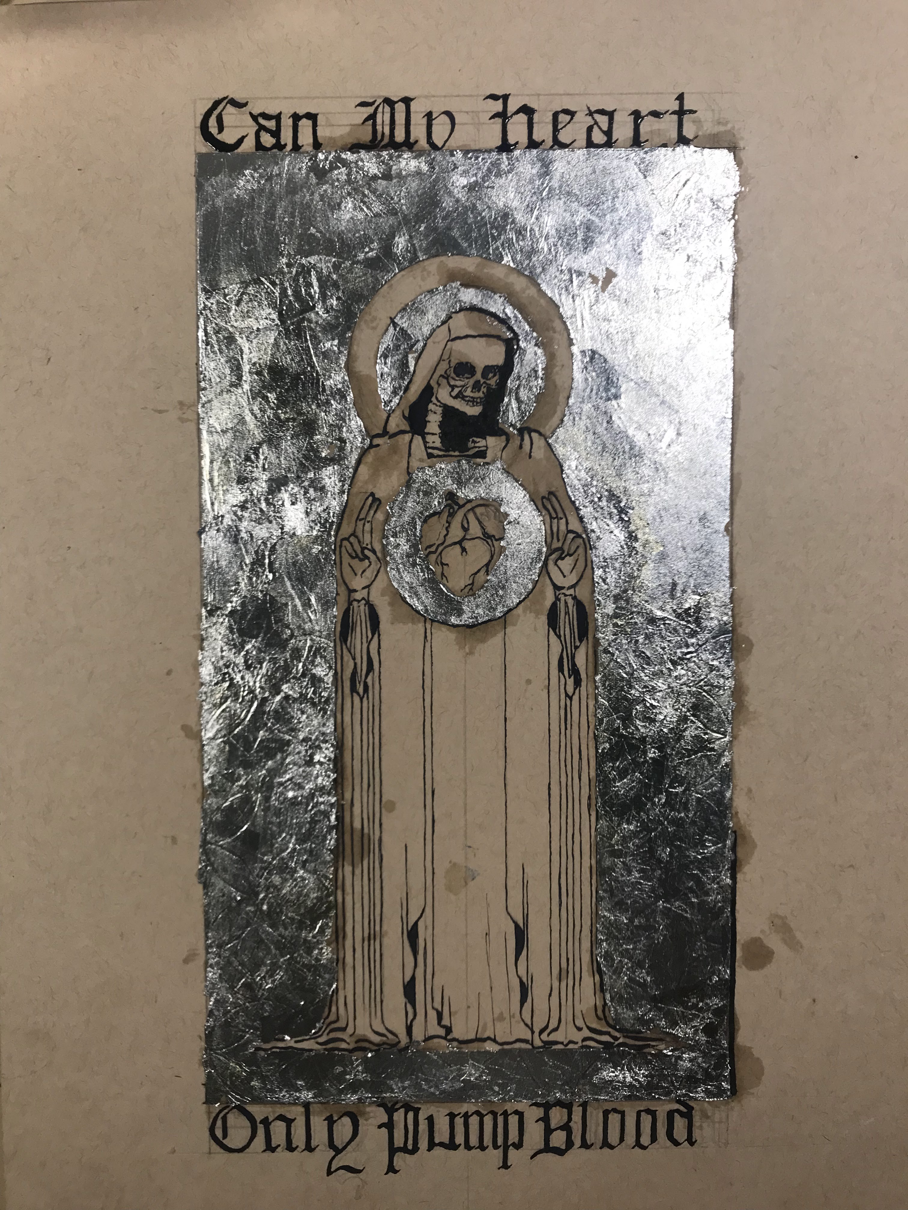
To outline the entire process: I first laid out the design in pencil, and I pressed down enough to make a small imprint on all of the lines. I also took an exacto knife to lightly go over the lines where I would trim the gilding. Then, I applied adhesive and laid the aluminum leaf. After waiting overnight for the adhesive to set, I trimmed the excess gilding and patched up any holes or tears to the best of my ability. I whipped up some egg whites for glair and got some saffron infused to apply onto the aluminum leaf. After that, I inked the letters and figure, then mixed up the pigments in more glair, and painted the rest of the design. Once the paint dried, I inked all of the lines and letters again.
All in all, I learned a lot, and I plan to make more manuscript-inspired pages. I know that I need to work on my gilding, and my calligraphy is a little out of practice. There are many aspects in medieval painting that maximizes the use of color and abstraction in conjunction with text and symbolism. These elements created a language for religious art and book design. Medieval painting might look a little silly to us now, but it shaped modern design as we know it today.
