Grotesques originate from Roman Antiquity, where they were painted onto walls. The rooms in which they were painted in were referred to as grotte, or caves, and thus grotesque means “in the cave style”. Late Romans used this style to decorate their spaces with fantastical, impossible elements and figures. There are human figures with animal-like or plant-like features. In addition, the style combines elements that do not occur together in nature, such as plants in architecture. In a sense, grotesques were a form of surrealism. Grotesque remained popular in Early Christian wall paintings, but mainly manifested as vegetal motifs rather than featuring fantastic figures. Grotesque fell in and out of fashion throughout the Middle Ages, but securely got revived in the Renaissance and Mannerist periods. Grotesques became a permanent motif among paintings, sculptures, architecture, and furniture as an element to bring drama and decadence. The grotesque also become an important trope in literature, as portraying a monster as more comedic or empathetic.
In architecture, when figures are attached to gutters and draining systems of roofs, they are known as gargoyles. Figures are considered grotesques if they are purely decorative. Despite not draining water, many architectural grotesques feature an open mouth, much like their gargoyle relatives, whose open mouths serve as drain spouts. I decided to evoke grotesques from the decorations of Late Gothic and Renaissance architecture, but I kept true to its wall painting roots by making a fresco painting.
My design features a horned human face with a wide open mouth, as well as a scrolling plant motif. The plant is baneberry, which grows fairly abundantly in Northern Minnesota. Its berries are more vibrantly red in person than I could paint. It is also toxic, so I thought that it fit the grotesque thematically. I also tried to incorporate the baneberry leaves into the beard on the figure, but that proved to be much more difficult to implement in a fresco.
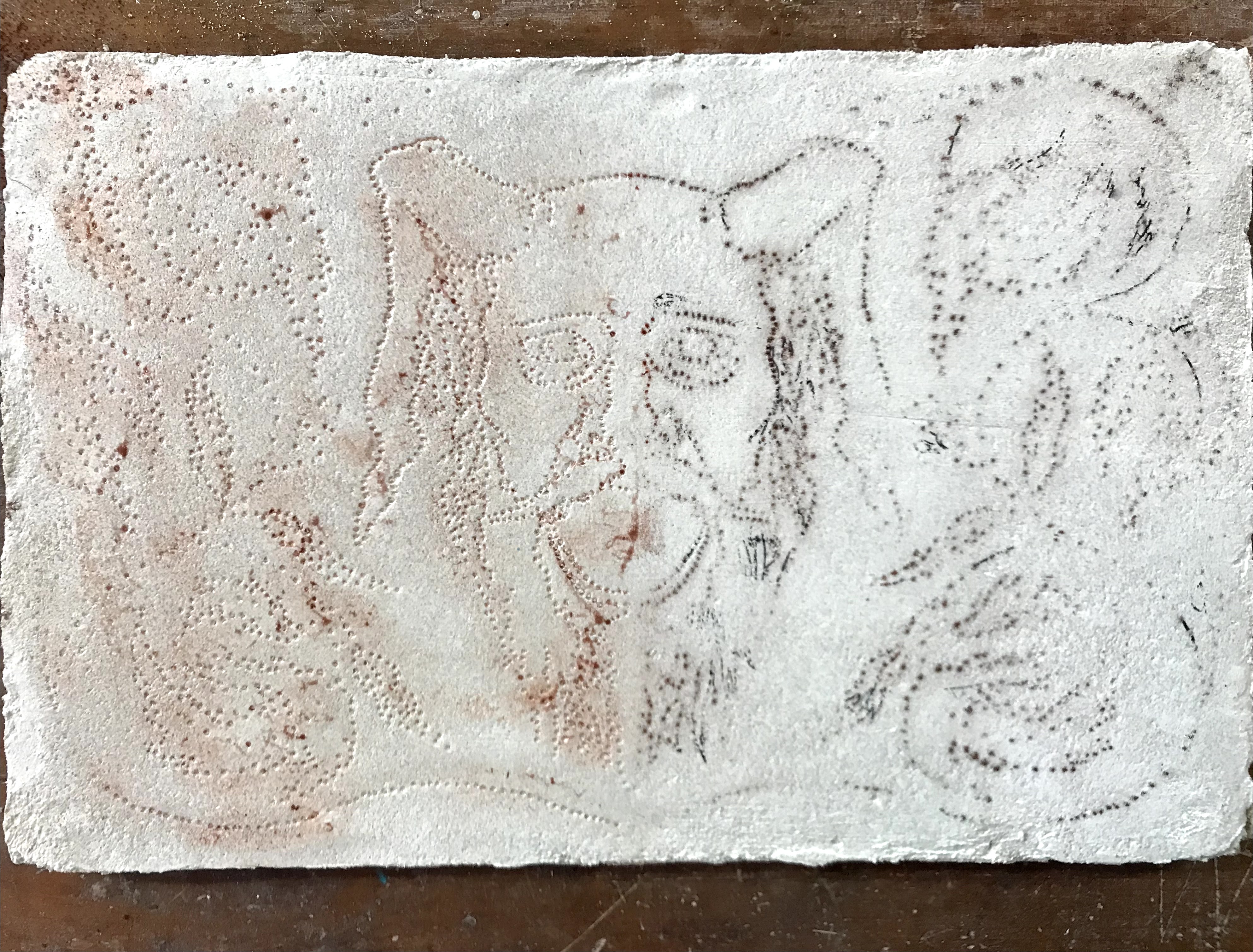
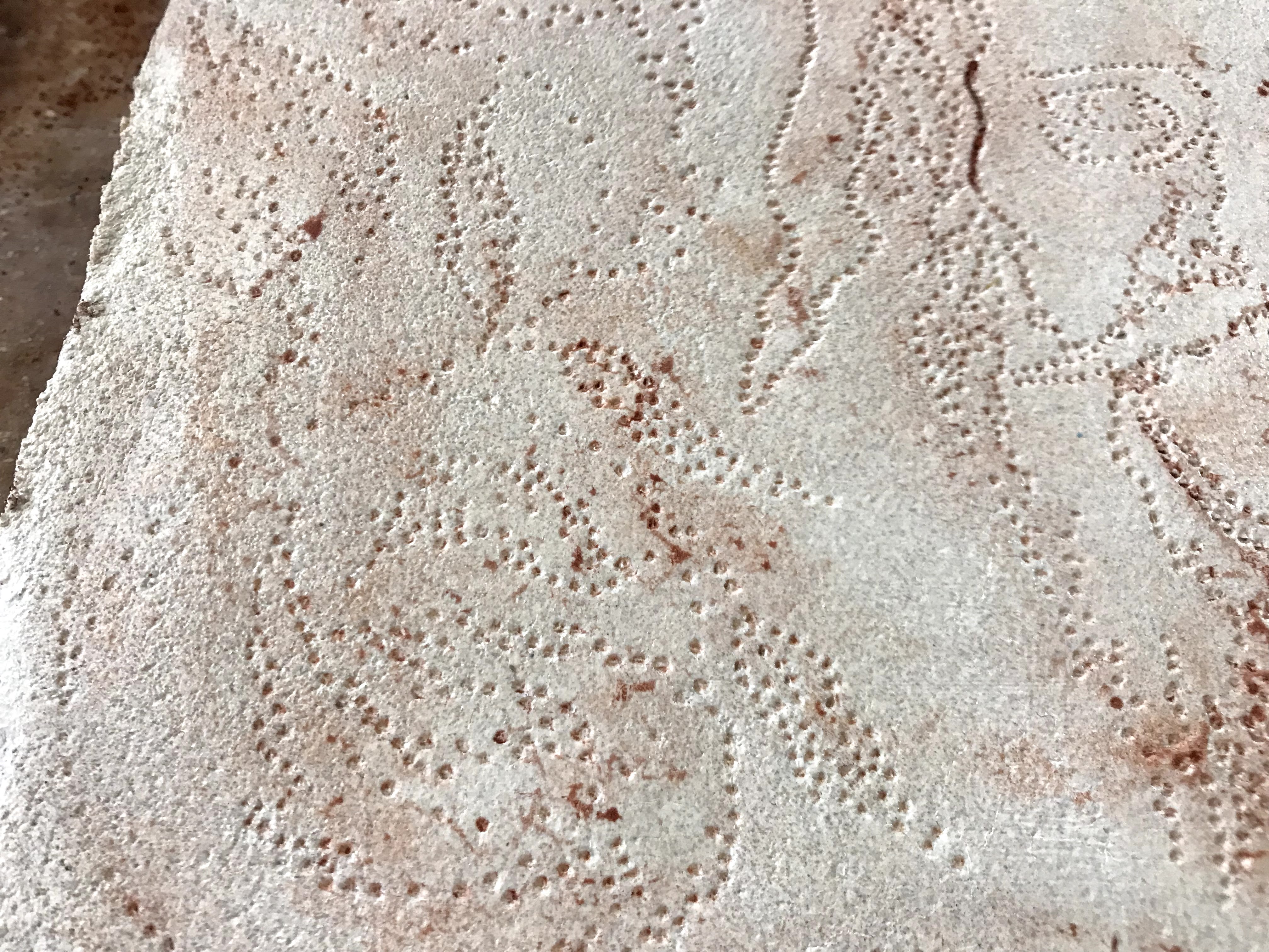
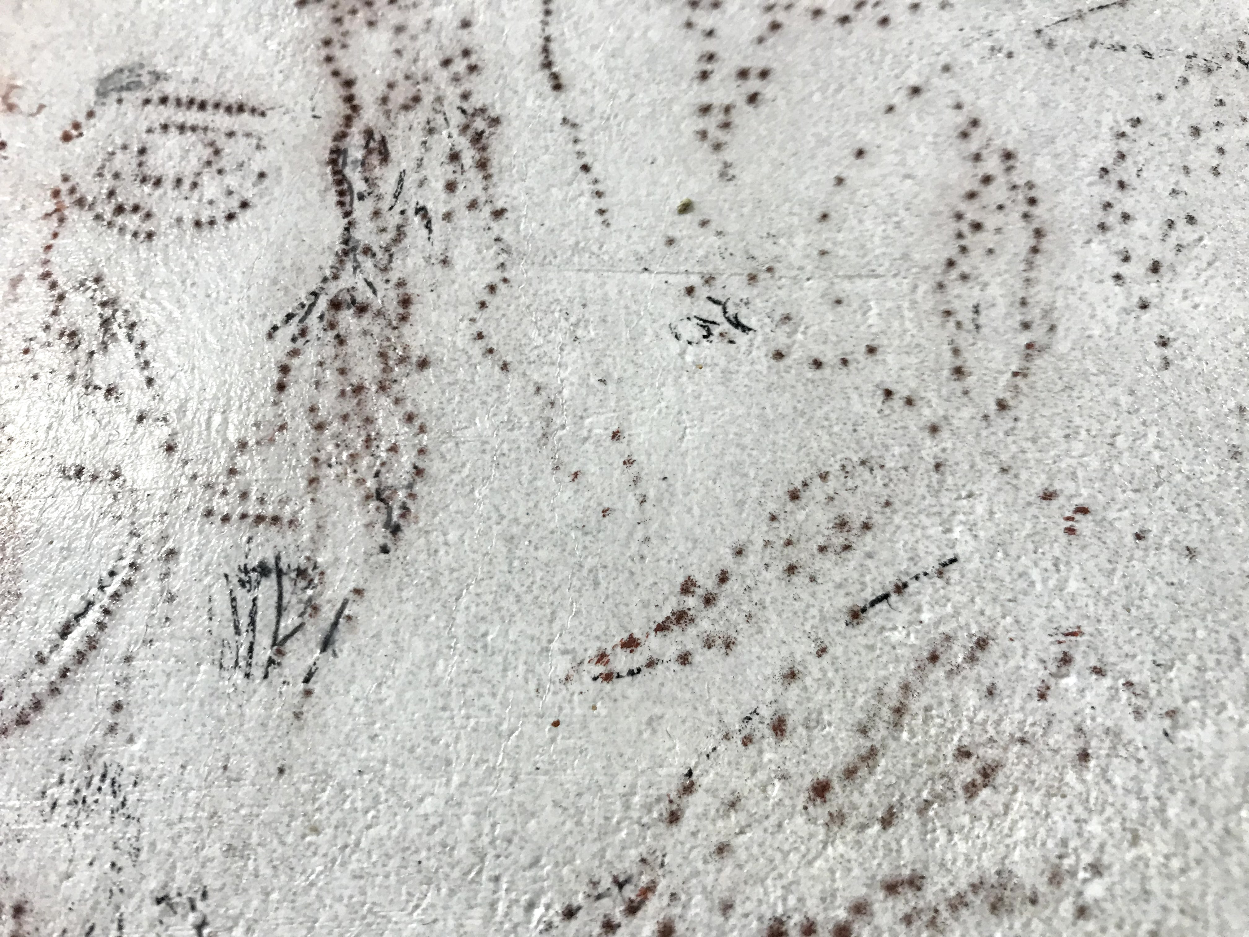
My methodology followed my earlier attempts for the most part. I laid down the first plaster layer and let that completely set up. Once the first layer was dry and I was ready for the next layer, I dampened the first layer and laid the second. As the second layer dried, I prepared the design to transfer onto the plaster. I tried two methods of transferring the design. I drew out the design, but I only punched through one half of the drawing. The punched paper can be pressed into the plaster to leave small dots in the plaster’s surface. The paper can be flipped over, and the holes left by the punches allow pigment to be pushed through and leave dots on the plaster’s surface that are easily traced to accurately recreate the image.
I waited for the plaster to dry until I was able to lightly press my finger in and leave a print but not dent the plaster surface. Then I transferred the design on. I used Indian red, yellow ocher, raw umber, and verdigris for the true fresco pigments. I also used madder red watercolors once the plaster had dried to give the berries a bit more color. Fresco painting is fairly straight-forward, and the rules are pretty much the same as watercolor painting. It works best to start light and layer up colors for more intense, varied tones. The process of lifting out colors is also similar, if a little less forgiving than watercolors.
The one aspect that proved to be the most difficult, and quite stressful, was the limited timeframe of the plaster drying. I felt rushed to get the entire painting done before the plaster dried too much. I admit that my painting work ethic leaves something to be desired, and I normally I pause during painting if I feel like something is not working. However, painting frescoes feels like a high stakes, now or never type of activity, and I have not painted something for so long and with such intensity for a while.

I am happy with the final result. The pigmented dots tracing the design muddied the verdigris quite dramatically, but I’ll say that it is a commentary on the duality of life and death. Otherwise, I am really impressed with the delicate, translucent quality of the pigments in the plaster. I think the face showcases the potential of fresco painting the best. The plaster sets up and gives the pigments a beautiful stone-like quality. Like watercolors, the light layers of paint are brought to their full potential. The cracking is still a problem, but I think leaving the fresco outside left the plaster vulnerable to the swinging summer temperatures. Moving inside should help mitigate the issue.
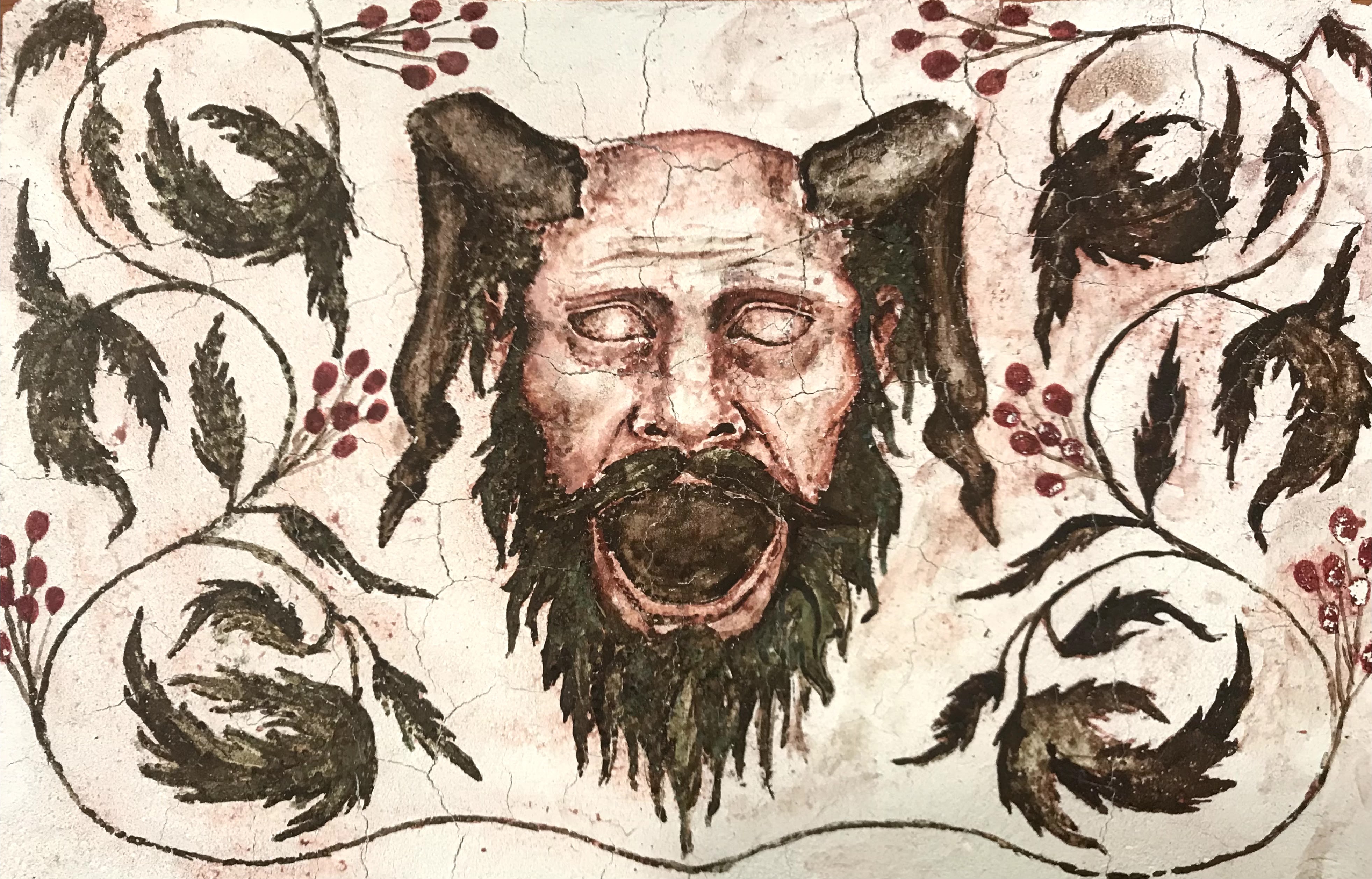
Unfortunately, the verdigris that I used turned brown very quickly. After just a week, the beautiful green had disappeared and left behind a muddy brown. I guess I shouldn’t be surprised, but the other paints I made with verdigris have not had this problem yet. Instead, I might try to use green verditer, which is still a copper compound like verdigris, but from what I have read, it does not seem to have the blackening quality of verdigris.
