One of the other great green pigments from history is malachite. It makes a soft, cool green. Malachite as a pigment is made up from a basic copper carbonate. Malachite can still be bought, if you know where to look. However, I wanted to try making the artificial version of malachite, which goes under the name green verditer, green bice, or mountain green. Verditer as a term comes from verte di terre, or green of the earth, which is not to be confused with another pigment called terre verte. The names may mean the same thing, but the pigments themselves are very different.
Creating green verditer took a couple of attempts to get right. I also wanted to make it sooner than I did in the end, but I was also trying to make my own copper sulfate. I later figured out that I had been making copper sulfate correctly, but I was not patient enough to let it fully evaporate. Making copper sulfate involves adding copper to oxidized sulfuric acid. I thought that copper sulfate would precipitate in the liquid, but the liquid evaporates and leaves copper sulfate crystals. I did end up with a small batch of copper sulfate crystals, but I ended up buying some copper sulfate pentahydrate from a hardware store.
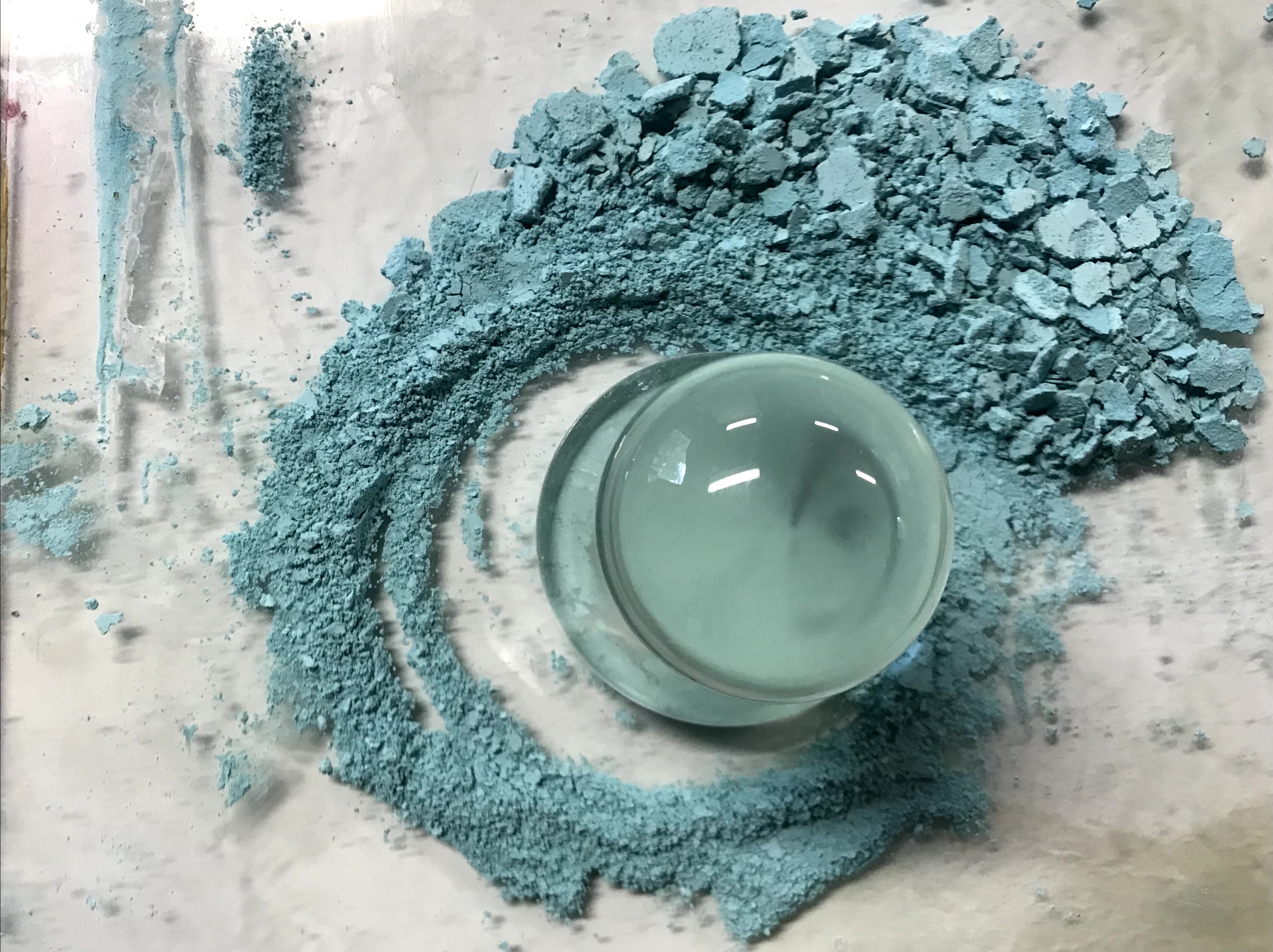
I ended up buying my copper sulfate from a local hardware store since I could not make enough in time. The process is pretty simple. Dissolve copper sulfate in water, which may take some time unless it gets heated, and dissolve sodium carbonate in water. Add these two solutions together and stir gently.
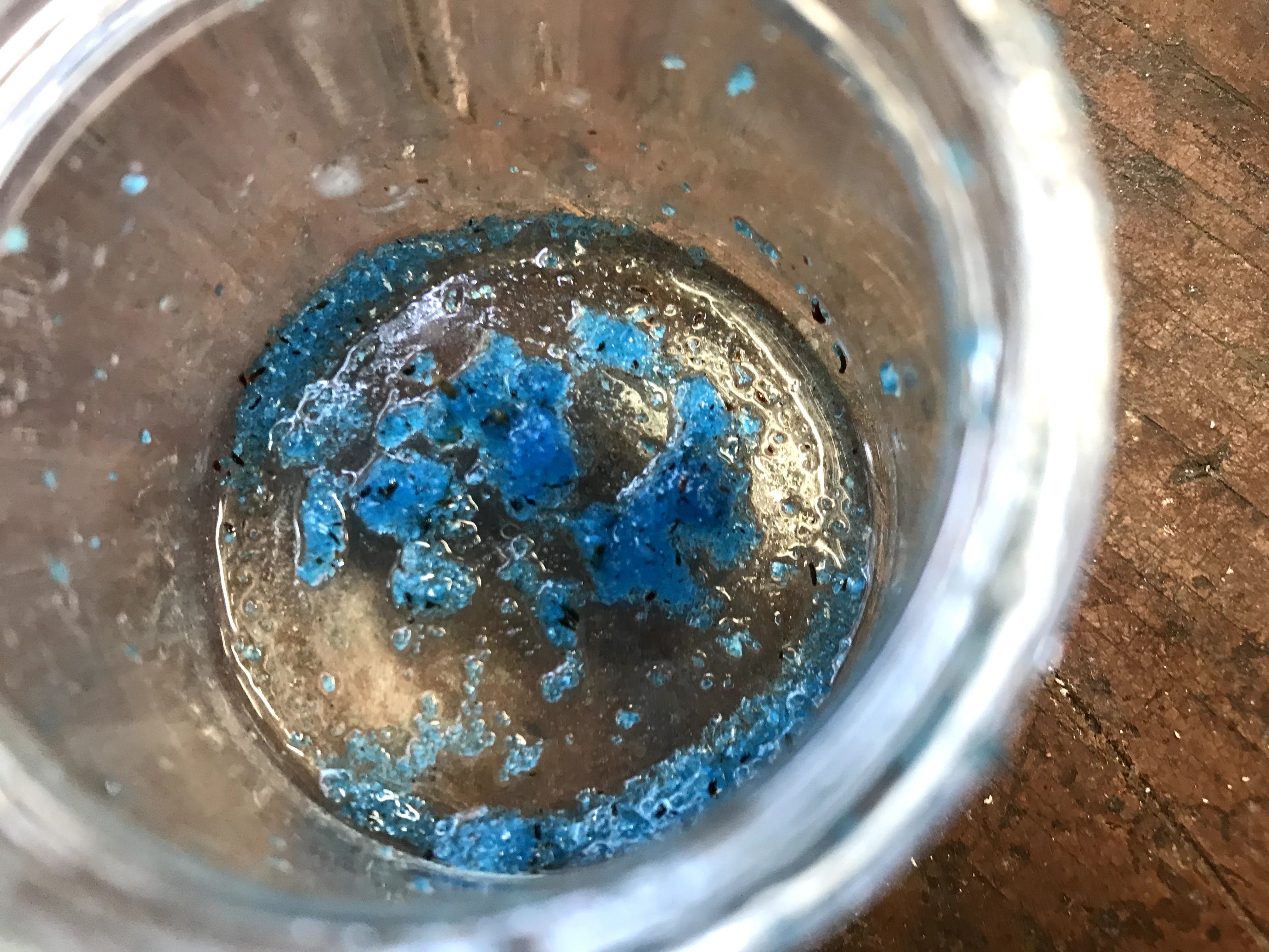
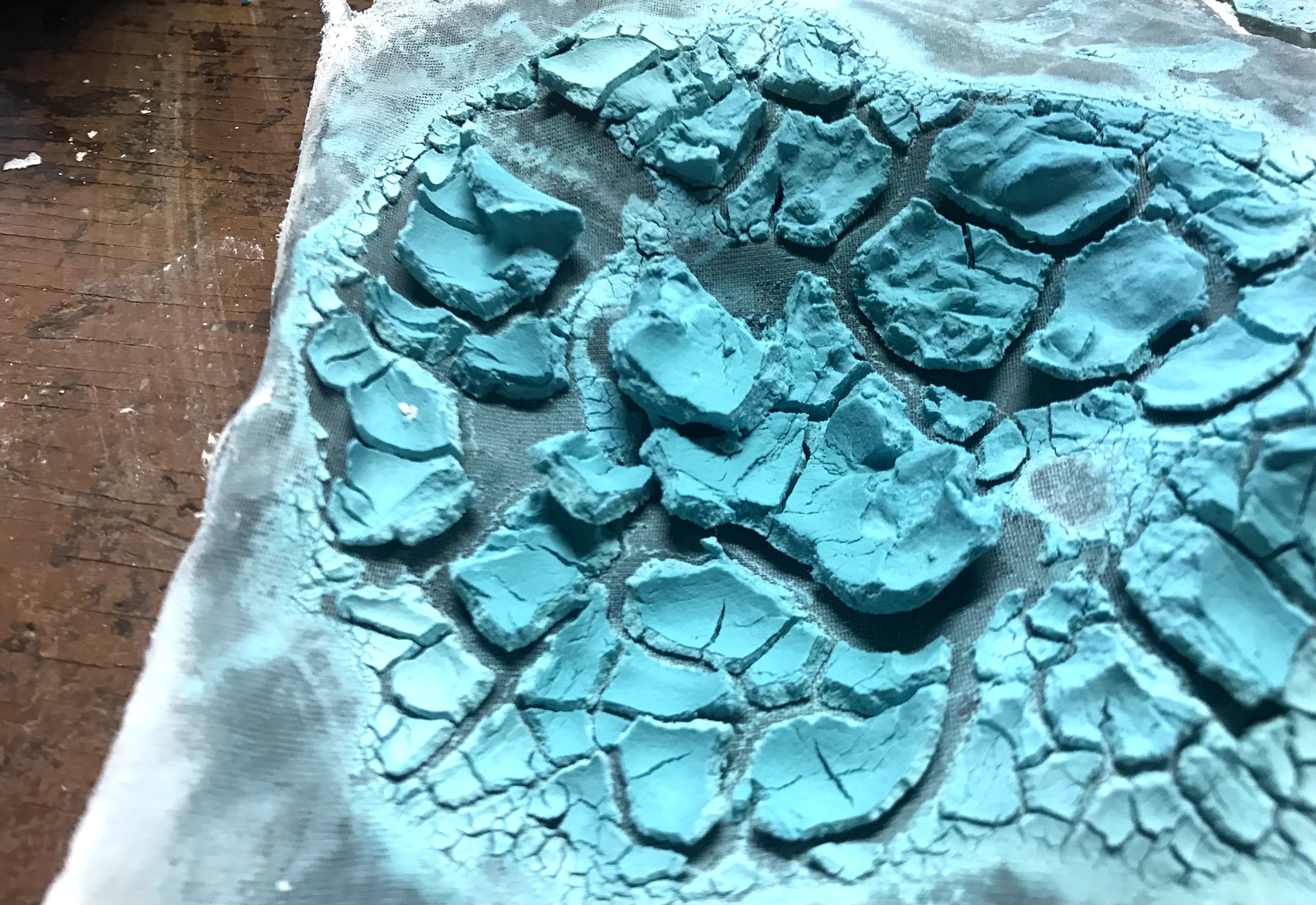
In my first attempt, I used equal amounts of copper sulfate and sodium carbonate. The initial product appeared to be successful. The color was more blue than I thought it should be, but I filtered it and spread it out to dry. Once it dried, the beautiful blue color turned a greyish green with a couple of patches of baby blue. I tried scraping the pigment into two powders based on their colors and made test oil paints out of them. Both pigments made similar colors that actually reminded me of terre verte, because the resulting paint is a warm, brownish green. What I made was not a bad pigment, I saved it and will use it later, but it was not green verditer.

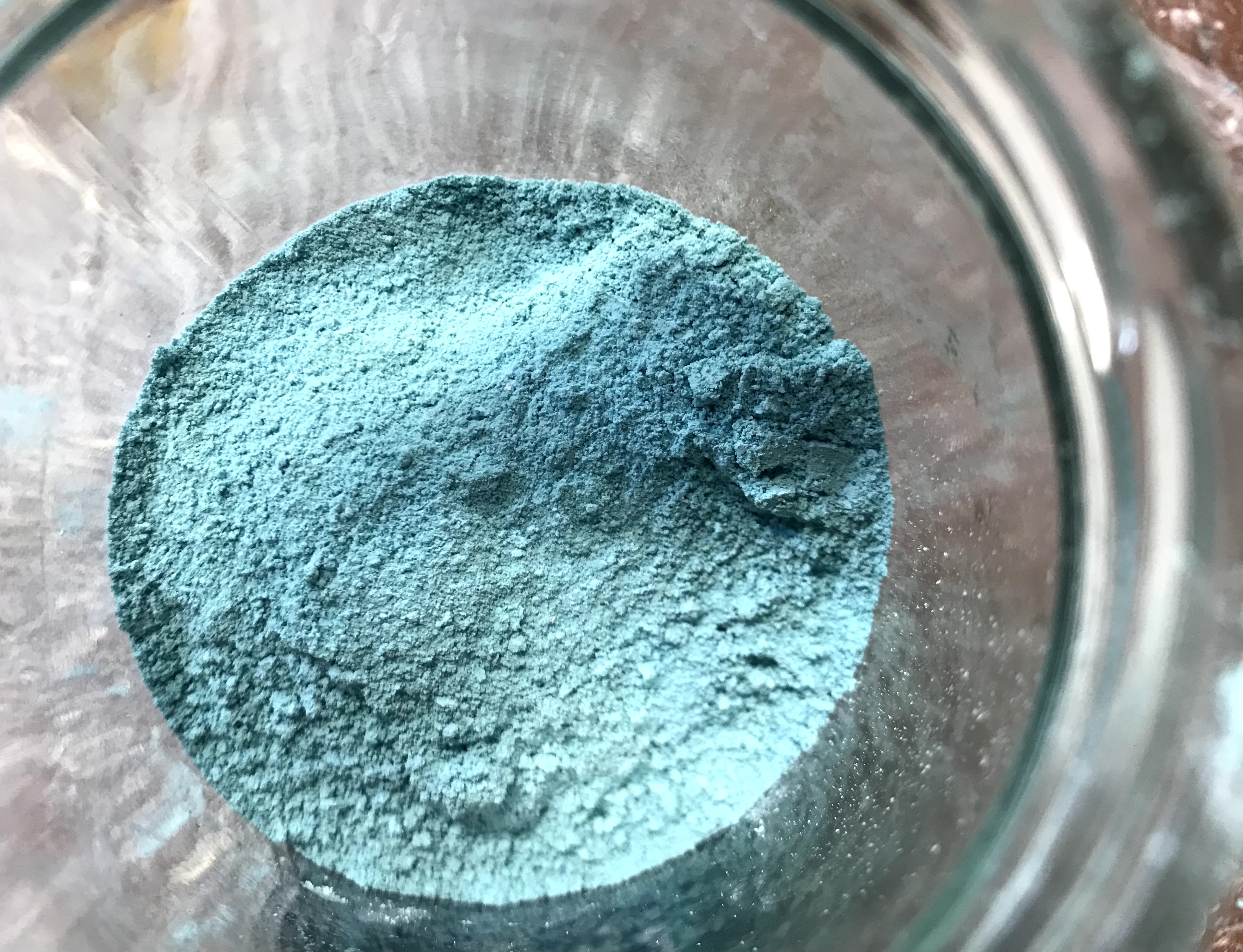
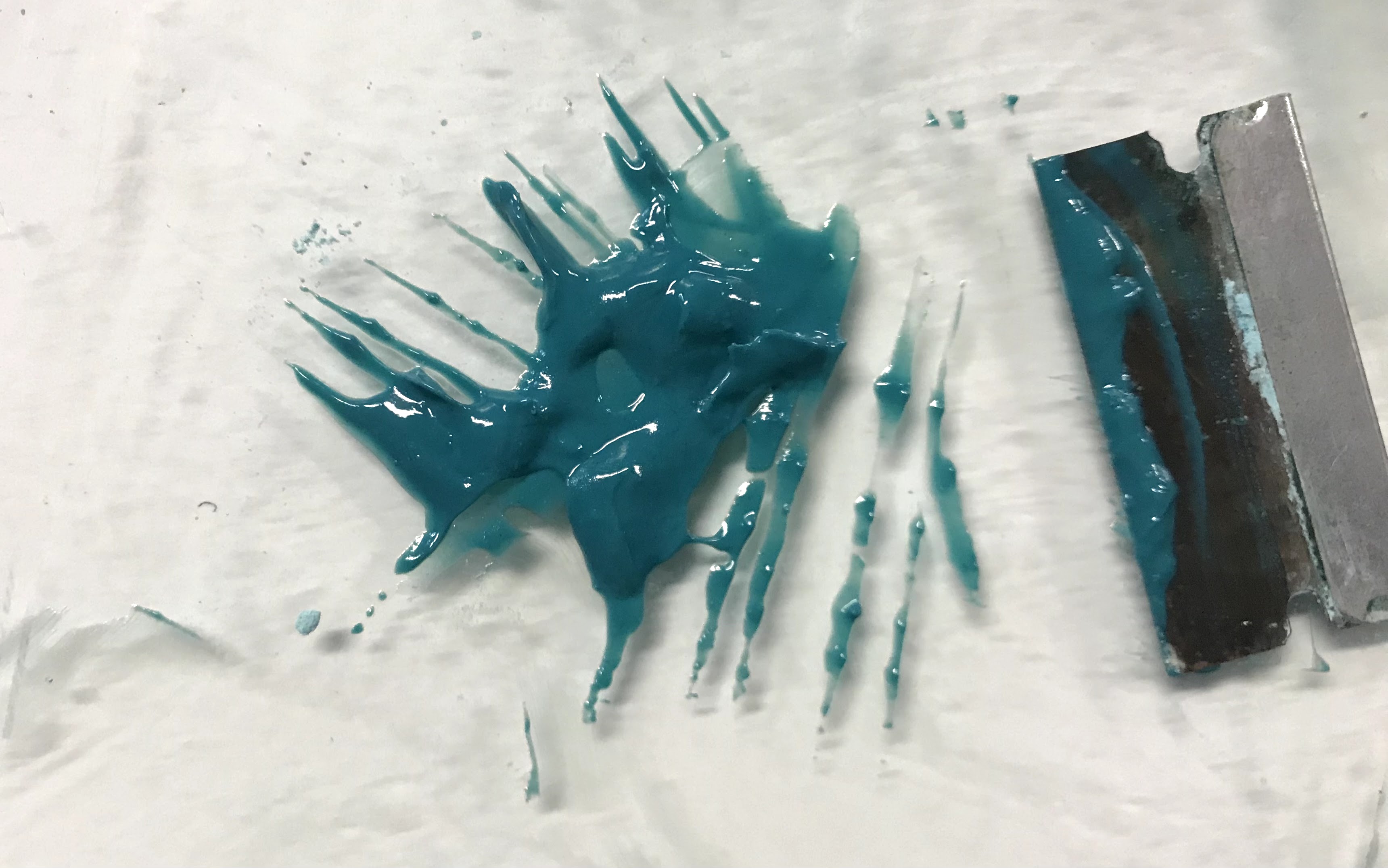
After the first attempt, I checked some websites and YouTube videos to get a more exact recipe. I adjusted the ratios to have more copper sulfate solution than sodium carbonate solution and added the two solutions together in a flask. This time, when I started swirling the flask, it bubbled up and over the top. Once it calmed down, I gently stirred until the solution turned a sea green and stopped bubbling. After that, I dumped the contents of the flask into a filter to separate the solid copper carbonate from the water and set the copper carbonate out to dry completely.


The second attempt was much more successful than the first. Once the copper carbonate had fully dried, I ground it up into a fairly fine powder. Sources that I have read mention that malachite can go pale if it is ground too finely. With hand grinding the pigment, I am not too worried about making it into too fine of a powder to lose color.

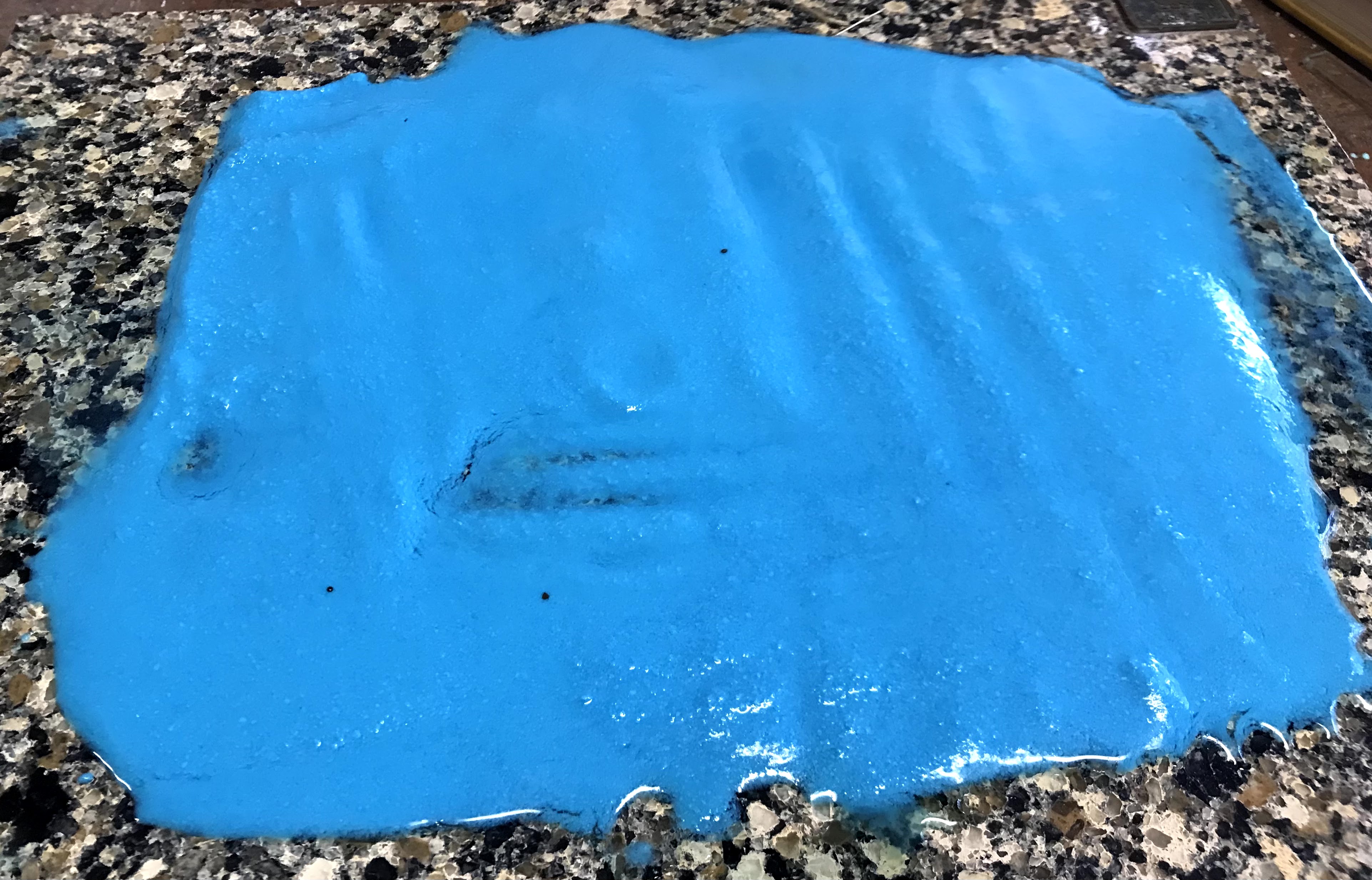
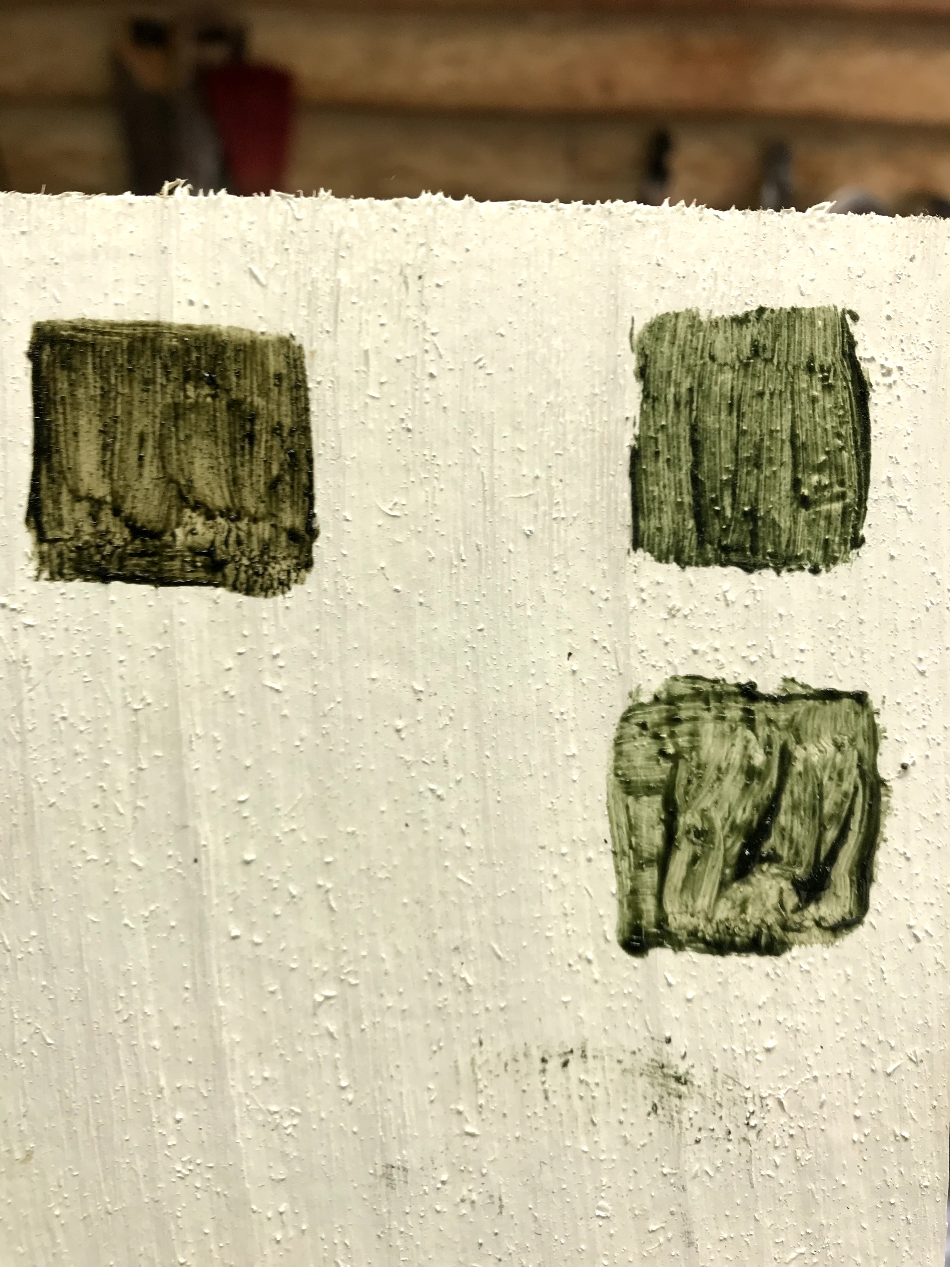
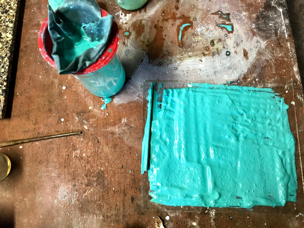
As I went, I quickly made up some oil paints of the pigments I was working with to compare them and test their color in application. I am still a little shocked by how different the colors of the powder pigments are from the paints they create. I tried to make a neatly organized and labeled test board, but I will explain it in more depth.
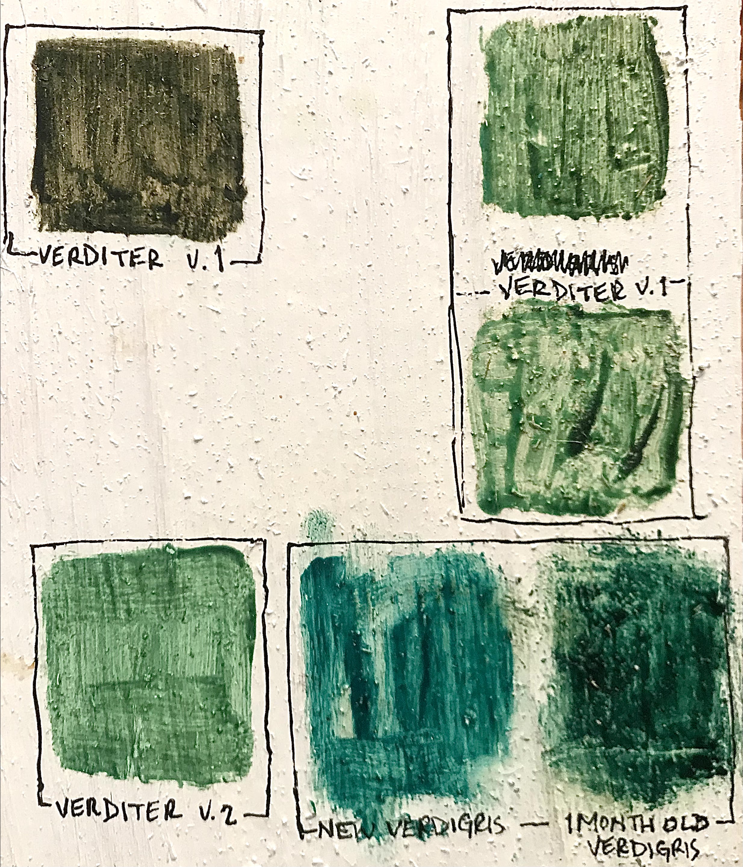
Verditer v. 1 was the result from my first attempt using equal parts copper sulfate and sodium carbonate. There were two distinctly colored sections of the powder as it dried. When these two powders were made into paint, the darker, greyer powder made the top leftmost square. The baby blue powder from the first attempt made the two squares in the top right corner.
Verditer v. 2 is the paint made from my second attempt, which was more successful. This was what I expected out of a green verditer pigment. Although, the top right squares from Verditer v. 1 look similar to the v. 2 square, they are a little more muddy of a green. The Verditer v. 2 color is more purely green, without the hits of brown or yellow that come through in the Verditer v. 1 squares.
I also thought that it would be interesting to compare green verditer to verdigris to see the difference between the two copper-based greens. At first blush, the paints were not too different when freshly painted next to each other. The green verditer went on as a light green that leaned heavily towards blue, but as it dried, it became a little warmer and more vibrant. Verdigris is a shockingly cold green, and most painting treatises from the middle ages suggest adding ochre or lead-tin yellow to verdigris in order to make it into a more proper green. However, I also knew that verdigris will change dramatically over time when exposed to air. I had some older verdigris paint that I made over a month ago, and it becomes a much warmer, deeper green over time.
