Back in January of 2021, I began an apprenticeship on the North Coast of California. I wasn’t quite in wine country proper, but I was close enough that the landscape looked Mediterranean to my midwestern eyes. The blue morning haze quietly crept through the trees, and the grass shone silvery as the first beams of light rose above the hills. The trees themselves looked familiar, like they were taken straight from a Giotto masterpiece. The far off farm building dotted the landscape in much the same way as little chapels in church panels. At the time I arrived there, the landscape was still shockingly verdant, and the sun stayed low, which created a mystical ambiance that I became enamored with.
Part 1: The Grass is Never Green Enough
The catalyst for my eventual rabbit hole was simply wanting to make plein air paintings of my surroundings to capture the Italianate nature of the landscape. I wanted to learn oil painting, as I had never tried it before, and I figured that oil painted picked up popularity in the height of the Italian Renaissance, so looking up Renaissance painter’s processes seemed like as good an introduction into oil paint as any university class on the same subject. I thought that the most direct method would be to get oil paints and just get out there and paint. However, true to form, I did a little research
before I did anything.
I thought that it would be the most interesting and practical to find the same pigments that the Renaissance masters would have used, in order to more faithfully follow along in their painting processes. I also figured that matching pigments would make my own painting better resemble Renaissance paintings with not much added effort.
The palette that I researched and aimed to find was:
White (not lead)
Venetian Red
Naples Yellow
Azurite (Mountain Blue)
Verdigris
Raw Umber
Carmine Red
I tried two different stores a couple of weeks apart, because I find most of them fairly easily, and even pick up terre verte. I did accidentally pick up cadmium red, instead of carmine red, which was a surprisingly expensive mistake, and not quite alike in color, but cadmium red made a decent substitute for vermillion. However, two proved to be particularly hard to find. I looked and looked at every last tube of paint trying to find azurite (also under the moniker of Mountain Blue) and verdigris. These pigments were going to be the backbone of my paintings, because it’s difficult to paint a landscape without blue and green.
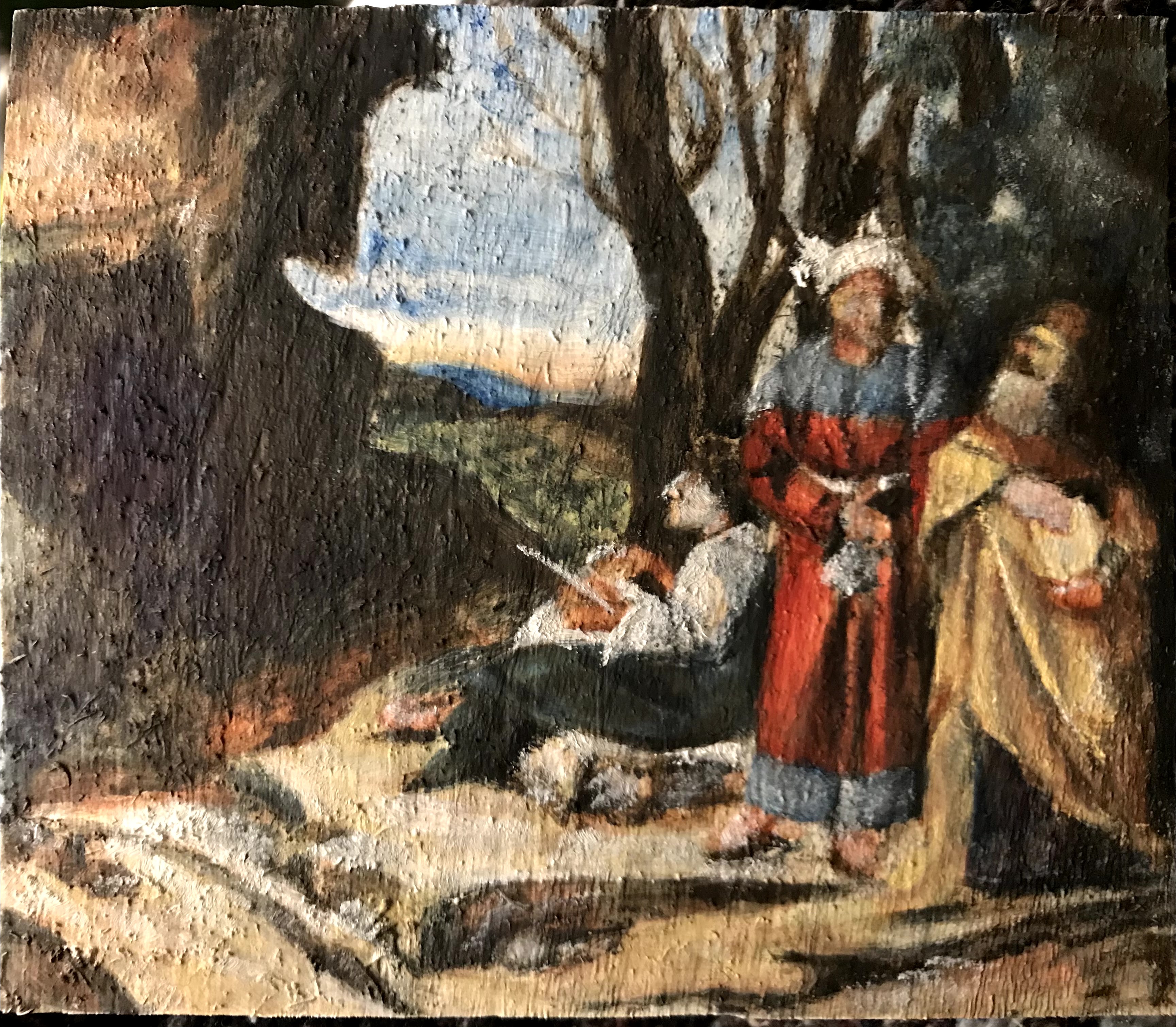
Nevertheless, I tried to soldier on and make some master study paintings with the paints that I had. They looked okay technically, the shapes were right, and there was a slight translucency to the painting from the process of laying in glazes. But there was one glaring flaw to all the paintings I tried, and that was the greens looking wrong.
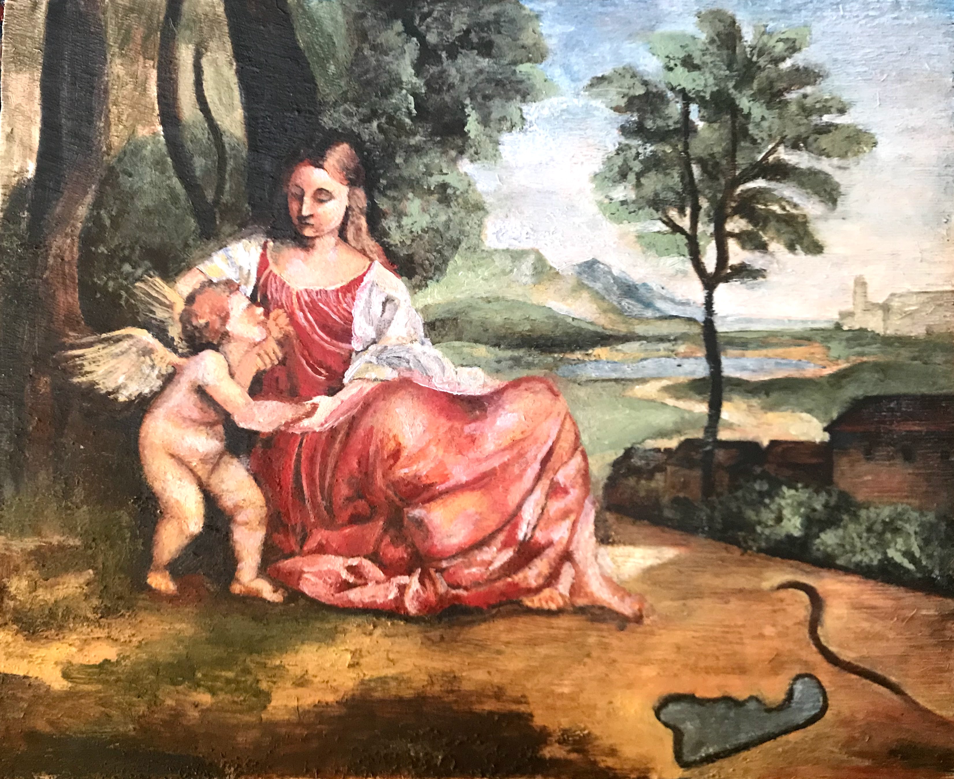
An additional hurdle I realized during painting my second master study, which also contributed to my abandonment of the painting, was that the colors that I was trying to copy were the aged pigments and varnish after years of degradation. At the start of the painting, I tried to match the warm hues of the yellows and browns, but I considered the warming effect of aged varnish and dying verdigris. I came to the conclusion that this painting was probably originally vibrant in the reds, blues, and greens, but over time, the blues and greens had turned brown from the copper-based pigments oxidizing, and the whole painting took on a yellowy cast from the old varnish. At that point, I was unsure which version I should copy, either the painting’s current state or what would have originally looked like. Either way, I knew I could not truly achieve an excellent copy of either because my greens were not right.
I knew that I had to find verdigris or its modern equivalent, so I resigned myself to doing more research.
Part 2: Breaking Bad
I came to the heartbreaking conclusion that it was impossible to find azurite or verdigris in any modern tube of paint. Both pigments are fairly fugitive, meaning the color does not last when exposed to other materials and the environment. The pigments, being copper based, also had the nasty habit of oxidizing and turning black or brown in oil paintings. I had picked up a phthalo blue tube, so for a time, I had a blue to use in my paintings. A green would be more difficult. I already had a complicated relationship with green paints, leftover from my acrylic painting days, and I had not bought a tube of green paint maybe ever in my life. I stuck to mixing blue and yellow, which I tried to do for oil painting as well. Pthalo blue and Naples yellow
do not make a pretty green. In fact, they hardly make more than a saturated grey. The terre verte that I got was not much more
useful than for base washes of color. So, it was back to the drawing board.
After more research, looking into verdigris specifically, I discovered that it is fairly simple to make at home. Verdigris is a basic copper acetate, and to make it, copper must be exposed to the vapors of acetic acid, better known as vinegar. Historically, verdigris was made by winemakers, somewhat as a byproduct. The dregs of wine mash that had gone off were thrown in a barrel, and sheets of copper were sealed inside as well. The barrel was sometimes buried, but left for a few weeks, then the barrel was open, the copper scraped off then returned to the barrel, and the process restarted. The patina that forms on the copper when exposed to vinegar fumes is the verdigris pigment used for paints. All I needed to do was find some copper.
As fortune occasionally smiles upon me, I didn’t have to wait long for copper. Meanwhile at work, I was redoing some wood shingle roofs. Sometimes, roofers would add a strip of copper flashing underneath the ridge boards to act as a deterrent for organic growths, like moss or lichen. On one particular roof, we were going to get rid of the copper flashing because it was adhered by tar strips, and we weren’t about to stick them onto the new ridge boards. I took the flashing home with me, knowing that I could finally make some verdigris and get to painting my landscapes.
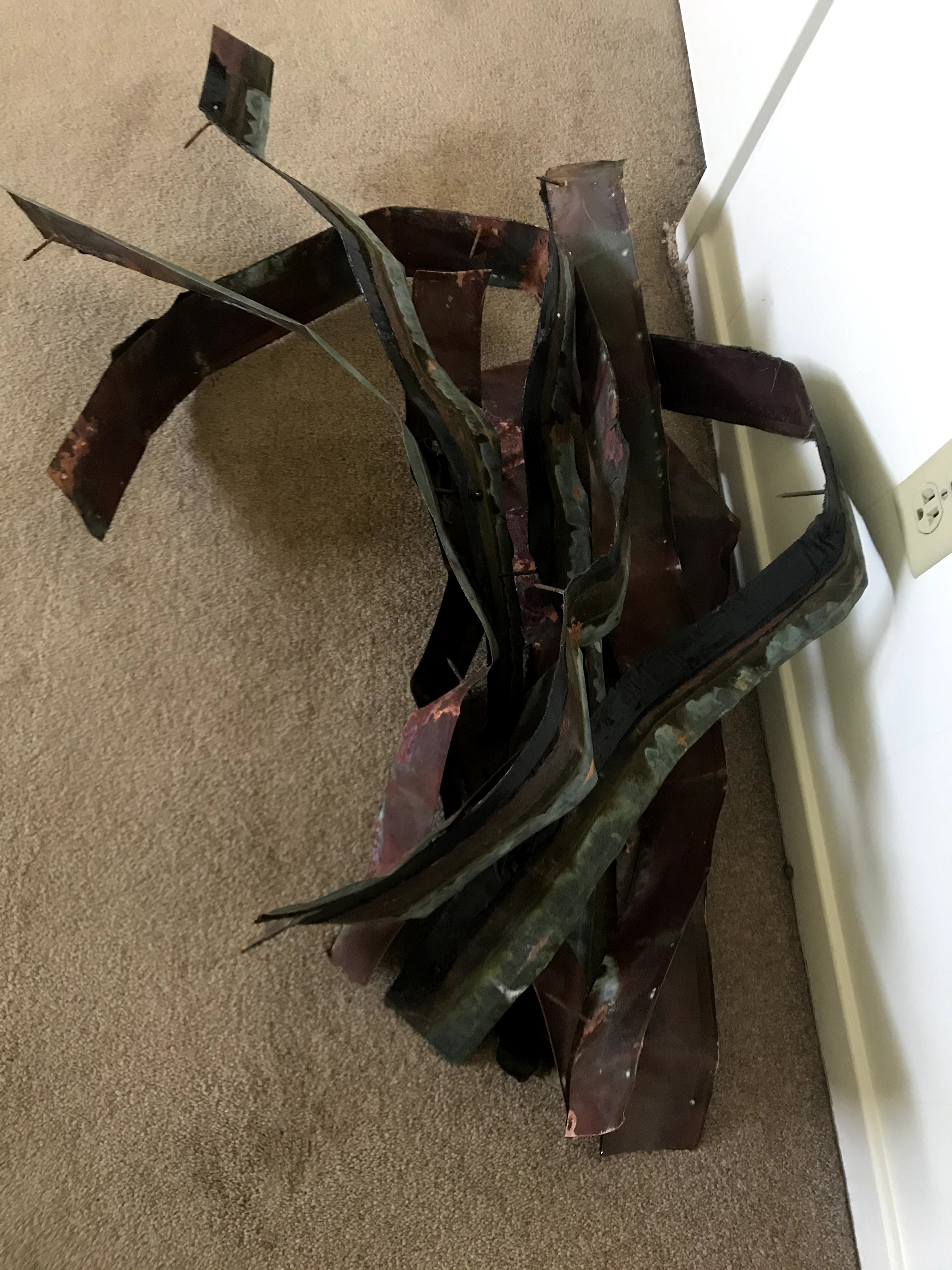
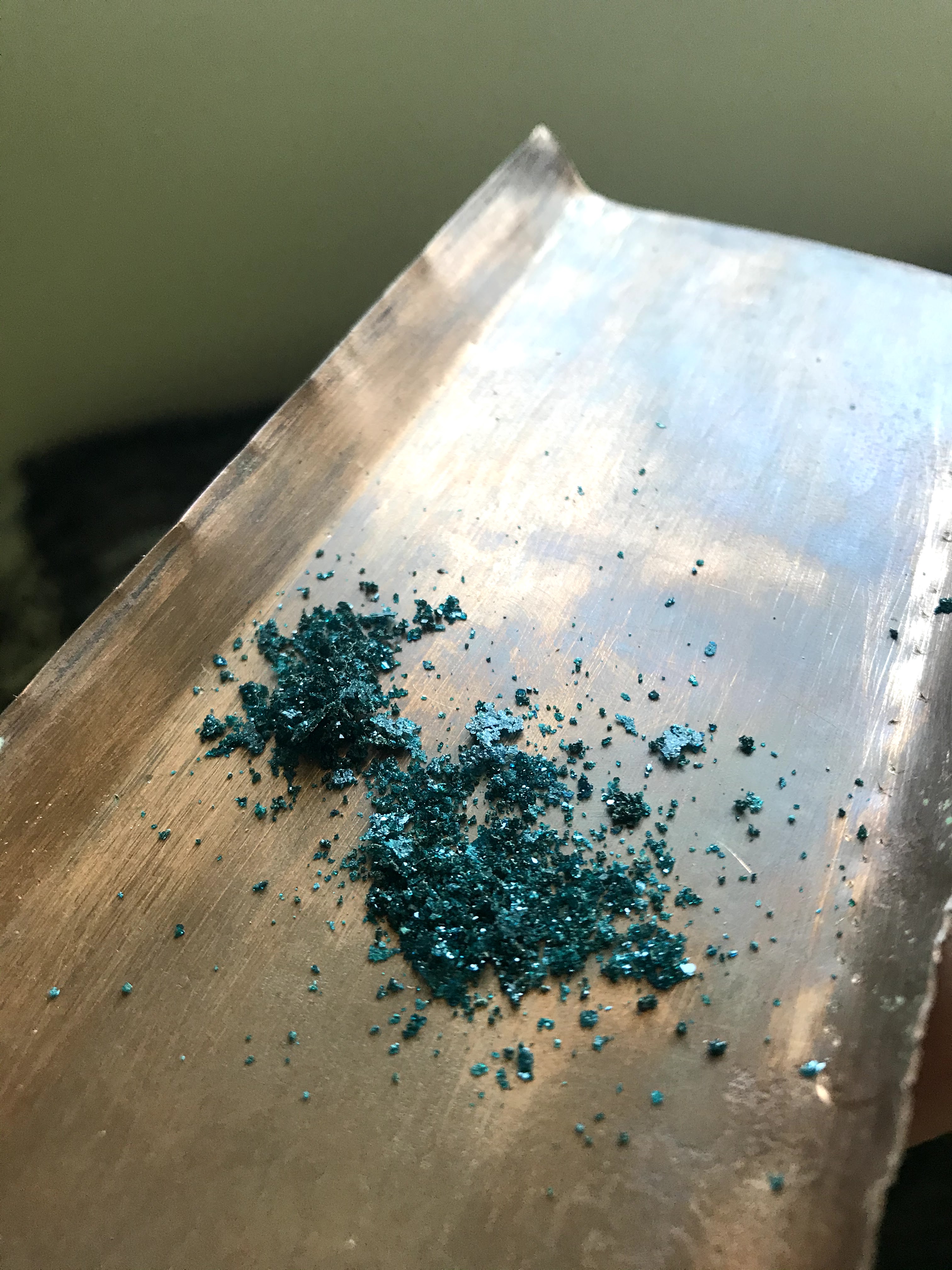
I tried just scraping off the existing patina on the flashing, but that turned brown when added to oil. I then set on resurfacing the sheets, which had become tarnished after exposure to the sun and ocean air for years. After that, the only thing left to do was place some copper sheets in a jar with vinegar.
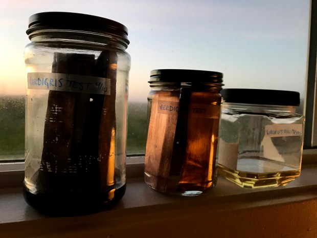
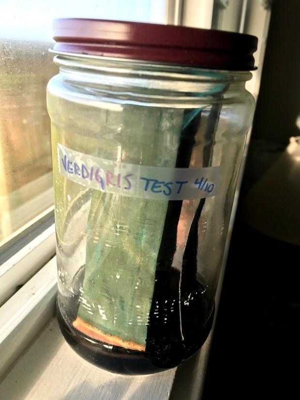
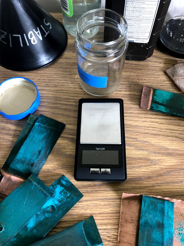
I thought that this next step would take months of waiting to let the patina grow to a substantial amount. However, to my surprise, there was enough verdigris after a week. I spent the rest of my time in California maintaining my verdigris factory. I still ended up with very little verdigris because of the small scale I was working in.
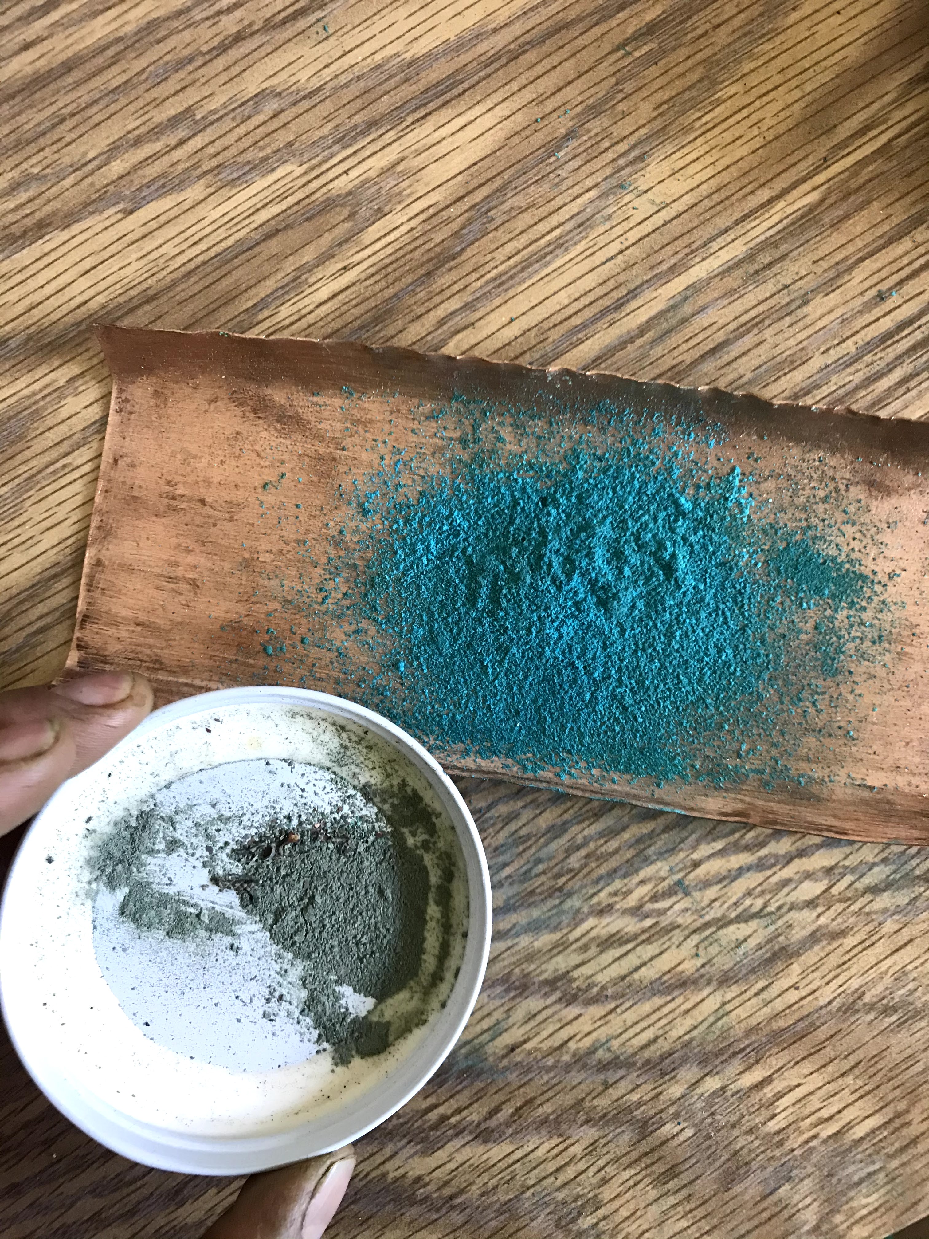
I also added the step of neutralizing the verdigris. To do so, the verdigris that is freshly scraped off of the copper sheet gets redissolved in vinegar. As the vinegar and water evaporate, the verdigris recrystallizes and becomes more stable in paints.
By the time I had enough neutral verdigris to make paints with, it was the end of March. My quest had taken me three months to achieve my goal. This experience also exposed me to the wonderful world of pigments, which I had looked into fleetingly before, but I became deeply engrossed in understanding pigment properties and chemical composition in relation to use in different paint mediums. Thus began my work into pigment making, as well as my desire to understand
historic paints and pigments.

